Your pricing page is the last stop before a deal closes or dies, and most SaaS companies treat it like a spreadsheet someone formatted in an afternoon. Layout, plan naming, toggle design, and label copy all carry measurable conversion weight, and this post covers how to fix the ones that are silently costing you closed revenue.
The Hidden Conversion Killer: Your SaaS Pricing Page
You have spent months, perhaps years, building a valuable SaaS product. You have invested in marketing, driven traffic, and nurtured leads. Your potential customers arrive at the final hurdle: your pricing page. This is the moment of truth. Yet, for many companies, this page is where deals die a silent death. It is often an afterthought, a functional necessity, not the carefully engineered conversion machine it should be.
A poorly designed SaaS pricing page can undo all your previous efforts. It can confuse users, introduce friction, and ultimately drive them away. Think of it as a salesperson’s final pitch. If that pitch is muddled, inconsistent, or fails to address unspoken concerns, the deal is lost. A small improvement in the clarity, guidance, and psychological framing on your pricing page can yield disproportionately large returns on your bottom line. This isn’t about trickery. It is about understanding how people make decisions and designing for that reality.
Pricing Psychology: More Than Just Numbers
People do not make purely rational decisions when it comes to pricing. We are all subject to cognitive biases and mental shortcuts. Your SaaS pricing page needs to account for this. It is a psychological battlefield, and how you present your options, not just the options themselves, dictates success.

Anchoring: Setting the Value Baseline
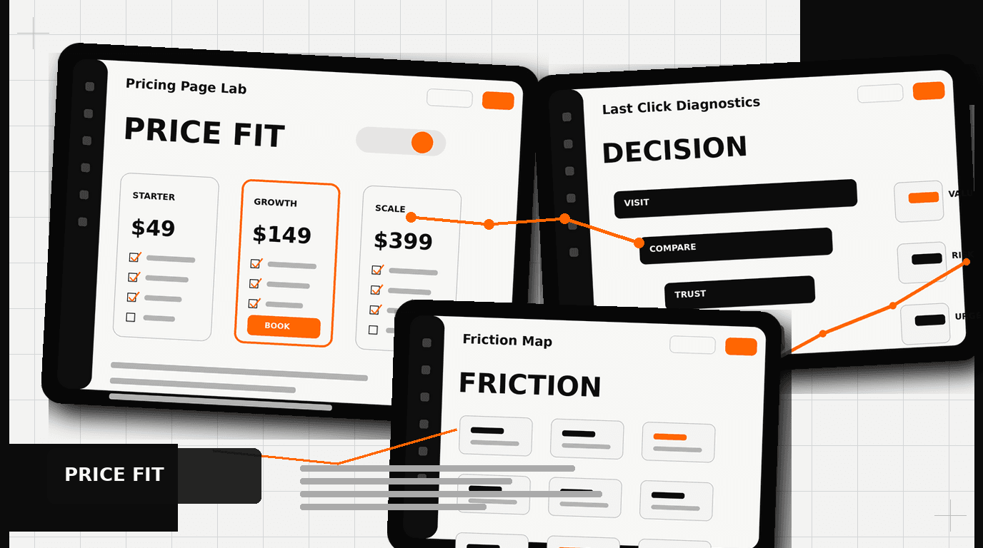
Anchoring is one of the most powerful psychological principles at play. It describes our tendency to rely heavily on the first piece of information offered, the “anchor,” when making decisions. For pricing, this means the first price a user sees significantly influences their perception of subsequent prices.
If you present a “Basic” plan at $49 first, then a “Pro” plan at $99, the $99 might seem expensive. However, if you lead with an “Enterprise” plan at $999, then the “Pro” plan at $99 appears significantly more affordable and reasonable. We see this pattern frequently. Even if most users never intend to buy the most expensive plan, its presence creates a higher anchor point, making the mid-tier options feel like a better value.
When we redesigned the catalog for Klein Tools, making their complex product lines and pricing easier to navigate was critical. While not a SaaS pricing page, the principle of clear value presentation and guiding the customer’s eye through options applies directly. The structure informed perception. Always consider what price you want to anchor your users to, and present it early, even if it is just a visible, unclickable, high-tier option.
Decoy Pricing: Guiding Choice
Building on anchoring, decoy pricing strategically introduces an option that is not necessarily meant to be chosen, but rather to make another option seem more attractive. A classic example is from The Economist, where they offered a web-only subscription, a print-only subscription at the same price as the web-only, and a web-plus-print subscription at a slightly higher price. The print-only option, being clearly inferior to the web-plus-print option at the same price, acted as a decoy, pushing many users towards the bundled, higher-value choice.
In SaaS, this might look like offering a “Standard” plan at $79 with X features, and a “Pro” plan at $99 with X+Y features, but then adding a “Business” plan at $95 with X+half of Y features. The “Business” plan, though close in price to “Pro,” offers less value, making the “Pro” plan seem like an obvious step up for a minimal cost difference. This guides users towards your preferred, higher-margin plan.
The key is careful calibration. The decoy must be clearly inferior to your target option but still plausible enough not to look like an obvious trick. It shapes the perceived value of your core offerings, gently nudging users toward the desired conversion path.
Designing for Decision: UI/UX Tactics
Beyond the psychological framing of numbers, the actual user interface and experience of your SaaS pricing page play a massive role. Every element, from toggle design to button copy, influences conversion.
Toggle Placement and Design: Annual vs. Monthly
The annual versus monthly payment toggle is a critical design element. Most SaaS companies prefer annual payments for improved cash flow and customer lifetime value. Your design should reflect this preference.
- Default to Annual: Always set the toggle to “Annual” by default. This immediately anchors the user to the higher, discounted annual price. The perceived savings are often significant, like “Save 20%.”
- Prominent Discount Callout: Make the annual discount impossible to miss. Use bold text, a distinct color, or a clear badge like “Save $X per year” or “2 months free.” The benefit must be immediate and obvious.
- Clear Toggle Interaction: The toggle itself needs to be visually distinct and intuitive. Users should instantly understand they can switch between payment frequencies.
- Benefit-Oriented Language: Instead of just “Monthly / Annual,” consider “Pay Monthly / Save with Annual.”
This design decision is not trivial. It directly impacts your recurring revenue and customer retention metrics. Making the annual option the path of least resistance, and clearly highlighting its value, is a must-do.
Handling the Enterprise Tier: Beyond “Contact Us”
The “Contact Us” button for enterprise plans is a common practice, but it is also a potential conversion killer. While necessary for qualifying leads and custom pricing, it introduces friction. Users want immediate answers, even if they are only estimates.
Consider these alternatives to a simple “Contact Us” button:
- ”Request a Demo” with Specific Benefits: Frame the button as “Request an Enterprise Demo” and directly below it, list 2-3 unique benefits of the enterprise tier, like “Dedicated Account Manager,” “Custom Integrations,” or “Advanced Security Features.”
- Starting Price or Range: If possible, provide a “Starting at $X,XXX/month” indicator. This gives users a ballpark idea and helps them self-qualify. Even a broad range, “Typically $X,XXX – $Y,XXX/month,” is better than nothing.
- Feature Comparison Highlights: Ensure the enterprise column on your pricing grid clearly lists unique, high-value features that justify a custom conversation. Do not just say “All features.” Detail them.
- Dedicated Enterprise Page: Link to a separate, brief page outlining the specific value proposition for enterprise clients. This page can include case studies, security certifications, and a more detailed form for qualification.
- ”Talk to Sales” with a Calendar Link: Instead of just a form, allow users to directly book a meeting with a sales representative. This shortens the sales cycle for high-intent leads.
When we worked with HP, simplifying complex product lines for different customer segments was a core challenge. The same principles apply to enterprise SaaS. Understand your enterprise buyer, what they need to see, and reduce the hurdles to getting that information.
Strategic FAQ Placement: Alleviating Doubts
FAQs on a pricing page serve a critical function: they address common objections and alleviate doubts just as a user is about to make a decision. The placement of these questions is crucial.
Do not put your FAQs at the top of the page. Users need to see your pricing plans and features first. They want to understand the core offering. Once they have processed the main options, *then* their specific questions will arise. Therefore, the FAQ section should be placed *below* your main pricing grid.
What kind of questions should you include?
- Billing inquiries: “Can I change my plan later?”, “What payment methods do you accept?”, “Is tax included?”
- Cancellation policy: “What is your refund policy?”, “How do I cancel my subscription?”
- Feature specifics: “Are all features available on all plans?”, “What happens if I exceed my usage limits?”
- Onboarding and support: “What kind of support do you offer?”, “How quickly can I get started?”
- Security and data: “How secure is my data?”
Present FAQs in an accordion format to keep the page clean and manageable. This allows users to expand only the questions relevant to them. A well-placed and thoughtfully curated FAQ section can significantly reduce cart abandonment and support requests, acting as a final sales assist.
Beyond the Click: Optimizing the Flow
The pricing page is a critical point, but it is part of a larger conversion journey. Consider what happens immediately after a user clicks “Sign Up” or “Get Started.”
- Clear Call to Action (CTA): Your buttons should be prominent, use high-contrast colors, and employ action-oriented language like “Start Free Trial,” “Get Started,” or “Subscribe Now.”
- Trust Signals: Reinforce trust. Display security badges (SSL, PCI DSS compliance), logos of recognizable clients (if applicable, like DesignX works with Oura Ring or Bodybuilding.com), or brief testimonials near your CTAs.
- Simplified Checkout: Once a user clicks, the subsequent signup or checkout process must be as frictionless as possible. Minimize form fields. Offer single sign-on options.
- A/B Testing: This is not a “set it and forget it” page. Continually test elements: button copy, layout variations, order of plans, color schemes, pricing tiers, and trial lengths. Even small adjustments, validated by data, can lead to substantial gains.
We approach every project, from the ground-up brand identity for Oura Ring to a complex catalog redesign, with the understanding that every touchpoint matters. A pricing page is a direct reflection of your product’s value and your company’s attention to detail.
DesignX’s Philosophy on SaaS Pricing Pages
At DesignX, we do not just build aesthetically pleasing pages. We engineer experiences that drive business results. Our approach to SaaS pricing page design is rooted in a deep understanding of user psychology, conversion optimization, and your specific business objectives. We look at the entire customer journey, not just one isolated page.
Our process involves thorough research into your target audience, competitive analysis, and an iterative design process that includes user testing and data-driven adjustments. We believe a pricing page should be a guided tour, not a confusing maze. It should clarify value, address concerns proactively, and make the decision to buy feel natural, even inevitable.
We have seen the impact of intentional design firsthand. Whether it is redesigning a complex catalog that lifts dealer adoption by 23% for Klein Tools, or helping a drone startup like Apellix define their visual presence, our focus remains on clarity, impact, and measurable success. Your SaaS pricing
Frequently Asked Questions
What should teams know about your SaaS pricing page?
You have spent months, perhaps years, building a valuable SaaS product. You have invested in marketing, driven traffic, and nurtured leads. Your potential customers arrive at the final hurdle: your pricing page. This is the moment of truth.
What should teams know about more than just numbers?
People do not make purely rational decisions when it comes to pricing. We are all subject to cognitive biases and mental shortcuts. Your SaaS pricing page needs to account for this. It is a psychological battlefield, and how you present your options, not just the options themselves, dictates success.
What should teams know about UI/UX tactics?
Beyond the psychological framing of numbers, the actual user interface and experience of your SaaS pricing page play a massive role. Every element, from toggle design to button copy, influences conversion. Toggle Placement and Design: Annual vs. Monthly The annual versus monthly payment toggle is a critical design element.
What should teams know about optimizing the flow?
The pricing page is a critical point, but it is part of a larger conversion journey. Consider what happens immediately after a user clicks “Sign Up” or “Get Started.” Clear Call to Action (CTA): Your buttons should be prominent, use high-contrast colors, and employ action-oriented language like “Start Free Trial,” “Get Started,” or “Subscribe Now.” Trust Signals: Reinforce trust. Display security badges (SSL, PCI DSS compliance), logos of recognizable clients (if applicable, like DesignX works with Oura Ring or Bodybuilding.com), or brief testimonials near your CTAs. Simplified Checkout: Once a user clicks, the subsequent signup or checkout process must be as frictionless as possible.
What should companies know about DesignX’s philosophy on SaaS pricing pages?
At DesignX, we do not just build aesthetically pleasing pages. We engineer experiences that drive business results. Our approach to SaaS pricing page design is rooted in a deep understanding of user psychology, conversion optimization, and your specific business objectives. We look at the entire customer journey, not just one isolated page.