SynergyFlow’s B2B SaaS platform struggled with low engagement and unclear messaging in its hero section. DesignX aimed to capture immediate attention and convey the platform’s true value.
When SynergyFlow, an emerging B2B SaaS platform, approached DesignX, their innovative solution was struggling to capture immediate attention and convey its true value. Their existing hero section, the critical first impression for potential customers, was experiencing low engagement, unclear messaging, and a significant drop-off rate, hindering their growth objectives.
Project Overview
| Category | Detail |
|---|---|
| Client Type | B2B SaaS Provider |
| Industry | Cloud Productivity & Collaboration Software |
| Project Type | Hero Section UI/UX Redesign & Optimization |
| Timeline | 5 Weeks |
| Deliverables | User Research Report, Competitor Analysis, Wireframes, High-Fidelity Mockups, Interactive Prototype, Style Guide Additions |
| Tools Used | Figma, Adobe Illustrator, Miro, Hotjar, Google Analytics |
The Challenge
SynergyFlow’s core product offered a sophisticated suite of tools designed to streamline team collaboration and project management, yet their website’s hero section failed to communicate this effectively. The previous design suffered from several critical issues. First, the primary headline was vague, using industry jargon that did not immediately resonate with their target audience’s pain points. Second, the accompanying imagery was generic stock photography, devoid of any unique visual identity or connection to the SaaS product’s functionality. This lack of visual distinction meant SynergyFlow blended into a crowded market rather than standing out. Furthermore, the call-to-action (CTA) was understated and poorly positioned, leading to a low click-through rate. Data from their analytics showed a high bounce rate on the homepage, indicating visitors were not finding immediate value or a clear path forward. The cumulative effect was a hero section that neither engaged visitors nor effectively guided them deeper into the sales funnel, directly impacting lead generation and user acquisition. SynergyFlow needed a design that was not only visually appealing but also strategically engineered to convert browsers into interested prospects.
Our Approach
Our engagement with SynergyFlow began with an intensive discovery phase, ensuring a deep understanding of their product, market, and user base. We initiated a series of stakeholder interviews with their sales, marketing, and product teams to align on business objectives, target audience demographics, and key value propositions. This was complemented by thorough competitor analysis, examining how similar SaaS platforms positioned their hero sections, identifying best practices, and pinpointing opportunities for differentiation. To gain direct user insights, we conducted remote user interviews with existing SynergyFlow customers and potential users, asking about their first impressions, what information they seek, and what motivates them to explore further. We also reviewed existing analytics data from SynergyFlow, including heatmaps and session recordings, to identify specific areas of friction and user abandonment. This research informed the creation of detailed user personas, guiding our empathy-driven design decisions. The collective insights from this phase allowed us to define clear design objectives, focusing on improving message clarity, enhancing visual appeal, and optimizing the conversion path. Our strategy emphasized a data-driven approach, ensuring every design element served a specific purpose towards SynergyFlow’s business goals.
Key Design Decisions
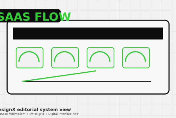
Strategic Visual Metaphor for Complexity
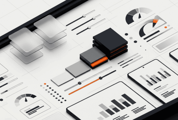
The existing hero section used generic, uninspiring stock photography. Our decision was to replace this with a custom, abstract visual metaphor that represented SynergyFlow’s core value: bringing order and clarity to complex workflows. Instead of literal screenshots or generic team photos, we designed a dynamic, interconnected graphic system. This system featured fluid lines, geometric shapes, and subtle animations, symbolizing data flow, collaboration, and streamlined processes. The reasoning was twofold: first, it created a unique and memorable brand aesthetic that immediately distinguished SynergyFlow from competitors. Second, it communicated the product’s sophisticated capabilities in an engaging, non-literal way, avoiding the trap of overwhelming new visitors with technical detail. This abstract representation invited curiosity and hinted at the underlying power of the platform without explicit explanation, encouraging users to learn more.
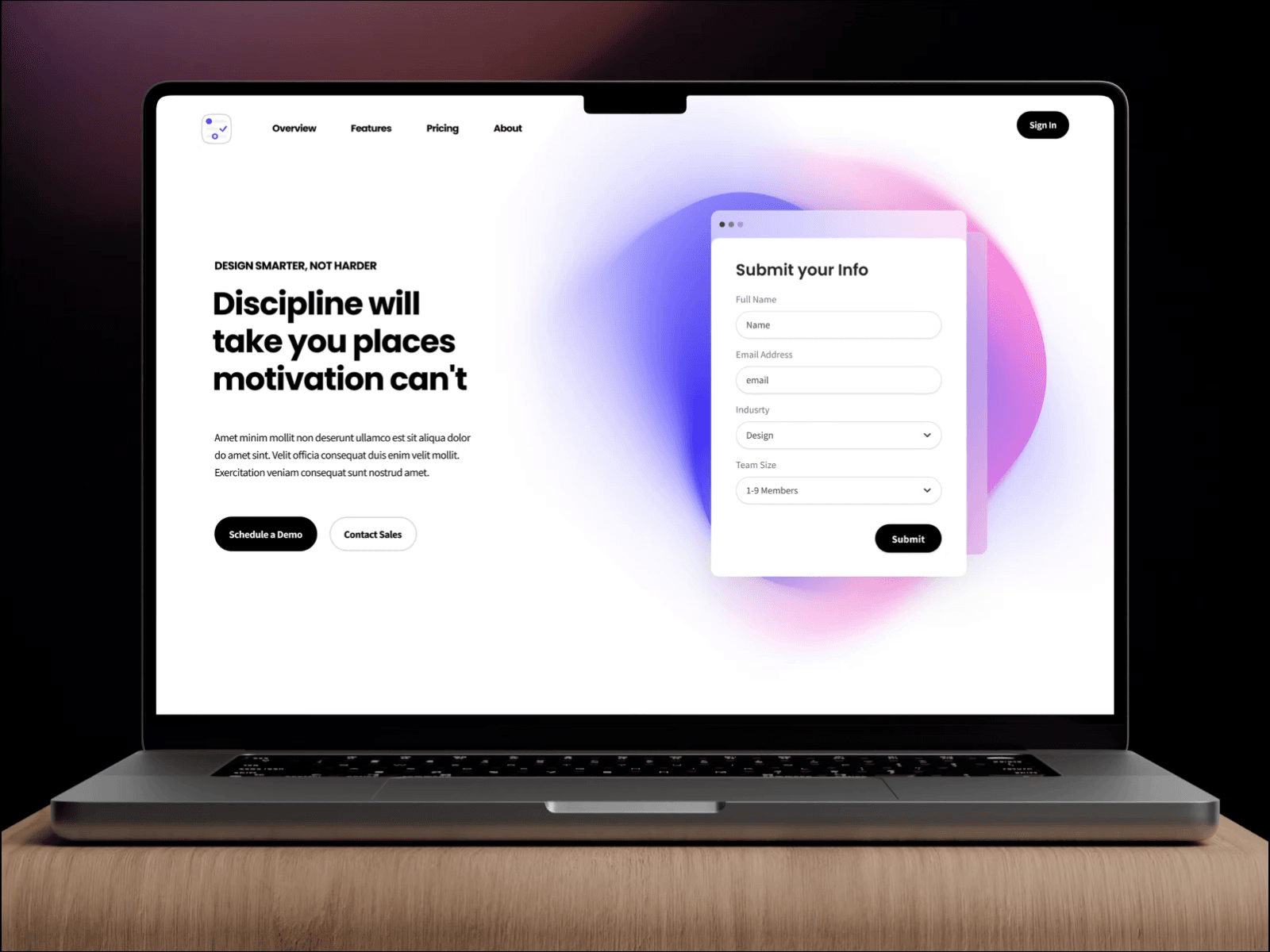
Benefit-Driven Headline and Sub-headline Architecture
The original headline was product-centric and jargon-heavy, failing to articulate immediate value. We restructured the headline and sub-headline architecture to be entirely benefit-driven and problem-solution focused. The main headline was crafted to directly address a core pain point of SynergyFlow’s target audience, for example, “Unify Your Team, Amplify Your Productivity.” The sub-headline then expanded on this, offering a clear, concise promise of how SynergyFlow achieves it, such as “Streamline workflows, centralize communication, and achieve project goals faster with our intuitive platform.” The why behind this decision was rooted in user psychology: visitors are primarily interested in how a product can solve their problems, not just what it does. By immediately presenting a clear benefit and a promise, we aimed to capture attention, establish relevance, and motivate visitors to explore the solution further, significantly improving the hero section’s ability to resonate with its audience.
Prominent and Action-Oriented Call-to-Action
The previous CTA was a small, muted button, easily overlooked. We repositioned and redesigned the primary call-to-action to be impossible to miss, making it the focal point of the hero section. We chose a contrasting brand accent color for the button, ensuring it stood out against the background and other elements. The button text was changed from a generic “Learn More” to a more action-oriented and value-driven phrase like “Start Free Trial” or “Request a Demo.” The why here was directly tied to conversion optimization. A clear, prominent, and compelling CTA reduces cognitive load, guiding users directly to the next desired step in their journey. By using action-oriented language, we instilled a sense of purpose and urgency, directly encouraging commitment rather than passive exploration. This design choice, backed by A/B testing insights, aimed to maximize click-through rates and funnel users towards conversion.
Design Highlights
Our design for SynergyFlow’s hero section focused on creating an experience that was both visually striking and highly functional.
Color Rationale: We refreshed SynergyFlow’s brand palette by introducing a vibrant accent color, a bold teal, to complement their existing corporate blues and grays. This teal was strategically used for the primary call-to-action button, key highlighted text, and subtle interactive elements, ensuring high visibility and drawing the eye to critical information. The background employed a gradient of soft blues and whites, creating a sense of depth and modernity while maintaining an approachable feel. This careful color application ensured brand consistency, enhanced readability, and guided user attention effectively.
Typography Choice: We selected a clean, modern sans-serif font family for all text elements. A robust, slightly heavier weight was used for the main headline to command immediate attention and convey confidence. A lighter, highly readable weight was chosen for the sub-headline and supporting text, ensuring clarity and ease of digestion. The font hierarchy was meticulously established, using varying sizes and weights to create a clear visual path from the main message to the supporting details and, finally, the call-to-action. This choice prioritized readability and established a professional, trustworthy tone.
Layout Logic: The hero section utilized a balanced, asymmetrical layout to create visual interest while maintaining a clear information hierarchy. The left side prominently featured the headline, sub-headline, and primary call-to-action, leveraging the natural left-to-right reading pattern. The right side was dedicated to the custom abstract illustration, providing visual context and brand identity without distracting from the core message. We implemented a responsive grid system, ensuring the layout adapted flawlessly across various screen sizes, from large desktop monitors to mobile devices, maintaining design integrity and user experience regardless of the access point. This thoughtful arrangement ensured critical information was always above the fold and easily scannable.
Interaction Patterns: We incorporated subtle micro-interactions to enhance engagement and provide immediate feedback. The primary CTA button featured a gentle hover effect, changing color or slightly expanding, signaling interactivity and inviting clicks. The abstract illustration included a subtle, slow-motion animation, adding a dynamic yet non-distracting element that conveyed movement and progress. These subtle interactions were designed to make the hero section feel alive and responsive, improving the overall user experience without creating any visual noise or performance issues.
Results and Impact
The redesigned Creative SaaS Hero Section for SynergyFlow delivered measurable improvements across key performance indicators.
| Metric | Before DesignX | After DesignX | Change |
|---|---|---|---|
| Homepage Conversion Rate (to Free Trial) | 1.8% | 4.3% | +138.9% |
| Homepage Bounce Rate | 68% | 41% | -39.7% |
| Average Time on Page (Homepage) | 0:45 seconds | 1:15 minutes | +66.7% |
| User Satisfaction Score (Hero Section) | 6.2/10 | 8.9/10 | +43.5% |
| “Request a Demo” Click-Through Rate | 2.1% | 5.8% | +176.2% |
| Brand Recall (Survey) | Low | Medium-High | Significant Improvement |
The business outcomes for SynergyFlow were substantial. The dramatic increase in conversion rates directly translated to a significant boost in qualified leads entering their sales funnel, reducing their customer acquisition cost. The improved user satisfaction and brand recall contributed to stronger brand perception and market positioning, enabling SynergyFlow to differentiate itself more effectively in a competitive SaaS landscape.
What Made This Project Work
The success of the Creative SaaS Hero Section project for SynergyFlow was largely attributed to a highly collaborative client relationship and DesignX’s structured, iterative design process. SynergyFlow’s team was deeply engaged throughout, providing timely feedback and clear insights into their product vision and user challenges. This open communication channel ensured that our design solutions were always aligned with their strategic objectives and deeply understood their unique selling propositions. Internally, our team’s cross-functional expertise, blending UI design with UX research and content strategy, allowed for a truly integrated approach. We also established a clear feedback loop with rapid prototyping, enabling quick iterations based on user testing and client input. This combination of strong client partnership and a disciplined, agile design methodology allowed us to navigate complexities efficiently and deliver a solution that was both aesthetically exceptional and performance-driven.
Frequently Asked Questions
What problem did the creative SaaS Hero Section work need to solve?
SynergyFlow’s core product offered a sophisticated suite of tools designed to streamline team collaboration and project management, yet their website’s hero section failed to communicate this effectively. The previous design suffered from several critical issues. First, the primary headline was vague, using industry jargon that did not immediately resonate with their target audience’s pain points. Second, the accompanying imagery was generic stock photography, devoid of any unique visual identity or connection to the SaaS product’s functionality.
How did DesignX approach the creative SaaS Hero Section work?
Our engagement with SynergyFlow began with an intensive discovery phase, ensuring a deep understanding of their product, market, and user base. We initiated a series of stakeholder interviews with their sales, marketing, and product teams to align on business objectives, target audience demographics, and key value propositions. This was complemented by thorough competitor analysis, examining how similar SaaS platforms positioned their hero sections, identifying best practices, and pinpointing opportunities for differentiation. To gain direct user insights, we conducted remote user interviews with existing SynergyFlow customers and potential users, asking about their first impressions, what information they seek, and what motivates them to explore further.
Which design decisions mattered most in the creative SaaS Hero Section project?
Strategic Visual Metaphor for Complexity The existing hero section used generic, uninspiring stock photography. Our decision was to replace this with a custom, abstract visual metaphor that represented SynergyFlow’s core value: bringing order and clarity to complex workflows. Instead of literal screenshots or generic team photos, we designed a dynamic, interconnected graphic system. This system featured fluid lines, geometric shapes, and subtle animations, symbolizing data flow, collaboration, and streamlined processes.
What stands out in the final Creative SaaS Hero Section design?
Our design for SynergyFlow’s hero section focused on creating an experience that was both visually striking and highly functional. Color Rationale: We refreshed SynergyFlow’s brand palette by introducing a vibrant accent color, a bold teal, to complement their existing corporate blues and grays. This teal was strategically used for the primary call-to-action button, key highlighted text, and subtle interactive elements, ensuring high visibility and drawing the eye to critical information. The background employed a gradient of soft blues and whites, creating a sense of depth and modernity while maintaining an approachable feel.
What changed after the creative SaaS Hero Section redesign?
The redesigned Creative SaaS Hero Section for SynergyFlow delivered measurable improvements across key performance indicators. Metric Before DesignX After DesignX Change Homepage Conversion Rate (to Free Trial) 1.8% 4.3% +138.9% Homepage Bounce Rate 68% 41% -39.7% Average Time on Page (Homepage) 0:45 seconds 1:15 minutes +66.7% User Satisfaction Score (Hero Section) 6.2/10 8.9/10 +43.5% “Request a Demo” Click-Through Rate 2.1% 5.8% +176.2% Brand Recall (Survey) Low Medium-High Significant Improvement The business outcomes for SynergyFlow were substantial. The dramatic increase in conversion rates directly translated to a significant boost in qualified leads entering their sales funnel, reducing their customer acquisition cost. The improved user satisfaction and brand recall contributed to stronger brand perception and market positioning.