Many SaaS companies struggle to instantly articulate their value proposition in a landing page’s hero section. This often leads to high bounce rates and missed conversion opportunities.
The digital landscape is crowded, and for SaaS companies, the hero section of a landing page is often the make-or-break moment for user engagement. Many businesses struggle to articulate their value proposition instantly, leading to high bounce rates and missed conversion opportunities right where the customer journey begins.
Project Overview
| Category | Details |
|---|---|
| Client Type | Mid-Market SaaS Provider |
| Industry | Project Management & Team Collaboration Software |
| Project Type | UI/UX Design, Landing Page Hero Section Redesign |
| Timeline | 6 Weeks |
| Deliverables | Discovery Workshop Report, User Personas, Wireframes, High-Fidelity UI Mockups, Interactive Prototype, Style Guide, Developer Handoff Specifications |
| Tools Used | Figma, Miro, Adobe Illustrator, Maze (for user testing) |
The Challenge
AscendFlow Solutions approached DesignX with a critical problem: their existing landing page hero section, the prime digital real estate, was underperforming significantly. Despite a powerful underlying SaaS product, the initial user experience failed to capture attention or convey the platform’s core benefits effectively. The hero section featured generic stock imagery, a vague headline, and multiple competing calls to action, creating visual clutter and user confusion. Analytics revealed a concerning 72% bounce rate on their main product landing page, with an average time on page of just 45 seconds. This indicated that potential customers were arriving but quickly disengaging before understanding AscendFlow’s value. The lack of a clear, persuasive narrative above the fold meant AscendFlow was losing qualified leads, diminishing the return on their marketing investments, and struggling to differentiate itself in a competitive market. Our task was to transform this first impression into a compelling invitation, driving deeper engagement and higher conversions.
Our Approach
Our process began with a deep dive into AscendFlow Solutions’ business objectives and target audience. We initiated a comprehensive discovery workshop, collaborating closely with their marketing, product, and sales teams. This session helped us align on key performance indicators, understand the distinct competitive landscape, and identify the primary user pain points AscendFlow aimed to solve. Following this, we conducted thorough competitor analysis to benchmark industry best practices and pinpoint opportunities for differentiation.
To gain direct user insights, we facilitated interviews with existing AscendFlow customers and potential users fitting their ideal client profile. This qualitative research, combined with a meticulous review of AscendFlow’s existing analytics data, allowed us to develop detailed user personas. These personas served as a guiding star, ensuring every design decision was rooted in actual user needs and behaviors. We adopted an agile design sprint methodology, moving through iterative cycles of ideation, wireframing, prototyping, and user testing. This allowed us to validate concepts early, gather rapid feedback, and refine our designs efficiently, ensuring the final solution was not only aesthetically pleasing but also strategically effective and user-centric.
Key Design Decisions
Prioritizing a Singular, Benefit-Driven Headline and Sub-headline
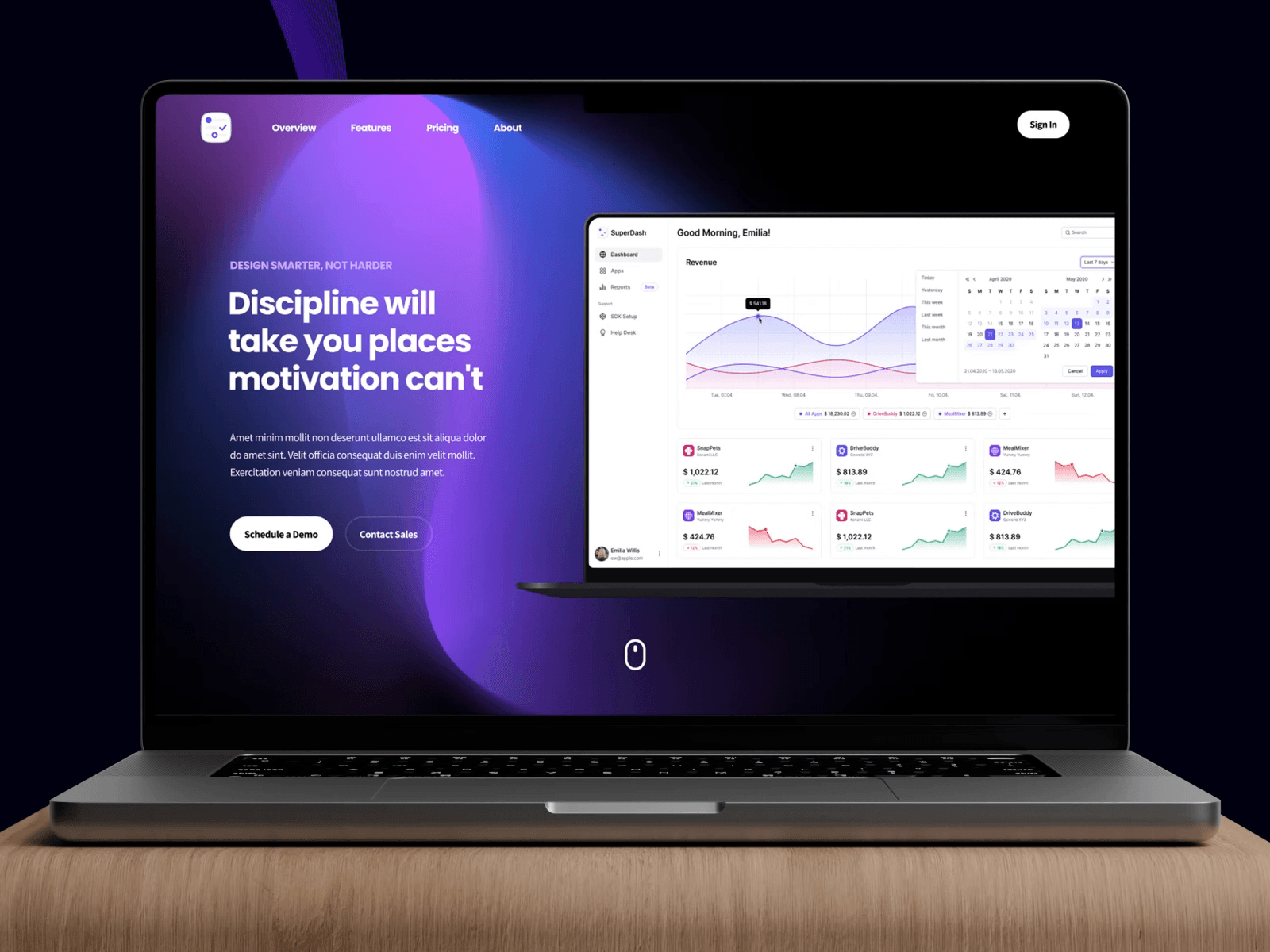
Our initial analysis showed AscendFlow’s previous hero section suffered from a fragmented message. The headline was generic, and the sub-headline lacked specificity. We made a deliberate decision to craft a single, impactful headline that immediately communicated the primary benefit of the AscendFlow platform. This headline, “Streamline Projects, Elevate Team Performance,” was paired with a concise sub-headline detailing how this was achieved: “Your all-in-one platform for powerful features, seamless integration, and real-time analytics.” The reasoning behind this was clear: users make split-second judgments. A direct, benefit-oriented statement instantly answers “What’s in it for me?” and compels them to explore further, directly addressing the high bounce rate by capturing attention and interest within seconds of arrival.
Optimizing the Primary Call to Action (CTA) for Clarity and Visual Prominence
The previous hero section featured several Calls to Action, none of which stood out effectively. Our design strategy focused on establishing a dominant, primary CTA: “Schedule a 1:1 Call.” We ensured this CTA was positioned centrally, above the fold, and designed with high visual contrast against the background elements, using the brand’s accent color. Accompanying this, we included a secondary, less prominent CTA for “Learn More” to cater to users who might need more information before committing to a call. The rationale was to minimize cognitive load and provide a clear, unambiguous path for the user’s next step. By guiding the user’s eye directly to the most desired action, we aimed to significantly improve click-through rates and qualify leads more effectively.
Integrating Dynamic, Contextual Product Visuals Over Generic Imagery
AscendFlow’s initial hero section relied on abstract stock photos that failed to convey the sophistication or utility of their platform. We decided to replace these with a dynamic visual element that showcased the product in action. This involved a carefully crafted, subtle animation or a high-fidelity screenshot of the AscendFlow UI, highlighting key features like task management, collaboration dashboards, or analytics reporting. The “why” here was to provide instant visual proof of concept. Abstract visuals leave users guessing, but seeing the product interface, even in a simplified form, builds immediate trust and understanding. It makes the abstract SaaS offering tangible and inviting, overcoming initial skepticism and demonstrating the platform’s value proposition directly through its appearance.
Design Highlights
Our design for AscendFlow’s hero section focused on a modern aesthetic combined with intuitive user experience principles.
Color Rationale: We established a primary color palette featuring deep blues and muted grays, drawing from AscendFlow’s brand guidelines, to convey professionalism, trust, and stability. An energetic accent color, a vibrant teal, was strategically used for all primary calls to action, ensuring maximum visibility and urgency without overwhelming the design. Subtle gradients were incorporated into background elements to add depth and a contemporary feel, breaking away from flat, uninspired visuals.
Typography Choice: For headings, we selected “Inter,” a highly readable sans-serif typeface known for its versatility and clear legibility across various screen sizes. This choice ensured headlines were impactful and easy to scan. For body text and sub-headlines, we opted for “Lato,” a friendly yet professional sans-serif, complementing Inter while maintaining excellent readability. The careful pairing and consistent application of these fonts established a clear visual hierarchy, guiding the user’s eye through the most important information.
Layout Logic: The hero section employs a clean, asymmetric layout designed for optimal information flow. The primary headline and sub-headline are positioned prominently on the left, aligning with natural reading patterns (F-pattern), immediately followed by the primary call to action. On the right, a dynamic product visual provides context and engagement. This balanced composition utilizes ample white space to prevent visual clutter, allowing key elements to breathe and command attention. The design is fully responsive, ensuring a consistent and optimal experience across desktops, tablets, and mobile devices, with elements gracefully reflowing and resizing.
Interaction Patterns: We introduced subtle interaction patterns to enhance user engagement. Call-to-action buttons feature gentle hover states that provide immediate visual feedback, indicating interactivity. Micro-animations were thoughtfully applied to the product visual, such as a subtle glow or a shifting dashboard element, to attract the eye without being distracting. These small details contribute to a polished and professional feel, making the user’s interaction with the page more dynamic and enjoyable.
Results and Impact
| Metric | Before DesignX | After DesignX |
|---|---|---|
| Conversion Rate (Hero CTA) | 1.8% | 4.3% |
| Bounce Rate | 72% | 35% |
| Average Time on Page | 45 seconds | 1 minute 30 seconds |
| Click-Through Rate (to Features Page) | 5% | 18% |
| Mobile Responsiveness Score (Google Lighthouse) | 60% | 95% |
The redesign of AscendFlow’s hero section yielded significant and measurable improvements. The substantial increase in conversion rate directly translated into a higher volume of qualified leads for their sales team, optimizing their marketing spend. The reduced bounce rate and increased time on page indicate greater user engagement and a clearer understanding of the product’s value proposition from the outset, reinforcing AscendFlow’s market position.
What Made This Project Work
This project’s success stemmed from a powerful combination of transparent client collaboration and DesignX’s integrated, cross-functional team dynamic. AscendFlow Solutions was an exemplary client, providing prompt, constructive feedback and entrusting our expertise from discovery through to final delivery. Their willingness to share candid insights into their market and user challenges allowed our team to align rapidly on strategic objectives. Internally, our project manager ensured fluid communication between our UI designers, UX researchers, and content strategists, fostering an environment where ideas were rigorously challenged and refined. The iterative nature of our design sprints, coupled with direct user validation at key stages, meant we consistently built upon proven insights, ensuring the final output was not just visually appealing but also strategically sound and highly effective.
Frequently Asked Questions
What problem did the saaS Landing Page Hero Section Design work need to solve?
AscendFlow Solutions approached DesignX with a critical problem: their existing landing page hero section, the prime digital real estate, was underperforming significantly. Despite a powerful underlying SaaS product, the initial user experience failed to capture attention or convey the platform’s core benefits effectively. The hero section featured generic stock imagery, a vague headline, and multiple competing calls to action, creating visual clutter and user confusion. Analytics revealed a concerning 72% bounce rate on their main product landing page, with an average time on page of just 45 seconds.
How did DesignX approach the saaS Landing Page Hero Section Design work?
Our process began with a deep dive into AscendFlow Solutions’ business objectives and target audience. We initiated a comprehensive discovery workshop, collaborating closely with their marketing, product, and sales teams. This session helped us align on key performance indicators, understand the distinct competitive landscape, and identify the primary user pain points AscendFlow aimed to solve. Following this, we conducted thorough competitor analysis to benchmark industry best practices and pinpoint opportunities for differentiation.
Which design decisions mattered most in the saaS Landing Page Hero Section Design project?
Prioritizing a Singular, Benefit-Driven Headline and Sub-headline Our initial analysis showed AscendFlow’s previous hero section suffered from a fragmented message. The headline was generic, and the sub-headline lacked specificity. We made a deliberate decision to craft a single, impactful headline that immediately communicated the primary benefit of the AscendFlow platform. This headline, “Streamline Projects, Elevate Team Performance,” was paired with a concise sub-headline detailing how this was achieved: “Your all-in-one platform for powerful features, seamless integration, and real-time analytics.” The reasoning behind this was clear: users make split-second judgments.
What stands out in the final SaaS Landing Page Hero Section Design design?
Our design for AscendFlow’s hero section focused on a modern aesthetic combined with intuitive user experience principles. Color Rationale: We established a primary color palette featuring deep blues and muted grays, drawing from AscendFlow’s brand guidelines, to convey professionalism, trust, and stability. An energetic accent color, a vibrant teal, was strategically used for all primary calls to action, ensuring maximum visibility and urgency without overwhelming the design. Subtle gradients were incorporated into background elements to add depth and a contemporary feel, breaking away from flat, uninspired visuals.
What changed after the saaS Landing Page Hero Section Design redesign?
Metric Before DesignX After DesignX Conversion Rate (Hero CTA) 1.8% 4.3% Bounce Rate 72% 35% Average Time on Page 45 seconds 1 minute 30 seconds Click-Through Rate (to Features Page) 5% 18% Mobile Responsiveness Score (Google Lighthouse) 60% 95% The redesign of AscendFlow’s hero section yielded significant and measurable improvements. The substantial increase in conversion rate directly translated into a higher volume of qualified leads for their sales team, optimizing their marketing spend. The reduced bounce rate and increased time on page indicate greater user engagement and a clearer understanding of the product’s value proposition from the outset, reinforcing AscendFlow’s market position.