
Boostbox, a digital marketing platform, struggled with a dated website and unclear messaging, leading to high bounce rates and low conversion that hindered their market growth. DesignX’s case study details their strategy, visual decisions, and measurable results in redesigning Boostbox’s website to better communicate its value.
Boostbox, a promising digital marketing platform, faced a critical challenge: their existing online presence failed to communicate the true value and sophistication of their offering. A dated website design and unclear messaging resulted in high bounce rates and low conversion, hindering their potential for market growth and user acquisition.
Project Overview
| Category | Description |
|---|---|
| Client Type | SaaS Startup |
| Industry | Digital Marketing Technology |
| Project Type | Website Redesign, User Experience (UX) Strategy, User Interface (UI) Design, Design System Development |
| Timeline | 10 Weeks |
| Deliverables | Discovery Report, Wireframes, Interactive Prototypes, High-Fidelity UI Designs, Design System Documentation, Frontend Handoff Specifications |
| Tools Used | Figma, Adobe Creative Suite, Maze, Hotjar, Google Analytics |
The Challenge
Boostbox possessed a powerful digital marketing platform, equipped with advanced analytics and campaign management capabilities, yet its public-facing website did not reflect this strength. The previous site suffered from a generic aesthetic, lacked a clear visual identity, and failed to effectively communicate the platform’s core advantages. Visitors frequently encountered an overloaded interface with scattered information, making it difficult to understand Boostbox’s unique selling propositions quickly. This resulted in significant user confusion, a high bounce rate, and critically low conversion rates for demo requests and sign-ups.
The information architecture was convoluted, presenting features in a disorganized manner that obscured their real-world impact for marketers. The site’s design also conveyed an impression of being less established or less trustworthy than competitors, despite Boostbox’s superior technology. There was no clear path for users to explore the platform’s benefits, leading to early exits. Boostbox needed more than just a visual refresh; they required a strategic overhaul that would clarify their message, build user confidence, and guide prospects intuitively towards conversion. The primary pain points included poor navigation, an inability to articulate value, and a general lack of professionalism in the visual presentation.
Our Approach
Our engagement with Boostbox began with an intensive discovery phase, designed to thoroughly understand their business goals, target audience, and existing pain points. We initiated a comprehensive kick-off workshop with the Boostbox leadership, marketing, and product teams to align on a shared vision and define key performance indicators for the project. This collaborative session allowed us to capture critical insights into Boostbox’s brand identity, market position, and the specific user segments they aimed to attract.
Following the internal alignment, our research phase commenced with a detailed competitive analysis. We examined leading digital marketing platforms to identify industry best practices, common user expectations, and opportunities for Boostbox to differentiate itself visually and functionally. Concurrently, we conducted user interviews and distributed surveys to Boostbox’s existing clients and target demographic. This research helped us uncover real user needs, pain points with current marketing solutions, and their motivations when evaluating new platforms. We performed a heuristic evaluation of Boostbox’s old website to pinpoint specific usability issues and areas of friction.
The insights gathered informed our information architecture redesign, where we used techniques like card sorting and tree testing to create a logical, intuitive navigation structure. This ensured that users could easily find information relevant to their needs. We then moved into iterative wireframing and prototyping, developing low-fidelity concepts that were regularly tested with target users. This early and frequent user feedback allowed us to validate design directions, refine user flows, and address potential usability concerns before investing in high-fidelity design. Our approach was highly collaborative, ensuring Boostbox’s team was involved at every stage, providing feedback that shaped the evolving design.
Key Design Decisions
Focus on Benefit-Driven Storytelling
One of our primary design decisions was to shift the website’s narrative from a feature-centric presentation to a benefit-driven storytelling approach. Instead of simply listing what Boostbox *does*, we focused on how it *solves specific problems* for digital marketers. Each section of the website was crafted to articulate a clear problem, present Boostbox as the solution, and illustrate the tangible outcomes users could expect. For example, rather than stating “real-time analytics,” we showed how “gain immediate insights to optimize campaigns instantly and reduce ad spend.”
The reasoning behind this was clear: users are not inherently interested in a platform’s technical specifications; they seek solutions to their challenges and pathways to achieve their goals. By framing the content around user benefits and success stories, we aimed to establish an immediate connection, increase perceived value, and differentiate Boostbox from competitors who often relied on jargon-heavy feature lists. This approach built trust and relevance, making the platform’s value proposition resonate more deeply with the target audience.
Modular, Scalable UI System
We designed a comprehensive, modular UI system for Boostbox. This involved creating a library of reusable components, from atomic elements like buttons and input fields to more complex modules such as feature cards, testimonial blocks, and data visualization widgets. Each component was meticulously documented for its structure, states, and usage guidelines, forming the foundation of a robust design system.
The “why” here was multifaceted. Firstly, it ensured absolute consistency across all pages of the website, fostering a polished and professional brand image. This consistency also significantly improved the user experience, as interaction patterns and visual cues remained predictable. Secondly, and critically for a growing SaaS company, a modular system dramatically accelerates future development and design iterations. Boostbox can now expand its content, add new landing pages, or introduce new features to its website with efficiency, reducing design debt and ensuring speed to market. This approach also simplified the handoff process to the development team, providing clear, pre-defined components that could be quickly implemented.
Strategic Use of Dynamic Visuals and Micro-interactions
We made a deliberate choice to incorporate dynamic visuals and subtle micro-interactions throughout the Boostbox website. This included scroll-triggered animations that progressively revealed key data points, interactive charts that simulated the platform’s analytics capabilities, and engaging hover effects on calls to action and navigational elements. We also designed hero sections with subtle background animations that convey a sense of activity and technological sophistication without being distracting.
The reasoning was to bring the often-abstract concept of digital marketing data and campaign management to life visually. These dynamic elements serve several purposes: they captivate user attention, reduce cognitive load by illustrating complex functionalities, and create a modern, high-tech impression that aligns with Boostbox’s advanced platform. By providing immediate visual feedback and mini-demonstrations of the product’s power, users gain a deeper understanding of Boostbox’s capabilities without needing to navigate away from the landing page. This enhances engagement, makes the site feel more responsive, and ultimately builds greater confidence in the platform’s ability to deliver real-time results.
Design Highlights
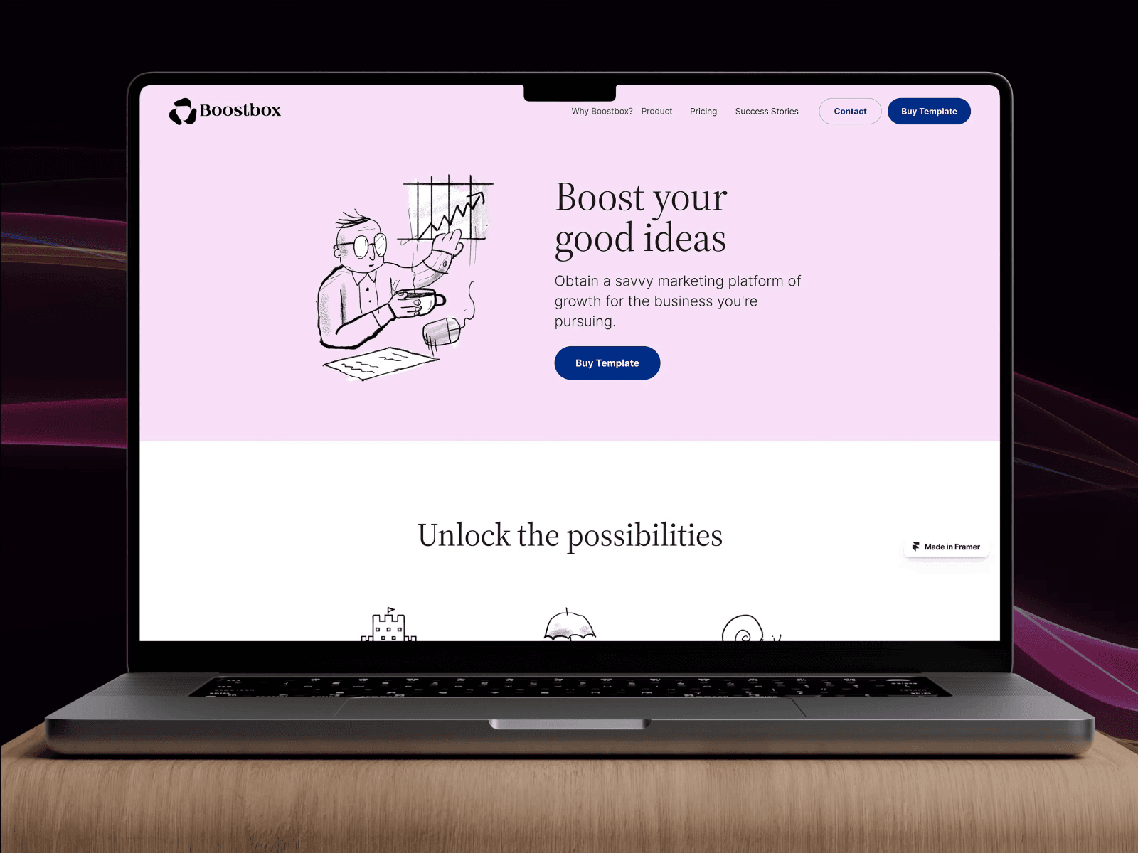
The visual and interactive design of the Boostbox website was meticulously crafted to embody professionalism, innovation, and user-centricity. Our color palette selection was a deliberate exercise in brand communication. We established a primary palette of vibrant blues and deep purples, complemented by secondary accents of energetic greens and subtle grays. The blues convey trust, stability, and intelligence, aligning with a data-driven platform, while the purples introduce a sense of sophistication and creativity. The greens are strategically used for calls to action and to highlight positive growth metrics, evoking feelings of success and vitality. This combination ensures a visually appealing and brand-aligned experience, guiding the user’s eye and emphasizing key information.
Typography choices played a significant role in establishing the site’s modern and authoritative tone. We selected Montserrat for all headings, a geometric sans-serif typeface known for its clean lines and contemporary feel. This choice provides strong visual impact and excellent readability at various sizes, asserting Boostbox’s forward-thinking identity. For body text, Open Sans was chosen for its exceptional legibility and versatility, ensuring that even complex explanations are easy to read and digest across all devices. The pairing creates a harmonious balance between expressive headlines and clear, accessible content.
The layout logic was built upon a flexible, responsive grid system, allowing for asymmetrical section compositions that break monotony while maintaining order. We prioritized generous whitespace to create a sense of openness and reduce visual clutter, enabling content to breathe and key messages to stand out. Information is presented in a layered fashion, using distinct cards and content blocks that group related information, making the site highly scannable. This structure guides the user through the narrative progressively, from problem introduction to solution and call to action, minimizing cognitive load and facilitating understanding.
Interaction patterns were designed to enhance engagement and provide immediate, intuitive feedback. Scroll-triggered animations were implemented to reveal statistics and feature benefits dynamically, adding a layer of sophistication and encouraging exploration. Hover effects on buttons and interactive elements offer clear affordance, indicating clickable areas and enhancing the tactile feel of the interface. We also incorporated subtle parallax scrolling on hero sections to add depth and visual interest without distracting from the core message. These interactions are not merely decorative; they serve to reinforce the platform’s data-driven nature and responsive capabilities, creating a truly immersive and memorable user experience.
Results and Impact
The redesign of the Boostbox digital marketing website yielded substantial improvements across key performance indicators, validating our strategic design approach.
| Metric | Before DesignX |
|---|