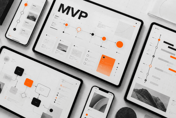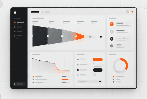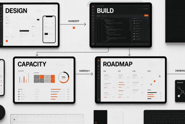

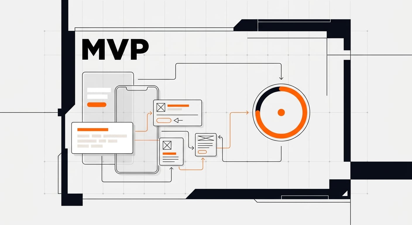
MVP design for startups is the discipline of shipping one complete core value loop with enough UX quality that real users can judge it. Cut secondary features hard. Keep the path from first click to first value obvious. Test before you scale polish.
- Design the shortest credible path for one primary user and one job.
- Include empty, error, loading, and return states that protect trust.
- Run a 1 to 2 week research-to-prototype pass before major engineering spend.
- Buy help when the team cannot force scope cuts or buildable handoff alone.
MVP design for startups is how founders stop burning runway on screens nobody needs. The goal is not a pretty half-app. The goal is a tight product experience that tests your riskiest assumption with real users while still feeling intentional enough to trust.
CB Insights' analysis of 431 VC-backed shutdowns since 2023 shows capital running out as the final cause in 70% of cases, with poor product-market fit underneath in 43% of failures with identified reasons. Design cannot invent demand. Strong MVP design can keep your team from spending three months perfecting a workflow users abandon in week one.
At DesignX, we treat MVP work as senior product compression: one user, one job-to-be-done, one end-to-end path, and handoff engineering can build without guessing. That approach sits next to our product design sprint process and commercial packaging in the UI/UX design agency pricing guide.
What MVP design for startups actually means
An MVP is the smallest product that still delivers a complete result for a defined user. Eric Ries framed it as the version that creates the most validated learning with the least effort. Atlassian's product guidance is similar: launch enough product to reduce risk, then iterate from live behavior instead of internal debate.
What it is not:
- A junk drawer of every roadmap item built halfway
- A broken UI excused as "lean"
- A pitch deck prototype with no operating states
- A full platform built "just in case"
Good startup MVP UX feels focused on purpose. Users should be able to start the job, finish the job, recover from mistakes, and understand what happened. If they bounce because navigation is a maze or every action is labored, you did not test the idea. You tested bad packaging.
Think of the first release like a single perfect workstation, not a warehouse with 40 unfinished aisles. Cupcake, not unfinished layer cake.
The decision test before you open Figma
Write four lines and keep them visible through the whole project:
- Primary user: who this is for on day one
- Job: what they must finish inside the product
- Riskiest assumption: the belief that, if false, kills the business case
- Proof metric: the behavior that means the assumption survived first contact
Example: "Ops managers at 20-person field teams will import last week's jobs, complete their morning schedule in under 8 minutes, and reuse the plan the next day without spreadsheet backup."
If your team cannot agree on those four lines, stop designing screens. You are still in problem definition.
Talk to 5 to 10 target users before manufacture-level UI work. Ask how they currently do the job, what they tried, where they drop workarounds into Slack or Sheets, and what would force a switch. Borrow language from those calls. Do not invent product copy from founder wishcasting.
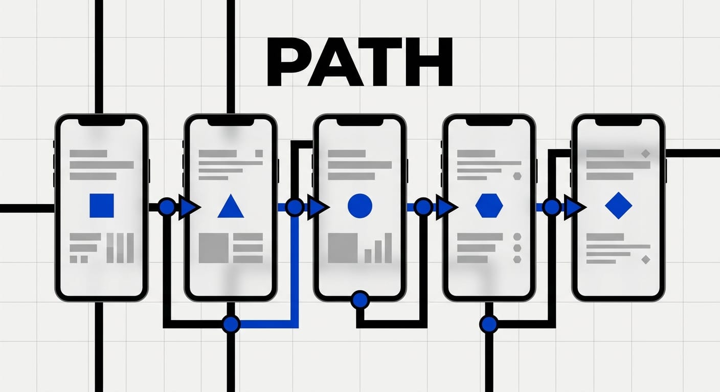
A practical MVP design process
Use this sequence whether you are DIY or hiring a product partner.
1. Compress the opportunity
Pick one user type and one co-pilot role only if the product cannot function without it. Map current workaround steps. Rank assumptions by reverse damage: which wrong belief wastes the most money if untested?
2. Draft the core value loop
List the 3 to 6 steps from entry to first value. For most software products that loop looks like: arrive, understand offer, set up the minimum required context, complete the action, see the result, decide to return.
Anything that does not support that loop waits. Settings, multi-roles, deep customization, analytics dashboards, and partner integrations almost always wait.
3. Wireframe ruthlessly
Stay low fidelity long enough that cuts stay cheap. Cap the first wireframe set around the screens that execute the loop. If the walkthrough needs more than about 8 to 12 product screens before value, the job is too vague or you smuggled in secondary workflows.
4. Prototype for real behavior
Interactive fidelity should match what you need to learn. Concept tests can stay rough. Purchase intent and workflow fit usually need real content, realistic empty states, and clickable recovery paths. Use actual labels, sample data, and expected failure messages. Skip lorem ipsum.
5. Test before major build
Run 5 moderated sessions with people who match the buyer or operator. Watch without rescuing them. Capture where they hesitate, misread hierarchy, invent missing steps, or lose trust. Nielsen Norman Group's testing guidance still holds in practice for early products: a small number of users, repeated rounds, high learning speed when the prototype is real enough to probe behavior.
Also test intent, not only preference. "Would you pay for this next quarter?" and "Would this replace the spreadsheet?" beat "Do you like the blue?"
6. Build the operating path, not the brochure
Engineering order should follow learning risk:
- Core action that creates value
- Minimum onboarding that reaches that action
- Accounts/data needed to keep the result
- Instrumentation around the proof metric
- One obvious feedback channel
If a proposed ticket does not protect or measure that path, it is later work, no matter how easy someone claims it is.
What to include vs cut in MVP UI design
| Keep in v1 | Park for later |
|---|---|
| One primary user and one complete job | Multi-role permission trees |
| Entry → value → return path | Secondary workflows and admin back offices users never see |
| Empty, loading, error, success states on critical screens | Theme packs, dark mode, dense preferences |
| Basic account state and data persistence | Every export, API, and integration request |
| Mobile-usable web if users touch phones at all | Native apps before the web loop works |
| Event tracking on the proof metric | A full analytics product layer |
| One support path for early users | In-product community features |
Basic quality is not optional. Users forgive narrow scope. They abandon broken flow. Buttons should behave predictably. Hierarchy should echo common software patterns. Forms should say what failed. A missing settings page is fine. A save action that silently dies is not lean. It is churn.
Smart shortcuts vs deadly shortcuts
Use these shortcuts:
- Component libraries and a small starter kit instead of inventing a full design system first
- Manual concierge steps behind a clean UI when the workflow is still unstable
- Progressive disclosure so advanced controls stay hidden until needed
- Template foundations for marketing surfaces while custom energy goes into the product loop
- No-code or low-code for throwaway experiments that never need production scale
Refuse these shortcuts:
- Custom navigation patterns people must relearn
- Invisible system feedback after primary actions
- Desktop-only layouts when the job happens in the field
- Feature dumps that hide the core action under five menus
- "We'll design edge states later" when those states happen on first use
DoorDash's early model is a useful founder reminder: validate the service loop before automating every operational layer. Your product can look coherent while humans still finish some backend work. That is allowed when it accelerates learning without lying to the user about the outcome.
Timeline and budget bands that stay honest
Public guides often say a controlled MVP can move from discovery to a usable release in roughly 3 to 6 months when scope stays tight. That number only holds if research, design, engineering, and launch measurement share one core path. Stretch timelines usually come from actor sprawl, untested multi-side marketplaces, heavy compliance, or leadership that keeps reopening cuts.
Design sequencing that works for many seed and Series A teams:
- Days 1 to 5: interviews, assumption ranking, journey cuts
- Week 1 to 2: wireframes + prototype on the core loop
- Week 2 to 3: user tests and pack for build
- Build window: only contingent on eng capacity and integrations
On the design-partner side, market packaging is noisy, but current public bands for specialist MVP and first-release UI work often cluster roughly like this:
- Prototype or sprint to force a build decision: about 1 to 2 weeks
- Focused first-release product UI for a narrow path: multi-week fixed engagement
- Ongoing senior capacity after launch: monthly retainer
DesignX project work for product teams often lands in a senior fixed-scope band around $15k to $25k for defined packages, with fractional product design retainers from $9.7k/month when the team needs continuous ownership after the first release. Full pricing context sits in our 2026 pricing guide and the deep dive on how to price a 30-day SaaS design partner sprint.
| Situation | Best shape | What "done" means |
|---|---|---|
| Idea risk still high | Research + prototype sprint | Build / pivot / kill decision with notes from live tests |
| Path known, UI not industrial strength | Fixed MVP design package | Core screens, states, components, and eng-ready handoff |
| First users live, weekly change required | Retainer after base package | Same senior owners, backlog triage, ship cadence |
| Comparing staffing models | Agency vs in-house model review | Clear ownership and cost of decision latency (see enterprise design partner vs in-house) |
When founders should DIY vs hire for MVP design
DIY works when a founder/designer pair already ships product software, can run interviews, and can force cuts without politics. Templates and component kits are enough in that case.
Hire outside help when one of these is true:
- No one on the team has shipped a guilty-first release under runway pressure
- Engineering is blocked by unresolved flows and edge cases
- Stakeholders keep adding "just one more" workflow
- The product fails first usability tests and the team cannot diagnose why
- You need senior judgment across product, brand surfaces, and handoff quality in the same package
A design partner should reduce decision latency. If the engagement creates more slides than path decisions, fire the process, not just a color. We package this judgment through sprints and scoped product work rather than endless exploration theater.
Common MVP design mistakes that waste months
- Building for imaginary users. Personas invented in a boardroom lose to five uncomfortable customer conversations.
- Copying competitor feature lists. Competitors can be wrong, overfunded, or selling a different buyer.
- Polishing before proving. Beauty on a dead path is expensive noise.
- Premature systems theater. A full design system before product-market evidence usually delays learning.
- Ignoring mobile reality. If the job happens between meetings or on-site, a desktop-only path falsifies usage data.
- Feature creep mid-build. "Easy adds" dilute the experiment and delay the only metric that matters.
- No proof metric instrumentation. If you cannot see activation or return behavior, you are collecting opinions.
Dropbox's video-demo era and Buffer's early waitlist tests remain useful because they measured interest before overbuilding. Your company may need more product surface than a landing page. You still need the same discipline: learn the riskiest point with the cheapest honest artifact.
How DesignX runs MVP design with founders
DesignX is a senior product and brand studio, not a junior production farm. On MVP-shaped work our operating bias looks like this:
- Force the one-sentence product bet before UI production
- Map the path that earns the first retained session
- Prototype and test the ugly risks early
- Ship buildable components and states, not orphan mockups
- Leave a thin system seed so week-five work does not invent a second product language
Client context we bring into these projects includes catalog and product complexity work for brands like Klein Tools, launch identity experience around Oura Ring, and product/brand systems for technical companies that need trust under operational pressure. The throughline is the same: clarity under constraint beats ornamental scope.
If your team needs a structured compression window, start with the sprint model. If you already know the first path and need industrial UI plus handoff, buy a fixed package. If you are post-first-user and drowning in weekly decisions, go retainer. The packaging should match the uncertainty, not a vanity timeline.
Frequently Asked Questions
What is MVP design for startups?
MVP design for startups is the practice of defining one primary user, one job, and one complete product path, then designing only the screens and states required to test whether that path creates value. It combines research, interaction design, content, and handoff discipline so the first release can be used and measured. The objective is validated learning with a product people can actually complete, not a feature skeleton with broken UX.
How long does MVP design take before engineering?
Many teams can finish research, wireframes, prototyping, and a first usability round in 1 to 3 weeks when scope stays narrow. Engineering then depends on stack, integrations, and compliance. Contained products aimed at one workflow can move from discovery to usable private release in roughly 3 to 6 months, while multi-sided or regulated products take longer because risk shows up outside pure UI design.
What screens belong in a startup MVP UX?
Keep the screens that complete the core value loop: entry, minimum setup, primary action, result, and return. Add account or permission moments only when they block completion. Include empty, loading, error, and success states for every critical step. Everything else (admin console extras, deep settings, secondary roles, edge marketing microsites) waits until the first loop holds.
Do I need a design system for an MVP?
You need consistency, not a 200-component library. Start with type, color, spacing, buttons, forms, and one card pattern so the product does not feel random. Formalize a deeper system after users prove they want the path. Building the museum of components before the product bet is validated is a common waste of early budget.
Should founders hire an agency for MVP design?
Hire when the team cannot force scope, cannot produce buildable flows, or cannot diagnose failed usability sessions. Stay in-house when you already have a senior product designer and fast decision rights. A good partner shortens the path to a tested build package. A weak partner adds slideware and mirrors your feature anxiety back to you.
What budget should startups expect for MVP product design?
Budgets swing with complexity, but founders should separate design compression from full product engineering. DesignX fixed product packages often sit in the mid-five-figure project band for defined scope, with retainers from $9.7k/month when continuous senior ownership is required. Ask every partner what is included: research, test rounds, states, components, revisions, and engineering handoff. Cheap screen packs that collapse under implementation are not savings.
Ship the loop, then earn the polish
MVP design for startups rewards teams that protect learning speed without insulting users. Define the bet. Design the path. Cut the theater. Instrument the proof. Then polish the surfaces people already use twice a week.
If you want a senior team to force those cuts with you, map the core loop, and leave engineering a package they can build, book a short scoping call with DesignX.
Book a 15-minute MVP design scoping call →