
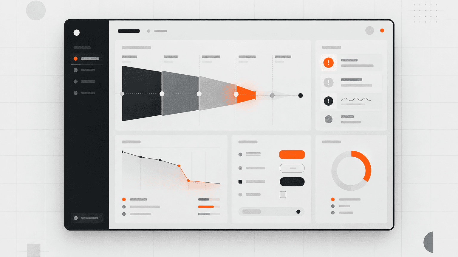
TL;DR: The strongest signs your SaaS needs a UX redesign show up in behavior, not opinions. Look for onboarding drop-off, repeat support tickets, trial-to-paid leakage, feature invisibility, workflow debt, and accessibility risk before you fund a full redesign.
- Use product data, support themes, and customer calls before trusting stakeholder taste.
- Run a UX audit when the problem is unclear. Redesign when the same friction repeats across the product.
- Prioritize onboarding, dashboard hierarchy, role-based workflows, pricing paths, and key activation moments.
- Protect the patterns users already understand while removing the product debt that blocks growth.
If you are searching for the signs your SaaS needs a UX redesign, you are probably seeing symptoms before you can name the disease. New users sign up, then stall. Sales says prospects understand the pitch but struggle inside the demo. Support keeps answering questions the interface should already answer.
That is the moment to slow down. A SaaS UX redesign should not start because the product feels old. It should start because the current experience is making users work too hard to get value.
DesignX has worked across brand, UX, product, and web systems for teams connected to Klein Tools, Oura Ring, HP, Bodybuilding.com, and Panasonic. The best redesign decisions are rarely about taste alone. For Klein Tools, clearer catalog experience design helped drive a 23% lift in dealer adoption. The same principle applies to SaaS: when a system gets easier to understand and use, business outcomes can move.
1. Signs Your SaaS Needs a UX Redesign Start in Onboarding
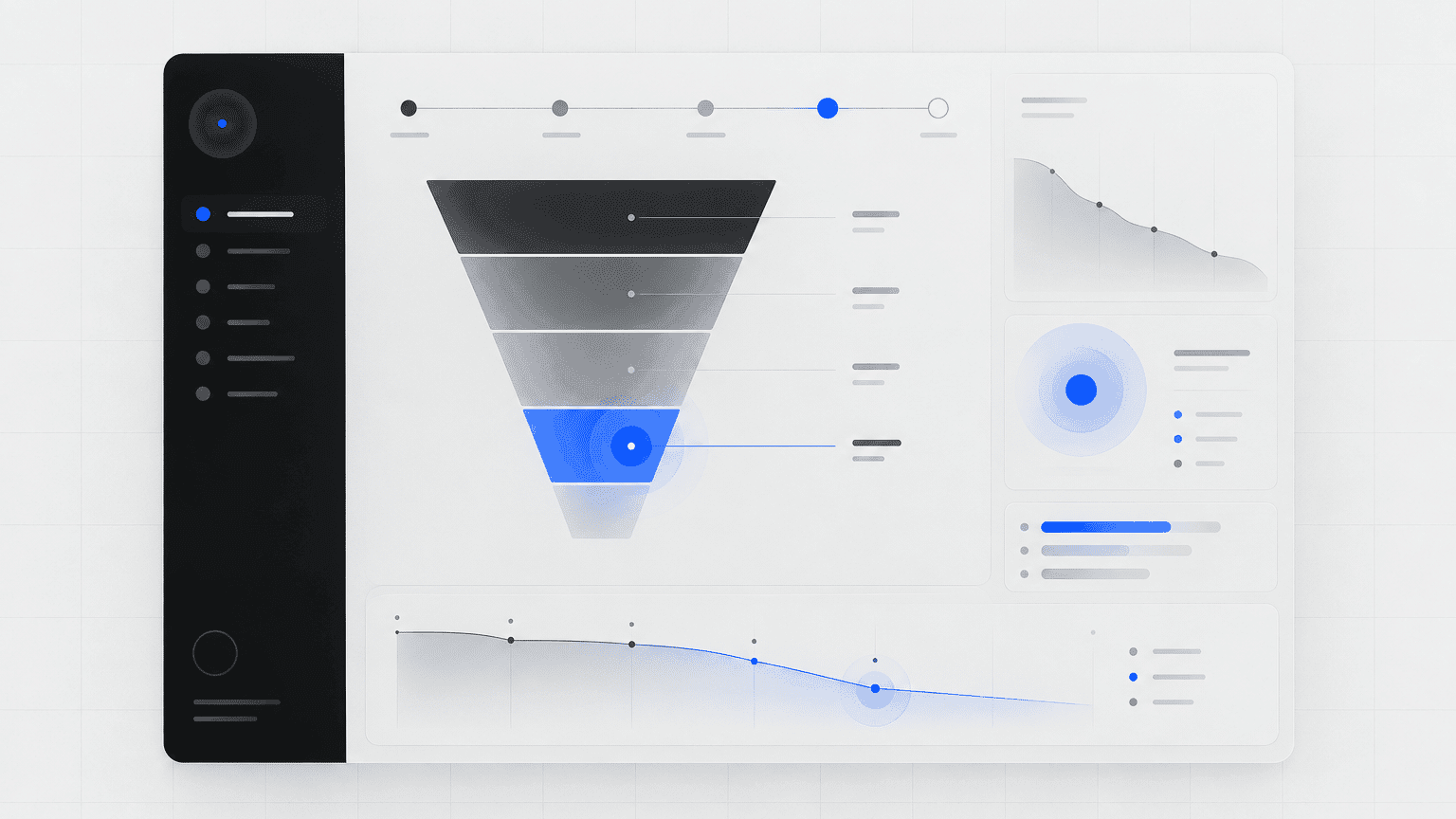
Onboarding is the fastest place to see whether your product promise survives contact with the interface. If signups are coming in but users are not reaching the first meaningful outcome, your SaaS may not need more acquisition. It may need a better path to value.
Nielsen Norman Group’s usability testing guidance is a useful reminder that a small amount of real user evidence beats internal debate. Your exact activation threshold will depend on category, pricing, and product complexity, but the lesson is practical: activation is measurable, and weak activation is often a UX problem hiding inside a growth problem.
Look for patterns like these:
- Users create an account but never complete setup.
- The first session ends before the user creates, imports, connects, or configures anything useful.
- Teams ask support how to do the same first task every week.
- Free trials expire with low product activity.
- Sales demos require too much explanation because the product cannot carry the story itself.
If these signals show up together, do not start with a new color palette. Start with the user journey. Map the first 10 minutes, the first useful outcome, and the first reason a user would invite a teammate or return tomorrow.
2. Support Tickets Are Repeating the Same UX Problems
Support data is one of the most underused redesign inputs. A founder may hear complaints as customer noise. A product designer hears a map of broken expectations.
If support keeps explaining basic actions, account settings, dashboard filters, permissions, billing flows, or integrations, the interface is making customers memorize the product instead of understand it. That is expensive. It slows adoption, burns customer success time, and makes the product feel less mature than the company behind it.
What to review before redesign scope is set
- Ticket themes: Group support requests by workflow, not by department label.
- Frequency: Count repeated issues across new users, admins, and power users.
- Account value: Identify whether high-value customers hit the same barriers.
- Time to answer: Flag problems that require long explanations or screen shares.
- Product location: Tie each theme back to the page, modal, empty state, table, or setup flow where confusion begins.
This is where a UX audit checklist for SaaS is useful. It gives the team a way to inspect the product before deciding whether the right move is copy cleanup, component work, onboarding fixes, or a broader redesign.
3. Trial-to-Paid Leakage Points to Friction, Not Price Alone
Pricing gets blamed for conversion problems because it is easy to see. UX friction is harder to admit. A user who never reaches value will always think the product costs too much.
Trial-to-paid leakage often appears in the gap between interest and confidence. The user wants the outcome, but the product makes setup, team rollout, data import, or feature evaluation feel risky. That risk can come from unclear hierarchy, missing proof inside the app, weak empty states, confusing plan gates, or flows that require too many decisions too soon.
For SaaS teams, conversion-focused UX means more than a nicer landing page. It should connect the marketing promise, onboarding, product value moment, plan selection, and expansion path. Our guide to conversion rate optimization UX covers that wider funnel view.
| Symptom | Likely UX issue | First move |
|---|---|---|
| Many signups, few active trials | The setup path is too vague or too demanding | Run onboarding research and reduce first-session decisions |
| Trials use one feature only | Feature discovery is weak after the first value moment | Redesign dashboard hierarchy and contextual prompts |
| Qualified accounts do not invite teammates | Roles, permissions, or collaboration value is unclear | Map team workflows and admin setup |
| Users visit pricing but do not upgrade | Plan fit, limits, or value proof is unclear | Review in-app upgrade paths and pricing copy |
| Customers churn after setup | The product helps users start but not repeat the core workflow | Study recurring tasks, dashboards, alerts, and reports |
4. Feature Discovery Is Weak, Even for Valuable Features
A product can have the right features and still feel weak because users cannot find them at the right moment. This is common in SaaS products that grew through customer requests, enterprise deals, or founder-led shipping without a strong information architecture.
Pendo’s 2024 product benchmarks show why context matters. The report notes that product adoption ranges vary widely by category, so the same adoption rate can be healthy in one market and alarming in another. That is a useful warning for redesign work: measure against the job your product is meant to support, not against a generic dashboard average.
Feature discovery problems usually look like this:
- Customers pay for capabilities they never use.
- Sales keeps showing features that the live product buries.
- Admins understand the product but end users do not.
- New releases ship, then disappear into menus.
- The dashboard surfaces activity, but not what the user should do next.
This is not always a full redesign problem. Sometimes a better navigation model, clearer empty states, and stronger dashboard layout are enough. If the dashboard is central to adoption, start with our SaaS dashboard design best practices guide and compare those patterns against your current product.
5. Your Dashboard Has Become a Junk Drawer
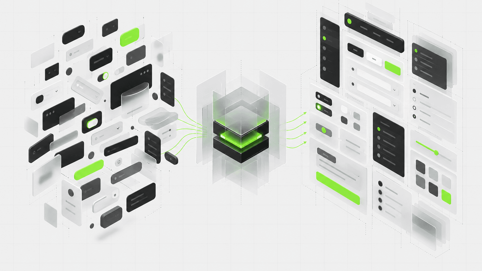
Dashboards often reveal the age of a SaaS product. Early versions answer one question. Later versions carry reporting, alerts, tasks, imports, admin notices, upsell cards, empty states, shortcuts, and product marketing messages in the same space.
When everything has equal weight, users lose the thread. The dashboard stops being a command center and becomes a storage closet.
Watch for these dashboard redesign triggers:
- Users ask where to start even after login.
- Important alerts compete with low-value cards.
- Different user roles see the same dashboard despite different jobs.
- Teams export data because the in-product view does not answer their question.
- Executives, managers, and operators all need different levels of detail.
This is where role-based UX becomes a growth feature. A founder may need revenue risk. An admin may need team setup health. A daily user may need the next task. A redesigned dashboard should respect those jobs instead of forcing everyone through one generic view.
6. Workflow Debt Is Slowing Enterprise Deals
SaaS products often break at the moment they move upmarket. The product that worked for one user now needs roles, permissions, approvals, audit trails, bulk actions, notifications, exports, integrations, and governance controls.
If enterprise prospects like the product but hesitate during security, admin, or workflow review, UX may be part of the sales barrier. Buyers are not only evaluating features. They are evaluating whether their team can adopt the product without operational chaos.
Look for sales and product clues:
- Enterprise demos spend too much time explaining admin setup.
- Prospects ask for custom workflows because the default model feels rigid.
- Power users need workarounds to complete repeat tasks.
- Permissions are hard to explain, test, or maintain.
- The product has grown beyond its original navigation model.
For teams evaluating outside help, our SaaS UI UX design agency guide explains how to choose a partner that can handle product complexity, not just attractive screens.
7. Accessibility and Usability Risk Has Become Business Risk
Accessibility is not a side checklist for mature SaaS products. It affects procurement, enterprise trust, usability, legal exposure, and the daily experience of customers who rely on keyboards, screen readers, focus states, captions, contrast, and predictable interaction patterns.
The WCAG 2.2 recommendation gives teams a shared standard for accessible web and product experiences. You do not need to turn every redesign conversation into a standards debate, but you should know whether your current interface creates barriers that design and engineering can fix.
Common SaaS accessibility signals include:
- Low contrast in charts, tables, filters, and status labels.
- Keyboard traps in modals, menus, or command interfaces.
- Form errors that rely only on color.
- Hover-only controls on dense dashboards.
- Focus states that disappear inside complex workflows.
- Data tables that are hard to scan, sort, or interpret.
If accessibility issues overlap with onboarding, support, and conversion friction, the problem is no longer isolated. The design system needs stronger rules, and the product may need a broader UX redesign.
8. You Cannot Tell Whether You Need an Audit, Sprint, or Full Redesign
Confusion about scope is itself a signal. If the team is arguing between new screens, better copy, product analytics, design system repair, onboarding work, or a full redesign, do not pick the biggest option first. Pick the diagnostic path that reduces uncertainty fastest.
Use this decision model:
- Run a UX audit when the symptoms are visible but the root causes are unclear.
- Run a focused redesign sprint when one flow, dashboard, onboarding path, or conversion step is costing revenue.
- Run a full SaaS UX redesign when navigation, workflows, roles, visual system, and product architecture are all fighting users.
- Use an ongoing design partner when the product changes every month and the team needs senior UX judgment across launches, pages, and product surfaces.
Website and product redesigns are different, but the same business logic applies: know what you are fixing before you change the system. If your team is also weighing a marketing-site rebuild, use the website redesign ROI calculator to keep the conversation tied to revenue, traffic, and conversion risk.
How DesignX Diagnoses SaaS UX Redesign Needs
DesignX starts with evidence. We review product analytics, onboarding paths, support-ticket themes, sales objections, dashboard hierarchy, accessibility risk, and the moments where users should reach value but do not.
Then we decide the shape of the work. Sometimes the right answer is a UX audit and a few high-impact fixes. Sometimes it is a redesign sprint around onboarding, pricing, or dashboard structure. Sometimes the product has outgrown its original system and needs a deeper redesign across navigation, workflows, components, and role-based experiences.
The goal is not to make your SaaS look newer. The goal is to make the product easier to buy, learn, trust, and keep using. If these signs are showing up in your metrics, support queue, and sales calls, start with a diagnostic review before the next redesign meeting gets political.
Ready to find the friction hiding inside your SaaS product? Let’s talk →
Frequently Asked Questions
What are the clearest signs your SaaS needs a UX redesign?
The clearest signs are trial users failing to activate, customers opening repeat support tickets for basic tasks, and paid users avoiding important features. You should also look for high drop-off in onboarding, low feature discovery, weak dashboard engagement, and conversion loss between trial and paid plans. One signal can be noise, but a cluster of product, support, and revenue signals usually means the interface is now costing the business money.
Should we run a UX audit before a SaaS redesign?
Yes, most SaaS teams should run a UX audit before committing to a full redesign. The audit helps separate surface-level design complaints from deeper issues in onboarding, information architecture, permissions, pricing paths, and workflow design. It also gives leadership a smaller first step when the team is not ready to fund a full product redesign.
How often should a SaaS product be redesigned?
There is no useful calendar rule for SaaS redesigns. A product needs redesign work when its business model, user base, feature set, or workflow complexity has outgrown the current interface. Some teams need a focused redesign every year around a major workflow, while others need a larger redesign after years of feature debt and customer segment changes.
What is the difference between a UX refresh and a full SaaS redesign?
A UX refresh updates a limited part of the experience, such as dashboard hierarchy, empty states, navigation labels, or onboarding screens. A full SaaS redesign changes deeper structures, including task flows, design system patterns, roles, permissions, feature organization, and product architecture. If users can still complete the right jobs but the interface feels dated, start with a refresh. If users cannot find, learn, or trust the product, redesign the system.
Can a SaaS redesign hurt conversions?
Yes, a redesign can hurt conversions if the team removes familiar workflows, hides high-use features, changes pricing paths without testing, or ships new UI without onboarding support. The safest redesigns protect known winning paths while fixing the friction that data and user research prove is real. That is why analytics baselines, customer interviews, support-ticket review, and staged rollout plans matter.
What should a SaaS UX redesign include?
A strong SaaS UX redesign should include a diagnostic audit, user journey review, onboarding analysis, feature discovery plan, dashboard hierarchy, accessibility review, and updated design system patterns. It should also include product analytics, support-ticket themes, customer language, and engineering constraints. The result should be a clearer operating system for the product, not a prettier version of the same confusion.