
Most design teams wrongly treat aesthetics and functionality as competing resources or trade-offs, believing more of one means less of the other. The article argues this is the wrong approach, instead explaining how top products make both work together for effective UX.
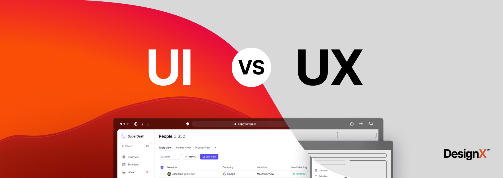
There’s a debate that resurfaces in almost every design project: should we prioritize how it looks or how it works?
It’s the wrong question. The real challenge is that most teams treat aesthetics and functionality as competing resources — a finite budget where more of one means less of the other. That’s not how good UX works. At DesignX, the projects that convert best, retain longest, and generate the strongest referrals are always the ones where the visual decisions and the functional decisions were made together, not traded off.
Here’s what that actually means in practice.
Why the “form vs. function” framing is broken
The old design debate — form follows function versus function follows form — was never really about which one matters more. It was about sequencing. Do you start with what it needs to do, then figure out how it should look? Or do you develop the visual language first and let it shape the experience?
Both approaches fail in isolation. A product that works perfectly but looks dated or confusing signals low quality to users before they’ve touched a single feature. A product that looks exceptional but buries core functionality in beautiful noise produces frustrated users who churn.
The more accurate model: aesthetics and functionality are both inputs to the same output — user confidence. When someone opens an app or lands on a website, they’re making rapid subconscious assessments. Does this look trustworthy? Is it clear what I should do? Can I find what I need? Visual design and UX architecture both answer those questions simultaneously.
What good balance actually looks like
On the Bodybuilding.com project, the initial brief leaned heavily aesthetic — the brand wanted the app to feel premium, energetic, and modern. Fair enough. But when we mapped the user flows, we found that the workout tracking interface required a lot of data entry during active exercise, hands sweaty, often squinting at the screen. That context changed every visual decision.
Font sizes had to be larger than the brand guidelines initially suggested. Tap targets had to be bigger. Contrast ratios needed to be higher. The “premium” look had to be achieved through hierarchy and spacing, not through delicate typography and low-contrast color palettes.
The result was a design that looked exactly as premium as the brand wanted — but one that actually worked during a deadlift set. That’s the balance. You don’t compromise the aesthetic; you find the aesthetic choices that serve the functional context.
The three places where aesthetics directly drive functionality
1. Visual hierarchy as navigation
In most products, the biggest navigation problem isn’t that users don’t know how to get somewhere — it’s that they can’t tell what matters. When everything is the same visual weight, users slow down. They scan instead of flow.
Strong visual hierarchy — size, color weight, whitespace — directly reduces cognitive load. It’s not decoration. It’s the functional architecture expressed visually. The best SaaS dashboard designs make this visible immediately: primary actions are unmistakably primary, secondary options recede without disappearing.
2. Color as communication
Color choices in UX aren’t branding decisions — they’re information design decisions. Red means stop, error, or danger in almost every cultural context. Green means success or go. Blue, in most SaaS products, means interactive — links, buttons, selected states.
When a design breaks these conventions for aesthetic reasons, users pay the cognitive tax. Every time they have to consciously figure out what a color means instead of responding instinctively, you’ve added friction. The aesthetic choice became a functional liability.
Good color work in UX means making the brand palette serve the communication system, not fight it. In our work with enterprise clients, this often means constraining the brand color to the header and primary CTA, while the rest of the interface uses standard communication colors that users already know.
3. Motion and feedback
Micro-animations are where aesthetics and functionality merge most visibly. A loading state that shows a skeleton screen instead of a blank white page feels more premium and also communicates that something is happening. A button that gives tactile visual feedback on press feels more responsive and also confirms the action registered.
These aren’t nice-to-haves. In user testing, products with thoughtful micro-interactions consistently score higher on perceived performance and trustworthiness — even when the actual load times are identical to products without them.
Where the balance breaks down — and why
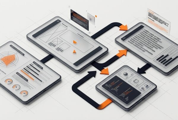
Most UX failures aren’t because a team chose aesthetics over function or vice versa. They’re because the two were handled by separate people at separate times.
The typical broken process: a visual designer produces high-fidelity mockups, then a UX designer or product manager reviews them for usability, then revisions happen, then someone implements. At each handoff, context is lost. The visual designer doesn’t know the edge cases. The UX reviewer doesn’t know the design rationale. The result is a product that’s been through multiple rounds of review and still feels disjointed.
The fix isn’t a better review process — it’s concurrent design. Visual and UX decisions need to happen in the same room, ideally by designers who can hold both dimensions at once. This is partly why the shift toward understanding the overlap between UI and UX has become so important in how agencies and in-house teams structure their work.
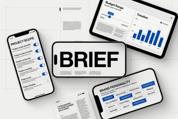
Practical framework: the three-question test
When reviewing any design decision — whether it’s a color choice, a layout, a font size, or an animation — ask three questions:
- Does this communicate something? If it doesn’t add information or context, it may be adding visual noise.
- Does this make an action easier or harder? Aesthetic choices that reduce tap targets, lower contrast, or create ambiguity are functional problems wearing visual clothes.
- Would a user understand this without a tutorial? If the design requires explanation, the visual language isn’t doing its job.
These questions aren’t a constraint on creative design — they’re a filter. A design that passes all three can still be strikingly original, beautifully crafted, and on-brand. The filter just keeps it grounded in reality.
The business case for getting this right
Companies sometimes push back on design investment with a straightforward argument: our product works, why does it need to look better? The answer is that users can’t separate the two.
Research from Stanford’s Persuasive Technology Lab found that 75% of users judge a company’s credibility based on its website design. Not its security certificates, not its case studies, not its pricing page — its design. First impressions form in 50 milliseconds. That’s an aesthetic judgment, and it directly shapes whether someone believes your product will work.
On the other side: a product that looks good but is hard to use produces an equally specific failure mode — high acquisition, high churn. Users tried it because it looked compelling. They left because they couldn’t get value from it.
Both problems are expensive. The only sustainable position is a product that earns trust visually and then validates it functionally. That’s what balanced UX design delivers — and it’s the standard every project at DesignX is built to hit.
Where to start if your product is off-balance
If you’re looking at your product and feel something is wrong but can’t name it, run a simple audit. Look at your analytics for where users drop off. Look at your support tickets for what confuses people. Then look at your design in those same spots.
In most cases, you’ll find one of two patterns: either the visual design is beautiful but the UX at that step is unclear, or the UX is technically correct but the visual design doesn’t communicate priority or urgency effectively. Both are solvable — but they require different interventions. The first is a UX architecture problem. The second is a visual design problem. Knowing which you’re dealing with changes the fix entirely.
If you’re at the stage of considering a full redesign or bringing in external design support, the design sprint model is worth evaluating — it’s specifically built to resolve these kinds of deep-rooted UX and aesthetic conflicts in a compressed timeline without committing to a full-scale agency engagement upfront.
Frequently Asked Questions
Why the “form vs. function” framing is broken?
The old design debate — form follows function versus function follows form — was never really about which one matters more. It was about sequencing. Do you start with what it needs to do, then figure out how it should look? Or do you develop the visual language first and let it shape the experience?
What good balance actually looks like?
On the Bodybuilding.com project, the initial brief leaned heavily aesthetic — the brand wanted the app to feel premium, energetic, and modern. Fair enough. But when we mapped the user flows, we found that the workout tracking interface required a lot of data entry during active exercise, hands sweaty, often squinting at the screen. That context changed every visual decision.
What should teams know about the three places where aesthetics directly drive functionality?
1. Visual hierarchy as navigation In most products, the biggest navigation problem isn’t that users don’t know how to get somewhere — it’s that they can’t tell what matters. When everything is the same visual weight, users slow down. They scan instead of flow.
Where the balance breaks down — and why?
Most UX failures aren’t because a team chose aesthetics over function or vice versa. They’re because the two were handled by separate people at separate times. The typical broken process: a visual designer produces high-fidelity mockups, then a UX designer or product manager reviews them for usability, then revisions happen, then someone implements. At each handoff, context is lost.
What should teams know about the three-question test?
When reviewing any design decision — whether it’s a color choice, a layout, a font size, or an animation — ask three questions: Does this communicate something? If it doesn’t add information or context, it may be adding visual noise. Does this make an action easier or harder? Aesthetic choices that reduce tap targets, lower contrast, or create ambiguity are functional problems wearing visual clothes.