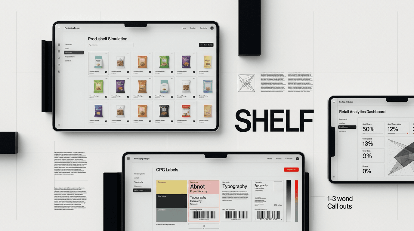
Retail shelves operate differently from digital product pages, where brands control the user journey. CPG packaging must capture attention quickly in a competitive physical environment.
The Shelf Is Not Your Website
Many brands, especially those born online, fail to grasp a fundamental truth: the retail shelf operates under entirely different rules than a digital product page. On your website, you control the user journey. You present information in a sequence, offer detailed descriptions, and guide the eye with clicks and scrolls. The consumer is actively seeking you out.
On a physical shelf, the environment is chaotic. Your product competes with dozens, sometimes hundreds, of others. Shoppers move quickly. They scan, not read. Research indicates the average CPG purchase decision takes just a few seconds. This is the “blink test” in action. If your CPG brand design packaging doesn’t communicate its core value and differentiate itself within that brief window, you’ve lost.
Peripheral vision plays a massive role. Consumers don’t approach the aisle intending to scrutinize every item. They spot a category, then narrow down their choices. Your packaging needs to stand out from a distance, pulling the eye in. It needs to convey its essence without conscious effort from the shopper. High-performing CPG brand design packaging is designed for this rapid, subconscious processing, not for detailed examination.
Architecture Wins, Campaigns Fade
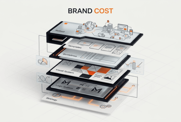
Many brands get caught in a cycle of chasing trends or designing for individual product launches. They focus on “campaign design,” which prioritizes novelty and short-term buzz. This approach is a trap for CPG. What you need is strong brand architecture.

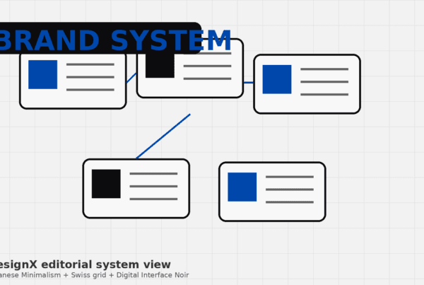
What is Brand Architecture in CPG?
Brand architecture, in the context of CPG brand design packaging, refers to the consistent, foundational visual system that defines your brand across all its products. It’s the underlying structure, not the decorative elements. Think about the dominant color, the logo placement, the unique typography for the brand name, and the consistent way information is presented. It’s about establishing recognition and trust through repetition and clarity.
A well-defined architecture means that even with new product variations or line extensions, the consumer immediately recognizes the parent brand. It creates a “brand block” on the shelf, where multiple SKUs from the same brand visually group together, creating a larger, more impactful presence than any single item could achieve alone.
This is different from designing a limited-time promotional pack or a seasonal variant. Those are tactical. Brand architecture is strategic, built for the long haul.
The Cost of Weak Architecture
Without solid brand architecture, every new product launch feels like starting from scratch. You lose the cumulative effect of brand recognition. Shoppers have to re-learn who you are and what you offer with each new item. This dilutes brand equity and forces you to spend more on marketing just to get noticed.
Consider a brand like Klein Tools. They have thousands of SKUs, each with specific technical details. When we redesigned their catalog, the focus wasn’t on flashy graphics, but on creating an information architecture that was clear, consistent, and easy to navigate. The result was a 23% dealer adoption lift. This wasn’t about a single product’s packaging, but about how a complex product line communicated its value through a unified, intelligent system. The principles apply directly to CPG: clarity, consistency, and intelligent organization of information, whether it’s on a page or a package.
Weak CPG brand design packaging architecture also makes it harder to compete for eye-level placement. Retailers want brands that perform. Brands with a strong, recognizable presence signal reliability and sales potential. If your products look like disparate items rather than a cohesive family, you’re harder to merchandise effectively, and less likely to secure premium shelf positioning.
The Power of Visual Hierarchy at Eye Level
Top-performing CPG brands don’t just exist on the shelf; they own it. They achieve this through masterful use of visual hierarchy on their packaging. They understand that the primary read panel, the front of the package, is prime real estate. Every element placed there serves a purpose, guiding the consumer’s eye in a deliberate sequence.
The “billboard effect” is critical here. When you have multiple products from the same brand, their consistent design elements should combine to create a larger, unified presence. Think of a row of Coca-Cola cans. The red, the script logo, the shape. Even without reading, you know it’s Coke. This visual repetition amplifies their presence and makes them impossible to ignore.
Category leaders prioritize certain pieces of information above others. Typically, the brand logo and product type are the largest and most prominent. This is followed by flavor, key benefits, and then supporting details. This isn’t arbitrary; it reflects the typical consumer decision-making process. First, “What brand is this?” Second, “What product is it?” Third, “Is it the one I want?”
For example, a major cereal brand will place its distinctive brand name and character prominently at the top. Below that, the specific cereal name. Then, a clear visual of the product and perhaps a benefit like “High Fiber” or “Low Sugar.” The details, like ingredients or nutritional facts, are relegated to side panels. This hierarchy ensures the most important information is absorbed instantly, even from a distance.
Color blocking is another powerful tool. Many successful brands use a dominant, recognizable color across their product line. Think of Tide’s orange, or Heinz’s red. This creates a strong visual anchor on the shelf, drawing the eye and making the brand easy to locate amidst a sea of competitors. It’s a non-verbal cue that acts like a beacon.
Our work building the launch identity for Oura Ring involved understanding how their unique product would be perceived. The packaging had to be distinct and communicate premium value, but also clearly identify the product category. We had to establish a hierarchy that worked for a completely new product entering the market.
Translating DTC Success to the Retail Aisle
Direct-to-consumer (DTC) brands have revolutionized how products reach consumers. But the transition from online darling to retail success story is often fraught with missteps. What works on a screen rarely translates directly to the grocery or pharmacy aisle.

The DTC Advantage and Its Retail Trap
DTC brands thrive on deep storytelling, personalized experiences, and direct relationships. Online, you have infinite “shelf space” to explain your mission, showcase your ingredients, and build community. You can use longer copy, multiple images, and videos. The consumer is often predisposed to learn more, having clicked on an ad or searched for a specific solution.
This environment allows for minimalist CPG brand design packaging that might feel sophisticated online, but becomes invisible in a physical store. Packaging that relies on subtle textures, extensive narratives, or small typefaces, all common in DTC, simply does not perform in retail. The intimacy of a one-on-one digital experience is replaced by a battle for attention in a high-stimulus environment.
The trap is assuming that because your brand identity resonated online, it will automatically translate. It won’t. The purchase journey is fundamentally different. Online, the consumer seeks. In retail, the product seeks the consumer.
Designing for Retail: From Scroll to Shelf
Translating a DTC brand to retail requires a re-evaluation of your CPG brand design packaging. It’s not about abandoning your brand identity, but adapting its expression for a new context. Here’s what needs to change:
- Simplify messaging: Boil down your core value proposition to its absolute essence. Use fewer words, larger type. What’s the one thing a shopper needs to know in two seconds?
- Amplify brand recognition: Your logo, primary color, and key visual elements need to be bolder, clearer, and more prominent. They need to be recognizable from several feet away, not just a few inches.
- Increase contrast and legibility: Text and graphics that look elegant on a backlit screen might be unreadable under harsh fluorescent store lighting. Ensure high contrast between text and background, and use fonts that are easily legible at a distance.
- Focus on immediate impact: The “hero shot” of your product online needs to become the hero panel in-store. What is the single most compelling image or piece of information? Make it dominant.
- Consider brand blocking: If you have multiple SKUs, design them to create a cohesive block. Use consistent visual cues to link them together, amplifying your presence.
When we worked with HP, a global brand with complex product lines, the challenge was always about consistency and clarity across diverse markets and product types. Similarly, for Bodybuilding.com, the packaging needed to instantly convey performance and trust in a highly competitive supplement market. These principles of clarity and immediate impact are universal, regardless of industry.
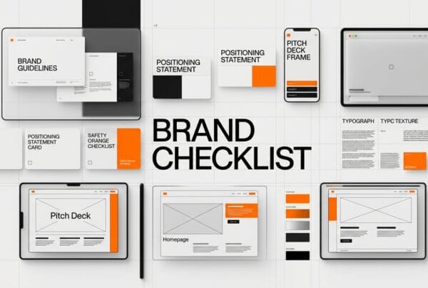
Actionable Steps for Your CPG Brand Design
To ensure your CPG brand design packaging earns and keeps shelf space, you need to be strategic and analytical, not just artistic.
- Conduct thorough shelf audits: Don’t just look at your product. Go to stores and photograph your competitors. Analyze their hierarchy, their use of color, their messaging. Understand the category codes and where you can disrupt or fit in.
- Prioritize your brand elements: Decide what absolutely must be seen first (brand name, product type). What comes second (flavor, key benefit)? What can be moved to the side or back? Every element on the front panel must justify its existence.
- Test packaging in realistic environments: Don’t rely solely on flat mock-ups. Create physical prototypes and place them in a simulated retail setting. Observe how people react, which elements draw their eye, and if they can quickly understand what your product is. Eye-tracking studies can provide valuable data here.
- Invest in foundational design: See your CPG brand design packaging as an investment in a sales tool, not just a cost. A well-designed package directly impacts sales. This means investing in strategic design thinking that builds strong brand architecture, not just attractive graphics.
- Collaborate with retail partners: Understand their planogramming requirements and merchandising strategies. A design that works well in a vacuum might fail when placed next to specific competitors or within certain shelf configurations.
Ready to design packaging that demands attention and drives sales? Contact DesignX to talk through your project.
Frequently Asked Questions
What should teams know about the shelf is not your website?
Many brands, especially those born online, fail to grasp a fundamental truth: the retail shelf operates under entirely different rules than a digital product page. On your website, you control the user journey. You present information in a sequence, offer detailed descriptions, and guide the eye with clicks and scrolls. The consumer is actively seeking you out.
What should teams know about architecture wins, campaigns fade?
Many brands get caught in a cycle of chasing trends or designing for individual product launches. They focus on “campaign design,” which prioritizes novelty and short-term buzz. This approach is a trap for CPG. What you need is strong brand architecture.
What should teams know about the power of visual hierarchy at eye level?
Top-performing CPG brands don’t just exist on the shelf; they own it. They achieve this through masterful use of visual hierarchy on their packaging. They understand that the primary read panel, the front of the package, is prime real estate. Every element placed there serves a purpose, guiding the consumer’s eye in a deliberate sequence.
How should teams approach translating DTC success to the retail aisle?
Direct-to-consumer (DTC) brands have revolutionized how products reach consumers. But the transition from online darling to retail success story is often fraught with missteps. What works on a screen rarely translates directly to the grocery or pharmacy aisle. The DTC Advantage and Its Retail Trap DTC brands thrive on deep storytelling, personalized experiences, and direct relationships.
What should teams know about actionable steps for your CPG brand design?
To ensure your CPG brand design packaging earns and keeps shelf space, you need to be strategic and analytical, not just artistic. Conduct thorough shelf audits: Don’t just look at your product. Go to stores and photograph your competitors. Analyze their hierarchy, their use of color, their messaging.