Tableride, a ride-sharing platform, needed a distinct brand identity to communicate its core values. DesignX aimed to visually convey reliability, connection, and community to its target audience.
In a competitive ride-sharing market, establishing a distinct brand identity is paramount for user trust and market penetration. Tableride, a burgeoning platform, recognized the urgent need to visually communicate its core values of reliability, connection, and community, moving beyond a generic presence to capture its unique market position and resonate with its target audience.
Project Overview
| Category | Details |
|---|---|
| Client Type | Growth-Stage Startup |
| Industry | Ride-Sharing, Transportation Technology |
| Project Type | Comprehensive Logo Branding and Visual Identity System |
| Timeline | 10 Weeks |
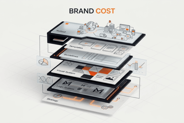
| Deliverables | Primary Logo, Secondary Logos, Brandmark, Iconography, Custom Wordmark, Color Palette, Typography System, Brand Guidelines Document, Logo Animation, Application Mockups |
| Tools Used | Adobe Illustrator, Adobe Photoshop, Adobe After Effects, Figma, Miro |
The Challenge
Tableride faced a significant hurdle in a market dominated by well-established players. Their existing visual identity lacked distinctiveness, appearing generic and failing to convey the platform’s core promise of shared, community-focused journeys. The brand struggled with low recall among potential users and inconsistent application across various digital and physical touchpoints. This inconsistency diluted their message and hindered their ability to build trust and credibility, essential for a service relying on personal safety and reliable transportation.
Specifically, Tableride’s previous logo was a simple, uninspired wordmark that did not communicate any unique value proposition. It failed to resonate with the idea of “table,” which for Tableride signified bringing people together for a shared purpose or journey. This absence of a compelling visual narrative made it difficult for the company to differentiate itself from competitors, attract early adopters, or secure investor confidence. The brand needed an identity that could convey a sense of modern efficiency, approachability, and the fundamental human connection inherent in shared experiences, without appearing overly complex or niche. The challenge was to create a brand mark that felt both dependable and inviting, capable of standing out in a crowded digital landscape while encapsulating Tableride’s vision for the future of urban mobility.
Our Approach
Our engagement with Tableride began with an intensive discovery phase designed to unearth the brand’s true essence and market position. We initiated a comprehensive competitor analysis, studying the visual languages and brand perceptions of leading ride-sharing services globally to identify gaps and opportunities for differentiation. This research extended to understanding the psychological drivers behind user choice in transportation, focusing on elements of trust, convenience, and community.
Central to our approach was a series of in-depth brand workshops with Tableride’s founding team and key stakeholders. These sessions were critical for defining the company’s core values, mission, vision, and desired brand personality. We guided them through exercises exploring their target audience’s aspirations and pain points, identifying what unique feeling Tableride aimed to evoke. Insights gathered from these workshops informed the creation of detailed mood boards, which served as visual springboards for initial concept generation. Our design process was iterative, involving multiple rounds of concept presentation, feedback, and refinement. We focused on translating Tableride’s commitment to connected journeys and communal experiences into a visual language that was both modern and timeless. Each design decision was rigorously tested against the defined brand strategy, ensuring that the final identity was not only aesthetically compelling but also strategically sound and highly functional across all anticipated applications.
Key Design Decisions
The “Connected Path” Brandmark
Our primary design decision was to create a distinctive brandmark that visually represented the convergence of paths and the concept of shared travel. We moved beyond literal interpretations of a “table” or “car,” opting for an abstract yet intuitive symbol. The final brandmark consists of two interlocking, fluid lines that subtly form a ‘T’ while also suggesting movement, connection, and a continuous journey. The lines meet at a central point, symbolizing the coming together of people or destinations. The reasoning behind this was to convey Tableride’s core offering: facilitating connections and shared experiences, rather than just transportation from point A to point B. This abstract approach allowed for greater versatility and longevity, avoiding trends and focusing on an enduring message of unity and forward motion.
A Dynamic, Trust-Inspiring Color Palette
The selection of Tableride’s color palette was a deliberate choice to differentiate it within the ride-sharing industry while instilling confidence and approachability. We opted for a primary palette featuring a deep, sophisticated teal and a vibrant, energetic orange. The teal, “Journey Teal,” was chosen for its association with reliability, professionalism, and depth, providing a grounding and trustworthy foundation. The orange, “Connect Orange,” injects warmth, optimism, and a sense of community and excitement, symbolizing the positive interactions facilitated by Tableride. The juxtaposition of these two colors creates a dynamic tension, representing the balance between dependable service and the lively experience of shared travel. This combination stands apart from the typical blues, blacks, and greys prevalent among competitors, giving Tableride a memorable and fresh visual identity.
The Custom “Tableride Sans” Wordmark
To ensure the Tableride brand felt truly unique and accessible, we developed a custom wordmark, “Tableride Sans.” This bespoke typeface features rounded terminals and subtly angled cuts, giving it a friendly yet structured appearance. The letterforms are designed for optimal legibility at various sizes, from app icons to vehicle branding, while maintaining a distinct personality. The gentle curves in the letterforms echo the fluid lines of the brandmark, creating visual cohesion across the entire logo system. The custom nature of the wordmark means Tableride possesses a unique typographic signature that cannot be replicated by off-the-shelf fonts. This decision was crucial for establishing an immediate sense of approachability and modernity, reinforcing the brand’s commitment to a user-friendly experience and setting it apart from competitors relying on standard typefaces.
Design Highlights
The visual identity for Tableride was crafted to be both cohesive and adaptable, ensuring a strong presence across all mediums.
Color Rationale: The chosen palette of “Journey Teal” and “Connect Orange” is more than just aesthetically pleasing, it is strategically functional. Journey Teal serves as the primary brand color, representing stability, professionalism, and the reliability of Tableride’s service. It evokes a sense of calm and trust, which is critical in the transportation sector. Connect Orange acts as a vibrant accent, symbolizing energy, community, and the positive interactions facilitated by the platform. It’s used to highlight calls to action, important notifications, and elements that emphasize connection. A secondary palette of soft greys and a clean white supports these primary colors, providing visual balance and ensuring readability, while allowing the core brand colors to truly pop. This thoughtful distribution of color ensures the brand feels contemporary, trustworthy, and inviting.
Typography Choice: Beyond the custom “Tableride Sans” wordmark, we established a clear typographic hierarchy using a combination of a geometric sans-serif for headings and a highly readable humanist sans-serif for body text. The heading font, selected for its clean lines and modern appeal, reinforces the brand’s forward-thinking stance. The body text font, chosen for its excellent readability across digital screens and print, ensures that all informational content is easily digestible and accessible to a broad audience. This dual-font system creates a sophisticated yet user-friendly experience, maintaining consistency and professionalism throughout all brand communications.
Layout Logic: The application of the Tableride logo and brand elements follows a modular and flexible layout logic. The primary logo, comprising the brandmark and wordmark, is designed to be highly versatile, functioning effectively in both horizontal and stacked configurations. Clear guidelines were provided for minimum size, clear space, and usage on various backgrounds to maintain brand integrity. For instances requiring a more compact presence, such as app icons or social media profiles, the standalone brandmark was optimized to be instantly recognizable and impactful. This systematic approach ensures that the Tableride brand maintains a consistent and strong visual presence, whether on a vehicle wrap, a mobile app, or a marketing billboard.
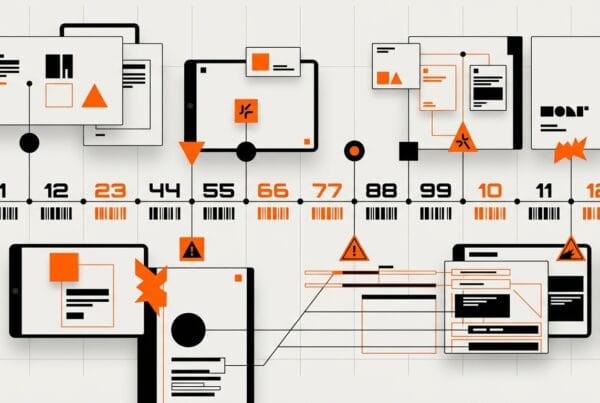
Interaction Patterns (Logo Animation): A key highlight of the Tableride branding project was the creation of its logo animation, specifically referenced in the Dribbble description. This animation brings the “Connected Path” brandmark to life with fluid motion and vibrant graphics. It begins with the two separate lines of the brandmark appearing independently, symbolizing individual journeys or needs. They then gracefully converge and interlock, forming the complete Tableride ‘T’ and brandmark. The animation is smooth and dynamic, accompanied by a subtle gradient shift in the Connect Orange, conveying
Frequently Asked Questions
What problem did the tableride Logo Branding Design work need to solve?
Tableride faced a significant hurdle in a market dominated by well-established players. Their existing visual identity lacked distinctiveness, appearing generic and failing to convey the platform’s core promise of shared, community-focused journeys. The brand struggled with low recall among potential users and inconsistent application across various digital and physical touchpoints. This inconsistency diluted their message and hindered their ability to build trust and credibility, essential for a service relying on personal safety and reliable transportation.
How did DesignX approach the tableride Logo Branding Design work?
Our engagement with Tableride began with an intensive discovery phase designed to unearth the brand’s true essence and market position. We initiated a comprehensive competitor analysis, studying the visual languages and brand perceptions of leading ride-sharing services globally to identify gaps and opportunities for differentiation. This research extended to understanding the psychological drivers behind user choice in transportation, focusing on elements of trust, convenience, and community. Central to our approach was a series of in-depth brand workshops with Tableride’s founding team and key stakeholders.
Which design decisions mattered most in the tableride Logo Branding Design project?
The “Connected Path” Brandmark Our primary design decision was to create a distinctive brandmark that visually represented the convergence of paths and the concept of shared travel. We moved beyond literal interpretations of a “table” or “car,” opting for an abstract yet intuitive symbol. The final brandmark consists of two interlocking, fluid lines that subtly form a ‘T’ while also suggesting movement, connection, and a continuous journey. The lines meet at a central point, symbolizing the coming together of people or destinations.
What stands out in the final Tableride Logo Branding Design design?
The visual identity for Tableride was crafted to be both cohesive and adaptable, ensuring a strong presence across all mediums. Color Rationale: The chosen palette of “Journey Teal” and “Connect Orange” is more than just aesthetically pleasing, it is strategically functional. Journey Teal serves as the primary brand color, representing stability, professionalism, and the reliability of Tableride’s service. It evokes a sense of calm and trust, which is critical in the transportation sector.