
A 2024 industry survey reveals that 78% of product teams with documented design systems achieve 40% faster product development cycles and significantly fewer design inconsistencies. Despite these significant advantages, only 44% of organizations currently maintain comprehensive design system documentation.
Introduction
According to a 2024 industry survey, 78% of product teams using documented design systems report 40% faster product development cycles and significantly fewer design inconsistencies. Yet surprisingly, only 44% of organizations maintain complete design system documentation. This gap represents one of the biggest missed opportunities in modern product development.
Design system documentation is the bridge between your component library and your team’s ability to use it effectively. Without clear, accessible documentation, even the most elegantly crafted design system becomes a source of confusion rather than efficiency. Whether you’re building your first design system template or refining an existing one, proper documentation transforms your design language from a collection of components into a scalable, team-wide asset.
In this complete guide, we’ll walk through exactly how to document a design system that your entire team will actually use. You’ll learn the essential components to include, proven documentation strategies from companies like Google and IBM, and practical templates you can implement immediately.
What Is Design System Documentation?
The Foundation of Design Consistency
Design system documentation is a complete resource that explains how to use, implement, and contribute to your design system. It goes far beyond a simple component library, it’s the knowledge base that lets designers, developers, and product managers to make consistent decisions aligned with your brand standards.

Think of it as the instruction manual for your visual language. Just as Material Design provides detailed guidance on every element from typography to motion, your documentation should answer every question a team member might have when building interfaces. This includes code snippets, design principles, usage guidelines, accessibility standards, and real-world examples.
Documentation vs. Component Library
Many teams conflate their component library with documentation, but they serve distinct purposes. Your component library (whether in Figma, Sketch, or code) contains the actual design assets and components. Documentation explains why these components exist, when to use them, and how to implement them correctly.
IBM’s Carbon Design System shows this distinction brilliantly. Their Figma library contains the components, while their documentation site provides context, usage guidelines, accessibility requirements, and code examples. This separation ensures designers can work quickly while having complete reference material when needed.
Who Benefits from Strong Documentation
Well-maintained design system documentation serves multiple stakeholders across your organization. Designers gain clarity on component usage and design patterns, reducing time spent reinventing solutions. Developers receive clear implementation guidelines with code examples, minimizing back-and-forth clarifications. Product managers understand design constraints and possibilities, leading to more realistic roadmaps.
New team members especially benefit from thorough documentation. A complete design system guide can reduce onboarding time from weeks to days, allowing new hires to contribute meaningfully almost immediately. This scalability becomes crucial as organizations grow and design systems mature.
Essential Components to Document
Design Tokens Documentation
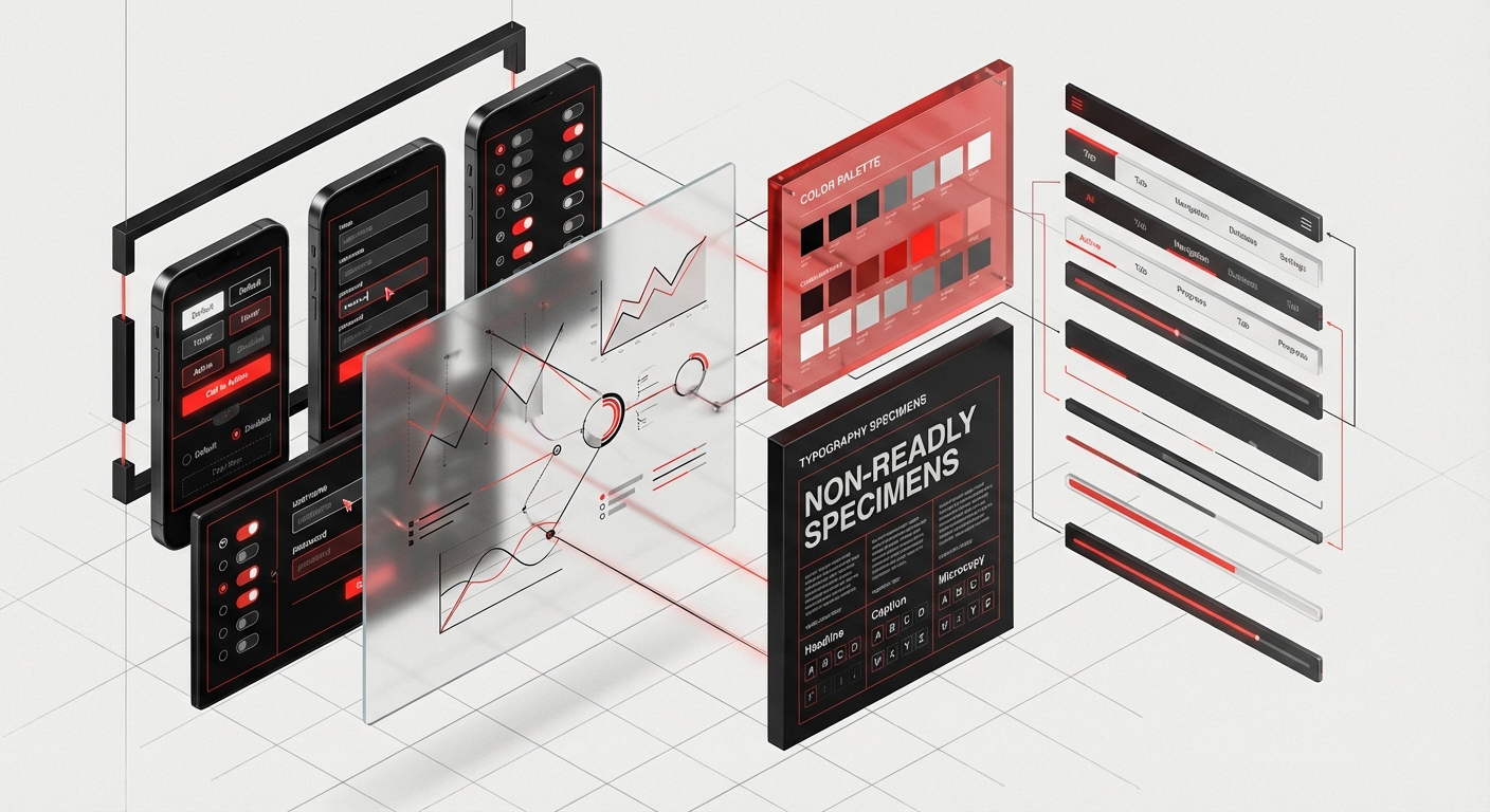
Design tokens are the atomic variables that define your visual language, colors, typography, spacing, and more. Your design tokens documentation should include the token name, value, purpose, and usage context. For example, Shopify Polaris documents each color token with its hex value, contrast ratios, and specific use cases like “surface-critical” for error states.
Include both the semantic meaning and technical specifications. A token named `color-text-primary` is more meaningful than `gray-800`, and your documentation should explain when each applies. Provide code snippets showing how developers access these tokens in different frameworks, and include visual examples demonstrating proper usage versus common mistakes.
Component Library Documentation
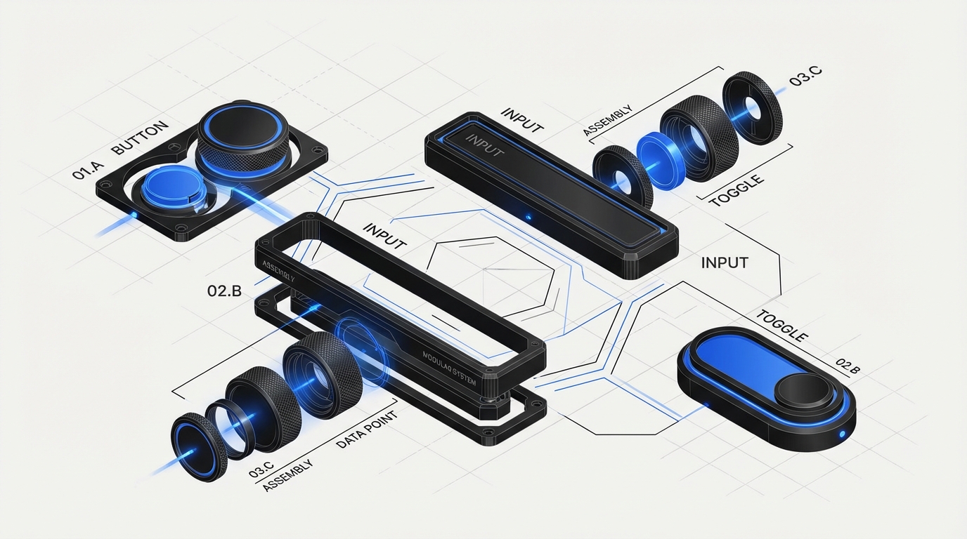
Each component in your system deserves its own documentation page. Start with a clear description of the component’s purpose and when to use it. Include anatomy diagrams labeling each part of the component, variants showing all available configurations, and states covering default, hover, active, focus, disabled, and error conditions.
Material Design’s component documentation is a gold standard here. Each component page includes interactive examples, API specifications, accessibility guidelines, and implementation code for multiple platforms. Your documentation should similarly provide everything a designer or developer needs without requiring them to hunt through multiple resources.
Usage Guidelines and Best Practices
Beyond technical specifications, your documentation needs contextual guidance. Create clear do’s and don’ts with visual examples showing correct and incorrect usage. Explain the reasoning behind constraints, when teams understand why a rule exists, they’re more likely to follow it and make good judgment calls in edge cases.
Address common questions proactively. If designers frequently ask whether to use a primary or secondary button in specific scenarios, create decision trees or flowcharts guiding them to the right choice. Shopify Polaris excels at this with their “Best practices” section for each component, providing actionable guidance that respects designers’ expertise while ensuring consistency.
Accessibility Standards
Accessibility documentation is non-negotiable for modern design systems. Document WCAG compliance levels for each component, keyboard navigation patterns, screen reader behavior, and focus management. Include ARIA attributes, contrast ratios, and touch target sizes with clear explanations of why each standard matters.
The BBC’s Global Experience Language (GEL) provides exceptional accessibility documentation, treating it as a first-class concern rather than an afterthought. Follow their lead by integrating accessibility requirements directly into component documentation rather than segregating them into a separate section. This approach ensures accessibility becomes part of every design decision.
Step-by-Step Documentation Process
Audit Your Existing System
Begin by inventorying everything that needs documentation. Create a spreadsheet listing every component, pattern, token, and guideline currently in your system. Note what documentation already exists, what’s missing, and what’s outdated. This audit reveals gaps and helps prioritize documentation efforts.
Include stakeholder interviews in your audit. Ask designers, developers, and product managers what information they need but can’t currently find. IBM’s Carbon team regularly surveys their users to identify documentation pain points, using that feedback to guide their documentation roadmap. Your team’s actual questions should shape your documentation structure.
Create a Documentation Template
Develop a consistent template that every component page follows. This standardization makes documentation easier to write and more predictable to use. Your template might include sections for: overview, anatomy, variants, properties, usage guidelines, accessibility, code examples, and related components.
Atlassian’s design system demonstrates excellent template consistency. Every component page follows the same structure, allowing users to quickly find the information they need. Include placeholders and brief writing guidelines in your template to help contributors maintain consistency even when multiple people document different components.
Write for Your Audience
Design system documentation serves diverse audiences with different needs. Designers need visual examples and usage context; developers need code snippets and API specifications; product managers need high-level overviews and constraints. Structure your documentation so each audience can quickly access relevant information without wading through irrelevant details.
Use clear, concise language avoiding jargon where possible. When technical terms are necessary, define them. Break complex information into scannable chunks with descriptive headings. Code examples should include comments explaining key decisions. Visual examples should show realistic use cases rather than abstract demonstrations.
Implement Version Control
Your design system will evolve, and your documentation must evolve with it. Implement clear version numbering for both your system and documentation. Document what changed in each version, why changes were made, and migration paths for teams using older versions.
The Material Design documentation includes a changelog highlighting recent updates, making it easy for teams to stay current. Consider using semantic versioning (major.minor.patch) and clearly communicating breaking changes. Tag deprecated components with sunset timelines, giving teams adequate time to migrate.
Tools and Platforms for Design System Documentation
Documentation Site Builders
Several specialized platforms streamline design system documentation. Storybook has become the industry standard for component documentation, offering interactive component playgrounds where designers and developers can experiment with props and states in real-time. It integrates smooth with popular frameworks and provides automatic prop documentation generation.

Zeroheight specializes in design system documentation, connecting directly to Figma and GitHub to automatically sync design assets and code. It offers beautiful, branded documentation sites without requiring development resources. For teams wanting more control, static site generators like Docusaurus or VuePress provide flexibility while maintaining good documentation-specific features.
Component Playground Tools
Interactive playgrounds transform static documentation into hands-on learning experiences. Storybook’s Canvas mode lets users manipulate component properties and see results immediately. Framer’s documentation capabilities allow fully interactive prototypes embedded directly in documentation, helping designers understand component behavior beyond static examples.
CodeSandbox integration takes this further by providing full development environments within documentation. Users can not only see how components work but fork examples and experiment without leaving the documentation site. This hands-on approach dramatically improves comprehension and reduces support questions.
Collaboration and Maintenance Tools
Documentation is never finished, it requires ongoing maintenance. Notion and Confluence work well for internal documentation and collaborative editing, though they lack component-specific features. GitHub or GitLab wikis keep documentation alongside code, enabling version control and pull request reviews for documentation changes.
Consider tools that enable community contributions if your design system serves multiple teams. The open-source model Carbon Design System uses allows anyone to propose documentation improvements via pull requests, use distributed knowledge across their user base. Clear contribution guidelines ensure quality while distributing maintenance burden.
Integration with Design Tools
Modern documentation platforms integrate directly with design tools, keeping documentation synchronized with design files. Figma’s API enables automatic screenshot generation, ensuring documented examples always reflect current designs. Plugins like Design Tokens can export tokens directly to documentation, eliminating manual synchronization.
This integration reduces maintenance overhead significantly. When IBM updates a component in Sketch, their documentation automatically updates with new screenshots and specifications. While initial setup requires technical effort, the long-term efficiency gains justify the investment for mature design systems.
Maintaining Documentation Over Time
Establish Documentation Ownership
Successful documentation requires clear ownership. Assign a documentation maintainer, either a dedicated technical writer or a rotating role among design system team members. This person ensures documentation stays current, maintains consistency, and coordinates contributor efforts.
Shopify’s Polaris team includes dedicated content designers responsible for documentation quality. Even if you can’t dedicate full-time resources, establishing ownership prevents documentation from becoming everyone’s responsibility and therefore no one’s priority. Define the role’s scope, including review cadence and quality standards.
Create a Contribution Workflow
Make contributing to documentation as frictionless as possible. Provide templates, style guides, and clear submission processes. Document the documentation process itself, meta-documentation prevents bottlenecks and lets team members to contribute without extensive guidance.
Implement a review process balancing quality with speed. Require at least one reviewer for documentation changes, preferably someone familiar with the component being documented. Use checklists to ensure all required sections are complete and maintain consistent quality across contributors.
Schedule Regular Audits
Set quarterly or biannual documentation audits to identify outdated information, broken links, and gaps. Create a checklist covering accuracy, completeness, code example validity, screenshot currency, and accessibility guideline updates. These systematic reviews prevent documentation debt from accumulating.
During audits, gather user feedback through surveys or analytics. Which pages receive the most traffic? Where do users drop off? What searches yield no results? This data reveals what’s working and where improvement is needed. Google’s Material Design team publicly shares their documentation improvement roadmap based on such insights.
Measure Documentation Effectiveness
Track metrics indicating documentation health and utility. Monitor page views, time on page, and search queries to understand how teams use documentation. Measure support ticket volume related to design system questions, effective documentation should reduce these over time.
Conduct periodic user testing with new team members. Watch them attempt common tasks using only documentation and note where they struggle. These sessions reveal gaps that analytics miss. IBM regularly conducts such research, using findings to iterate on their Carbon documentation structure and content.
Common Documentation Mistakes to Avoid
Assuming Technical Knowledge
One of the most frequent documentation pitfalls is assuming readers possess specific technical knowledge. Your documentation should serve everyone from junior designers to senior engineers. Define acronyms on first use, explain concepts before diving into implementation details, and provide context for why things work as they do.
Remember that developers might not understand design terminology and designers might not grasp technical constraints. Bridge this gap with clear explanations that respect both disciplines. When Airbnb documents their design system, they provide parallel explanations for design and development audiences, ensuring both groups understand the full picture.
Focusing Only on Components
Many teams document components thoroughly while neglecting patterns, principles, and processes. complete design system documentation includes foundational principles guiding design decisions, common patterns solving recurring problems, contribution guidelines, and governance processes. These contextual elements are often more valuable than component specifications.
Atlassian’s design system dedicates significant documentation to patterns like empty states, progressive disclosure, and onboarding flows. These cross-component patterns provide higher-level guidance that component docs alone cannot deliver. Your documentation should address both the “what” (components) and the “how” (patterns and principles).
Letting Documentation Fall Behind
Outdated documentation is worse than no documentation, it actively misleads teams and erodes trust in the design system. When components change but documentation doesn’t, teams waste time implementing deprecated patterns or struggling with undocumented new features. This disconnect frustrates users and undermines adoption.
Treat documentation updates as mandatory parts of component changes, not optional follow-up tasks. Before merging any design system update, verify corresponding documentation updates are complete and accurate. Some teams use automated checks preventing component releases without documentation changes, ensuring they stay synchronized.
Overcomplicating the Structure
While complete documentation is valuable, overly complex navigation and structure create barriers to finding information. Avoid deep hierarchies requiring multiple clicks to reach basic information. Use clear, predictable labels for navigation items. Implement strong search functionality, many users search rather than browse.
Test your information architecture with actual users before finalizing it. Card sorting exercises reveal how your team mentally organizes design system concepts, helping create intuitive navigation. The UK Government Design System underwent extensive user research to optimize their documentation structure, resulting in highly usable documentation.
Design System Documentation Template & Checklist
Component Documentation Template
Use this template for every component in your system:
Component Name
- Brief description (1-2 sentences explaining purpose and primary use case)
- Visual example showing default state
Anatomy
- Labeled diagram identifying all component parts
- Explanation of each element’s function
Variants
- Visual examples of all available variants
- When to use each variant
States
- Default, hover, active, focus, disabled, loading, error
- Visual examples and technical specifications for each
Properties/Props
- Complete API documentation
- Default values and acceptable ranges
- Code examples demonstrating common configurations
Usage Guidelines
- When to use this component
- When NOT to use this component
- Best practices with visual examples
- Common mistakes to avoid
Accessibility
- WCAG compliance level
- Keyboard interactions
- Screen reader behavior
- Required ARIA attributes
- Focus management
Code Examples
- Implementation examples for each supported framework
- Edge case handling
- Integration with related components
Related Components
- Links to similar or commonly paired components
Documentation Audit Checklist
Completeness
- [ ] All components documented
- [ ] All design tokens defined
- [ ] Patterns and principles included
- [ ] Accessibility standards specified
- [ ] Code examples provided
- [ ] Visual examples current
Accuracy
- [ ] Screenshots match current designs
- [ ] Code examples execute successfully
- [ ] Links work and point to correct destinations
- [ ] Version information current
- [ ] Deprecated items clearly marked
- [ ] Navigation intuitive and shallow
- [ ] Search functionality working
- [ ] Mobile-responsive documentation
- [ ] Loading performance acceptable
- [ ] Content scannable with clear headings
Quality
- [ ] Writing clear and concise
- [ ] Technical terms defined
- [ ] Consistent tone and style
- [ ] Grammar and spelling correct
- [ ] Visual examples realistic
Frequently Asked Questions
How long does it take to document a design system?
Documenting a design system typically takes 2-4 weeks for initial creation and 10-20% of ongoing maintenance time. The timeline depends on system complexity, existing documentation quality, and team size. Start with your most-used components rather than attempting complete documentation immediately. IBM Carbon’s documentation evolved over years with continuous refinement based on user feedback.
Should documentation live in Figma, a website, or both?
Both, ideally. Figma documentation provides quick reference for designers actively working in design files, while a dedicated website offers complete guidance for all stakeholders. Use Figma for component-specific annotations and basic usage notes. Reserve detailed guidelines, code examples, and cross-component patterns for your documentation site. Shopify Polaris maintains minimal Figma documentation with extensive web documentation, preventing duplication.
Who should write design system documentation?
The most effective approach combines design system creators with dedicated content designers or technical writers. Component creators understand nuances and edge cases, while professional writers ensure clarity and consistency. If resources are limited, establish a collaborative review process where system maintainers draft documentation and team members from design and development review it. Atlassian employs dedicated content designers for their design system, recognizing documentation as a specialized skill.
How do you keep documentation synchronized with code?
Implement automated documentation generation where possible using tools like Storybook that extract component props and generate API documentation directly from code. For manual content, treat documentation updates as required components of pull requests, don’t merge changes without corresponding documentation updates. Use version control for documentation alongside code, and implement CI/CD checks that flag missing documentation for new components.
What’s the minimum viable documentation for a new design system?
Start with foundational elements: design principles (2-3 core principles guiding decisions), color and typography tokens (complete specifications), 5-10 most-used components (following your documentation template), and basic contribution guidelines. This minimum foundation enables teams to begin using your system while you document remaining components iteratively. Focus on quality over quantity, thorough documentation of key components beats superficial documentation of everything.
How technical should design system documentation be?
Tailor technical depth to audience needs. Component pages should include both high-level design guidance and detailed technical specifications, allowing readers to engage at their comfort level. Use progressive disclosure, present essential information prominently while placing advanced technical details in expandable sections. Material Design excels at this layered approach, providing quick-start information with deep technical references available for those who need them.
How do you measure if your documentation is effective?
Track quantitative metrics including documentation page views, time-on-page, search success rates, and design system support ticket volume. Conduct qualitative research through user interviews, onboarding observations, and regular feedback surveys. The most telling metric is support ticket reduction, if teams can self-serve answers through documentation, your documentation is working. Aim for 30-50% reduction in support questions within six months of publishing complete documentation.
Conclusion
Design system documentation transforms a collection of components into a powerful tool for organizational consistency and efficiency. While creating complete documentation requires significant investment, the returns, faster development cycles, reduced design debt, and improved team collaboration, justify the effort many times over.
Start with your documentation audit, understanding what exists and what’s missing. Implement the template and checklist provided here, adapting them to your organization’s specific needs. Focus on making your documentation accurate, accessible, and actionable. Remember that documentation is never finished; it evolves alongside your design system and organizational needs.
The difference between a successful design system and an abandoned one often comes down to documentation quality. Teams use what they understand, and complete documentation is what makes your design system understandable.
Ready to build a design system that your entire team will love? Contact DesignX to learn how our UX/UI experts can help you create a complete design system with documentation that drives adoption and consistency across your organization. Our team specializes in design systems that scale with your business, complete with documentation that lets teams and accelerates product development.
Related Reading
- Design Sprints vs Traditional Agencies: A Cost-Benefit Analysis for Modern Teams
- The ROI of Design: How Enterprise Companies Measure Design Impact
- Design Sprints vs Traditional Agencies: A Cost-Benefit Analysis for Modern Teams
FAQ
What is Design System Documentation: The Complete Template?
Design System Documentation: The Complete Template is a practical framework used by teams to improve product outcomes, reduce execution risk, and create clearer decision-making.
How long does it take to build a complete design system documentation library?
Most teams see early signal improvements within the first few weeks when changes are tied to measurable conversion and UX goals.
How do design teams decide what to include in their design system documentation?
Start with the highest-impact user journeys, prioritize fixes by business impact, and validate performance with clear analytics and iteration cycles.


