Whole Foods Market’s existing app was outdated and did not reflect its premium brand experience. The app needed improvements in personalization and product showcasing.
When Whole Foods Market recognized the evolving landscape of digital grocery, they faced a critical challenge: their existing native app, while functional, no longer reflected the premium brand experience customers expected. The interface felt dated, personalization was rudimentary, and the rich array of organic and specialty products, central to the Whole Foods identity, was not showcased effectively. This friction in the digital customer journey presented a significant opportunity for a strategic redesign.
Project Overview
| Category | Details |
|---|---|
| Client Type | Iconic Retail Brand |
| Industry | Grocery, Retail, E-commerce |
| Project Type | Native Mobile App Redesign (UX/UI) |
| Timeline | 6 Months |
| Deliverables | UX Research Report, User Personas, User Flows, Information Architecture, Wireframes, Interactive Prototypes, UI Style Guide, Design System, Final UI Screens, Usability Testing Reports |
| Tools Used | Figma, Maze, UserTesting.com, Adobe Illustrator, Miro |
The Challenge
The Whole Foods Market app, before our engagement, exhibited several critical pain points that hindered the user experience and undermined the brand’s premium positioning. Users reported an outdated visual design that felt inconsistent with the in-store experience. Navigation proved cumbersome, making it difficult for customers to quickly find specific products or explore new offerings. A significant issue was the lack of genuine personalization; the app failed to learn user preferences, dietary restrictions, or past purchases, resulting in generic content and irrelevant recommendations. Product discovery, especially for the unique organic and specialty items Whole Foods is known for, was buried under layers of categories and filters. Furthermore, the checkout process was clunky, leading to frustration and abandoned carts. These issues collectively led to lower app engagement, reduced customer loyalty in the digital space, and a missed opportunity to fully support the Whole Foods brand promise of quality and convenience. The app was not effectively serving as a digital extension of the high-quality, personalized shopping experience found in physical stores.
Our Approach
Our engagement with Whole Foods Market began with a deep, iterative, and exploratory approach, centered on a thorough understanding of their customers and business objectives. We initiated the project with extensive UX Research, conducting a blend of qualitative and quantitative studies. This involved in-depth user interviews with existing Whole Foods app users and customers of competitor apps, contextual inquiries, and comprehensive surveys to uncover core needs, frustrations, and aspirations. We performed a competitive analysis to benchmark current industry standards and identify opportunities for differentiation. A heuristic evaluation of the existing app provided a baseline of usability issues.
Following research, our UX Design phase focused on translating insights into actionable design strategies. We developed detailed user personas, journey maps, and empathy maps to guide design decisions. A complete overhaul of the information architecture was undertaken to simplify navigation and enhance product discoverability. This was followed by wireframing and interactive prototyping to rapidly test and validate design concepts with real users, ensuring early identification and resolution of usability issues. The UI Design phase then brought these validated concepts to life, establishing a refreshed visual aesthetic, a cohesive design system, and high-fidelity mockups that aligned with the brand’s premium identity. Throughout this process, we maintained close collaboration with the Whole Foods team, integrating their invaluable brand knowledge and business insights into every stage of the redesign.
Key Design Decisions
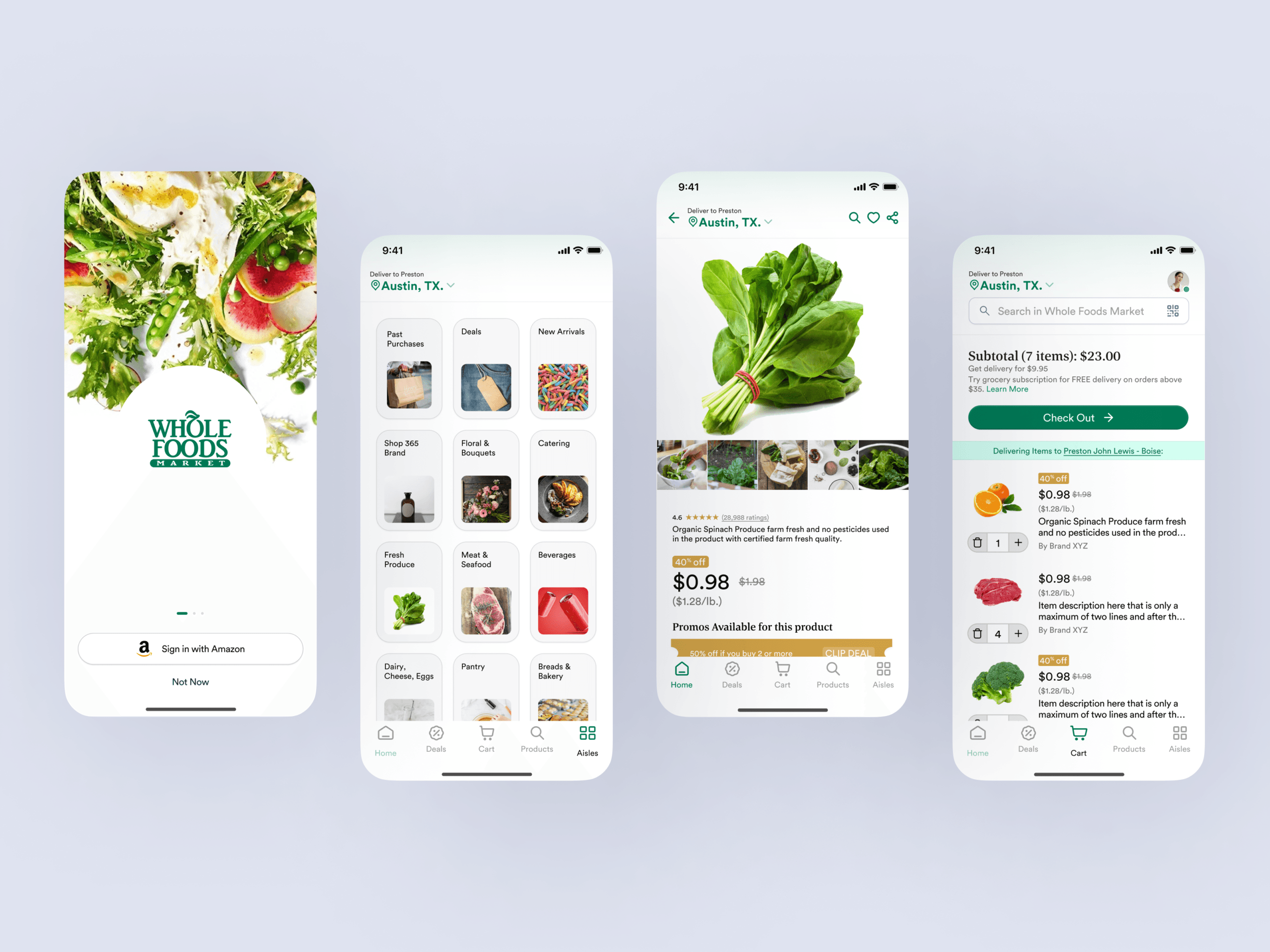
Personalized Home Screen and AI-driven Recommendations
The previous Whole Foods app offered a static, one-size-fits-all home screen that did not reflect individual user needs or preferences. Our research consistently revealed user frustration with irrelevant content and a desire for a more tailored experience. To address this, we implemented a dynamic, personalized home screen that adapts to each user’s profile. This involved integrating an AI-driven recommendation engine that suggests products based on past purchases, saved dietary preferences, browsing history, and even local store inventory and promotions. The “Why” behind this decision was clear: by presenting users with content and products directly relevant to them, we aimed to significantly reduce decision fatigue, enhance product discoverability for specific needs, and foster a deeper sense of connection with the brand. This feature directly translates into increased engagement, more efficient shopping trips, and a higher likelihood of discovering new items aligned with their lifestyle.
Enhanced Product Discovery for Organic and Specialty Items
Whole Foods Market is synonymous with high-quality organic, natural, and specialty products. However, the original app’s navigation and product listings made these unique offerings difficult to find, often burying them amidst conventional items. Our redesign prioritized showcasing these core differentiators. We introduced a completely re-imagined product browsing experience, featuring richer product detail pages with detailed nutritional information, sourcing stories, and clear labeling for dietary restrictions such as vegan, gluten-free, or keto. Dedicated sections for “Curated Collections” and “Seasonal Specialties” were created, allowing users to explore unique items through visually appealing storytelling modules. The “Why” for this decision was strategic: by elevating the visibility and discoverability of their signature products, we reinforced Whole Foods’ market position, empowered customers with more informed choices, and encouraged exploration beyond their usual shopping lists. This design choice directly supports the brand’s identity and value proposition.
Streamlined Checkout Flow with Integrated Loyalty and Payment
A common pain point identified in our research was the clunky and multi-step checkout process, which contributed to high cart abandonment rates. The previous app required users to navigate several screens, manually inputting information or struggling with loyalty program integration. Our solution involved a complete overhaul of the checkout flow, reducing the number of steps to a minimum and implementing smart defaults. We integrated Amazon Prime member benefits, including discounts and delivery options, directly into the checkout summary, making the value immediately apparent. Saved payment methods, one-tap reordering for frequently purchased items, and clear progress indicators were introduced to create a frictionless experience. The “Why” behind this decision was to significantly improve conversion rates and enhance user satisfaction by removing friction. A smooth, transparent, and quick checkout process not only reduces cart abandonment but also builds trust and encourages repeat purchases, making the overall app experience more rewarding and efficient for the customer.
Design Highlights
Our design philosophy for the Whole Foods Market app redesign focused on creating an experience that felt fresh, intuitive, and authentically Whole Foods. Visually, we evolved the iconic Whole Foods green palette, grounding it with warm, earthy tones and introducing fresh, vibrant accent colors. The color rationale aimed to maintain strong brand recognition while injecting a contemporary feel and improving accessibility through higher contrast ratios, ensuring a pleasant and readable experience for all users.
For typography, we selected a modern, highly legible sans-serif typeface that offers excellent readability across various screen sizes. A clear typographic hierarchy was established to guide the user’s eye, allowing for quick scanning of information, from product titles to nutritional facts, without feeling overwhelmed. This choice balanced a clean aesthetic with functional clarity.
The layout logic was built on a flexible, content-first grid system. We employed ample whitespace to create a premium, uncluttered feel, characteristic of the Whole Foods brand. Card-based UI elements were extensively used for product listings and recipe cards, making content easily digestible, visually appealing, and highly tappable. This modular approach also ensures scalability and consistency across different sections of the app.
Interaction patterns were meticulously crafted to feel natural and responsive. We implemented intuitive gestures, such as horizontal swiping for product carousels and recipe collections, along with clear visual feedback states for button presses and loading animations. A sticky bottom navigation bar ensures core actions, like accessing the shopping list, cart, or personalized dashboard, are always within reach. Modal windows were designed for quick actions, like adjusting quantities or
Frequently Asked Questions
How long does a comprehensive mobile app redesign project typically take?
A comprehensive mobile app redesign typically spans 4 to 8 months, depending on project complexity and scope. The Whole Foods Market redesign took 6 months and included extensive UX research, user persona development, information architecture restructuring, wireframing, prototyping, UI design, and usability testing. This timeline allows for proper discovery, iterative design validation with real users, and close collaboration with stakeholders to ensure the final product aligns with both business goals and user needs. DesignX follows a phased approach that balances speed with quality, ensuring every design decision is data-informed and strategically sound.