
A design system component library is the operational core of a modern product team. It turns brand rules, interaction patterns, accessibility requirements, and front-end code into reusable building blocks that help teams ship faster without creating interface chaos. The best libraries are not giant piles of components. They are governed systems built around tokens, documentation, contribution rules, and a tight design-to-code workflow.
If your product team keeps redesigning the same button, rebuilding the same form field, or debating spacing rules in every sprint, you do not have a creativity problem. You have a system problem.
A strong design system component library gives designers and developers a shared set of parts they can trust. It reduces duplicated effort, improves accessibility, speeds up delivery, and makes multi-product growth much less painful. It also creates the discipline most teams avoid until the cost of inconsistency becomes obvious.
We have seen this firsthand at DesignX. On enterprise work, including our Klein Tools case study, the real challenge is rarely just visual polish. It is organizing complexity so teams can produce consistent experiences at scale. A component library is one of the most practical ways to do that.
What a design system component library actually is
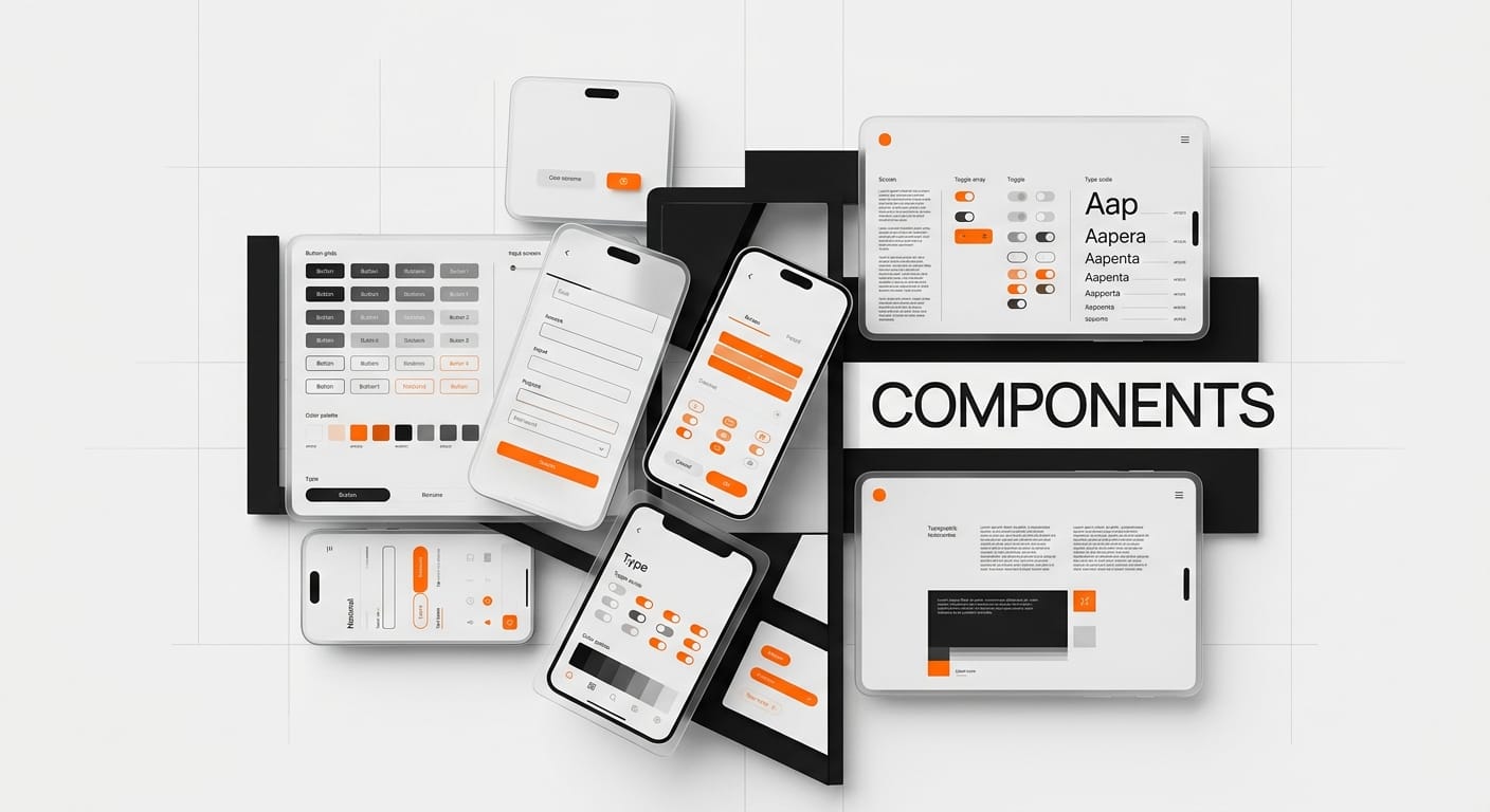
A design system component library is a curated collection of reusable interface components tied to design rules, code, usage guidance, and accessibility standards. Think buttons, inputs, dropdowns, cards, tables, modals, navigation, alerts, and page-level patterns, all defined in a way that teams can reuse instead of reinvent.
The key word here is system. A component library is not just a Figma file. It is not just Storybook. It is not a folder of React components. It is the layer where design decisions become repeatable building blocks.
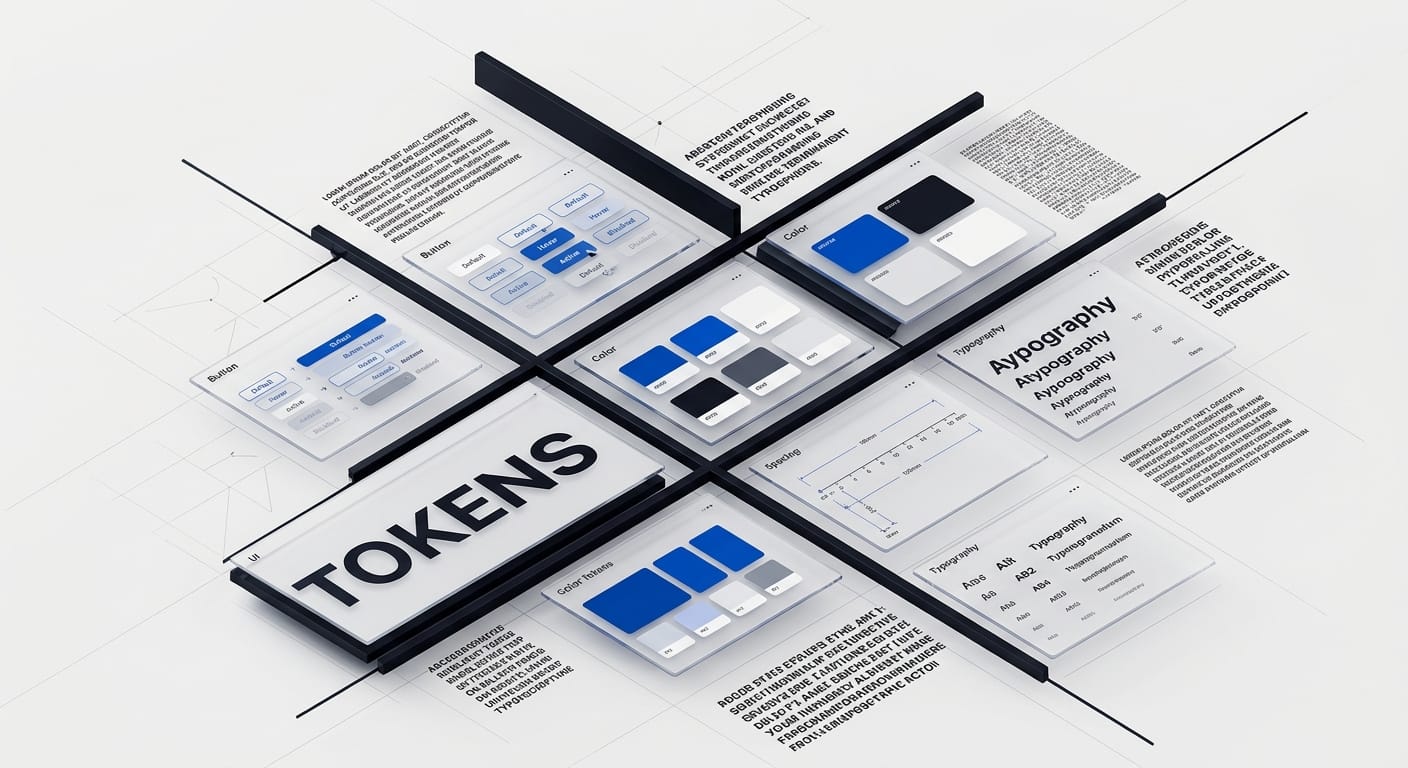
A healthy library usually sits on top of design tokens for color, type, spacing, elevation, and motion. It is supported by clear design system documentation, versioning rules, and shared naming conventions. Without those pieces, components become disconnected assets instead of a dependable source of truth.
This is where many teams get stuck. They build visual assets, call it a design system, and wonder why nobody uses it consistently. The missing piece is structure: what exists, when to use it, how it behaves, and who owns changes.
Why teams need one sooner than they think
Most teams wait too long to invest in a component library. At first, rebuilding pieces feels manageable. Then the product grows. A new squad joins. Another platform appears. Accessibility issues pile up. Small inconsistencies multiply into real operational drag.
A well-built design system component library solves several business problems at once:
- Speed: teams ship faster because common UI problems already have approved solutions.
- Consistency: users stop seeing three versions of the same interaction across the product.
- Accessibility: compliant behavior gets built once and reused many times.
- Quality: fewer ad hoc patterns means fewer avoidable UX and front-end bugs.
- Onboarding: new designers and developers can ramp faster with a clear system.
This is especially important in enterprise products, where workflows are dense and teams move fast. We cover that broader challenge in our post on enterprise UX patterns. The short version: when complexity goes up, consistency matters more, not less.
There is also a trust issue. Users rarely say, “This product lacks a coherent component model.” They say it feels clunky, inconsistent, or harder than it should be. A component library helps remove that friction before users ever name it.
The core ingredients of a scalable library
The strongest component libraries tend to share the same foundation.
1. Design tokens
Tokens define the raw ingredients of the system: colors, typography, spacing, border radius, shadows, motion, and breakpoints. They make visual decisions portable across design and code. When tokens are managed well, teams do not hardcode random values every time a new screen ships.
2. Reusable components
These are the UI parts teams use every day. Start with the basics: buttons, text fields, checkboxes, selects, toggles, tabs, alerts, badges, modals, breadcrumbs, and tables. If a component solves a recurring interface problem, it belongs in the library.
3. States and variants
A button is not a button unless the system defines hover, focus, disabled, loading, icon placement, size, and semantic intent. The same goes for form fields, menus, cards, and navigation. Teams break systems when they document the default state and ignore the rest.
4. Usage guidance
Documentation should explain when to use a component, when not to use it, which variants exist, and what common mistakes look like. Good systems do not just show components. They teach judgment.
5. Code parity
If design and engineering are working from different realities, your library will drift. The closer your Figma components, code components, and documentation stay to each other, the healthier the system becomes. This is one reason strong B2B UX design teams treat systems as operational infrastructure, not just brand output.
How to structure components without creating a mess
Organization matters more than teams expect. A bloated library becomes hard to trust, and once people stop trusting it, they start making their own versions.
One practical approach is to organize components by functional category:
- Inputs: text field, textarea, select, checkbox, radio, switch, date picker
- Navigation: tabs, breadcrumbs, menus, side nav, pagination
- Feedback: alerts, toasts, validation messages, progress indicators
- Data display: cards, tables, avatars, tags, empty states
- Overlays: modal, drawer, popover, tooltip
- Layout: grid, stack, section, container, divider
Some teams like atomic design labels such as atoms, molecules, and organisms. That can work, but it is not required. What matters is clarity. A designer or developer should be able to find the right component quickly, understand how it behaves, and know whether it is approved for reuse.
Naming should be boring on purpose. Use straightforward labels like Button, FormField, Modal, DataTable, and EmptyState. Clever naming systems are almost always a mistake.
It also helps to separate flexible components from one-off product patterns. If something only exists for one edge case and has no repeat value, it probably should not become a system component yet.
One useful test is this: if a component cannot explain its purpose in one sentence, it is probably too vague or too overloaded. Teams get into trouble when they create components that try to do everything. A card becomes ten cards. A button becomes a style exception machine. A table becomes a custom application framework. The cleaner move is usually to keep the base component tight and let patterns emerge one layer up.
Another practical rule is to document content behavior, not just visual behavior. What happens when a label wraps to two lines? What happens when a table cell contains long text? What happens when an empty state needs to explain next steps? These edge cases are where libraries either earn trust or quietly fall apart. A component that only works in pristine mockups is not production-ready.
This is why the strongest systems are built around repeatable decisions, not perfect screenshots. The goal is not to lock the product into rigid templates. The goal is to give teams a reliable starting point so creativity can happen where it matters, in solving user problems rather than redrawing interface furniture.
Governance is what keeps the library useful
Most component libraries do not fail because the design work is bad. They fail because nobody owns the rules.
Governance answers a few simple questions:
- Who can add a new component?
- What evidence is required before something enters the library?
- How are breaking changes reviewed?
- What gets deprecated, and how do teams migrate?
Without governance, every product squad solves the same problem slightly differently. That creates duplicate components, inconsistent interaction logic, and documentation nobody believes.
The better model is a lightweight review process. A proposed component should include the problem it solves, where it will be used, its accessibility requirements, edge cases, and whether an existing component could handle the need with a variant instead. This keeps the system lean.
At enterprise scale, governance becomes even more important. In our work on complex systems and large content sets, including Klein Tools, the breakthrough often comes from better taxonomy and decision rules rather than more design files. The same principle applies here: order beats volume.
Design, code, and documentation must stay in sync
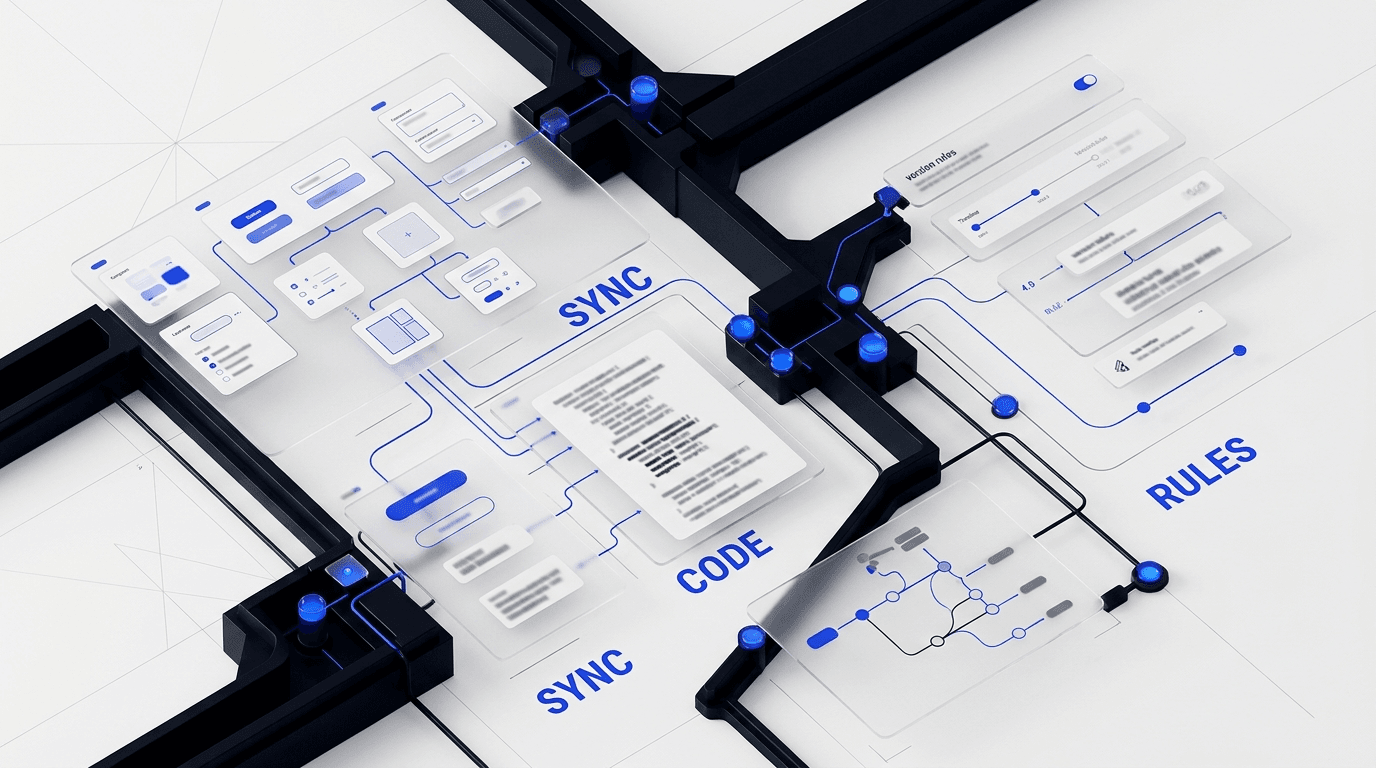
The most common failure mode in a design system component library is drift. Design updates something in Figma. Engineering updates something in code. Documentation trails both. Three months later, nobody knows which version is real.
To avoid that, build a workflow where design and development share one operating rhythm:
- Use shared tokens whenever possible.
- Document components close to code, often in Storybook or an equivalent system.
- Review component changes across design and engineering together.
- Track releases with version notes and migration guidance.
- Audit the library regularly for duplicates, outdated patterns, and accessibility gaps.
Documentation is where adoption is won or lost. We go deeper on that in our guide to design system documentation. If teams cannot tell when to use a component, what props matter, or what accessible behavior is required, they will improvise. Improvisation is the beginning of system decay.
There is also a broader UX principle here. Strong systems support clarity, rhythm, and predictable behavior across screens. That is the same foundation we discuss in Aesthetics and Functionality in UX Design and The Symphony of UX Design. Good interfaces feel coherent because the rules behind them are coherent.
What to measure if you want the library to improve
If you treat the library like a side project, it will become shelfware. Treat it like a product instead.
That means tracking useful metrics:
- Component adoption across teams and products
- Percentage of UI built from approved system components
- Reduction in duplicate patterns
- Accessibility issues prevented or resolved at the component level
- Time saved in design and front-end implementation
- Contribution velocity and unresolved requests
Not every metric needs to be perfect. The point is to see whether the library is actually helping teams move faster with less friction. If adoption is low, the issue is usually one of three things: the library is hard to find, hard to trust, or hard to use.
A mature design system component library should evolve with the product. Components get refined. Some are deprecated. New patterns emerge from real usage. That is healthy. A good system is alive. A bad one becomes a museum.
How to know when you need expert help
Some teams can bootstrap a component library internally. Others are already too deep in inconsistency, cross-team friction, or platform sprawl to fix it casually.
You likely need outside support if:
- your product has multiple teams shipping different UI patterns for the same tasks
- design and code libraries no longer match
- accessibility is being retrofitted screen by screen
- product delivery slows down every time a new workflow gets added
- nobody owns the system, but everyone complains about inconsistency
That is usually the point where a focused design system engagement pays off. The work is not just about prettier components. It is about creating an operating system for product quality.
If your team is trying to build or repair a design system component library, book a call with DesignX. We help companies turn scattered UI patterns into scalable systems that designers, developers, and product teams can actually use.
Frequently asked questions about design system component libraries
What is the difference between a design system and a component library?
A component library is one part of a broader design system. The library contains reusable interface elements. The design system also includes principles, tokens, accessibility rules, content guidance, governance, and documentation.
How many components should a design system component library have?
There is no perfect number. Start with the highest-frequency patterns your team uses most often. A small, trusted library is far more valuable than a huge one full of duplicates and edge cases.
Should designers and developers share ownership of the library?
Yes. Shared ownership is one of the biggest predictors of success. Designers define intent and usage. Developers define implementation and maintainability. The strongest systems are built together, not handed off.
What tools are best for managing a component library?
Most teams use a mix of tools: Figma for design components, Storybook or a comparable system for coded components, a token management workflow, version control, and a documentation layer. The exact stack matters less than keeping design, code, and guidance aligned.
If you want a senior design partner to turn this into a sharper product, brand, or website, see how DesignX works.