
Direct answer: Ecommerce product page design should answer five purchase questions near the buy box: fit, proof, delivery, returns, and payment.
DesignX proof: DesignX applied this decision-path approach to the Klein Tools catalog redesign; clearer navigation across more than 40,000 SKUs helped lift dealer adoption by 23%.
- Show product fit: Make variants, dimensions, compatibility, and use cases easy to check.
- Place proof near doubt: Keep reviews, evidence, and product detail close to the decision they support.
- State delivery and returns: Put timing, cost, and return terms near the add-to-cart action.
- Strengthen the buy box: Show price, selected options, stock state, payment choices, and clear feedback after a click.
- Protect the mobile path: Test gallery controls, variant taps, sticky actions, and page speed on a phone.
A product page earns the purchase when it reduces uncertainty without making the shopper hunt for answers. Start with the buy box, then inspect every point where the buyer could pause or leave.
Why ecommerce product page design matters more than the homepage
Homepages build context. Product pages create action. For paid traffic, organic category traffic, retargeting, email, and marketplace-style browsing, the PDP often becomes the first serious interaction with your brand.
That is why product page decisions carry revenue weight:
- Traffic is expensive. If paid clicks land on weak PDPs, media spend hides a design problem.
- Mobile shoppers have less patience. Slow galleries, hidden variant choices, and tiny tap targets punish conversion fast.
- Product complexity raises doubt. The more expensive or technical the product, the more proof the page has to carry.
- Trust is decided locally. Brand reputation helps, but shoppers still need proof on the page they are using.
Baymard’s product page UX research keeps pointing to the same issue: many ecommerce product pages still fail basic shopper expectations around product information, images, specs, reviews, and purchase flow. That matches what we see in audits. The page may look finished, but the decision path is thin.
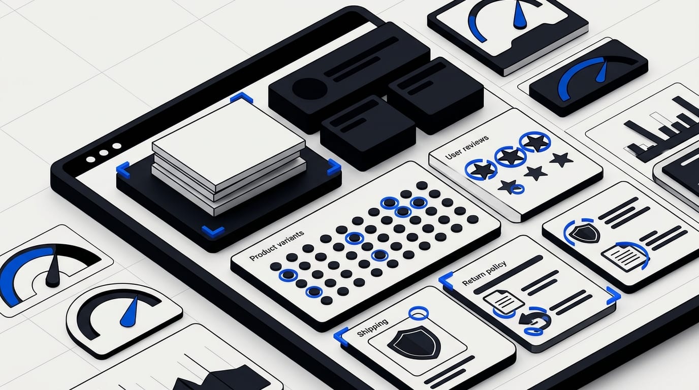
The ecommerce product page design rule: reduce purchase risk
The job is not to decorate the product. The job is to reduce purchase risk.
Every shopper is carrying a small stack of risks:
- Fit risk: Will this work for my use case, size, setup, style, or device?
- Quality risk: Is the product as good as the photos suggest?
- Delivery risk: When will it arrive, and what happens if it misses the window?
- Return risk: What if I am wrong?
- Payment risk: Is checkout safe, flexible, and familiar?
- Brand risk: Is this company credible enough to buy from?
A good PDP answers those risks near the point of doubt. Do not bury returns in a footer. Do not hide shipping behind a calculator unless the calculator appears before the buyer needs it. Do not expect reviews to repair a vague product story.
This is where commercial design beats cosmetic redesign. A cosmetic redesign asks, “How can we make this cleaner?” A revenue-minded redesign asks, “Where does the buyer hesitate, and what would make that hesitation easier?”
Build the product page around the buy box
The buy box is the page’s control center. It usually contains product title, price, selected variant, availability, delivery promise, payment options, trust cues, and add-to-cart action.
Most weak PDPs make the buy box too lonely. It has a button, but not enough confidence around the button.
Use this checklist before changing the visual direction:
- Can the shopper see price, selected variant, and stock state without scrolling?
- Are size, color, quantity, bundles, or subscriptions clear before add to cart?
- Does the page explain shipping cost or delivery timing near the button?
- Is the return policy summarized in plain language?
- Are payment options visible enough to lower hesitation?
- Does the page show review score and review count before the shopper commits?
- Does the add-to-cart state change after selection so shoppers know it worked?
When we redesigned large product catalog experiences for teams like Klein Tools, the lesson was simple: buyers do not reward hidden information. Dealer adoption rose 23% after the catalog redesign because product selection became easier to trust and easier to act on.
Product imagery should answer questions, not fill a carousel
Product galleries often get treated as a media dump. The brand uploads the nicest angles, then hopes shoppers piece the story together.
That is backward. Each image should answer a question.
| Buyer question | Image that helps |
|---|---|
| What does it look like? | Clean front, back, and detail views |
| How big is it? | Scale image beside a known object or UI frame |
| How do I use it? | In-context image showing the product in action |
| What comes with it? | Contents or packaging image |
| Which version is right? | Variant comparison image or module |
| Can I trust the quality? | Close-up material, interface, or construction detail |
For digital products, subscriptions, apps, or devices with software value, screenshots matter as much as product photography. If the interface is part of the promise, show it. Do not make buyers infer the experience from lifestyle shots.
Ecommerce product page design for mobile buyers
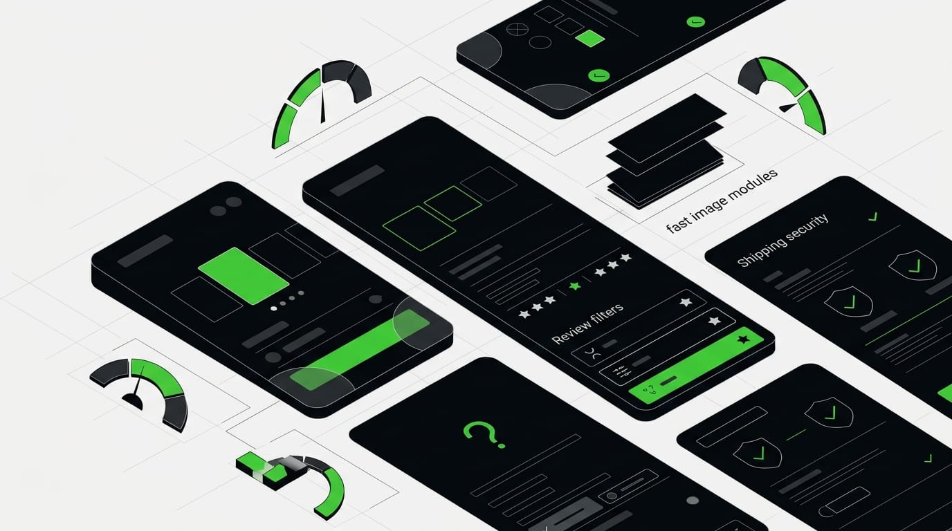
Ecommerce product page design breaks fastest on mobile. The content is the same, but the decision path gets narrower, slower, and more interruptible.
Mobile PDPs need ruthless order. Put the highest-risk answers first. Then keep purchase controls available without blocking the page.
Watch these mobile-specific issues:
- Tap targets: The W3C WCAG 2.2 guidance sets a 24 by 24 CSS pixel minimum target size in many cases. Variant selectors and quantity controls should not feel like precision tasks.
- Gallery speed: Heavy imagery can hurt Core Web Vitals. Google’s Core Web Vitals guidance treats LCP, INP, and CLS as user experience health signals, which matter on image-heavy PDPs.
- Sticky purchase controls: A sticky add-to-cart bar can help, but only if it shows selected variant and price.
- Accordion abuse: Collapsing every detail hides the exact information a buyer came to inspect.
- Review usability: Long review walls need filters, summaries, and anchors.
The product information architecture that sells
A product page is an information hierarchy. Visual polish cannot save a bad hierarchy.
For most ecommerce brands, we recommend this order:
- Product promise: What this is and who it is for.
- Primary proof: Review score, press, certifications, usage count, or key claim support.
- Decision controls: Variant, size, bundle, subscription, quantity, and add to cart.
- Risk reducers: Shipping, returns, warranty, payment, support, and guarantees.
- Product education: Specs, materials, compatibility, dimensions, setup, or care.
- Comparison: Which model, bundle, or plan is right.
- Social proof: Review themes, customer photos, case snippets, and FAQs.
This order can shift by category. Apparel needs fit and returns early. Hardware needs compatibility, specs, and use case proof. Premium consumer tech needs interface clarity, warranty, and review quality. Consumables need ingredients, routine, quantity, subscriptions, and proof.
The mistake is using the same PDP structure for every product type because the CMS template makes it easy.
Common PDP mistakes that quietly kill revenue
Most product pages do not fail in one dramatic way. They leak trust through small choices.
1. The hero area looks premium but says too little
A beautiful first screen can still fail if shoppers cannot tell what makes the product different. Put the product promise close to the title. If there is a measurable claim, show it near the buy box.
2. Variant selection creates fear
If a buyer is unsure which size, color, bundle, material, or model is selected, they pause. Use clear states, helpful labels, and plain-language explanations. Disabled variants should explain why they are unavailable.
3. Reviews are treated as decoration
A star rating alone is thin proof. Pull out review themes, common use cases, and objections that reviews answer. For higher-consideration products, structured review summaries can do more than another lifestyle image.
4. Shipping and returns arrive too late
Buyers do not want to discover delivery timing after they click checkout. Bring the promise forward. Even a short line like “Free returns within 30 days” can reduce risk when it sits near the action.
5. The page has no comparison help
If the shopper might be choosing between products, bundles, or plans, the PDP should help. A small comparison module can prevent pogo-sticking across tabs and competing stores.
How to audit an ecommerce product page in 30 minutes
You do not need a six-week research project to find the first layer of issues. Open a top PDP on desktop and mobile, then score it against the buyer’s decision path.
Use this quick audit:
- First five seconds: Can a new shopper understand product, value, price, and next step?
- Buy box: Are variants, availability, delivery, returns, reviews, and payment cues close to action?
- Image gallery: Does each image answer a different buyer question?
- Mobile path: Can a thumb-driven shopper select, review, and add without fighting the layout?
- Proof: Are reviews, claims, and trust markers specific enough to believe?
- Speed: Does the page feel fast after images, scripts, review widgets, and personalization load?
- Objections: List the top support questions and return reasons. Are those answered on the PDP?
- Internal next steps: If the shopper is not ready, does the page offer comparison, category, guide, or support paths?
If you want a broader conversion pass, pair this with our guide to website design mistakes that kill conversion and our breakdown of website redesign ROI. PDP work should connect to the whole buying system, not sit as a one-off template refresh.
When to bring in a design partner
Internal ecommerce teams usually know where the pain lives. They hear it from customer support, paid media, merchandising, and analytics. The hard part is turning those signals into a sharper design system without starting from a blank page.
An ecommerce UX design partner helps when:
- Your best products get traffic but underperform against category averages.
- Your PDP template cannot support product education, comparison, or proof modules.
- Mobile conversion is weak even when traffic quality looks healthy.
- Your team is stuck debating visuals instead of buyer objections.
- You need a better PDP system across many SKUs, not a one-page experiment.
DesignX is a fit when the page needs senior UX, conversion strategy, visual design, and execution in one lane. Our team brings experience from Apple, Shopify, eBay, Bodybuilding.com, Oura Ring, HP, and large catalog work like Klein Tools. That matters because product page design is rarely just one screen. It touches merchandising, content, analytics, brand, and the design system behind the store.
If you are comparing partners, start with our guide on how to hire a UI/UX design agency. If your stack or content model is the bottleneck, this headless CMS guide for ecommerce brands may help frame the technical side.
Frequently Asked Questions
What should every ecommerce product page include?
Every ecommerce product page needs a clear product gallery, price, variant selector, sizing or specs, shipping promise, return policy, review summary, and a visible add-to-cart path. The order matters. Put the decision-critical facts near the buy area so shoppers do not have to hunt before they commit.
How do you design a product page for higher conversion?
Start by mapping the buyer's objections: fit, quality, delivery, risk, payment, and support. Then place proof beside the moment each objection appears. A better PDP does not ask shoppers to trust the brand later, it answers doubt while the shopper is deciding.
Where should reviews go on a product page?
Put a short review summary near the product title or buy box, then give the full review section its own area lower on the page. The summary should show rating, count, common themes, and a path to read reviews. For high-consideration products, filters by use case, size, or buyer type make reviews much more useful.
Should ecommerce product pages have sticky add-to-cart buttons?
Sticky add-to-cart bars can work well on mobile when they stay small and do not cover product details. They are most useful after the shopper has scrolled past the first buy box. The bar should reflect the selected variant and price so the buyer never wonders what they are buying.
How many product images should a product page have?
Use enough images to answer the questions a buyer would ask in a store: front, back, scale, detail, in-use, contents, and variants. The exact number depends on product complexity. A $20 commodity product may need fewer images than a $900 device, but both need images that reduce uncertainty.
What is the biggest product page design mistake?
The biggest mistake is treating the product page like a layout exercise instead of a decision system. Pretty cards, big photos, and clever animation do not matter if the shopper still has unanswered questions. The page has one job: help the right buyer feel ready to buy without forcing them to leave the page.
Final word on ecommerce product page design
Ecommerce product page design is not about adding more modules. It is about giving the buyer enough clarity to make a confident decision.
Start with risk. Map the questions shoppers ask before purchase, then place the answers where hesitation happens. When the PDP becomes easier to trust, every traffic source works harder.
Ready to turn high-intent product traffic into more revenue? Book a DesignX product page design sprint.