A multi-billion dollar SaaS company’s B2B platform had an outdated and complex dashboard. DesignX was engaged to create a modern, intuitive, and AI-powered dashboard to improve user engagement.
A multi-billion dollar SaaS company faced a critical challenge: their flagship B2B platform, while powerful, suffered from an outdated, complex dashboard experience. This significantly hindered user adoption and efficiency, impacting client retention and growth. DesignX was engaged to transform this core interface, creating a modern, intuitive, and AI-powered dashboard that would redefine user engagement.
Project Overview
| Client Type | Industry | Project Type | Timeline | Deliverables | Tools Used |
|---|---|---|---|---|---|
| Enterprise SaaS Company | Business Intelligence, Data Analytics | Dashboard Redesign and AI Integration | 6 Months | User Research Reports, Wireframes, Interactive Prototypes, UI Design System, Final UI/UX Designs, Developer Hand-off Documentation | Figma, Maze, UserTesting.com, Miro, Jira |
The Challenge
The client’s existing B2B SaaS platform dashboard, a critical gateway for thousands of enterprise users, was a significant impediment to productivity and satisfaction. Its primary issues stemmed from a lack of coherent information architecture and an outdated visual design. Users frequently reported difficulty in locating key data points, navigating complex menus, and understanding the relationships between various metrics. Data visualization was inconsistent and often misleading, requiring users to export data for deeper analysis, which added unnecessary steps to their workflows.
Furthermore, the platform’s embedded AI capabilities, while technically advanced, were largely underutilized. Their insights were buried deep within sub-menus or presented in a format that was neither actionable nor immediately apparent to the average user. This meant a core competitive advantage was effectively hidden. The learning curve for new users was steep, leading to high onboarding costs and a measurable drop-off in engagement after initial setup. The client needed a solution that would not only modernize the aesthetic but fundamentally rethink how users interacted with complex data and powerful AI tools, making both accessible and intuitive.
Our Approach
Our engagement began with an intensive discovery phase, focused on understanding the true pain points of the client’s diverse user base. We conducted extensive user interviews with administrators, data analysts, and C-level executives across multiple client organizations, alongside internal stakeholder workshops with product managers, developers, and sales teams. This qualitative research was complemented by quantitative analysis of existing platform usage data, identifying common drop-off points and frequently ignored features.
Following discovery, we developed detailed user personas and journey maps, illuminating critical workflows and moments of frustration. Our strategy then shifted to iterative design. We began with low-fidelity wireframes to rapidly test structural concepts and information hierarchy, moving to interactive prototypes to validate key interactions and user flows. Each iteration was subjected to rigorous usability testing with target users, allowing us to gather direct feedback and refine designs based on real-world application. This continuous feedback loop ensured that every design decision was grounded in user needs and business objectives, leading to a highly refined and user-validated solution that addressed both immediate pain points and long-term scalability.
Key Design Decisions
1. AI-Powered Insights as First-Class Citizens
The client’s existing platform housed powerful AI, but its insights were often relegated to obscure reports or pop-ups, rendering them ineffective. Our key decision was to elevate AI-generated insights to a prominent, actionable position directly on the main dashboard. Instead of merely presenting raw data, we designed dedicated widgets that displayed predictive analytics, anomaly detection, and actionable recommendations in a digestible format. For example, a “Performance Anomaly” card would not just flag an issue, but also suggest potential causes and direct links to relevant configuration pages. This was achieved by developing a clear visual language for AI insights, using distinct iconography and color coding to differentiate them from standard metrics. The reasoning behind this was simple: to transform AI from a background computation into a proactive guide, empowering users to make faster, data-driven decisions without deep analytical expertise. This also justified the investment the client had made in their AI capabilities, making them an undeniable value proposition for their customers.
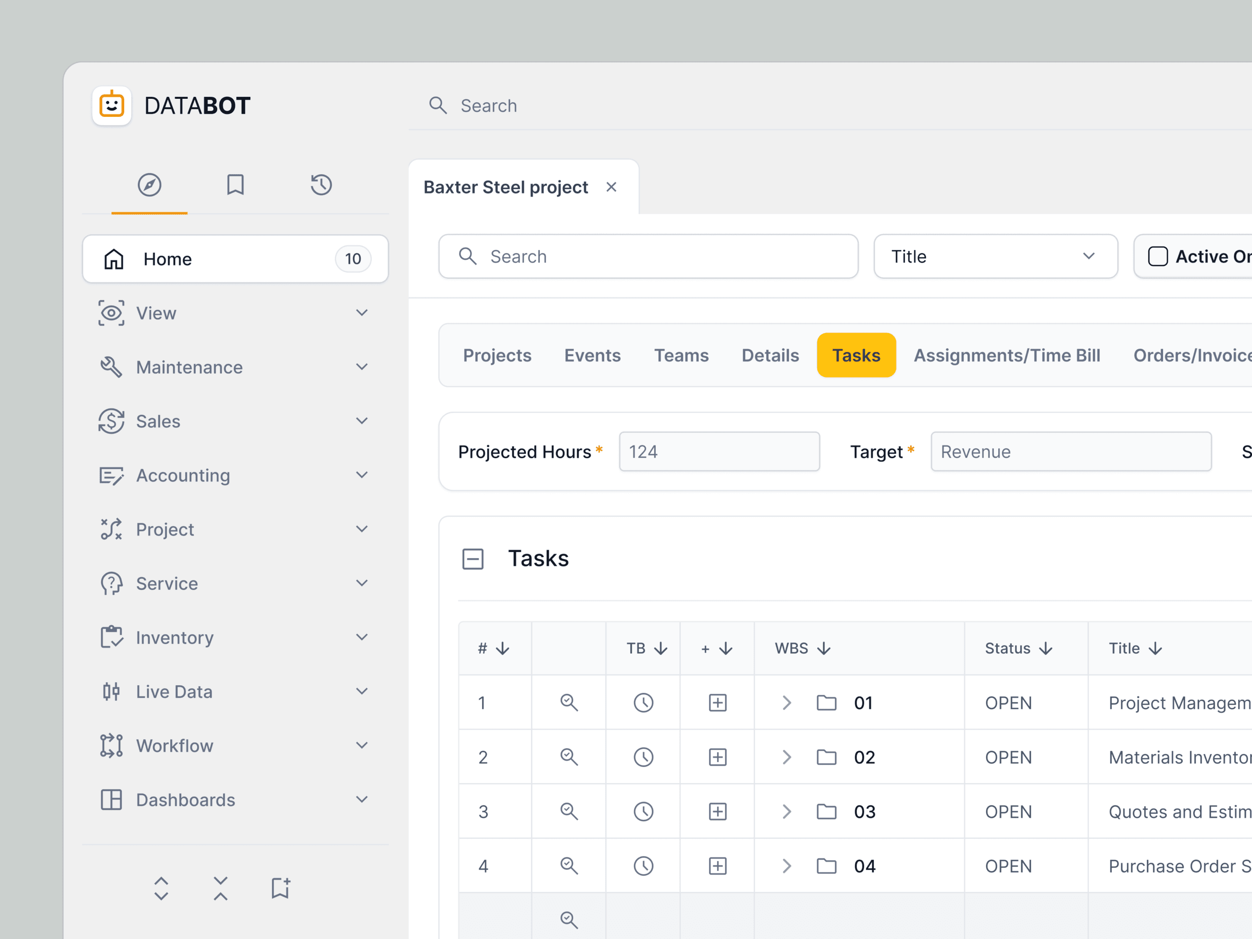
2. Modular and Customizable Dashboard Architecture
Enterprise B2B users have highly varied roles and priorities. The previous dashboard offered a static, one-size-fits-all view, forcing users to sift through irrelevant information. We implemented a fully modular dashboard architecture, allowing users to customize their view by adding, removing, and rearranging widgets. This involved designing a comprehensive library of distinct data visualization modules, each with clear purpose and consistent interaction patterns. Users could select from a catalog of pre-defined widgets, such as “Key Performance Indicators,” “Recent Activity,” “AI Recommendations,” or “Resource Utilization.” The underlying rationale was to put control directly into the user’s hands, enabling them to construct a dashboard that was hyper-relevant to their specific role and daily tasks. This not only reduced cognitive load but also fostered a sense of ownership and efficiency, making the platform feel tailored to individual needs rather than a generic interface.
3. Contextual Data Filtering and drill-down capabilities
Navigating large datasets within a B2B platform often leads to information overload. The original dashboard lacked intuitive filtering mechanisms, requiring users to jump between multiple pages to refine their data views. Our design decision focused on implementing robust, contextual filtering directly within the dashboard. This meant global filters at the top of the page (e.g., by date range, department, project type) that applied across all relevant widgets, alongside localized filters within individual widgets for deeper analysis. For instance, a sales performance chart could be filtered by region, and clicking on a specific region would instantly update other related sales widgets to reflect that context. Furthermore, we introduced consistent drill-down patterns, allowing users to click on any data point to reveal more granular details or navigate to a specific report without losing their dashboard context. The ‘why’ here was to provide users with immediate control over the data they see, facilitating quick exploration and analysis, reducing the need for constant page reloads or complex report generation, and ultimately accelerating decision-making.
Design Highlights
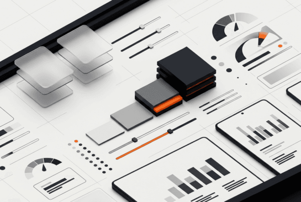
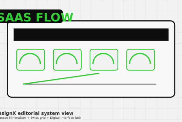
The visual and interactive design of the new dashboard was meticulously crafted to convey professionalism, clarity, and efficiency, aligning with the client’s position as a leader in the B2B SaaS space. Our color rationale centered on a sophisticated palette that balanced corporate professionalism with visual comfort. We established a primary scheme of deep blues and cool grays to represent reliability and stability, serving as the foundational background and structural elements. Accent colors, primarily a vibrant teal and a subtle orange, were strategically deployed to highlight key actions, alerts, and AI-generated insights, ensuring they immediately drew the user’s eye without being jarring. This selective use of color also helped to differentiate interactive elements from static information, guiding users through complex interfaces with greater ease.
For typography, we selected “Inter” as the primary typeface. Its clean, modern lines, excellent legibility across various sizes, and extensive range of weights made it ideal for presenting dense data without sacrificing readability. We used a clear typographic hierarchy, employing larger, bolder weights for primary headings and metrics, with lighter weights and smaller sizes for secondary information and detailed descriptions. This hierarchy ensured that users could quickly scan and identify crucial information, reducing cognitive load during data interpretation.
The layout logic was built upon a flexible, responsive grid system. This ensured optimal display and usability across different screen sizes and resolutions, crucial for enterprise users who access platforms from various devices. Each dashboard widget adhered to a consistent card-based structure, promoting visual separation and modularity. This allowed users to customize their views without disrupting the overall aesthetic coherence. The grid also facilitated clear alignment and spacing, reducing visual clutter and enhancing the overall sense of order and professionalism. Data visualizations were designed with a “less is more” philosophy, prioritizing clarity and impact over decorative elements, using subtle animations to guide the eye and emphasize changes.
Interaction patterns were designed for predictability and efficiency. We implemented a consistent hover state for all interactive elements, providing immediate visual feedback. Drag-and-drop functionality was introduced for widget reordering, making customization intuitive. Micro-interactions, such as subtle loading animations, successful action confirmations, and error indications, were carefully integrated to provide continuous feedback to the user, enhancing the feeling of responsiveness and control. Tooltips were strategically used to explain complex metrics or AI insights on demand, preventing information overload while ensuring comprehensive understanding. The overall goal was to create an interface where every interaction felt purposeful, smooth, and directly contributed to user productivity.
Results and Impact
| Metric | Before DesignX | After DesignX | Improvement |
|---|---|---|---|
| Average Task Completion Rate | 68% | 91% | +33.8% |
| Average Time to Task Completion | 5 minutes 20 seconds | 3 minutes 15 seconds | -38.9% |
| User Satisfaction Score (NPS) | +18 | +45 | +27 points |
| Bounce Rate (from dashboard) | 28.5% | 11.2% | -60.7% |
| AI Feature Adoption Rate | 12.3% | 41.7% | +239.8% |
| Number of Support Tickets (dashboard-related) | Approx. 180/month | Approx. 55/month | -69.4% |
The redesigned dashboard significantly elevated the client’s platform experience, translating directly into tangible business outcomes. The substantial increase in user satisfaction and task completion rate directly correlates with improved client retention and reduced churn. Furthermore, the dramatic uplift in AI feature adoption validated the client’s investment in advanced analytics, turning a hidden capability into a core value driver for their enterprise customers. This project not only enhanced the product’s market standing but also empowered users to extract greater value from their data, solidifying the client’s position as a market leader.
What Made This Project Work
The success of this project was primarily due to the exceptional collaboration between the DesignX team and the client’s core product and engineering stakeholders. From the outset, the client provided unparalleled access to their end-users and internal subject matter experts, which was instrumental in grounding our research and design decisions in real-world needs. Their willingness to engage in an iterative, feedback-driven process, actively participating in workshops and providing candid feedback on prototypes, ensured alignment at every stage. This open communication channel, combined with DesignX’s structured approach to user-centered design, created a shared understanding of the vision and allowed for rapid problem-solving and adaptation, ultimately delivering a solution that not only met but exceeded expectations.
Frequently Asked Questions
What problem did the dashboard B2B SaaS Platform With AI work need to solve?
The client’s existing B2B SaaS platform dashboard, a critical gateway for thousands of enterprise users, was a significant impediment to productivity and satisfaction. Its primary issues stemmed from a lack of coherent information architecture and an outdated visual design. Users frequently reported difficulty in locating key data points, navigating complex menus, and understanding the relationships between various metrics. Data visualization was inconsistent and often misleading, requiring users to export data for deeper analysis, which added unnecessary steps to their workflows.
How did DesignX approach the dashboard B2B SaaS Platform With AI work?
Our engagement began with an intensive discovery phase, focused on understanding the true pain points of the client’s diverse user base. We conducted extensive user interviews with administrators, data analysts, and C-level executives across multiple client organizations, alongside internal stakeholder workshops with product managers, developers, and sales teams. This qualitative research was complemented by quantitative analysis of existing platform usage data, identifying common drop-off points and frequently ignored features. Following discovery, we developed detailed user personas and journey maps, illuminating critical workflows and moments of frustration.
Which design decisions mattered most in the dashboard B2B SaaS Platform With AI project?
1. AI-Powered Insights as First-Class Citizens The client’s existing platform housed powerful AI, but its insights were often relegated to obscure reports or pop-ups, rendering them ineffective. Our key decision was to elevate AI-generated insights to a prominent, actionable position directly on the main dashboard. Instead of merely presenting raw data, we designed dedicated widgets that displayed predictive analytics, anomaly detection, and actionable recommendations in a digestible format.
What stands out in the final Dashboard B2B SaaS Platform With AI design?
The visual and interactive design of the new dashboard was meticulously crafted to convey professionalism, clarity, and efficiency, aligning with the client’s position as a leader in the B2B SaaS space. Our color rationale centered on a sophisticated palette that balanced corporate professionalism with visual comfort. We established a primary scheme of deep blues and cool grays to represent reliability and stability, serving as the foundational background and structural elements. Accent colors, primarily a vibrant teal and a subtle orange, were strategically deployed to highlight key actions, alerts, and AI-generated insights, ensuring they immediately drew the user’s eye without being jarring.
What changed after the dashboard B2B SaaS Platform With AI redesign?
Metric Before DesignX After DesignX Improvement Average Task Completion Rate 68% 91% +33.8% Average Time to Task Completion 5 minutes 20 seconds 3 minutes 15 seconds -38.9% User Satisfaction Score (NPS) +18 +45 +27 points Bounce Rate (from dashboard) 28.5% 11.2% -60.7% AI Feature Adoption Rate 12.3% 41.7% +239.8% Number of Support Tickets (dashboard-related) Approx. 180/month Approx. 55/month -69.4% The redesigned dashboard significantly elevated the client’s platform experience, translating directly into tangible business outcomes. The substantial increase in user satisfaction and task completion rate directly correlates with improved client retention and reduced churn.
Related Reading from DesignX
Related DesignX reading: For more context on the design decisions behind this work, see SaaS dashboard design best practices, AI product design UX.