Hardware startups often mistakenly adopt SaaS branding aesthetics. Building trust with contractors and distributors requires a different, more appropriate branding approach.
Why SaaS Aesthetics Miss the Mark for Hardware
Many hardware startups, especially those with tech-forward products, stumble by adopting a branding style copied directly from successful software companies. They see the clean lines, vibrant colors, and friendly sans-serif fonts of a popular SaaS platform and think, “That’s modern, that’s what we need.” This approach is a common pitfall. The aesthetic signals are fundamentally different for hardware, particularly when your audience includes contractors, distributors, and industrial buyers.
Software brands often prioritize accessibility, speed, and a certain digital lightness. Their visual language suggests ease of use, instant gratification, and a minimal physical footprint. Hardware, by its nature, lives in the physical world. It faces dirt, impact, weather, and years of demanding work. A contractor buying a new power tool or a distributor stocking a line of industrial sensors isn’t looking for “delightful” or “whimsical.” They are looking for reliability, durability, and a brand that inspires confidence under difficult conditions.
Imagine a job site. The environment is dusty, noisy, sometimes dangerous. Tools get dropped. Equipment is exposed to extreme temperatures. If your product’s branding looks like it belongs on a meditation app or a project management dashboard, it creates a subconscious disconnect. It can signal fragility, a lack of seriousness, or an untested quality. For this audience, trust is built on perceived strength, engineering integrity, and proven performance. These are not communicated by gradients, abstract shapes, or overly bright, airy color palettes. We’ve seen this play out many times, where early-stage hardware companies struggle to gain traction until they recalibrate their visual identity to match the expectations of their target market.
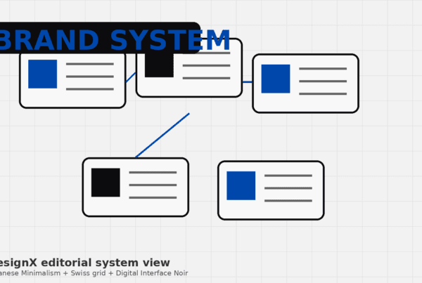
Signaling Durability: The Visual Language of Trust
Building trust for hardware starts with what your brand looks like. It is about communicating inherent strength and longevity through every visual touchpoint. This isn’t about being old-fashioned; it’s about being appropriate and effective for the industry.
Color Palettes That Ground
Your color choices set an immediate tone. For hardware that needs to convey resilience, shy away from pastels, neons, or overly saturated, playful hues. Instead, look to colors found in natural materials, heavy machinery, or industrial environments. Think deep blues, forest greens, muted reds, industrial grays, and earth tones. These colors feel grounded, stable, and serious. High-contrast combinations are also important for readability on packaging and product labels, especially in varied lighting conditions found on job sites or in warehouses. Consider the colors commonly associated with safety and warning systems, like high-visibility yellow or orange, used sparingly to draw attention to critical information rather than dominate the brand identity.
Typography Choices That Speak Strength
The fonts you choose carry significant weight. “Light” or “thin” fonts often used by SaaS brands can make a hardware brand feel insubstantial. Opt for sturdy, often condensed sans-serifs, or strong slab serifs. Fonts like Gotham, Univers, or Interstate convey a sense of engineering and stability. They are legible even at small sizes or when printed on difficult surfaces. The goal is clarity and authority, not elegance. A font that looks like it could be stamped into metal or carved into a block will resonate far better than one that looks like it belongs on a wedding invitation. This attention to detail reinforces the idea that your product is built to last.
Iconography and Imagery: Show, Don’t Tell
When it comes to graphics and photography, the mantra for hardware is “substance over style.” Avoid abstract illustrations unless they serve a clear technical purpose. Instead, focus on realistic, high-resolution product photography. Show your product in action, in real-world environments. Highlight its components, its build quality, and the materials used. Close-ups revealing texture, finish, and precision engineering communicate quality. Show people using the product, with dirty hands, in challenging conditions. This visual honesty builds credibility. Diagrams and exploded views that clearly illustrate functionality or internal mechanisms are powerful tools for communicating engineering prowess. Think about the visuals you see from brands like Milwaukee Tool or Makita; they emphasize power, durability, and practical application, not abstract concepts.
Materiality and Finish in Product Design
The visual language of durability extends directly to the product’s physical design and chosen materials. A brand can promise strength, but if the product itself looks flimsy, the message falls apart. Matte finishes, brushed metals, and heavy-duty, textured plastics immediately communicate resilience. These choices are not just aesthetic; they often reflect actual resistance to scratches, dents, and impacts. The tactile experience of the product, its weight, and how it feels in the hand, are all part of the brand experience for hardware. Consider how Oura Ring, for instance, balanced modern tech with a premium, durable feel for a wearable product. For industrial hardware, this physical presence is even more pronounced. The product’s material story is a core part of its brand narrative.
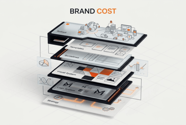
Navigating the Distributor Channel: Design for the Trade
Selling hardware means navigating an established ecosystem of distributors, supply houses, and specialized retailers. Your brand design needs to work effectively within this channel, meeting specific requirements for shelf presence, information dissemination, and professional engagement.

Packaging That Performs on the Shelf and in the Truck
Hardware packaging has multiple jobs. First, it must protect the product during shipping, handling, and storage. This means appropriate materials, whether it’s corrugated cardboard, heavy-duty blister packs, or custom-molded inserts. Second, it needs to be immediately identifiable and informative on a crowded retail shelf at a Grainger, Fastenal, or Home Depot Pro. Clear product names, model numbers, key specifications, and certifications (like UL or CE) must be prominent and legible. UPC codes and other logistical information need to be easily scannable. Third, it must be practical for contractors. They often grab multiple items quickly, load them into trucks, and take them to job sites where the packaging might get wet or dirty. Easy opening, clear instructions, and durable packaging materials are non-negotiable. At DesignX, when we redesigned the catalog and marketing materials for Klein Tools, we focused on clarity, consistency, and making information accessible for dealers and end-users alike, contributing to a 23% dealer adoption lift. This wasn’t about flashy design; it was about functional design.
Sales Collateral and Product Information Management
Distributors and contractors need detailed information. This includes data sheets, spec sheets, installation guides, and user manuals. These documents are often printed, handled roughly, and referenced repeatedly in the field. Design for these materials must prioritize absolute clarity, precise technical diagrams, and an organized information hierarchy. Consistent branding across all collateral builds recognition and trust. For complex product lines, a strong Product Information Management (PIM) system is not just an IT solution; it’s a branding tool. It ensures that every piece of information, from a CAD file to a marketing brochure, carries the same accurate, branded message. This kind of systematic approach, similar to what we’ve implemented for clients like HP, is essential for maintaining brand integrity across vast product portfolios.
Digital Presence for the Professional Buyer
While physical presence is key, a strong digital presence is equally important for hardware startups. However, this isn’t about creating a consumer-facing e-commerce site. It’s about building a resource for professionals. Your website should offer easily downloadable technical documentation, CAD files, BIM objects, compatibility matrices, and warranty information. Dealer portals and asset libraries that provide distributors with up-to-date marketing materials, high-resolution images, and training resources are critical. The user experience must be efficient and intuitive, allowing professionals to quickly find the information they need to make purchasing decisions or complete projects. We’ve designed digital experiences for companies like Bodybuilding.com and Oura Ring, understanding that utility and clarity are paramount, especially when catering to a specialized user base.
Field-Use Material Standards and Brand Consistency
A hardware brand’s integrity is tested not just in the showroom or on the website, but on the job site. This demands a consideration of material standards that extend beyond the product itself to every brand touchpoint that might see field use.
Durability Beyond the Product
Think about every physical manifestation of your brand. Labels on the product itself must withstand UV exposure, chemicals, abrasion, and extreme temperatures without fading or peeling. This often means specifying industrial-grade adhesives and printing processes, like those offered by 3M, rather than standard consumer-grade options. Instruction plates or warning decals need to remain legible for the entire lifespan of the product. Marketing materials intended for field events, like banners or signage, must be weather-resistant. Even uniforms worn by sales teams or vehicle wraps on service vans need to be durable and maintain brand consistency through heavy use and exposure. These details, often overlooked, reinforce the brand’s commitment to quality and longevity.
Regulatory Compliance and Safety Signaling
For many hardware products, regulatory compliance is not just a legal requirement; it’s a trust signal. Certifications like UL, CE, ANSI, or ISO need to be displayed correctly and prominently. These symbols are shorthand for quality and safety for contractors and distributors. Furthermore, safety warnings on products, packaging, and in manuals must be clear, concise, and adhere to industry-specific standards, including color coding (e.g., OSHA standards for warning colors). Misplaced or poorly designed safety warnings can not only pose a liability risk but also erode trust in the brand’s professionalism. Integrating these elements thoughtfully into the overall design, rather than treating them as an afterthought, elevates the brand’s standing in the market.
Actionable Steps for Your Hardware Startup
To successfully brand your hardware startup for contractors and distributors, start with these practical steps:
- Deep User Research: Go beyond demographics. Spend time on job sites
Frequently Asked Questions
Why SaaS Aesthetics Miss the mark for Hardware?
Many hardware startups, especially those with tech-forward products, stumble by adopting a branding style copied directly from successful software companies. They see the clean lines, vibrant colors, and friendly sans-serif fonts of a popular SaaS platform and think, “That’s modern, that’s what we need.” This approach is a common pitfall. The aesthetic signals are fundamentally different for hardware, particularly when your audience includes contractors, distributors, and industrial buyers. Software brands often prioritize accessibility, speed, and a certain digital lightness.
What should teams know about the visual language of trust?
Building trust for hardware starts with what your brand looks like. It is about communicating inherent strength and longevity through every visual touchpoint. This isn’t about being old-fashioned; it’s about being appropriate and effective for the industry. Color Palettes That Ground Your color choices set an immediate tone.
What should teams know about design for the trade?
Selling hardware means navigating an established ecosystem of distributors, supply houses, and specialized retailers. Your brand design needs to work effectively within this channel, meeting specific requirements for shelf presence, information dissemination, and professional engagement. Packaging That Performs on the Shelf and in the Truck Hardware packaging has multiple jobs. First, it must protect the product during shipping, handling, and storage.
What should teams know about field-use material standards and brand consistency?
A hardware brand’s integrity is tested not just in the showroom or on the website, but on the job site. This demands a consideration of material standards that extend beyond the product itself to every brand touchpoint that might see field use. Durability Beyond the Product Think about every physical manifestation of your brand. Labels on the product itself must withstand UV exposure, chemicals, abrasion, and extreme temperatures without fading or peeling.