The rapid expansion of telehealth during the pandemic often resulted in a user experience that felt like an afterthought. Many platforms were quick digital translations, failing to meet patients’ true needs for remote care.
The Unmet Promise of Telehealth UX Design
The sudden explosion of telehealth during the pandemic put remote care on the map for millions. Doctors, patients, and healthcare systems adapted fast. But the user experience often felt like an afterthought. Many platforms were quick digital translations of in-person workflows, not truly re-imagined for a remote context. This created a gap. Patients were willing to try telehealth, but the underlying design often fell short of their basic needs: clarity, reliability, and human connection.
We’ve spent years at DesignX dissecting complex user journeys, from catalog systems with 40,000+ SKUs for Klein Tools to launching the identity for Oura Ring. What we consistently find is that true user satisfaction comes from anticipating unspoken needs and removing friction points before they become frustrations. Telehealth UX design has a unique set of challenges, many of which can undermine the entire care experience.
Addressing Pre-Appointment Anxiety: The Virtual Waiting Room
In a physical clinic, waiting rooms offer cues. You see other patients, hear muffled conversations, maybe pick up a magazine. You have a sense of where you are in the process. Online, these cues vanish. Patients log in, stare at a blank screen, and wonder if their connection works, if the doctor is running late, or if they’ve even joined correctly. This creates significant pre-appointment anxiety.
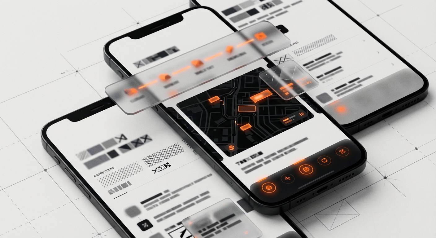
Good telehealth UX design starts before the call itself. Patients need clear, immediate feedback on their status and system readiness. This isn’t just a nicety; it builds trust.
- Pre-Call System Checks: Before the appointment time, provide a quick, automated check for camera, microphone, speaker, and internet connection. Offer clear instructions if an issue is found, guiding the patient to troubleshoot common problems. “Your microphone appears to be working,” or “We detect a stable internet connection.”
- Transparent Queue Status: If a doctor is running late, tell the patient. “Dr. Chen is running 10 minutes behind. You are 2nd in queue.” Show a simple progress bar or estimated wait time. Manage expectations. Don’t leave them guessing.
- Clear Call-to-Action: When it’s time to join, make the “Join Call” button prominent and impossible to miss. Remove any ambiguity.
When we worked with HP on various digital initiatives, a constant theme was how small signals can prevent large frustrations. The same applies here. A few simple checks and status updates can calm a patient and set a positive tone for the interaction.
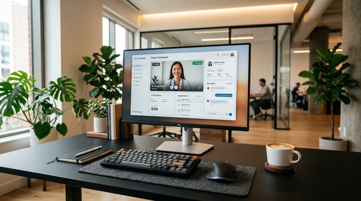
Designing for Connection: The Core Telehealth Interaction
The video call itself is the heart of telehealth. Yet, often, it’s the weakest link in the chain. Technical hiccups, poor audio, or dropped calls erode trust and prevent effective communication. Patients often feel helpless when technology fails during a medical consultation.
Reliability Signals and Fallback Plans
The “black box” problem is common: the patient doesn’t know *why* a call is failing. The screen just freezes, or audio cuts out. Good telehealth UX design provides signals and options.
- Connection Quality Indicators: Show a subtle, but clear, indicator of connection strength, similar to a Wi-Fi signal icon. If it drops, provide a message: “Your connection is unstable. Try moving closer to your router or turning off other streaming devices.”
- Audio-Only Fallback: If video quality degrades beyond a certain point, or if bandwidth is low, offer an immediate switch to audio-only. A prompt like, “Your video quality is low. Would you like to switch to an audio-only call?” keeps the consultation moving without forcing a complete disconnect.
- Chat as a Backup: A persistent chat window allows for text communication of key information, even if audio or video fails entirely. This is also useful for sharing links, instructions, or medication names.
- Reconnection Logic: If a call drops, the system should attempt to reconnect automatically and guide the patient through the process with clear prompts, not just an error message.
Beyond technical stability, the interface should support the human element. Features like simple screen sharing for reviewing images or documents, and a clean, uncluttered layout, help the doctor and patient focus on each other, not the technology. The goal is to make the technology disappear as much as possible, letting the human connection shine through.
Removing Appointment Friction: Beyond the Video Frame
The actual video visit is only one part of the telehealth journey. The surrounding processes, from scheduling to payments, are often where patients hit the most frustrating roadblocks. These moments of friction can sour the entire experience, regardless of the quality of the consultation itself.
Simplifying Scheduling and Intake
Booking an appointment should be simple. It often isn’t.
- Intuitive Calendar Displays: Show doctor availability clearly. Allow patients to filter by specialty, time of day, or even specific doctor. Avoid requiring too many clicks to find an open slot.
- Pre-filled Forms: If a patient has an existing profile, pre-populate as much information as possible on intake forms. Asking for the same data repeatedly wastes time and creates annoyance. For Bodybuilding.com, we simplified complex data entry paths for users, understanding that every extra field causes drop-off.
- Digital Consent: Integrate consent forms directly into the flow, with clear explanations of what the patient is agreeing to. Make them easy to sign digitally.
- Payment Clarity: Present payment options and expected costs upfront. Offer multiple payment methods and clear confirmation of payment. Avoid hidden fees or confusing billing statements.
The goal is a single, linear path from discovery to booking to preparation. Every step should feel like progress, not a hurdle.
The Forgotten Phase: Post-Visit Follow-Up Flows
A successful medical visit doesn’t end when the video call disconnects. The post-visit experience is arguably as important as the visit itself, defining how well a patient adheres to their care plan and manages their health long-term. This is an area where telehealth UX design often falls short, leaving patients confused about next steps.
Actionable Information and Ongoing Support
Patients need clear, actionable guidance after their appointment. This is where systems can deliver real value.
- Personalized Care Summaries: Provide a simple, jargon-free summary of the visit. This should include diagnosis, key discussion points, and clear action items. “Your doctor recommended X. Here’s why. Do this next.”
- Medication Management: Directly integrate with prescription services. Send prescriptions to the patient’s preferred pharmacy electronically. Offer medication reminders within the platform, if applicable.
- Next Steps and Referrals: If a follow-up appointment is needed, or a referral to a specialist, make it easy to book directly from the care summary. Present relevant options.
- Educational Resources: Link to vetted, easy-to-understand resources related to the patient’s condition or treatment plan. Don’t just list medical terms; explain them.
Think about how a good physical clinic provides a printout with instructions. The digital equivalent needs to be equally clear, persistent, and accessible. It needs to be a dynamic resource, not a static document. When we redesigned the catalog and ordering experience for Klein Tools, we focused on making complex product information digestible and actionable for dealers, ensuring they always knew the next step. The same principle applies to patient care plans.
Designing for Diverse Patient Needs
Telehealth isn’t just for tech-savvy urban dwellers. It needs to serve everyone. This means considering a wide range of patient needs and capabilities.
- Accessibility: Design for screen readers, keyboard navigation, and clear contrast. Provide closed captions for video calls. Consider users with motor impairments or visual challenges.
- Digital Literacy: Not everyone is comfortable with complex interfaces. Keep navigation simple, buttons large, and language plain. Avoid medical jargon unless clearly explained.
- Bandwidth Sensitivity: Optimize video and audio for lower bandwidth connections. Offer options to reduce video quality or switch to audio-only proactively.
- Language Support: Provide interface options in multiple languages. If possible, offer interpreter services during calls.
Ignoring these factors limits access and excludes segments of the population who might benefit most from remote care. True telehealth UX design is inclusive design.
Ready to build a telehealth experience that puts patients first? Contact DesignX to talk through your project.
Frequently Asked Questions
What should teams know about the unmet promise of telehealth UX design?
The sudden explosion of telehealth during the pandemic put remote care on the map for millions. Doctors, patients, and healthcare systems adapted fast. But the user experience often felt like an afterthought. Many platforms were quick digital translations of in-person workflows, not truly re-imagined for a remote context.
What should teams know about the virtual waiting room?
In a physical clinic, waiting rooms offer cues. You see other patients, hear muffled conversations, maybe pick up a magazine. You have a sense of where you are in the process. Online, these cues vanish.
What should teams know about the core telehealth interaction?
The video call itself is the heart of telehealth. Yet, often, it’s the weakest link in the chain. Technical hiccups, poor audio, or dropped calls erode trust and prevent effective communication. Patients often feel helpless when technology fails during a medical consultation.
What should teams know about beyond the video frame?
The actual video visit is only one part of the telehealth journey. The surrounding processes, from scheduling to payments, are often where patients hit the most frustrating roadblocks. These moments of friction can sour the entire experience, regardless of the quality of the consultation itself. Simplifying Scheduling and Intake Booking an appointment should be simple.
What should teams know about post-visit follow-up flows?
A successful medical visit doesn’t end when the video call disconnects. The post-visit experience is arguably as important as the visit itself, defining how well a patient adheres to their care plan and manages their health long-term. This is an area where telehealth UX design often falls short, leaving patients confused about next steps. Actionable Information and Ongoing Support Patients need clear, actionable guidance after their appointment.