Given that 77% of consumers base purchasing decisions on brand name alone, effective branding is essential for startups to cut through market noise. This guide emphasizes that branding is not a luxury but a foundational element determining a startup’s survival.
In today’s hyper-competitive market, 77% of consumers make purchasing decisions based on brand name alone. For startups trying to break through the noise, this statistic isn’t just interesting, it’s essential. Your startup branding guide begins with understanding that branding isn’t a luxury reserved for established companies; it’s the foundation that determines whether your business will survive its first year or become the next unicorn.
Most founders treat branding as an afterthought, slapping together a logo and calling it done. But companies like Stripe, Notion, Linear, and Figma didn’t stumble into iconic status, they built it deliberately from day one. Early-stage branding shapes how customers perceive your value, how investors assess your credibility, and how talented people decide whether to join your team.
This complete startup branding guide will walk you through everything from strategic foundations to visual execution. Whether you’re pre-launch or ready to scale, you’ll learn how to build a brand identity that doesn’t just look good, it drives growth, commands premium pricing, and creates the kind of magnetic pull that turns users into evangelists.
Why Branding Matters More for Startups
Limited Resources Demand Maximum Impact
Startups can’t outspend established competitors on marketing, which makes branding your most powerful use point. A strong brand identity multiplies every dollar you invest in acquisition, turning paid ads into brand-building moments and social posts into shareable assets. When Figma launched, they weren’t competing on features alone, their distinct visual language and community-first brand positioning helped them punch above their weight against Adobe.
Strong branding reduces customer acquisition costs by creating instant recognition and trust. Instead of explaining who you are and why you matter in every interaction, your brand does the heavy lifting. This efficiency becomes critical when you’re burning through runway and need every marketing dollar to work harder.
First Impressions Create Lasting Assumptions
You never get a second chance to make a first impression, and for startups, that first impression often happens in 3-5 seconds. Whether it’s a landing page, a pitch deck, or a product screenshot, your visual identity for startups communicates professionalism, innovation, and trustworthiness before anyone reads a word. Linear’s minimalist aesthetic immediately signals sophisticated engineering culture, exactly what their developer audience expects.
Poor branding doesn’t just fail to impress, it actively damages credibility. Investors, customers, and potential hires all make snap judgments about your competence based on visual cues. A generic logo or inconsistent design suggests you cut corners, lack attention to detail, or don’t understand your market.
Differentiation in Crowded Markets
Every market has hundreds of “solutions” that claim to solve the same problem. Startup brand strategy separates you from commoditization by owning a unique position in your customer’s mind. Notion didn’t just build another productivity tool, they created a distinct category around “all-in-one workspace” with branding that feels creative, flexible, and slightly rebellious.
Your brand becomes the reason customers choose you when features are similar. It’s why people pay more for Apple over Samsung, why they choose Stripe over PayPal for new projects, and why they recommend certain tools even when cheaper alternatives exist. Differentiation isn’t about being different, it’s about being memorably different in ways that matter to your audience.
Attracting Talent and Investment
Top talent doesn’t just chase salaries, they chase missions they believe in and brands they want to be part of. Your startup brand identity signals your culture, values, and ambition. Companies with strong brands attract higher-quality applicants who self-select based on alignment, reducing hiring friction and improving retention.
Investors also bet on brands, not just products. A compelling brand story demonstrates market understanding, execution capability, and the potential to build defensible moats. When two startups have similar traction, the one with stronger branding gets better terms because investors recognize brand equity as a multiplier of future value.
Brand Strategy Foundations
Defining Your Mission and Values
Your brand strategy starts with clarity about why you exist beyond making money. Your mission articulates the change you want to create in the world, Stripe’s mission to “increase the GDP of the internet” elevates them beyond payment processing. This north star guides every brand decision, from messaging to design choices.
Values translate your mission into behavioral principles that shape your culture and customer relationships. These aren’t generic platitudes like “innovation” and “integrity”, they’re specific beliefs that create boundaries and priorities. Figma’s value of “design is for everyone” drives their freemium model, educational content, and community-building efforts.
Start by identifying the gap between what exists and what should exist in your market. Your mission fills that gap. Then define 3-5 values that feel true to how you want to operate, even when it’s costly. These become filters for hiring, product decisions, and brand communications.
Identifying Your Target Audience
Generic brands appeal to no one. Your startup brand strategy requires ruthless focus on who you serve and what they care about. Create detailed audience profiles that go beyond demographics to understand psychographics, their aspirations, frustrations, daily workflows, and decision-making criteria.
Notion targets “creative professionals who feel constrained by traditional tools”, a psychological profile, not just a job title. This specificity informs their visual aesthetic (playful but professional), their messaging (empowering customization), and their go-to-market strategy (bottom-up adoption through passionate users).
Validate your audience definition through customer interviews, not assumptions. Talk to 20-30 potential users to understand their language, pain points, and the emotional journey they experience. This research becomes the foundation for authentic messaging that resonates because it reflects their reality back to them.
Crafting Your Positioning Statement
Positioning defines the unique space you own in your customer’s mind relative to alternatives. Use this framework: “For [target audience] who [need/opportunity], [brand name] is the [category] that [unique benefit] unlike [competitors who] [their approach].”
Example: “For design teams who need smooth real-time collaboration, Figma is the design platform that enables multiplayer creativity unlike traditional tools that force asynchronous handoffs.” This clarity prevents scope creep and keeps your brand focused.
Your positioning should be defensible, relevant, and simple enough to communicate in one sentence. Test it by asking customers to describe what you do, if their answers align with your positioning, you’ve succeeded. If they describe you generically or incorrectly, your positioning isn’t yet clear enough.
Developing Your Brand Voice and Personality
Your brand voice is how you sound across all touchpoints, email, ads, product copy, social media. Are you authoritative or conversational? Playful or serious? Technical or accessible? Linear’s voice is confident and precise, matching their product’s focus on efficiency. Notion’s voice is warm and encouraging, inviting experimentation.
Define 3-4 voice characteristics with examples of what you do and don’t do. For instance: “Confident, not arrogant, we say ‘this is the better way’ not ‘we’re the only way.’” These guidelines ensure consistency as your team grows and different people create content.
Your brand personality should feel authentic to your founder DNA while appealing to your audience. Don’t force quirkiness if you’re building security software for enterprises. Don’t be corporate if you’re targeting creative freelancers. The best brand voices feel effortless because they’re true to who you actually are.
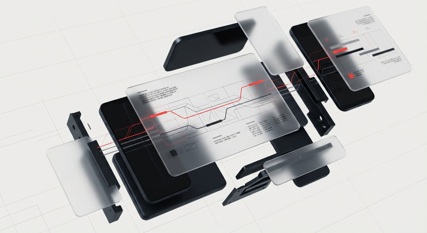
Visual Identity System
Logo Design Principles for Startups
Your startup logo design is the most recognizable element of your brand, appearing everywhere from your product to pitch decks. Great startup logos are simple, memorable, scalable, and meaningful. Stripe’s iconic blue wordmark works as both a favicon and a billboard. Linear’s geometric symbol suggests precision and direction without being literal.
Avoid overly complex designs with gradients, fine details, or multiple elements that don’t work at small sizes. Your logo needs to be legible at 16px on a mobile screen and impressive at 16 feet on a trade show booth. Test it in black and white, reversed on dark backgrounds, and at extreme sizes before finalizing.
Consider whether you need a wordmark (text-based like Stripe), a symbol (icon-based like Apple), or a combination mark. Early-stage startups often benefit from wordmarks for name recognition, adding symbols later once they’re established. Work with a professional designer who understands startups, this isn’t the place to crowdsource or use AI generators. How to choose the right design partner
Color Psychology and Palette Selection
Color communicates emotion and meaning before conscious thought. Blue suggests trust and professionalism (Stripe, Linear), which is why fintech and SaaS companies gravitate toward it. Purple indicates creativity and innovation (Notion, Twitch). Green signals growth and health. Your color choices should align with both your brand personality and audience expectations.
Build a primary palette with 1-2 main brand colors, then add 3-4 secondary colors for flexibility. Include neutral grays for UI and typography. Define exact values in HEX, RGB, and CMYK so colors remain consistent across digital and print. Notion’s warm neutrals with occasional color pops create a sophisticated yet approachable feel.
Test your palette for accessibility, ensure sufficient contrast between text and backgrounds to meet WCAG AA standards. Your colors should work harmoniously together while providing enough variation for hierarchy and emphasis. Avoid trendy colors that will date your brand quickly; aim for timeless with distinctive accents.
Typography That Reinforces Your Brand
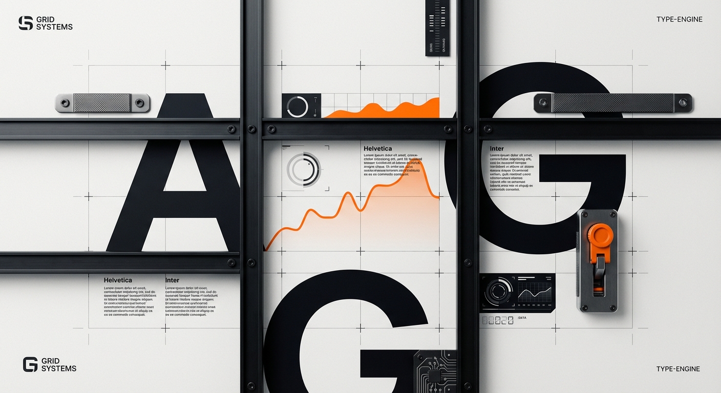
Typography might seem like a minor detail, but it shapes readability, personality, and professionalism. Choose 2-3 typefaces maximum: one for headings, one for body copy, and optionally one for accents or data. Figma uses Inter for its clean, modern aesthetic. Linear pairs a geometric sans-serif with a monospace font that feels technical and precise.
Your primary typeface appears most often, so it must be highly legible, support multiple weights, and work across digital and print. Avoid novelty fonts that look clever in logos but fail in paragraphs. Typography best practices for digital products Google Fonts and Adobe Fonts offer excellent options with proper licensing for commercial use.
Create a typography scale that defines sizes, weights, and spacing for different contexts, H1, H2, body, captions, buttons. This consistency creates visual rhythm and professionalism. Document exact specifications (font-size, line-height, letter-spacing) so developers can implement your designs perfectly.
Imagery Style and Iconography
Your approach to imagery and icons creates visual consistency across your product and marketing. Will you use photography, illustrations, 3D renders, or a mix? Stripe uses minimal, abstract photography with bold colors. Notion combines playful illustrations with clean product screenshots. This choice should reflect your brand personality and audience preferences.
Develop an icon system with consistent stroke weights, corner radii, and visual style. Linear’s precise geometric icons match their overall aesthetic. Whether you create custom icons or use a library like Feather or Phosphor, ensure they feel cohesive. Icons should function clearly at small sizes while adding visual interest at larger scales.
Document your imagery guidelines: acceptable subjects, composition styles, color treatments, and what to avoid. If you use photography, specify whether it’s lifestyle, product-focused, candid, or staged. For illustrations, define the style (flat, isometric, hand-drawn) and color application. These guidelines prevent visual chaos as your content library grows.
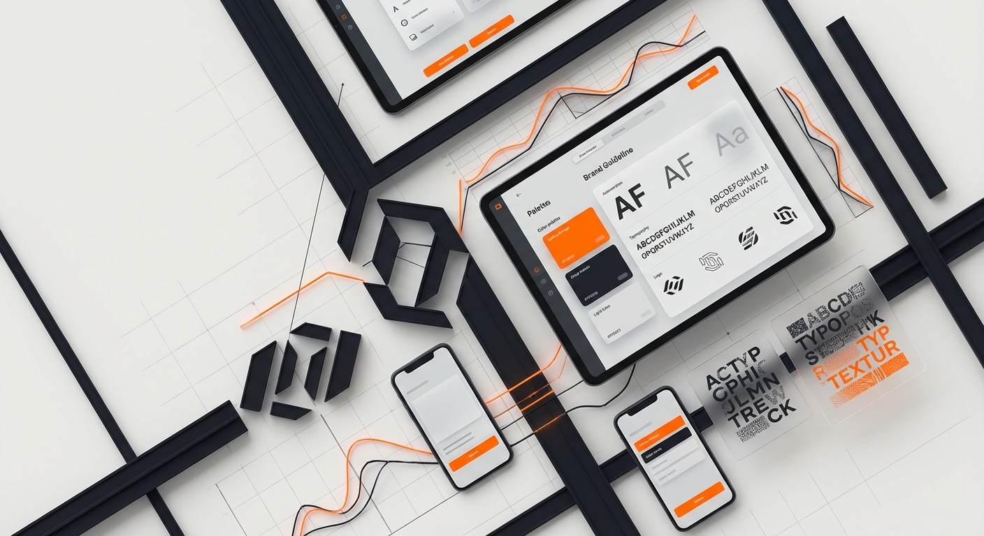
Building Brand Guidelines
Creating Your Brand Guidelines Document
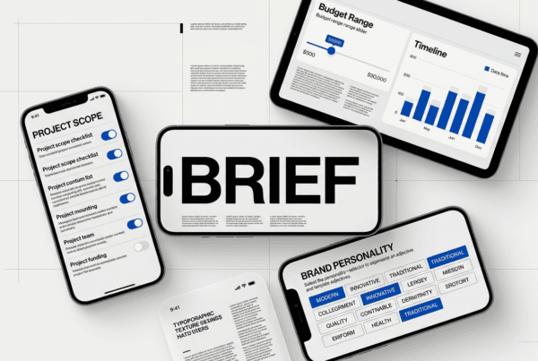
A brand guidelines template codifies your brand identity into a reference document that ensures consistency as your team expands. Start with brand story and values, then detail visual standards, logo usage, color codes, typography, spacing rules, and imagery guidelines. Notion’s internal brand guide runs 50+ pages, covering everything from presentation templates to social media specs.
Structure your guidelines for usability, not perfection. Include visual examples of correct and incorrect usage. Show your logo on different backgrounds, in different sizes, with proper clear space. Provide download links to approved assets. The goal is to make doing the right thing easier than doing the wrong thing.
Keep guidelines alive, update them as your brand evolves. Version your guidelines and communicate updates to stakeholders. Brand guidelines template download Use tools like Frontify, Brandfolder, or a simple Notion page to host your guidelines where everyone can access them. Quarterly reviews ensure guidelines stay relevant and useful.
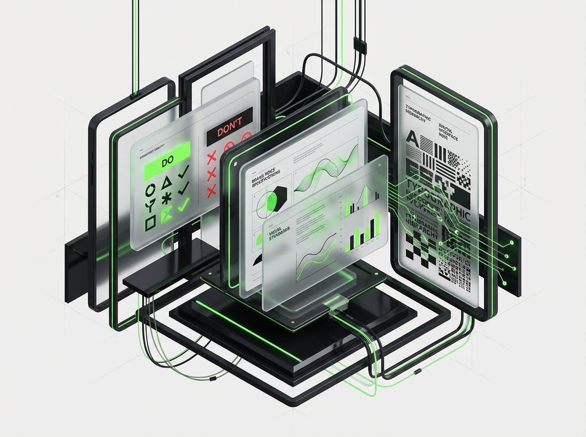
Logo Usage and Protection
Define logo clear space (minimum area around your logo that must remain empty), minimum sizes for digital and print, and approved color variations. Stripe’s guidelines specify exact pixel dimensions for favicons, social media profiles, and email signatures. This precision prevents squished, pixelated, or poorly placed logos that damage brand perception.
Document what not to do: don’t rotate, stretch, outline, add effects, or recolor your logo in unapproved ways. Show examples of violations to make rules crystal clear. Provide logo files in multiple formats (SVG for digital, EPS for print, PNG for quick use) organized in clearly labeled folders.
Establish approval processes for external logo usage, partnerships, press, integrations. You want visibility, but not at the cost of brand integrity. Create a simple request form and response template to handle these efficiently without bottlenecking on founder approval.
Maintaining Consistency Across Touchpoints
Your brand appears across dozens of touchpoints, website, product UI, emails, ads, social media, pitch decks, customer support, and more. Brand consistency means each touchpoint feels unmistakably connected to the others. When someone moves from your Instagram to your website to your product, the experience should feel smooth.
Create templates for common assets: presentation decks, email signatures, social media graphics, one-pagers, case studies. These templates embed your brand standards so team members create on-brand content by default. Figma, Canva, or Pitch templates reduce design time while maintaining quality.
Audit your brand presence quarterly. Screenshot key touchpoints and review them side-by-side. Are colors consistent? Is messaging aligned? Does your LinkedIn feel like the same brand as your product? Inconsistency confuses customers and dilutes brand equity. Fix gaps immediately and update guidelines to prevent recurrence.
Scaling Your Brand System
As you grow from 5 to 50 to 500 employees, your brand system must scale without degrading. This requires building extensible design systems that provide enough components and patterns to cover new use cases without constant designer involvement. Linear’s design system enables their team to ship consistent experiences rapidly.
Document decision-making principles, not just rules. When team members encounter edge cases not covered in guidelines, principles help them make brand-aligned choices. For example: “When in doubt, choose clarity over cleverness” guides copywriting decisions across contexts.
Invest in design systems and component libraries as you scale. Tools like Figma libraries, Storybook for development, and design tokens create single sources of truth. Appoint brand stewards, designers or marketers who review major releases for brand consistency. This shared ownership prevents brand drift as teams multiply.
When to Rebrand
Signs It’s Time for a Brand Refresh
Rebranding is disruptive and expensive, so timing matters. Consider a refresh when your brand no longer reflects who you’ve become, you’ve pivoted markets, expanded offerings, or outgrown your original positioning. Stripe refreshed their brand as they expanded beyond developers to serve entire businesses, requiring broader appeal.
Other signals: your brand looks dated compared to competitors, you’re expanding internationally and current branding doesn’t translate culturally, or you’ve acquired companies and need unified branding. User research showing brand confusion or negative associations also indicates refresh needs.
Distinguish between brand evolution and complete overhaul. Most startups need iterative refinement, not scorched-earth rebrands. Update your visual identity while maintaining brand equity you’ve built. Notion has evolved their visual style over time while keeping core brand elements recognizable.
Evolution vs. Complete Overhaul
Brand evolution modernizes aesthetics and messaging while preserving recognition and equity. Think of it as remodeling your house versus tearing it down. You might refine your logo, expand your color palette, or update typography while maintaining essential brand DNA. This approach respects existing customer relationships and brand awareness.
A complete rebrand is necessary when your original brand actively hinders growth, it’s associated with a failed product, it’s legally problematic, or it fundamentally misrepresents what you do. These are rare situations that justify starting fresh, but be honest about whether you need a new brand or just better execution of your current one.
Test potential changes with existing customers before committing. Show updated branding to loyal users and gather feedback. They’ve invested in your current brand, and their reactions indicate whether evolution maintains equity or damages it. Unexpected negative reactions can save you from costly mistakes.
Managing the Transition
A brand transition requires careful orchestration across all touchpoints. Create a complete rollout plan: update your website, product UI, marketing materials, social media, email templates, and physical materials in coordinated waves. Announce the change to customers explaining the why and what’s improved. Transparency builds buy-in.
Stripe’s rebrand rolled out over weeks, with preview content building anticipation before the full reveal. This staged approach lets you monitor reactions and adjust rather than shocking your audience overnight. Provide updated assets to partners, press, and integrations simultaneously to minimize confusion.
Budget for the full transition, design work is only part of the cost. Factor in website development, updated swag, new business cards, reshot photography, and team time. Hidden costs often double initial estimates. A phased rollout spreads costs and reduces risk compared to big-bang launches.
Common Startup Branding Mistakes
Mistake #1: Copying Competitors
The temptation to “look like Stripe” or “be the Figma of X” kills differentiation before you start. Generic branding makes you forgettable and signals you don’t understand your unique value. Every “modern SaaS” brand with a sans-serif wordmark, gradient logo, and purple-blue palette blurs together in customers’ minds.
Study successful brands to understand principles, not to replicate aesthetics. Stripe’s minimalism works for them because it matches their “invisible infrastructure” positioning. That same approach might be wrong for your category. Find your own authentic expression instead of chasing trends.
How to build a differentiated brand strategy Your brand should emerge from your strategy, not from Dribbble’s trending page. If your first instinct is “make it look like everyone else but slightly different,” stop and restart from strategy fundamentals.
Mistake #2: Inconsistent Application
You nailed your brand guidelines but implementation is chaos, the website uses different colors than the product, your social media ignores your brand voice, and every salesperson has their own custom deck template. Inconsistency doesn’t just look unprofessional; it prevents brand recognition from compounding across touchpoints.
The fix requires both systems and culture. Systems: brand asset libraries, approval workflows, templates. Culture: make brand consistency a value, celebrate good examples, and constructively correct violations. Assign ownership, someone must care about brand integrity as their primary responsibility.
Audit quarterly and fix gaps immediately. The longer inconsistencies persist, the more they multiply and the harder correction becomes. Think of brand consistency like code quality, pay the maintenance cost continuously or face expensive refactoring later.
Mistake #3: Premature Complexity
Early-stage startups sometimes build elaborate brand systems they don’t yet need, custom illustrations for every use case, 12-color palettes, multiple logo variations, exhaustive voice charts. This over-engineering wastes resources and creates decision paralysis. Your first brand system should be minimum viable, enough structure to stay consistent, not enough to slow you down.
Start with logo, 2-3 colors, 1-2 typefaces, and basic usage rules. Add complexity only when you encounter real needs. Notion’s early branding was relatively simple; their sophisticated system evolved as they scaled. Let your brand system grow with your company.
Focus your limited design resources on customer-facing experiences that drive growth, landing pages, product design, key marketing assets. Internal perfectionism on brand details yields diminishing returns when you’re fighting for survival.
Mistake #4: Ignoring Brand After Launch
Some founders treat branding as a launch checklist item, hire a designer, get a logo, never think about it again. But brand building is continuous work. Your brand should deepen and strengthen as you learn more about customers, refine positioning, and expand your presence.
Schedule regular brand reviews tied to business milestones, fundraising rounds, product launches, market expansion. Each milestone may require messaging updates, visual refreshes, or new brand assets. Companies that invest continuously in brand building compound their equity over time.
Measure brand metrics alongside product metrics: brand awareness, consideration, preference, and customer perception. Survey customers about brand attributes. Track share of voice in your category. These signals indicate whether your brand is strengthening or stagnating.
Mistake #5: DIY-ing What Requires Expertise
Founders who wouldn’t dream of self-hosting their infrastructure sometimes DIY their entire brand with Canva templates and stock logos. While scrappiness is admirable, professional branding is a strategic investment, not a cost center. A mediocre brand costs more long-term through lost opportunities than professional help costs upfront.
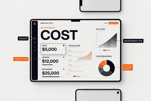
Find the right level of investment for your stage. Pre-seed startups might use quality freelancers or junior designers building portfolios. Seed-stage companies should budget $15-30K for complete brand identity. Series A+ startups benefit from specialized brand studios that understand category positioning. How to budget for branding at different stages
Even with limited budgets, invest in logo and core visual identity from a professional. You can execute tactical design yourself, but strategic brand foundations require expertise. The alternative, rebranding after 12 months because your initial brand hinders growth, costs far more.
FAQ
How much should a startup spend on branding?
Budget 5-10% of your seed round for complete startup brand identity development, including strategy, visual identity, and initial asset creation. This typically ranges from $15,000-$50,000 depending on scope and expertise level. Pre-seed companies can start with $5,000-$10,000 for essentials. The ROI comes from reduced acquisition costs, premium pricing power, and faster trust-building with customers and investors.
Don’t confuse initial investment with ongoing costs. Factor in 10-15% of marketing budget for maintaining and evolving your brand over time. This covers design support, content creation, and system updates as you scale.
Can I rebrand after launching without confusing customers?
Yes, but timing and communication are critical. Early-stage companies (under 12 months, small user bases) can rebrand with minimal disruption since brand equity is still building. Announce changes clearly, explain the reasoning, and maintain continuity in product experience and customer relationships.
Established companies need more careful transitions, preview changes, involve loyal customers in the process, and roll out gradually. Stripe, Dropbox, and Uber all rebranded successfully by treating it as evolution, not revolution. The key is preserving what customers value while improving what isn’t working.
What’s the difference between brand identity and visual identity?
Brand identity is complete, your mission, values, positioning, voice, visual elements, and customer experience. It’s the complete expression of who you are and how you want to be perceived. Visual identity for startups is the subset focused on design, logo, colors, typography, imagery, and design systems.
Think of brand identity as your personality and visual identity as your appearance. You need both aligned. A beautiful logo with unclear positioning fails just as surely as strong positioning with amateur design. Invest in brand strategy first, then express it through visual identity.
Should my brand target investors or customers?
Always prioritize customers, they’re the reason your business exists and the evidence investors seek. A brand that resonates with customers naturally attracts investors because it demonstrates market understanding and execution capability. The reverse isn’t true; investor-focused branding often feels corporate and fails to connect with users.
That said, your brand should make both groups confident in your competence. Professional brand execution signals that you take your business seriously, pay attention to details, and understand modern expectations. Stripe’s brand appeals to developers while impressing enterprise buyers and VCs simultaneously because it’s authentic to their core audience.
How do I maintain brand consistency with a remote team?
Remote teams need stronger documentation and systems than co-located ones. Host complete brand guidelines in accessible tools like Notion, Frontify, or Google Drive. Create templates for all common assets. Use shared design tools like Figma where everyone works from the same component library.
Establish clear review processes, who approves external communications, marketing assets, product design? Use asynchronous tools like Loom for brand training videos. Schedule quarterly brand syncs where the team reviews examples of great and poor brand execution. Make brand assets findable, organized folders, clear naming conventions, obvious download locations.
Do I need a brand style guide from day one?
You need basic brand standards from day one, logo files, colors, fonts, and simple usage rules. This can be a 2-page PDF initially. A complete style guide becomes necessary when you hire your third or fourth employee and can no longer personally approve everything.
Build your style guide iteratively. Start with visual basics, add voice and tone as you create content, document imagery standards when you start marketing campaigns, and expand sections as you encounter new use cases. A 50-page guide at launch is overkill; a 50-page guide after two years of scaling is probably necessary.
How do successful startups like Notion approach branding differently?
Companies like Notion, Linear, Stripe, and Figma treat branding as product, not decoration. They invest in brand from day one because they understand it’s fundamental to product-market fit, not a post-launch addition. Their founders often have design backgrounds or deep appreciation for design’s business impact.
These startups integrate brand into product development, brand personality informs product voice, visual identity shapes UI decisions, and brand positioning drives product roadmap. They hire design talent early and give them strategic seats at the table. Most importantly, they maintain consistent quality standards across all customer touchpoints, refusing to ship anything that doesn’t meet their brand bar.
Conclusion
Building a compelling startup brand identity isn’t optional in 2026, it’s the foundation that determines whether you’ll capture attention, earn trust, and command premium value in crowded markets. From strategic positioning to visual systems, every element of your brand either multiplies your growth efforts or undermines them.
The startups that win don’t treat branding as a creative exercise divorced from business objectives. They recognize that strong brands reduce acquisition costs, increase customer lifetime value, attract top talent, and create compounding advantages that become harder for competitors to replicate over time.
Your brand is being formed right now whether you’re actively shaping it or not. Every customer interaction, every product decision, every social media post contributes to perception. The question isn’t whether to invest in branding, it’s whether you’ll do it strategically or leave it to chance.
Ready to build a brand that drives growth? Schedule a brand strategy consultation Our team at designx.co has helped dozens of startups transform from forgettable to unforgettable. Let’s build yours together.
Related Reading
- From Boise to the Fortune 500: How DesignX Partners with Klein Tools
- AI Branding: How Artificial Intelligence is Transforming Brand Design
- AI Workflows for Designers: From Prompt Engineering to Production