SaaS companies routinely pour millions into product development and almost nothing into the five minutes that determine whether a new user stays or leaves permanently. This guide shows you how to engineer the path to core value so users get their first win before they have a reason to quit.
The First Five Minutes: Why SaaS Onboarding UX Matters More Than Ever
Most SaaS companies spend millions building a powerful product, then neglect the first interaction a new user has with it. That initial experience, often within the first five minutes of signup, sets the tone for everything that follows. It determines if someone clicks around, gets value, or bounces permanently. This isn’t just about a good first impression. It’s about engineering the path to your product’s core value.
We’ve worked with companies like Klein Tools, simplifying a catalog of 40,000+ SKUs for dealer adoption, and Oura Ring, defining their launch identity. In every case, understanding the user’s first interaction, their needs, and their journey is critical. For SaaS, this means focusing on activation, not just registration.
The Myth of the “Perfect” Onboarding Flow
Many product teams envision a single, linear onboarding path that everyone must follow. They want to show off every feature, explain every button, and gather every piece of profile information upfront. This approach often leads to overwhelming new users. They get lost in a sea of tooltips, forced tours, and endless forms before they even experience what the product can do.
The reality is there is no single “perfect” flow. What works for one user segment might alienate another. Our goal in designing SaaS onboarding UX isn’t to create a rigid path, but a dynamic system that progressively reveals value. Think of it less like a guided tour and more like an intelligent concierge, anticipating needs and offering help at the right moments.
Empty States: Your First Impression
After a user signs up, they often land on a blank canvas. An empty dashboard, an unpopulated project list, a calendar with no events. This “empty state” is a crucial, often overlooked, moment in the onboarding journey.
Beyond Just a Blank Screen
An empty state is an opportunity to guide, motivate, and educate. It’s not merely the absence of content; it’s the presence of potential. A well-designed empty state does several things:
- It explains what the section is for.
- It tells the user what they can do there.
- It provides a clear, actionable path to get started.
- It offers reassurance or celebrates success when a task is completed.
Consider Slack’s empty channel states. Instead of just showing nothing, they offer prompts to “Add people” or “Send a message.” Asana’s empty project lists suggest “Create your first task” or “Import from a spreadsheet.” These aren’t just polite suggestions. They are direct invitations to engage with the product’s core functionality.
When we designed for Bodybuilding.com, understanding what motivated users to fill out their initial fitness profiles was key. The blank fields weren’t just data inputs; they were steps towards a personal transformation. The empty state needed to communicate that journey.
To design effective empty states, identify the primary action a user needs to take to populate that screen. Then, craft microcopy that is encouraging and clear. Use subtle illustrations or animations to add personality without distraction. Most importantly, ensure the call to action is prominent and easy to find. This isn’t filler; it’s a critical design element that directly impacts user activation.
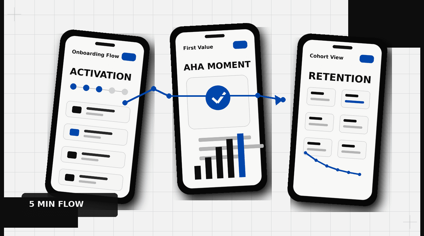
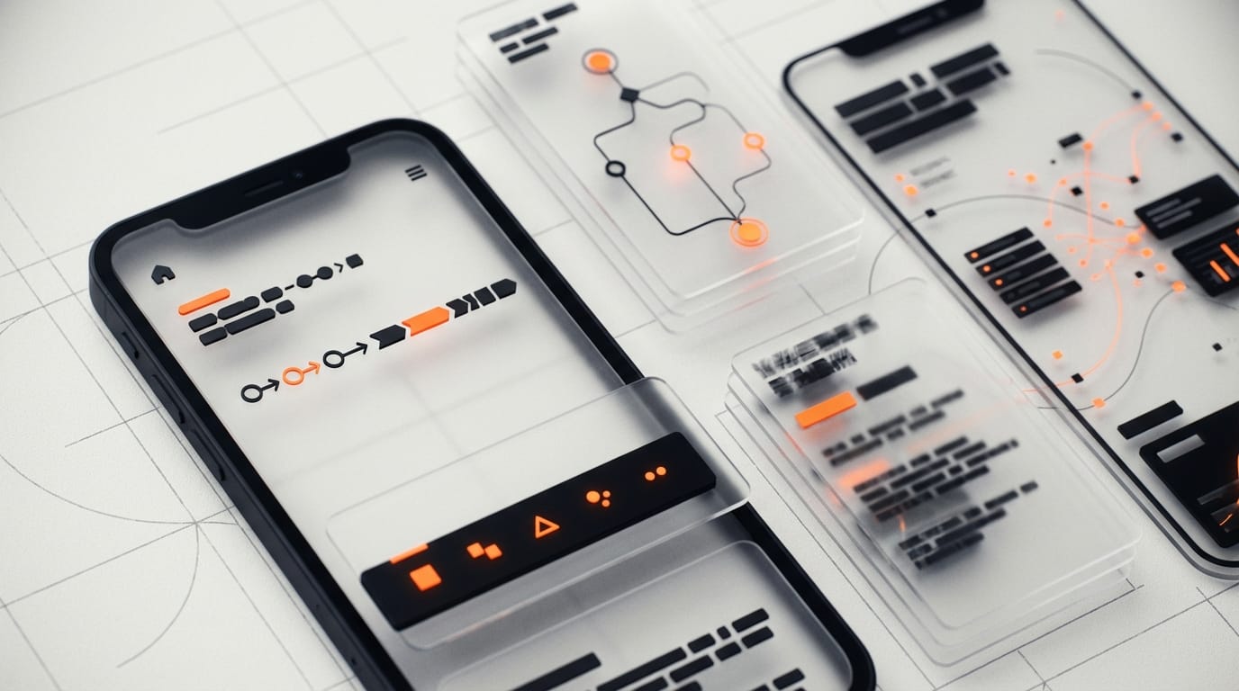
Progressive Value Delivery: The “Aha!” Moment
The core principle of effective SaaS onboarding UX is progressive value delivery. This means giving the user small, meaningful wins early on, rather than making them wait to unlock the full power of your product. The goal is to help them experience their individual “Aha!” moment as quickly as possible.
Guiding, Not Dictating
The “Aha!” moment is that point where a user truly understands the product’s value proposition. For Dropbox, it might have been successfully syncing a file across devices. For Calendly, it’s scheduling a first meeting without the email back-and-forth. Identifying this moment is paramount. It requires deep user research and a clear understanding of your product’s unique selling proposition.
Many products fail by requiring extensive setup before a user can even glimpse the value. Imagine signing up for a task manager and having to configure 20 settings before creating your first task. This friction kills activation. Instead, designers should guide users through the bare minimum required to achieve their first successful outcome. This could be:
- Creating a single project.
- Connecting one integration.
- Inviting one team member.
- Uploading one document.
These small, early successes build momentum and reinforce the product’s utility. They create a positive feedback loop that encourages further exploration.
Activation Metrics: What Are We Measuring?
Signup numbers are vanity metrics if users don’t activate. Activation is the point where a user experiences the core value of your product. Defining this metric is a critical step in designing an effective onboarding flow. It’s not always simple, but it’s always specific.
Consider the famous example of Facebook: their key activation metric was often cited as “7 friends in 10 days.” Not just signing up. Not just logging in. But making meaningful connections. For a project management tool, it might be “user creates a project and assigns at least two tasks.” For an analytics platform, it could be “user connects a data source and views a custom report.”
Once you define your activation metric, every element of your onboarding UX should aim to drive users towards that action. This focus helps eliminate unnecessary steps, simplifies complex choices, and ensures that the user’s first few minutes are spent experiencing, not just setting up.
Skip-ability vs. Guidance: The Personalization Paradox
The tension between guiding new users and allowing experienced users to bypass instruction is a common design challenge. One size rarely fits all. A first-time user needs hand-holding. A power user migrating from a competitor might want to jump straight into advanced features. The goal is to offer intelligent choices, not forced paths.
When to Offer a Skip
Offering a “Skip” option in an onboarding flow is a delicate balance. Too many “skip” buttons can make the process feel optional, leading users to miss critical information. Too few, and you frustrate those who feel they already know what they’re doing.
Consider offering skip options when:
- The step requires significant effort or data entry that can be done later.
- The user has indicated prior experience with similar tools.
- The step is purely informational and not critical for initial activation.
- There’s a clear “I’ll do this later” path available without consequence.
The language around skipping should be clear. Instead of just “Skip,” consider “I’ll set this up later” or “I know what I’m doing, take me to the dashboard.” This communicates the consequence, or lack thereof, of bypassing the step.
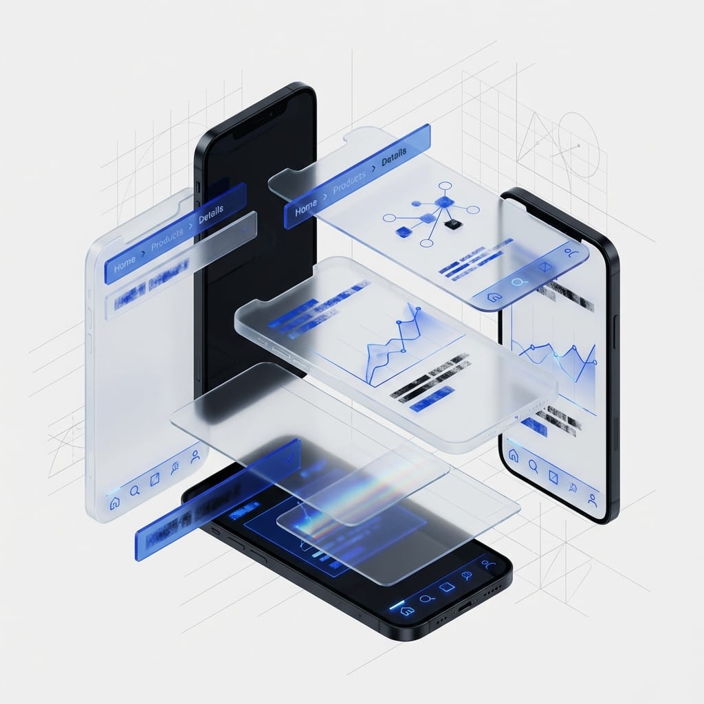
Conditional Onboarding Paths
A more sophisticated approach is conditional onboarding. This means tailoring the flow based on initial user input. Tools like HubSpot and Intercom excel at this. They might ask a user about their role (e.g., Marketing, Sales, Engineering) or their primary goal (e.g., “Grow my email list,” “Manage projects,” “Track team performance”) immediately after signup.
Based on these responses, the onboarding flow can present relevant features, pre-populate certain settings, or recommend specific templates. This approach personalizes the experience, making the user feel understood and quickly directing them to the parts of the product most relevant to their needs. Our work with HP involved creating pathways for diverse user types interacting with complex software, ensuring that the initial experience felt relevant to their specific role and tasks.
This dynamic tailoring requires careful planning and strong backend logic, but the payoff in user satisfaction and activation rates is substantial. It moves beyond a generic tour to a guided journey built for their specific context.
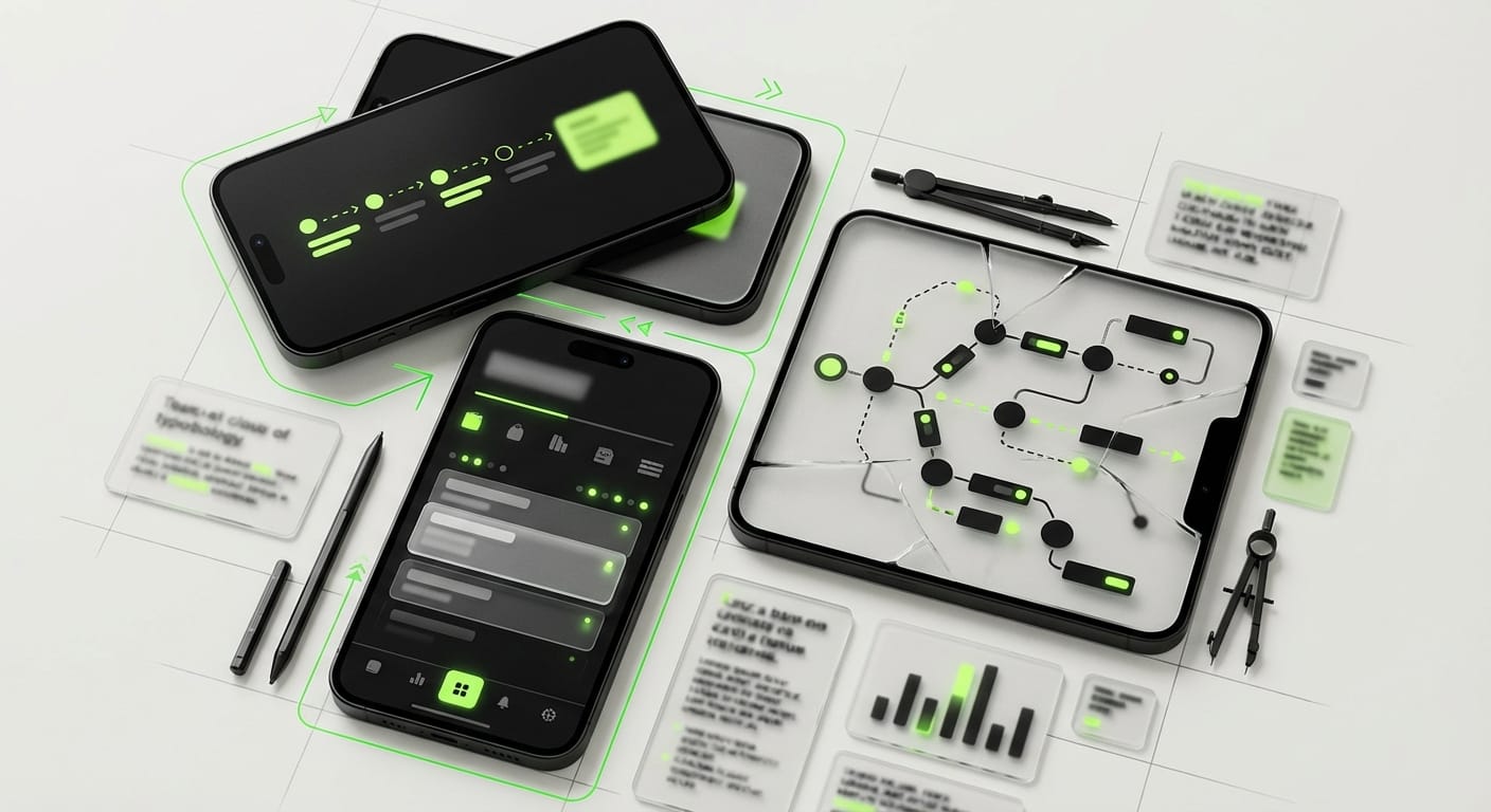
In-App Tooltips & Nudges: Context is King
Tooltips and in-app nudges, when used correctly, can be powerful allies in SaaS onboarding UX. When used poorly, they become annoying distractions that users blindly click past.
The Right Tool, The Right Time
Avoid “tour fatigue.” A carousel of pop-ups explaining every UI element on first login is almost always a bad idea. Instead, reserve tooltips and nudges for specific, context-sensitive situations:
- First-time feature discovery: When a user interacts with a new, complex feature for the first time, a subtle tooltip explaining its purpose can be helpful.
- Problem prevention: If a user is about to make a common mistake, a timely nudge can guide them.
- Reinforcing success: A small celebratory message after a user completes a key action can provide positive reinforcement.
- Introducing advanced options: Once a user has mastered the basics, a tooltip might highlight a more powerful, related feature they can explore.
The design of these elements matters. They should be visually distinct but not overpowering. Use clear, concise language. Consider using arrows or highlighting to draw attention to the specific UI element being discussed. Most importantly, ensure they are dismissible and, ideally, don’t reappear unnecessarily.
Think about how DesignX tackled the Klein Tools catalog. We didn’t just present information; we designed pathways that guided users through complex product hierarchies, with context-sensitive details appearing only when relevant. This approach to information delivery is directly applicable to in-app guidance.
Another approach is using “hotspots” or “beacons” that are less intrusive than full pop-ups. These small, animated dots or rings can draw attention to new features or important areas, allowing the user to click to learn more if they choose.
Designing for Human Behavior, Not Feature Lists
At its heart, SaaS onboarding UX is about understanding human behavior. Users are impatient. They are goal-oriented. They want to accomplish something, not learn your entire product roadmap. The first five minutes are a race against the clock to prove your product’s worth.
Focus on enabling immediate action. Prioritize the core tasks a user needs to complete to get value. Remove unnecessary steps. Provide clear, empathetic guidance. Respect their time and their intelligence.
A well-designed onboarding flow isn’t just about reducing churn. It’s about creating advocates. It’s about turning a curious visitor into an engaged, long-term customer. The initial experience dictates that entire relationship.
Ready to turn more sign-ups into activated users? Contact DesignX to talk through your project.
Frequently Asked Questions
What should teams know about why SaaS onboarding UX matters more than ever?
Most SaaS companies spend millions building a powerful product, then neglect the first interaction a new user has with it. That initial experience, often within the first five minutes of signup, sets the tone for everything that follows. It determines if someone clicks around, gets value, or bounces permanently. This isn’t just about a good first impression.
What should teams know about the myth of the “perfect” onboarding flow?
Many product teams envision a single, linear onboarding path that everyone must follow. They want to show off every feature, explain every button, and gather every piece of profile information upfront. This approach often leads to overwhelming new users. They get lost in a sea of tooltips, forced tours, and endless forms before they even experience what the product can do.
What should teams know about your first impression?
After a user signs up, they often land on a blank canvas. An empty dashboard, an unpopulated project list, a calendar with no events. This “empty state” is a crucial, often overlooked, moment in the onboarding journey. Beyond Just a Blank Screen An empty state is an opportunity to guide, motivate, and educate.
What should teams know about the “aha!” moment?
The core principle of effective SaaS onboarding UX is progressive value delivery. This means giving the user small, meaningful wins early on, rather than making them wait to unlock the full power of your product. The goal is to help them experience their individual “Aha!” moment as quickly as possible. Guiding, Not Dictating The “Aha!” moment is that point where a user truly understands the product’s value proposition.
What should teams know about the personalization paradox?
The tension between guiding new users and allowing experienced users to bypass instruction is a common design challenge. One size rarely fits all. A first-time user needs hand-holding. A power user migrating from a competitor might want to jump straight into advanced features.