
A financial technology startup’s mobile app struggled with user engagement due to an unappealing interface. DesignX aimed for a modern, sophisticated redesign, including a dark theme, to captivate users.
A leading financial technology startup faced a critical challenge: their mobile application, while functional, struggled with user engagement and retention. Users found the interface visually unappealing and difficult to use in varying light conditions, signaling a need for a modern, sophisticated redesign that could captivate and serve their increasingly discerning user base.
Project Overview
| Category | Detail |
|---|---|
| Client Type | Established FinTech Startup |
| Industry | Financial Services, Mobile Banking |
| Project Type | UI/UX Redesign, Dark Theme Implementation |
| Timeline | 14 Weeks |
| Deliverables | User Research Report, Wireframes, Interactive Prototypes (Dark Theme), UI Style Guide, Design System Components, Usability Test Reports |
| Tools Used | Figma, Adobe Illustrator, Maze, Miro, Slack |
The Challenge
Our client, a rapidly growing FinTech provider we will refer to as “Ascend Financial,” possessed a mobile application that capably performed its core functions of transaction tracking and budget management. However, the app suffered from significant user experience deficiencies. The existing interface, characterized by a predominantly bright, somewhat generic aesthetic, contributed to low user satisfaction and high attrition rates. Specific pain points identified through initial data analysis and user feedback included a perceived lack of visual sophistication, leading to the app feeling outdated when compared to market competitors. Users reported eye strain during evening use, a common scenario for financial management, and difficulty discerning critical information due to inconsistent visual hierarchy. Furthermore, the absence of personalization options meant the app failed to resonate deeply with a demographic that increasingly expects tailored digital experiences. Ascend Financial recognized that a visually compelling and comfortable interface was not merely a cosmetic upgrade, but a strategic imperative for improving user loyalty and expanding market reach. Without addressing these issues, the company risked stagnating user growth and losing market share to more visually appealing platforms.
Our Approach
DesignX initiated the project with a rigorous discovery phase, collaborating closely with Ascend Financial’s product and marketing teams through intensive workshops. This ensured a complete understanding of their business objectives, technical constraints, and target audience aspirations. We conducted a thorough competitive analysis, evaluating the strengths and weaknesses of both direct and indirect financial applications, paying particular attention to emerging trends in dark theme adoption and user interface patterns. Our research strategy prioritized direct user insights. We conducted extensive user interviews with a diverse segment of existing Ascend Financial users, as well as potential new users, specifically probing their preferences for interface themes, usage contexts, and pain points with current financial apps. Surveys complemented these interviews, gathering quantitative data on screen time habits, perceived visual comfort, and feature priorities. We also performed expert usability reviews on Ascend Financial’s existing application, identifying specific navigational hurdles and information display inefficiencies. This multi-faceted research process allowed us to construct detailed user personas and journey maps, providing a data-driven foundation for our design decisions. Our iterative design methodology, involving rapid prototyping and continuous feedback loops, ensured that every design choice was validated against user needs and business goals, culminating in a solution that was both aesthetically superior and functionally intuitive.
Key Design Decisions
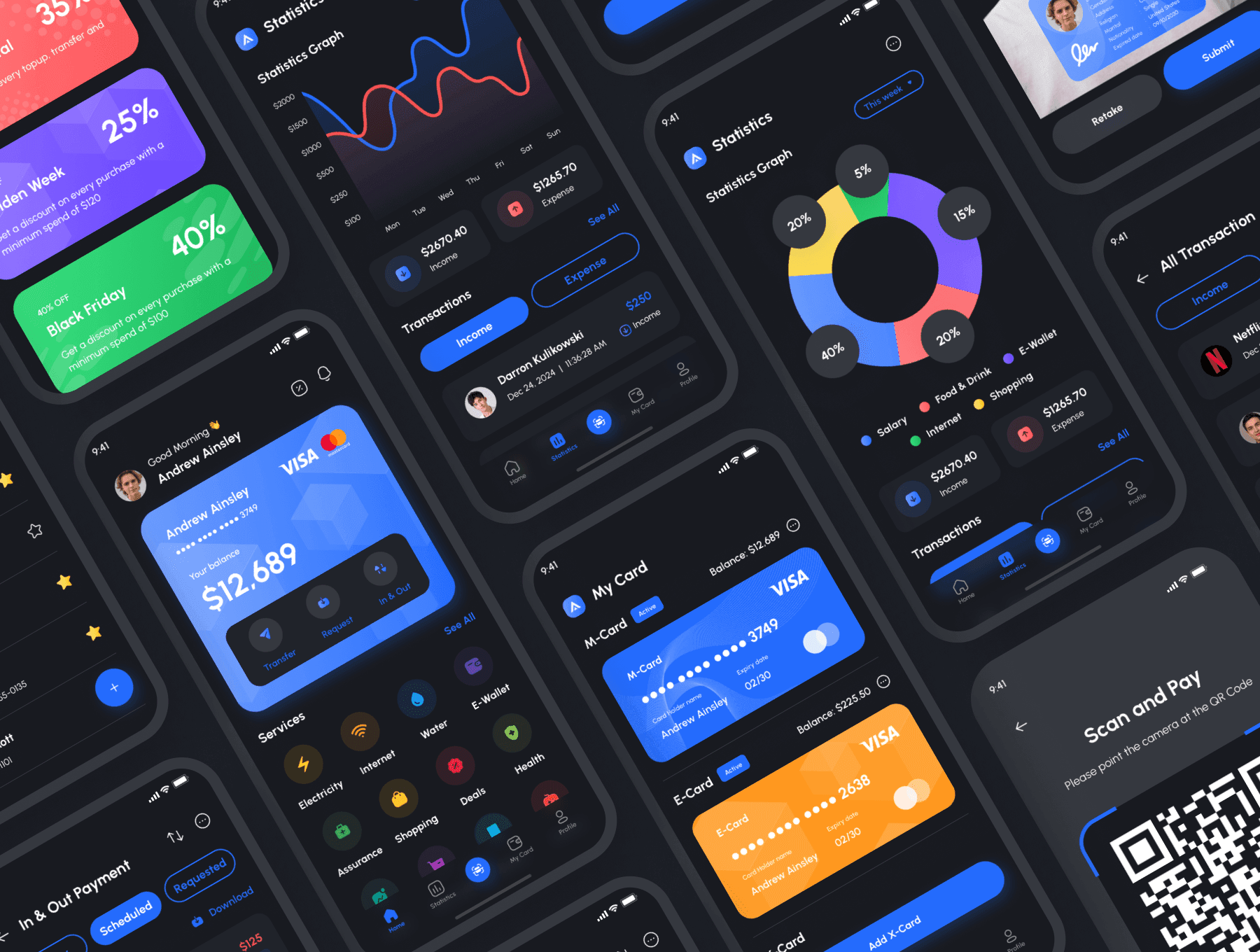
Primary Dark Palette with Strategic Accent Colors
The decision to implement a dark theme as the primary interface was driven by compelling user research indicating a strong preference for reduced eye strain during extended use, particularly in low-light environments. A dark theme also communicates a sense of sophistication and modernity, aligning with the premium experience Ascend Financial sought to deliver. We selected a deep charcoal gray, specifically #1A1A1A, as the foundational background color, providing a luxurious canvas that reduces visual fatigue. This was complemented by #282828 for secondary containers and cards, creating subtle depth and separation without harsh contrasts. To maintain clarity and engagement, we introduced a vibrant, accessible teal, #00C8C8, as the primary accent color. This teal was reserved for interactive elements such as call-to-action buttons, key indicators, and positive transaction values, offering a clear visual hierarchy and a touch of brand personality. For negative values or alerts, a distinct but restrained red, #FF5757, was used sparingly. This careful color strategy ensures that information remains highly legible, emotional cues are clear, and the overall aesthetic is both elegant and user-friendly, enhancing the perceived trustworthiness and contemporary appeal of the financial application.
Information Density and Visual Hierarchy through Typography and Card-Based Layouts
Financial applications inherently deal with complex data, making clear information display paramount. Our design focused on optimizing information density without overwhelming the user, achieved through a meticulous application of typography and a structured card-based layout. We chose “Inter,” a modern sans-serif typeface, for its exceptional legibility across various sizes and weights, making it ideal for presenting numerical data and detailed transaction descriptions. We established a typographic scale that clearly differentiates headings, subheadings, body text, and numerical values, using varying font weights and sizes to guide the user’s eye. For instance, account balances were presented in a larger, bolder weight to ensure immediate visibility. The use of a card-based layout was central to segmenting information logically. Each account, transaction, or budget category was encapsulated within its own card, providing clear visual boundaries and making the information highly scannable. This modular approach allows users to quickly grasp key data points, reducing cognitive load and improving the efficiency of information retrieval. Strategic use of white space around these cards further enhances clarity, preventing visual clutter and creating a calm, focused environment essential for financial decision-making.
Intuitive Gestural Navigation and Micro-interactions
Modern mobile users expect fluid, responsive, and intuitive interactions that go beyond simple taps. We therefore integrated sophisticated gestural navigation and subtle micro-interactions to elevate the user experience. For instance, instead of relying solely on dropdown menus or static buttons for account selection, we implemented a horizontal swipe gesture on the main dashboard to smoothly transition between different financial accounts. This creates a more natural and efficient way for users to navigate their various holdings. Similarly, swiping left on a transaction item reveals quick actions like “categorize” or “add note,” streamlining common tasks. Each interaction is accompanied by carefully designed micro-animations and, where appropriate, subtle haptic feedback. For example, a successful transaction submission might trigger a brief, satisfying visual confirmation animation and a gentle vibration. These small, deliberate animations are not merely decorative; they provide immediate visual and tactile cues, confirming user actions, reducing perceived loading times, and making the application feel more responsive and alive. This approach reduces friction, increases user delight, and contributes to a more engaging and efficient financial management experience, fostering a sense of control and empowerment.
Design Highlights
Our design for Ascend Financial’s mobile application prioritized clarity, sophistication, and user comfort, particularly within the dark theme context. The color rationale was built on a foundation of deep, non-straining grays. We selected #1A1A1A as the primary background, offering a true dark canvas that minimizes light emission and reduces eye fatigue.
Frequently Asked Questions
What problem did the finance Mobile App Dark Theme work need to solve?
Our client, a rapidly growing FinTech provider we will refer to as “Ascend Financial,” possessed a mobile application that capably performed its core functions of transaction tracking and budget management. However, the app suffered from significant user experience deficiencies. The existing interface, characterized by a predominantly bright, somewhat generic aesthetic, contributed to low user satisfaction and high attrition rates. Specific pain points identified through initial data analysis and user feedback included a perceived lack of visual sophistication, leading to the app feeling outdated when compared to market competitors.
How did DesignX approach the finance Mobile App Dark Theme work?
DesignX initiated the project with a rigorous discovery phase, collaborating closely with Ascend Financial’s product and marketing teams through intensive workshops. This ensured a complete understanding of their business objectives, technical constraints, and target audience aspirations. We conducted a thorough competitive analysis, evaluating the strengths and weaknesses of both direct and indirect financial applications, paying particular attention to emerging trends in dark theme adoption and user interface patterns. Our research strategy prioritized direct user insights.
Which design decisions mattered most in the finance Mobile App Dark Theme project?
Primary Dark Palette with Strategic Accent Colors The decision to implement a dark theme as the primary interface was driven by compelling user research indicating a strong preference for reduced eye strain during extended use, particularly in low-light environments. A dark theme also communicates a sense of sophistication and modernity, aligning with the premium experience Ascend Financial sought to deliver. We selected a deep charcoal gray, specifically #1A1A1A, as the foundational background color, providing a luxurious canvas that reduces visual fatigue. This was complemented by #282828 for secondary containers and cards, creating subtle depth and separation without harsh contrasts.
What stands out in the final Finance Mobile App Dark Theme design?
Our design for Ascend Financial’s mobile application prioritized clarity, sophistication, and user comfort, particularly within the dark theme context. The color rationale was built on a foundation of deep, non-straining grays. We selected #1A1A1A as the primary background, offering a true dark canvas that minimizes light emission and reduces eye fatigue.
Related Reading from DesignX
Related DesignX reading: For more context on the design decisions behind this work, see fintech app design, SaaS dashboard design best practices, enterprise UX patterns.