TL;DR: Conversion rate optimization UX is the practice of finding the design friction that stops users from taking the next step, then fixing that friction with research, better flows, and measured tests. The best CRO work is not a button-color guessing game. It is a decision-path audit that connects user hesitation to revenue.
Conversion rate optimization UX matters when traffic is coming in but demos, signups, purchases, or contact forms are not moving. Marketing can buy attention, but UX decides whether that attention turns into action. If the wider website is already underperforming, this pairs naturally with the conversion problems we break down in website design mistakes killing conversions.
Most teams look at conversion data after the fact. They see a low form-submit rate, a cart drop-off, or a landing page with strong clicks and weak pipeline. The mistake is treating those numbers as a copy problem or a paid media problem first. Often, the page is asking users to make a decision before the interface has earned enough trust.
What conversion rate optimization UX actually changes
Conversion rate optimization measures the percentage of visitors who take a desired action. UX explains why they do or do not take that action. When the two work together, the team stops arguing about preferences and starts studying the path from intent to decision.
A user does not convert because a layout is attractive. They convert because the experience answers their questions in the right order, removes doubt, and makes the next step feel worth it.
That shift changes the work. A conversion project becomes less about isolated tests and more about the quality of the decision path.
- Message clarity: Can the user tell what the offer is within seconds?
- Relevance: Does the page match the visitor’s job, pain, and stage of awareness?
- Trust: Is there proof before the ask?
- Effort: Is the next step short, clear, and low-friction?
- Momentum: Does each screen guide the user toward the next action?
This is where good UX beats surface-level CRO. If the information order is wrong, a new CTA color will not fix the page. If the form asks for too much too early, a new headline may lift clicks but still fail to create qualified leads.
Why CRO fails when UX is treated as decoration
Bad CRO starts with a tactic: change the button, shorten the headline, add urgency, move the form. Good CRO starts with a question: what is preventing this user from feeling safe enough to proceed?
The data supports that focus. Baymard Institute tracks checkout UX across hundreds of ecommerce sites and reports that average cart abandonment sits at 70.19%. Its checkout research also estimates that better checkout design can lift conversion rate by 35% for large ecommerce sites. That is not decoration. That is business design.
Performance is part of the same system. Google’s web.dev guidance recommends a Largest Contentful Paint of 2.5 seconds or less for at least 75% of page visits. Slow pages do not just feel worse. They create uncertainty before the value proposition has a chance to land.
Google has also reported that 53% of mobile visits are abandoned when pages take longer than three seconds to load, according to coverage of its mobile speed research by Marketing Dive. Speed is a UX issue, a CRO issue, and a credibility issue at the same time.
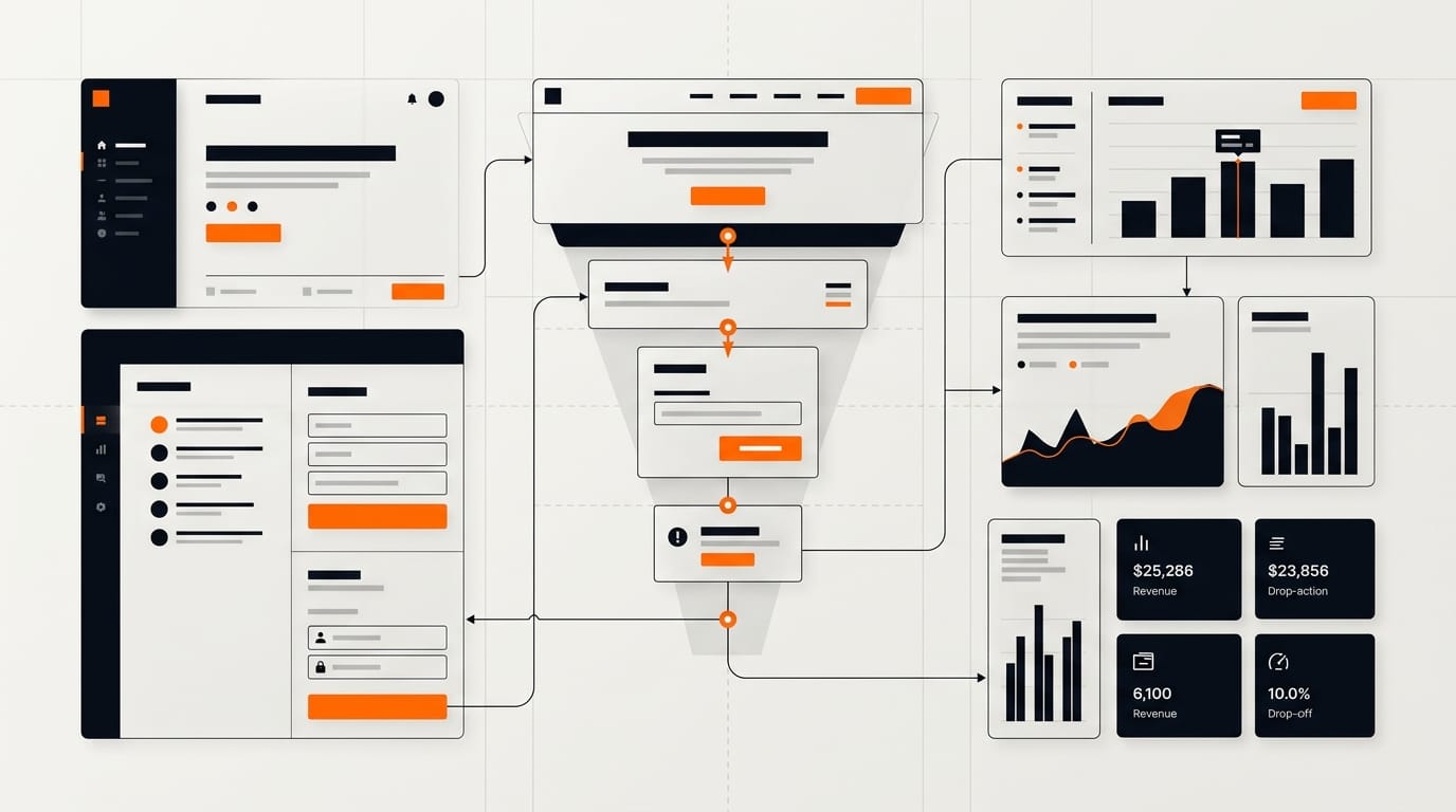
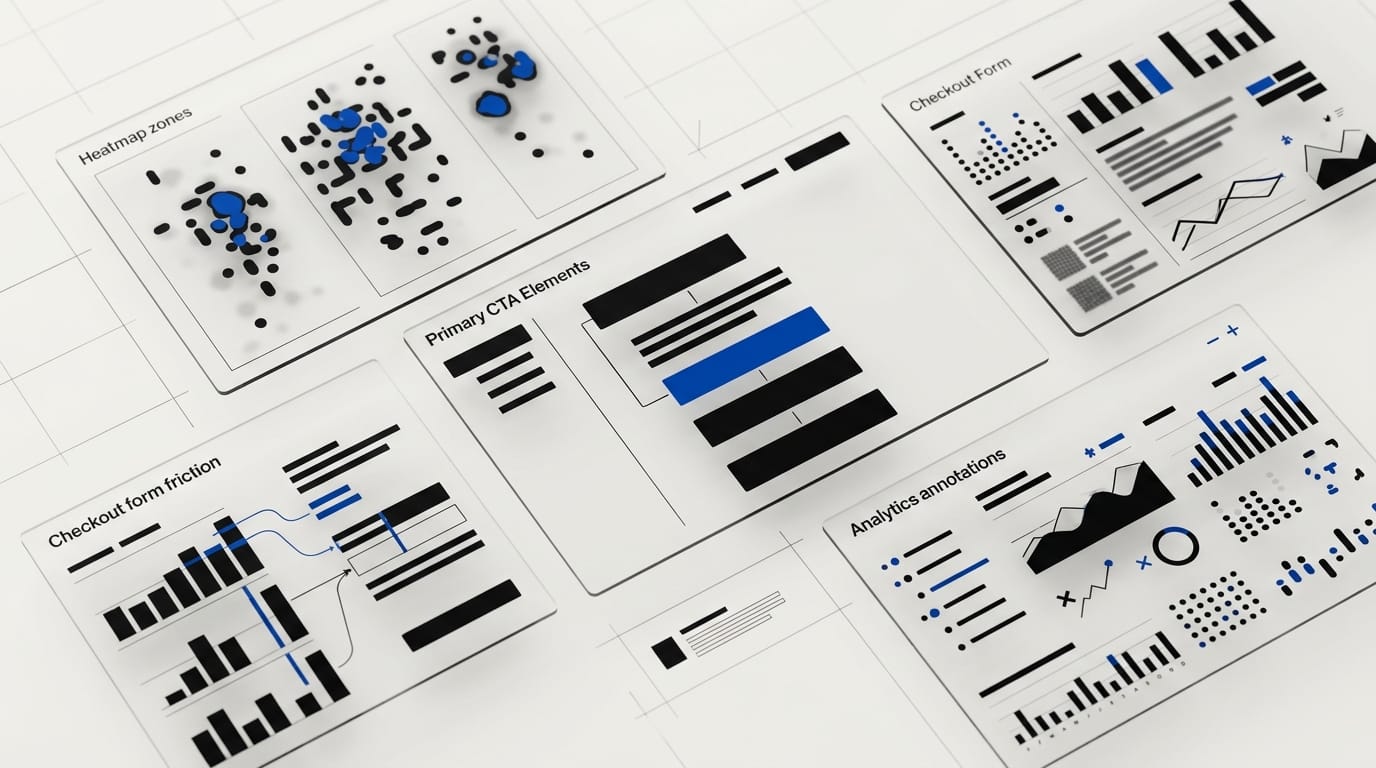
The conversion rate optimization UX audit: 9 places to inspect first
A CRO UX audit should find the spots where user confidence breaks. Start with the highest-intent pages: homepage, pricing, product pages, demo pages, checkout, onboarding, and any landing page tied to paid traffic.
At DesignX, we look for friction in the same way we looked at a complex product catalog for Klein Tools. The win was not more visual polish. The win was a clearer path through 40,000-plus SKUs, which helped drive a 23% lift in dealer adoption. Conversion UX is often the same problem in a different wrapper: reduce cognitive load, increase confidence, and make the next action easier.
- Above-the-fold clarity: The first screen should say who the offer is for, what outcome it creates, and what to do next. If the user has to interpret the page, the page is working against conversion.
- CTA hierarchy: One primary action should dominate the page. Secondary actions can exist, but they should not compete with the main business goal.
- Form friction: Every field must earn its place. If sales does not need the answer before the first conversation, remove it or move it later.
- Proof placement: Case studies, client logos, metrics, reviews, and security cues should appear before high-commitment asks.
- Information scent: Labels, navigation, and page sections should match the words buyers already use. Clever naming slows people down.
- Mobile task flow: Thumb reach, tap targets, sticky CTAs, and form inputs often decide mobile conversion before copy does.
- Page speed: Heavy hero media, third-party scripts, and delayed content can erase intent before the page loads.
- Offer fit: The UX may be fine while the ask is wrong. A cold visitor may need a benchmark, audit, or guide before a demo request.
- Error recovery: Validation messages, failed payments, and broken form states should help users recover without shame or confusion.
Do not audit every page at once. Pick the highest-value conversion path and trace it from the first click to the final submit. Then watch where the experience asks for trust it has not earned.
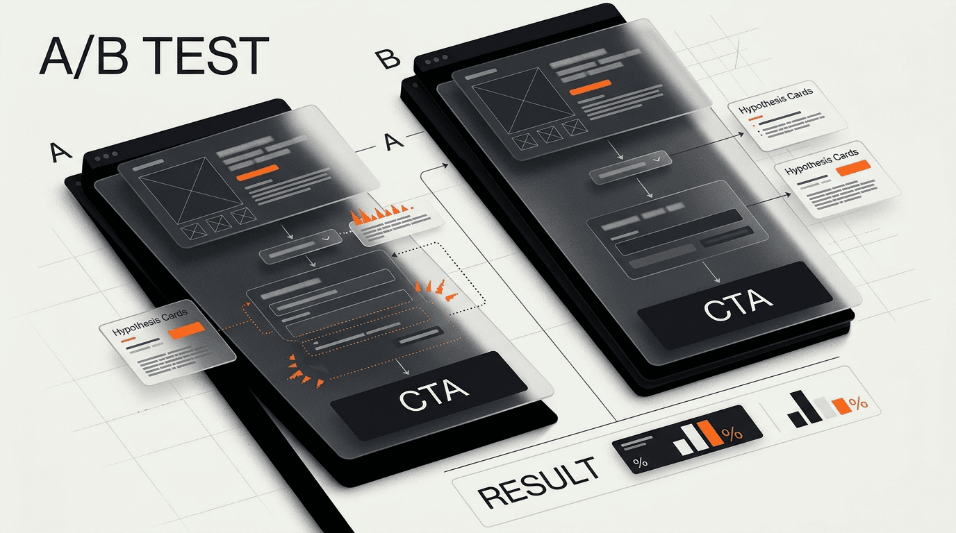
What to test before a redesign
Redesigns are expensive because they bundle many changes into one release. If conversion is the goal, test the riskiest assumptions first. You want to know which friction points matter before you commit to a full rebuild.
Start with a mix of behavioral data and human evidence. Analytics will show where users drop. Session recordings can show the moments of hesitation. User interviews and usability tests can explain what the numbers missed.
| Signal | What it may mean | UX test to run |
|---|---|---|
| High traffic, low CTA clicks | The value proposition is unclear or the CTA feels premature | Test a clearer first screen and move proof higher on the page |
| CTA clicks, low form submits | The form asks too much or creates effort at the wrong moment | Test fewer fields, progressive disclosure, or a lower-commitment ask |
| Strong desktop conversion, weak mobile conversion | The mobile path is harder than the desktop path | Test sticky CTA placement, input design, and faster content loading |
| Checkout starts, high abandonment | Trust, cost clarity, or field design may be breaking confidence | Test cost transparency, guest checkout, proof cues, and field grouping |
Good tests have a reason behind them. A weak test says, “Let’s try a green button.” A stronger test says, “Users are missing the primary action because pricing proof appears below the fold, so we will move proof above the CTA and measure qualified submits.”
Conversion rate optimization UX for SaaS, ecommerce, and service brands
The core idea stays the same across business models: reduce hesitation at the point of decision. The execution changes by buying context.
SaaS websites
SaaS conversion usually breaks when the product is hard to understand quickly. The homepage tries to serve founders, operators, engineers, finance, and enterprise buyers at once. The result is a page that sounds broad but lands with no one.
For SaaS, focus on role-based relevance, product screenshots with context, proof near the demo ask, and pricing signals that reduce uncertainty. Link your audit work to pipeline quality, not just raw demo volume. Our guide to why SaaS websites are not converting goes deeper on those first-screen and trust gaps.
Ecommerce flows
Ecommerce conversion depends on confidence and effort. Product details, returns, shipping, size guidance, payment options, and cart design all shape whether the buyer feels safe moving forward.
Checkout UX deserves special attention because the user has already shown intent. If they abandon there, the business is losing warm demand, not cold traffic. Teams working on pricing and final-decision pages should also review SaaS pricing page design for last-click conversion patterns.
Service businesses
Service conversion is often a trust problem. Buyers need to know who you serve, what outcomes you create, how your process works, and whether the engagement feels credible enough to discuss budget.
For agencies and consultants, the contact page is not a form. It is the final trust page. Show client proof, define the next step, set expectations, and remove ambiguity from the ask.
How DesignX thinks about CRO UX
We do not see conversion rate optimization UX as a growth hack. We see it as product strategy expressed through interface decisions. The better the experience matches the buyer’s mental model, the less persuasion the page has to do.
That is why our work often starts with structure. What does the buyer need to believe before they click? What proof do they need before they share contact information? What part of the product or service is hard to understand without a better visual system?
DesignX has worked with brands including Oura Ring, HP, Bodybuilding.com, and Klein Tools. Across those projects, the pattern holds: conversion improves when the design makes the business easier to understand and the next step easier to trust.
If your analytics show weak conversion, do not start with a new visual style. Start with the decision path. Find the moment where confidence drops, then fix the interface around that moment.
Frequently Asked Questions
What is conversion rate optimization UX?
Conversion rate optimization UX is the practice of improving a website, app, or funnel so more users complete a desired action. CRO measures the action, while UX finds and fixes the friction that prevents it. The work can include research, page structure, forms, navigation, proof placement, speed, and testing.
How is CRO different from UX design?
CRO is usually measured by business outcomes such as signups, demos, purchases, or form submits. UX design focuses on how easy, clear, and trustworthy the experience feels to the user. The best conversion work uses both, because metrics show what happened and UX research explains why it happened.
What UX changes improve conversion rate fastest?
The fastest wins often come from first-screen clarity, better CTA hierarchy, shorter forms, stronger proof placement, and faster page load times. These are high-impact because they touch the moments where users make quick decisions. The right change depends on the page, so start with analytics and a short usability review before testing.
Should we run A/B tests before doing UX research?
You can, but blind A/B testing often wastes traffic. UX research helps you form better test ideas by showing why users hesitate, misread, or abandon a flow. Even five short user sessions can reveal problems that analytics alone will not explain.
Is conversion rate optimization UX only for ecommerce?
No. Ecommerce teams use CRO UX heavily, but SaaS, healthcare, fintech, B2B services, and agencies need it too. Any business with a website or product flow has conversion moments, such as requesting a demo, booking a call, starting a trial, completing onboarding, or submitting a lead form.
When should a company hire a UX agency for CRO?
Hire outside help when conversion has stalled and the team is debating opinions instead of working from evidence. A good UX agency can audit the path, identify friction, create test-ready design changes, and connect the work to business metrics. It is especially useful before a redesign, because it reduces the risk of rebuilding the same conversion problems into a new interface.
Ready to fix your conversion rate optimization UX?
Conversion rate optimization UX is not about tricking users into a click. It is about removing the friction that keeps serious buyers from taking the next step.
If your site has traffic but not enough qualified leads, DesignX can help you audit the path, find the revenue leaks, and design a clearer route from interest to action. Ready to turn more qualified visitors into pipeline? Let’s talk →
If you want a senior design partner to turn this into a sharper product, brand, or website, see how DesignX works.