DesignX has redesigned digital experiences for Klein Tools, Oura Ring, and Bodybuilding.com, brands that collectively drive over $500 million in revenue through digital channels, and the same five conversion killers appear every time. Most of them are invisible friction problems, not aesthetic ones, which is why they survive so many redesigns.
Your website looks modern. The typography is clean. The hero image is sharp. But your conversion rate is still stuck at 1.2%.
Here’s the uncomfortable truth: most websites aren’t losing conversions because of bad aesthetics. They’re losing them because of invisible friction, design decisions that look fine in Figma but collapse under real user behavior.
Over the last decade, DesignX has redesigned web experiences for companies like Klein Tools, Oura Ring, and Bodybuilding.com, brands that have collectively driven over $500M in revenue through digital channels. We’ve seen the same conversion killers show up again and again, regardless of industry.
This article breaks down the five most common website design mistakes that quietly drain your conversion rate, and what to do about them.
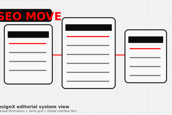
Mistake #1: Your Value Proposition Is Buried Three Scrolls Deep
The Problem:
You have seven seconds to communicate what you do and why it matters. Most websites waste those seven seconds on clever taglines, vague mission statements, or auto-playing hero videos.
If a first-time visitor can’t answer “What does this company do?” and “Why should I care?” in under 10 seconds, they’re gone.
Real Example:
We worked with a B2B SaaS company whose homepage opened with “Empowering teams to achieve more.” Vague. Forgettable. Their actual product, API monitoring for DevOps teams, was mentioned in paragraph three, below the fold.
After restructuring the hero section to lead with “Catch API failures before your customers do,” conversion on their demo request form jumped 34% in the first month.
The Fix:
- Lead with a single-sentence value proposition that names the problem you solve
- Place it above the fold, in the largest text on the page
- Follow with a one-sentence “who it’s for” (e.g., “Built for fast-moving DevOps teams at scaling startups”)
- Your hero CTA should reflect the visitor’s intent: “See how it works” beats “Get started” when trust is low
Mistake #2: Your Navigation Is a Junk Drawer
The Problem:
Navigation menus have become dumping grounds. Products, Services, Solutions, Resources, Company, About, Careers, Blog, Partners, Case Studies, all fighting for attention.

Every additional navigation item increases cognitive load and decision paralysis. Jakob’s Law states that users prefer your site to work like every other site they use. When your nav doesn’t match mental models, friction spikes.
The Data:
A 2023 Baymard Institute study found that websites with 5-7 primary navigation items had 28% higher task completion rates than those with 10+ items.
The Fix:
- Limit primary navigation to 5-7 items maximum
- Use mega-menus sparingly (only if you have genuinely distinct product lines)
- Group related pages under logical parent categories
- Move low-priority links (Careers, Press, Legal) to the footer
- Test your navigation with the “drunk user test”, if someone slightly distracted can’t find your pricing page in under 10 seconds, simplify

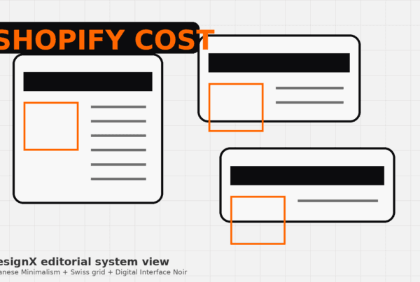
Mistake #3: Your Forms Ask for Too Much, Too Soon
The Problem:
Your contact form asks for: First Name, Last Name, Email, Phone, Company, Company Size, Industry, Job Title, Project Budget, Project Timeline, How Did You Hear About Us, and a message field.
Twelve fields to ask a question.
Every form field you add drops conversion rate by an average of 4-6%, according to Formstack’s analysis of 650,000+ forms. Why? Because you’re asking for commitment before you’ve built trust.
Real Example:
Klein Tools’ dealer portal originally required 14 fields to request a product catalog. We reduced it to 3 (Name, Email, Company). Catalog requests increased 47%.
The key insight: they didn’t need perfect data upfront. They needed volume. Sales could qualify leads on the back end.
The Fix:
- For top-of-funnel forms (newsletter, demo request, contact), ask for 3-5 fields maximum
- Move “nice to have” fields to a second step or post-signup survey
- Use conditional logic, only show “Company Size” if they select “I’m evaluating for my team”
- Default to optional fields unless you genuinely can’t proceed without the data
- Replace “Submit” with action-specific CTAs: “Get the Guide” or “Book My Demo Slot”
Mistake #4: Your Mobile Experience Is a Shrunken Desktop Site
The Problem:
60% of B2B research now happens on mobile devices (Google, 2024). But most “mobile-responsive” sites just stack desktop layouts vertically and call it done.
True mobile optimization isn’t about fitting content on a smaller screen. It’s about recognizing that mobile users have different contexts, different intent, and different interaction patterns.
What Actually Breaks:
- Tap targets under 44x44px (users miss buttons, rage-quit)
- Forms that trigger the wrong keyboard (email fields that open the standard keyboard instead of the email-optimized one)
- Horizontal scrolling on tables or images
- Pop-ups that can’t be closed on mobile
- Auto-playing videos that eat mobile data
The Fix:
- Test your site on actual devices, not just browser DevTools
- Use thumb-zone heatmaps, place primary CTAs in the “easy reach” zone (bottom third of the screen)
- Simplify mobile navigation to a focused hamburger menu or bottom tab bar
- Hide or collapse secondary content on mobile (move it to accordion sections)
- Optimize images for mobile, a 4MB hero image that looks crisp on desktop will kill mobile load times
Mistake #5: You’re Optimizing for Pageviews, Not Outcomes
The Problem:
You obsess over traffic. You track pageviews, bounce rate, session duration. But you’re not tracking what actually matters: conversion paths.
Most analytics setups measure vanity metrics. The question isn’t “How many people visited our pricing page?” It’s “How many people who visited pricing then requested a demo within 7 days?”
The Data Trap:
High time-on-page can mean users are engaged, or it can mean they’re confused and hunting for information. Low bounce rate can mean your site is compelling, or it can mean your exit links are broken.
The Fix:
- Set up goal tracking in Google Analytics (or your analytics tool of choice) for every conversion point: demo requests, contact form submissions, newsletter signups, pricing page visits
- Build conversion funnels to identify drop-off points (e.g., 70% of users who view pricing never click “Request Demo”, why?)
- Use heatmaps (Hotjar, Microsoft Clarity) to see where users actually click, scroll, and rage-click
- A/B test based on hypotheses, not guesses: “I think users are confused by our pricing tiers” → Test a simplified 2-tier structure vs. current 4-tier
- Measure revenue per session, not just sessions, a site with 10K visitors and 50 conversions beats a site with 50K visitors and 40 conversions

What to Do Next
If you recognized your site in two or more of these mistakes, you’re not alone. Most websites are built to look good in stakeholder presentations, not to convert cold traffic.
The good news: these aren’t deep technical problems. They’re design decisions. And design decisions can be changed.
Here’s where to start:
- Audit your homepage above-the-fold, Can a stranger describe what you do in 10 seconds?
- Run a mobile test, Load your site on your phone. Can you complete your primary CTA (demo request, purchase, contact) in under 60 seconds?
- Review your top-performing pages in analytics, Where are users dropping off?
If you need an outside perspective, we offer conversion audits for growing companies. We’ll walk through your site, identify friction points, and give you a prioritized list of fixes.
Ready to fix what’s costing you conversions?
Let’s talk →
Frequently Asked Questions
What is mistake 1: your value proposition is buried three scrolls deep?
The Problem: You have seven seconds to communicate what you do and why it matters. Most websites waste those seven seconds on clever taglines, vague mission statements, or auto-playing hero videos. If a first-time visitor can’t answer “What does this company do?” and “Why should I care?” in under 10 seconds, they’re gone. Real Example: We worked with a B2B SaaS company whose homepage opened with “Empowering teams to achieve more.” Vague.
What is mistake 2: your navigation is a junk drawer?
The Problem: Navigation menus have become dumping grounds. Products, Services, Solutions, Resources, Company, About, Careers, Blog, Partners, Case Studies, all fighting for attention. Every additional navigation item increases cognitive load and decision paralysis. Jakob’s Law states that users prefer your site to work like every other site they use.
What is mistake 3: your forms ask for too much, too soon?
The Problem: Your contact form asks for: First Name, Last Name, Email, Phone, Company, Company Size, Industry, Job Title, Project Budget, Project Timeline, How Did You Hear About Us, and a message field. Twelve fields to ask a question. Every form field you add drops conversion rate by an average of 4-6%, according to Formstack’s analysis of 650,000+ forms. Why?
What is mistake 4: your mobile experience is a shrunken desktop site?
The Problem: 60% of B2B research now happens on mobile devices (Google, 2024). But most “mobile-responsive” sites just stack desktop layouts vertically and call it done. True mobile optimization isn’t about fitting content on a smaller screen. It’s about recognizing that mobile users have different contexts, different intent, and different interaction patterns.
What should teams do next?
If you recognized your site in two or more of these mistakes, you’re not alone. Most websites are built to look good in stakeholder presentations, not to convert cold traffic. The good news: these aren’t deep technical problems. They’re design decisions.