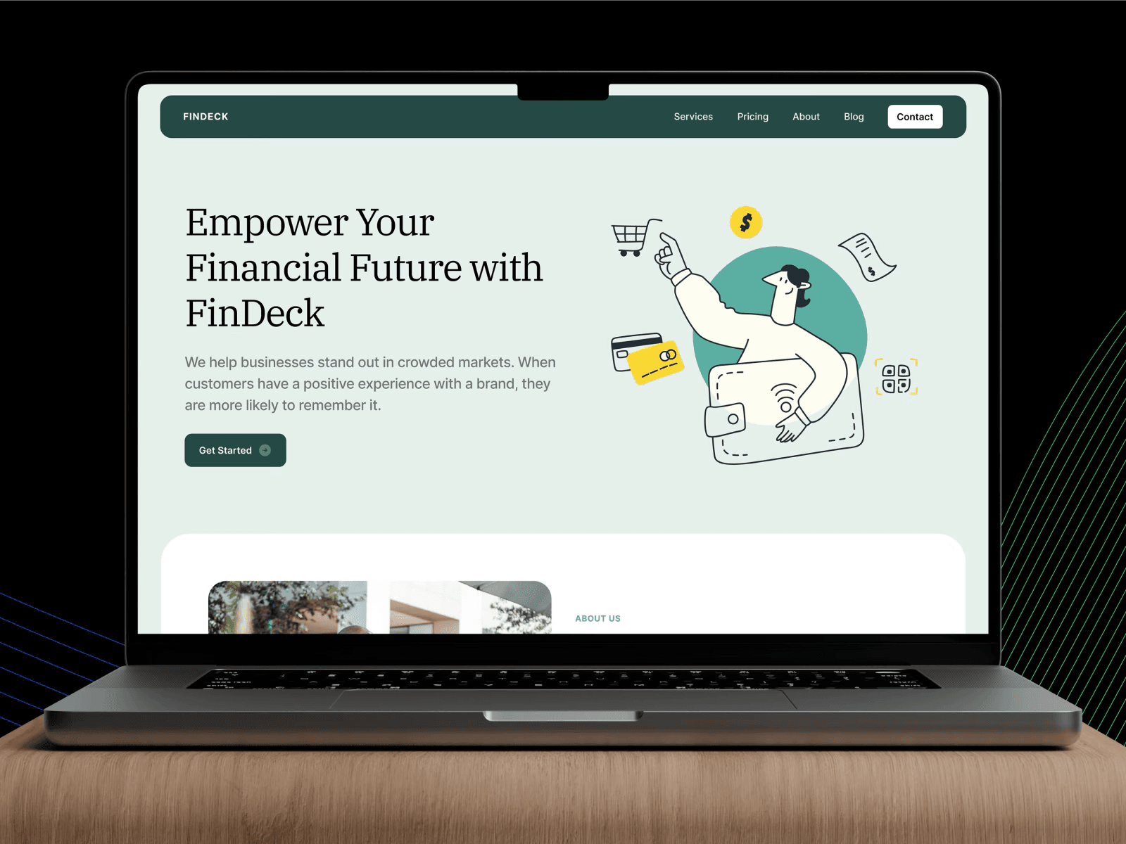
FinDeck’s online presence failed to convey trustworthiness and the value of its financial tools. DesignX aimed to improve user experience and visual identity to boost user acquisition.
FinDeck, a promising financial solution startup, faced a critical hurdle: its existing online presence failed to convey its trustworthiness and the true value of its sophisticated tools. A confusing user experience and an outdated visual identity hindered user acquisition and engagement, preventing the company from connecting with a broad audience seeking clearer financial management.
Project Overview
| Category | Detail |
|---|---|
| Client Type | Financial Technology Startup |
| Industry | Fintech, Personal Finance |
| Project Type | Website Redesign and New Landing Page Development |
| Timeline | 10 Weeks |
| Deliverables | User Experience Research, Information Architecture, Wireframes, High-Fidelity UI Design, Interactive Prototype, Design System, Style Guide |
| Tools Used | Figma, Miro, Adobe Creative Suite, Maze |
The Challenge
FinDeck approached DesignX with a significant problem: their existing website was a barrier, not a gateway. Despite offering powerful budgeting, investment tracking, and financial planning tools, the platform suffered from low user engagement and a stagnant conversion rate. The primary issues stemmed from a cluttered interface that overwhelmed users with too much information, poorly defined navigation that made finding specific features difficult, and an inconsistent visual design that lacked professionalism and trust, essential qualities for any financial service. Users frequently expressed confusion during initial onboarding, leading to high bounce rates and abandonment before exploring FinDeck’s core functionalities. The brand perception was diluted, failing to communicate the stability and security that users expect from a financial partner. This created a disconnect between FinDeck’s genuine value proposition and its digital presentation, directly impacting user acquisition and the company’s growth potential. Our task was to transform this into an intuitive, trustworthy, and engaging digital experience.
Our Approach
Our engagement with FinDeck began with an intensive discovery phase, focused on understanding both the business objectives and the end-user needs. We initiated this with a series of stakeholder interviews and workshops to define FinDeck’s core values, target audience, and long-term vision. This foundation allowed us to conduct comprehensive user research, including surveys and one-on-one interviews with potential and existing financial solution users. We sought to uncover their pain points, financial habits, and expectations when interacting with online financial platforms. Concurrently, we performed a thorough competitor analysis, identifying industry best practices and areas where FinDeck could differentiate itself.
This research informed the creation of detailed user personas and journey maps, which guided our information architecture redesign. We then moved into wireframing, iteratively sketching and refining page layouts to prioritize clarity and ease of navigation. These low-fidelity designs were tested internally and with a small group of users to validate early assumptions. The feedback from these sessions was crucial, allowing us to identify and address usability issues before proceeding to high-fidelity UI design. Our process emphasized constant communication with the FinDeck team, ensuring alignment at every stage and allowing for flexible adjustments based on new insights.
Key Design Decisions
1. Implementing a Progressive Disclosure Model for Complex Financial Data
The initial FinDeck website overwhelmed users by presenting all financial data upfront, creating cognitive overload. Our decision was to adopt a progressive disclosure model. This meant structuring information so that users only saw essential summaries at first, with more detailed data available upon interaction, such as clicking on an investment portfolio or expanding a budget category. The why behind this was to reduce initial intimidation, guide users through complex information step by step, and empower them to explore at their own pace. This approach made the platform feel less daunting and more inviting, particularly for new users who might be less familiar with advanced financial concepts. It also significantly improved the perceived simplicity and efficiency of navigating through personal finance tools.
2. Adopting a Calming, Trust-Focused Color Palette with Strategic Data Visualization
Financial platforms demand trust and clarity. FinDeck’s previous design used a disparate color scheme that lacked cohesion. We made a deliberate choice to build a primary color palette centered on deep blues and cool greens, accented by carefully selected neutral tones. The why for this was twofold: deep blues evoke stability, trust, and professionalism, while cool greens suggest growth, prosperity, and a sense of calm. These primary colors were strategically paired with a vibrant, but limited, secondary palette for data visualization elements, like charts and graphs. This ensured that critical data stood out clearly without causing visual clutter. This color strategy not only enhanced the aesthetic appeal but also subconsciously reinforced FinDeck’s reliability and expertise, crucial for a financial service.
3. Integrating Interactive Explanations and On-Page Tooltips
A common issue reported by users was difficulty understanding the purpose or functionality of certain financial metrics and tools. To address this, we integrated interactive explanations and context-sensitive tooltips directly within the interface. Hovering over a term like “Return on Investment” or a specific chart segment would reveal a concise, easy-to-understand explanation. The why for this decision was to provide immediate, in-context learning opportunities, reducing the need for users to navigate away to a separate help section or FAQ. This approach fostered a sense of empowerment and self-sufficiency, allowing users to grasp complex financial concepts on demand, directly within their workflow. It lowered the barrier to entry for more sophisticated features and significantly improved overall user comprehension and satisfaction.
Design Highlights
Our design for FinDeck focused on creating an experience that felt both sophisticated and approachable, prioritizing clarity, trust, and user empowerment.
Color Rationale: The chosen color palette is anchored by a calming, professional deep blue, symbolizing trust, stability, and intelligence, which are paramount in the financial sector. This is complemented by a lighter, energetic green, representing growth, freshness, and prosperity. These primary colors are used for core interface elements, backgrounds, and calls to action, creating a sense of reliability. A carefully curated set of neutral grays and soft whites ensures readability and provides visual breathing room, preventing the interface from feeling overwhelming. Accent colors are reserved sparingly for data visualization elements, like chart segments and progress indicators, ensuring they stand out clearly without creating visual noise. This strategic use of color reinforces FinDeck’s identity as a secure, forward-thinking financial partner.
Typography Choice: We selected a clean, modern sans-serif typeface for all textual content. The primary font was chosen for its excellent readability across various screen sizes and its professional yet friendly appearance. A secondary, slightly more condensed sans-serif was used for numerical data and labels within charts, optimizing for clarity and efficient display of figures. The consistent application of these typefaces, with appropriate hierarchy in font sizes and weights, ensures that complex financial information is presented in a highly scannable and digestible manner. The chosen typography avoids any overly decorative elements, maintaining a serious and trustworthy tone fitting for a financial platform.
Layout Logic: The layout follows a modular, grid-based system designed for consistency and scalability. Each section, from budgeting overviews to investment tracking, is presented in distinct, card-like modules. This approach allows users to quickly scan and identify different data sets and functionalities. The information architecture employs a logical flow, guiding users from high-level summaries to detailed breakdowns through progressive disclosure. Important calls to action are strategically placed and given prominence, ensuring users can easily navigate to key tasks such as adding an account or creating a new budget. Ample white space is used to reduce visual clutter, enhance focus on critical information, and contribute to an overall clean, premium aesthetic.
Interaction Patterns: We incorporated intuitive interaction patterns to enhance user engagement and provide immediate feedback. Micro-interactions, such as subtle animations on button clicks or data updates, confirm user actions and make the interface feel responsive and alive. Dynamic charts and graphs allow users to hover over data points for detailed information, and drag-and-drop functionality was considered for future budget reordering. Form fields include real-time validation and clear feedback messages, guiding users smoothly through data entry. A persistent, yet unobtrusive, navigation bar ensures access to core features from any page. These patterns collectively create an engaging and user-friendly experience, making complex financial management feel straightforward and controllable.
Results and Impact
The redesign of FinDeck’s website by DesignX yielded significant improvements in user engagement and business performance, directly addressing the initial challenges.
| Metric | Before DesignX | After DesignX |
|---|---|---|
| Conversion Rate (New Sign-ups) | 1.8% | 4.3% |
| Bounce Rate | 65% | 32% |
| Average Time on Page | 1:30 minutes | 3:45 minutes |
| User Satisfaction Score (out of 5) | 3.2 | 4.5 |
| Task Completion Rate (e.g., budget setup) | 55% | 88% |
| Pages per Session | 2.1 | 4.7 |
These quantitative improvements translated into substantial business outcomes for FinDeck. The dramatic increase in conversion rate led to a 138% increase in new user sign-ups within the first three months post-launch. Reduced bounce rates and extended time on page indicated a more engaged and satisfied user base, suggesting users found the platform more trustworthy and valuable. FinDeck also reported a noticeable decrease in customer support inquiries related to website navigation and feature understanding, freeing up resources and improving operational efficiency. The redesign successfully positioned FinDeck as a credible and user-centric financial solution in a competitive market.
What Made This Project Work
The success of the FinDeck project was a direct result of an exceptional collaborative dynamic between the DesignX team and FinDeck’s stakeholders. From the outset, FinDeck provided clear, candid insights into their business challenges and user feedback, fostering an environment of transparency. This open communication allowed our team to truly understand their vision and align our design strategy with their specific goals. Furthermore, FinDeck’s willingness to actively participate in iterative feedback sessions and their trust in our user-centric design process enabled quick decision-making and efficient progression. The shared commitment to a data-informed approach, combined with DesignX’s structured methodology, ensured that every design choice was purpose-driven and aimed squarely at resolving user pain points and achieving measurable business impact.
Frequently Asked Questions
How long did the design process take from initial concept to final handover?
The entire design process for the FinDeck website, from our initial discovery workshops to the final handover of design assets and a comprehensive design system, spanned approximately 10 weeks. This timeline included extensive user research, wireframing, prototyping, iterative design, and client feedback cycles, ensuring a thorough and polished outcome.
What was the biggest challenge in designing for a financial product like FinDeck?
The primary challenge was balancing the need for clear, intuitive usability with the inherent complexity and sensitivity of financial data. Building trust through design, ensuring information security is visually communicated, and presenting complex financial tools in an accessible, non-intimidating way required careful consideration of every visual and interaction element.
How did DesignX ensure the new design would build user trust and convey security?
We built trust through several design principles: adopting a professional, calming color palette, using clear and consistent typography for readability, implementing a logical information hierarchy, and employing subtle visual cues that suggest reliability. We also designed for transparency, ensuring important security disclaimers and privacy policies were easily accessible without disrupting the user flow, reinforcing FinDeck’s commitment to user data protection.
Can DesignX assist with the implementation or ongoing maintenance of the website?
While our core expertise lies in UI/UX design and strategy, we often collaborate with development partners for implementation. For ongoing