Your brand is the first filter prospects use to decide whether you are worth their time, and a dated or unclear visual identity ends deals before the first conversation starts. This post identifies five concrete signs your brand is costing you clients and gives you a specific action for each one.
Your brand isn’t just your logo. It’s the first filter potential clients use to decide if you’re worth their time.
If your branding looks dated, unclear, or cheap, you’re losing deals before the first conversation. I’ve watched this happen hundreds of times, qualified prospects bounce because the visual signal says “2011” or “generic template” or “we don’t invest in quality.”
Here are five concrete signs your brand is costing you revenue, and what to do about each one.
Sign 1: Your Website Looks Like Everyone Else’s Template
The Problem:
You’re using a SaaS template that 10,000 other companies have deployed. Same stock photos. Same three-column feature grid. Same “innovative solutions for modern businesses” headline.
When a prospect can’t distinguish you from your competitors within three seconds, they default to price. You become a commodity.
What It’s Costing You:
Premium positioning. The ability to charge 30-50% more than your competitors. Clients who value craft and precision won’t take you seriously if your site screams “I spent $200 on Themeforest.”
What to Do:
Custom design doesn’t mean redesigning from scratch. Start with your homepage hero section and your About page. Replace generic stock images with authentic photography, even iPhone shots of your team, your workspace, or your product in action beat stock photos.
Kill the jargon. Replace “innovative solutions” with a specific outcome your client cares about. “We design checkout flows that convert 40% higher than industry standard” beats “modern e-commerce experiences.”
Invest in one unique design element that becomes your signature. Klein Tools didn’t need a full rebrand, they needed a product presentation system that showcased precision. That’s what we built for them.
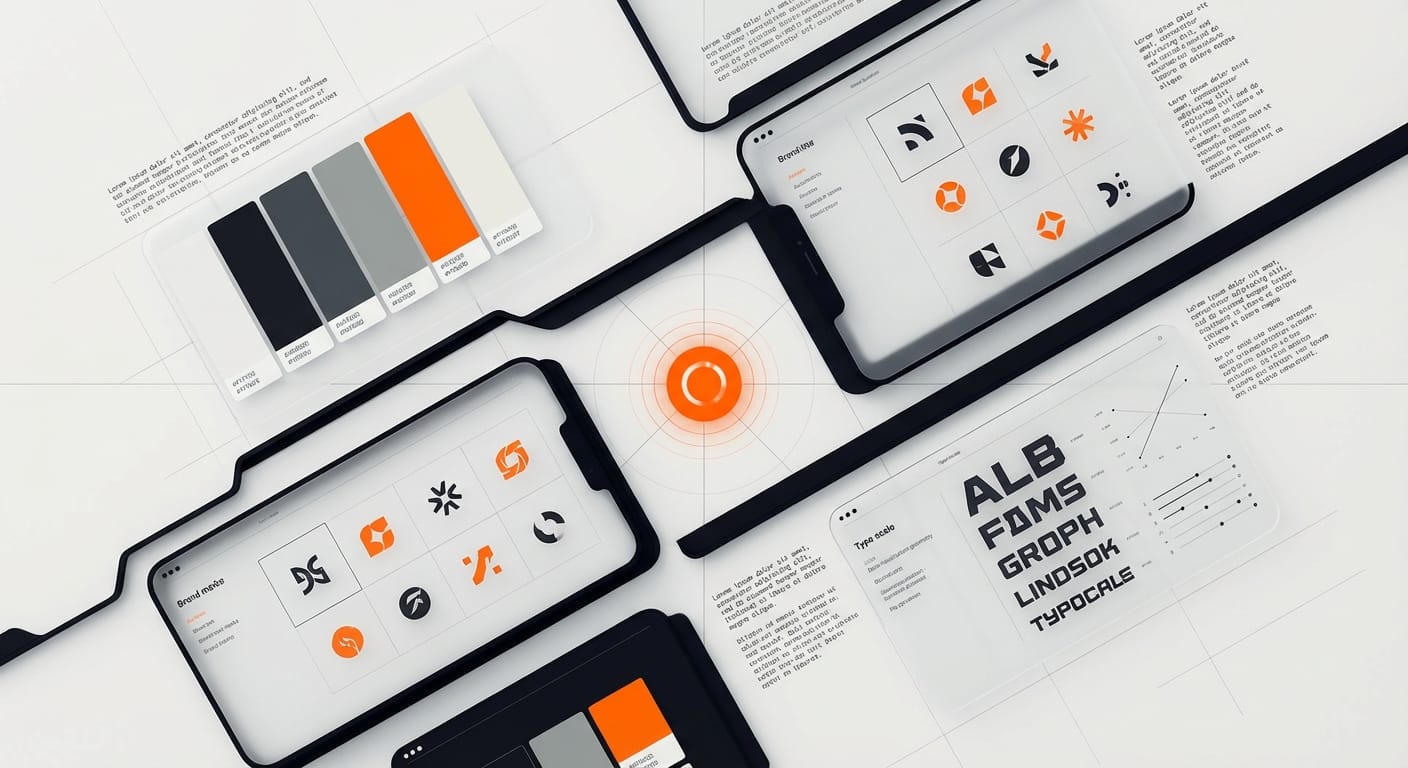
Sign 2: Your Color Palette Signals “Budget Tier”
The Problem:
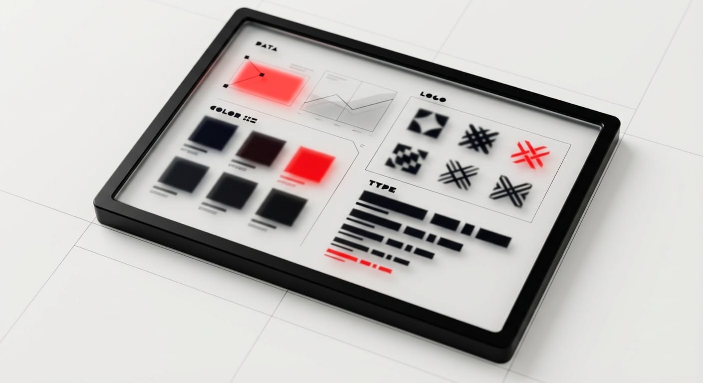
You’re using the default blue-and-gray combination, or worse, the Microsoft Office color wheel. Your palette has six colors competing for attention. Nothing feels intentional.
Color is one of the fastest cognitive shortcuts. Cheap color choices signal budget constraints and lack of design oversight.
What It’s Costing You:
Enterprise deals. Corporate buyers have been trained by years of vendor presentations, sophisticated brands use restrained, intentional color systems. Busy, saturated, or default palettes trigger “small vendor” pattern matching.
What to Do:
Audit your current palette. Count your colors. If you’re using more than three primaries plus neutrals, you’re diluted.
Pick ONE brand color that owns your category differently. Stripe owns purple in fintech. Notion owns beige in productivity. What color is underused in your space?
Build a system:
- Primary brand color (10% of usage)
- Neutral grays (80% of usage)
- One accent for CTAs (10% of usage)
That’s it. Constraint creates recognition.
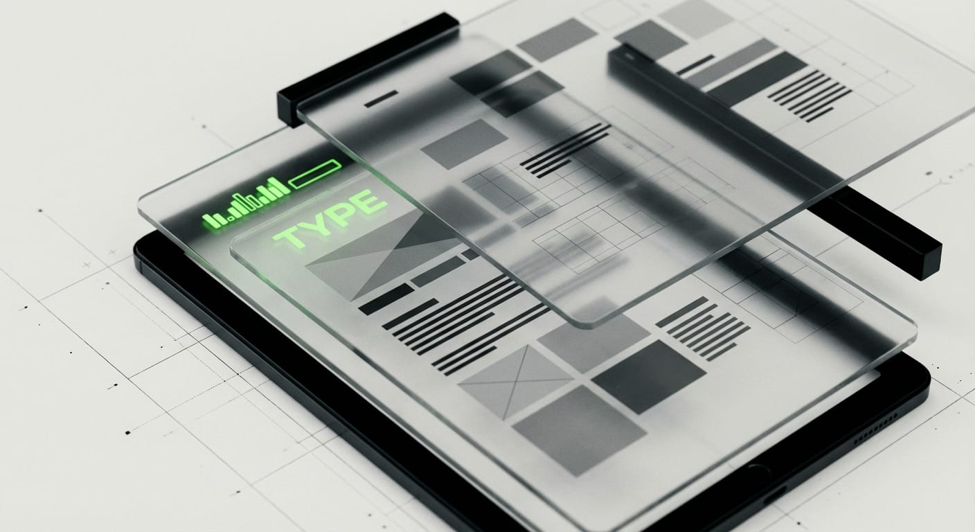
Sign 3: Your Typography Makes People Squint
The Problem:
You’re using multiple font families across your site. Your body copy is 14px gray text on a white background. Your headings lack hierarchy. Reading your content feels like work.
Typography is invisible when it’s right and exhausting when it’s wrong. If your prospects have to work to read your copy, they won’t.
What It’s Costing You:
Engagement. Average session duration on your site is probably under 60 seconds. That’s not a content problem, it’s a readability problem. You’re losing qualified leads who would read your case studies if you made it effortless.
What to Do:
Set a minimum body text size of 18px. Make your line height 1.6x your font size. Use actual black (#000000) for headlines, not gray.
Limit yourself to two font families maximum:
- One for headings (can be distinctive)
- One for body copy (must be readable)
Test your site on your phone right now. If you have to pinch-to-zoom to read anything, your typography is costing you mobile conversions.
Look at how Stripe, Linear, or Basecamp handle type. Notice the generous spacing, the clear hierarchy, the confident sizing. That’s not aesthetic preference, it’s conversion optimization.
Sign 4: Your Brand Tells No Story About Who You Serve
The Problem:
Your homepage could apply to any company in your industry. There’s no signal about who your ideal client is, what problems you solve, or why you’re different from the 47 other options.
Generic positioning forces prospects to do detective work. Most won’t bother.
What It’s Costing You:
Qualified inbound leads. When your brand doesn’t pre-qualify, you waste time on discovery calls with companies too small, too large, or in the wrong vertical. Your sales cycle extends because every prospect needs education.
What to Do:
Get specific on your homepage. Replace “We help businesses grow” with “We design checkout experiences for Shopify brands doing $2M-$20M annually.”
Show your work. Real client logos, real projects, real outcomes. We put HP, Oura Ring, and Bodybuilding.com on our homepage because those names do the credibility work for us.
Write your positioning for one person. When Stripe launched, their homepage said “Payments for developers.” Not businesses, not companies, developers. That specificity built a $95B company.
Add one case study to your homepage with a real metric. “Increased mobile conversion by 42%” with a client logo is worth more than ten generic testimonials.
Sign 5: Your Brand Hasn’t Evolved With Your Business
The Problem:
You launched four years ago as a scrappy startup. You picked a name, bought a logo from Fiverr, and moved fast. That made sense then.
But now you’re charging $50K per project, competing for enterprise deals, and your brand still looks like a weekend project. The visual language doesn’t match your current positioning.
What It’s Costing You:
Big deals. When a Fortune 500 procurement team evaluates vendors, brand polish is a proxy for operational maturity. If your brand looks unfinished, they assume your processes are too.
What to Do:
Audit the gap between your current revenue and your brand presentation. If you’re doing $2M+ annually and your website hasn’t been touched since 2021, you’re leaving money on the table.
You don’t need a full rebrand. You need strategic updates:
Phase 1 (Week 1): Update your homepage hero and main headline to reflect your current positioning.
Phase 2 (Week 2-3): Refresh your color palette and lock in a type system. Update your pitch deck and proposal templates to match.
Phase 3 (Month 2): Build out case studies with real metrics. Remove any outdated work from your portfolio.
Phase 4 (Month 3-4): Redesign your core landing pages (homepage, about, services, contact) with your new system.
This isn’t vanity. It’s revenue infrastructure. Your brand should make selling easier, not harder.
What This Actually Looks Like In Practice
I’ve seen this pattern play out repeatedly: A company doing $500K-$2M in revenue with a brand that still reflects their first year in business. They’re leaving 30-40% revenue growth on the table because their visual presentation doesn’t match their operational maturity.
One example: A SaaS company came to us closing deals at $8K ACV. Their brand looked like a Bootstrap template from 2015. We didn’t rebuild everything, we fixed their homepage positioning, upgraded their typography and color system, and built three detailed case studies.
Six months later, their average contract value hit $18K. Same product. Same sales team. Different signal.
Your brand is doing one of two things: opening doors or closing them. There’s no neutral.
Where to Start
Pick the sign above that stung the most when you read it. That’s your starting point.
If you’re a founder or CEO who knows your brand is costing you deals but doesn’t have the time or team to fix it yourself, that’s exactly the problem we solve at DesignX. We’ve built brand systems and digital products for HP, Oura Ring, Klein Tools, and Bodybuilding.com, companies that need precision, speed, and measurable outcomes.
See our work at designx.co.
Related Reading
- AI Branding: How Artificial Intelligence is Transforming Brand Design
- Design Agency Pricing Guide: What You'll Actually Pay in 2026
- Unlocking Brand Success: Graphic Design as a Service (DAAS) Explained
Frequently Asked Questions
What is sign 2: your color palette signals “budget tier”?
The Problem: You’re using the default blue-and-gray combination, or worse, the Microsoft Office color wheel. Your palette has six colors competing for attention. Nothing feels intentional. Color is one of the fastest cognitive shortcuts.
What is sign 3: your typography makes people squint?
The Problem: You’re using multiple font families across your site. Your body copy is 14px gray text on a white background. Your headings lack hierarchy. Reading your content feels like work.
What is sign 4: your brand tells no story about who you serve?
The Problem: Your homepage could apply to any company in your industry. There’s no signal about who your ideal client is, what problems you solve, or why you’re different from the 47 other options. Generic positioning forces prospects to do detective work. Most won’t bother.
What is sign 5: your brand hasn’t evolved with your business?
The Problem: You launched four years ago as a scrappy startup. You picked a name, bought a logo from Fiverr, and moved fast. That made sense then. But now you’re charging $50K per project, competing for enterprise deals, and your brand still looks like a weekend project.
What This Actually Looks Like In Practice?
I’ve seen this pattern play out repeatedly: A company doing $500K-$2M in revenue with a brand that still reflects their first year in business. They’re leaving 30-40% revenue growth on the table because their visual presentation doesn’t match their operational maturity. One example: A SaaS company came to us closing deals at $8K ACV. Their brand looked like a Bootstrap template from 2015.