Industrial brands should view trade show booths as critical sales infrastructure. A booth functions as a temporary showroom, lead generation engine, and brand representation.
Your Trade Show Booth Is Sales Infrastructure, Not Just Decoration
Many industrial brands approach trade show booths as an expense. They see a display, some graphics, and a place to put their products. This thinking misses the point. Your booth is a critical piece of sales infrastructure. It’s a temporary showroom, a lead generation engine, and a brand experience, all rolled into one. When you design with this mindset, your investment begins to pay off. We’ve seen companies transform their show results by shifting from a “display” mentality to an “infrastructure” mentality.
Consider the average trade show environment. It’s loud, crowded, and overwhelming. Attendees have limited time and a specific agenda. Your booth must cut through the noise, communicate value quickly, and pull qualified prospects into a conversation. This requires a deliberate trade show design strategy, one that integrates your visual presence with your sales goals.
Mastering Sight-Line Strategy: Designing for Every Approach
People interact with your booth in stages. They see it from a distance, approach it, and then engage with it. Each stage demands a different design focus. We break this down into a four-stage sight-line strategy.
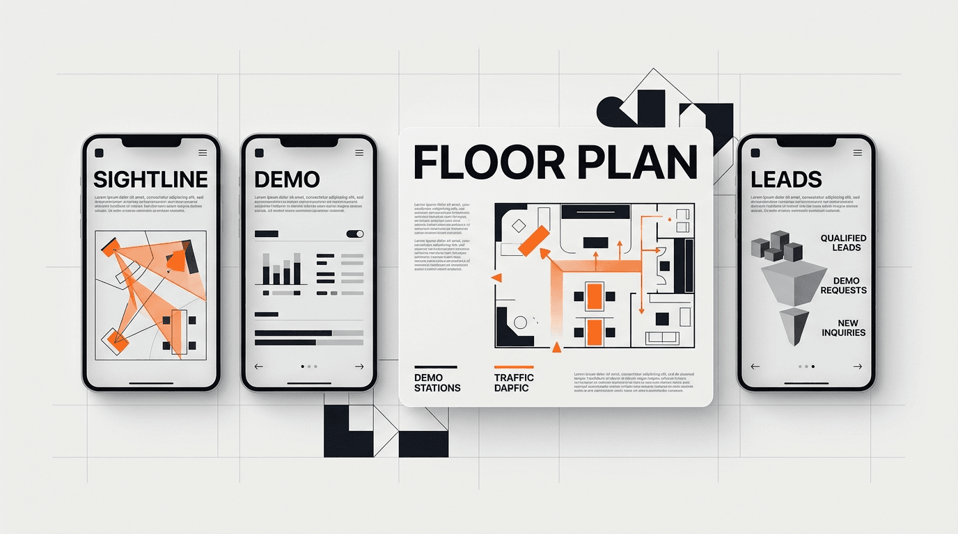
The 40-Foot View: The Initial Grab
From 40 feet away, attendees are scanning the aisle. Their eyes are seeking patterns, bold colors, and large, clear brand identifiers. This is where your brand’s primary logo and a single, powerful headline should dominate. Think of it like a billboard on a highway. What is the absolute core message you want to convey? Is it “Industrial Automation Solutions” or “Precision Machining Tools”? Use large, legible fonts. Avoid clutter. Your goal here is to stop them in their tracks, even if just for a second, and make them curious enough to walk closer.
This is where things like an elevated brand sign, distinct lighting, or a large hero image of your product in action makes a difference. For a company like Klein Tools, known for its extensive product catalog, we might focus on a singular, iconic tool or a powerful usage image, rather than trying to show everything at once.
The 20-Foot Approach: Sparking Interest
As attendees get within 20 feet, they’re looking for more detail. Here, you introduce a secondary message or a clear visual differentiator. This could be a unique product feature, a key benefit, or an industry problem you solve. This is not the place for paragraphs of text. Use bullet points or short, punchy statements. Visuals remain dominant. A well-placed monitor showing a short, silent product video loop can work wonders. The video needs to be self-explanatory.
Consider the psychology: the attendee is deciding whether to commit a few more steps to your booth. Give them a reason. If you offer a complex industrial solution, this is where you hint at the problem you solve for their specific industry. For example, “Reduce Downtime by 30% with X System.”
The 10-Foot Zone: Inviting Engagement
At 10 feet, a prospect is likely considering entering your booth space. The design here needs to be welcoming. Remove physical barriers. Make your reception counter inviting, not imposing. Your staff should be visible and approachable, not hidden behind desks or engrossed in their phones. This is the zone for a clear call to action, whether explicit or implied. It could be “See a Live Demo” or simply an open, attractive demo station.
This is also where you might feature a compelling, tangible product display, allowing for closer inspection. If your product is large, display a key component or a scale model. If it’s software, have an interactive kiosk or a live screen showing the interface. We designed the launch identity for Oura Ring, emphasizing clarity and approachability; that same principle applies here, making the product feel accessible even if it’s high-tech.
The 3-Foot Interaction: Deepening the Conversation
Once inside the booth, your design supports the sales conversation. This means comfortable spaces for discussion, clear pathways, and accessible product information. Your product demo staging areas become paramount. Ensure adequate lighting, power, and space for both your product and the attendees observing it. Have dedicated areas for quick chats and more in-depth consultations. This is where your print materials should be readily available but not overwhelming. We’ll discuss this in more detail later.
The goal is to move from initial attention to a meaningful dialogue. The booth’s layout should naturally guide people to where your sales team can engage them effectively. Think about the flow of traffic and how it leads to points of interest within your space.
Engineering the 10-Second First Impression
Research indicates you have roughly 10 seconds to make a lasting impression on a trade show floor. This short window is not about conveying every detail of your offering. It’s about communicating your core value and brand identity. This is the “What do you do?” test.
For industrial brands, this usually comes down to two things: a problem you solve or a unique capability you possess. Your booth design must visually answer these questions instantly.
- Visual Clarity: Can someone understand your primary offering without reading a single word? Use large, high-resolution imagery of your products in their application. Show, don’t just tell.
- Targeted Messaging: Avoid jargon. Speak directly to your audience’s pain points. A headline like “Optimizing Supply Chains for Heavy Industry” is more effective than “Next-Gen Integrated Logistical Solutions.”
- Brand Consistency: Your booth is an extension of your brand. Colors, fonts, and imagery should align with your overall brand guidelines. This builds recognition and trust. We’ve helped companies like HP maintain brand consistency across various marketing touchpoints, and a trade show booth is no different.
- Impactful Lighting: Strategic lighting can highlight key products or areas, creating a focal point. Use spotlights on hero products and ambient lighting for conversation areas. Avoid dim or overly harsh lighting.
The 10-second rule applies to every element: the main graphic, the overall shape of the booth, even the uniform color of your staff. Everything contributes to that initial, fleeting judgment.
Effective Product Demo Staging
Product demos are the heart of many industrial trade show experiences. They are not merely showing a product; they are performing a sales story. Poorly staged demos waste booth space and staff time.
Designing the Demo Zone:
- Visibility: Ensure your demo is easily seen from the aisle, drawing people in. If possible, elevate the product or use clear safety barriers that don’t obstruct the view.
- Accessibility: Can attendees get close enough to see the details, or even interact safely? For heavy machinery, this might mean a clear viewing platform. For software, it’s about ergonomic kiosk design.
- Interaction Points: Design for active engagement. Can prospects touch, test, or try the product? We helped Bodybuilding.com optimize user experience, and that focus on interaction is critical for demos. Provide clear instructions for interaction.
- Supporting Graphics: Have concise, benefit-oriented graphics near the demo. What problem does this product solve? What is its key advantage?
- Power and Data: Plan for all necessary power outlets, internet connectivity, and ventilation if your product generates heat. Running extension cords across the floor is unsafe and unprofessional.
The Demo Narrative:
Every demo needs a concise narrative. It starts with a problem, introduces your product as the solution, and demonstrates the key benefits. Train your staff to stick to this narrative. Time demos to specific durations, perhaps 5-minute quick looks and 15-minute deep dives, depending on the product complexity. Video screens can display real-time data or highlight specific features during a live demo.
For industrial equipment, safety is paramount. Clearly marked danger zones, safety barriers, and visible safety protocols are not just compliant, they communicate professionalism and care. This builds trust with potential buyers.
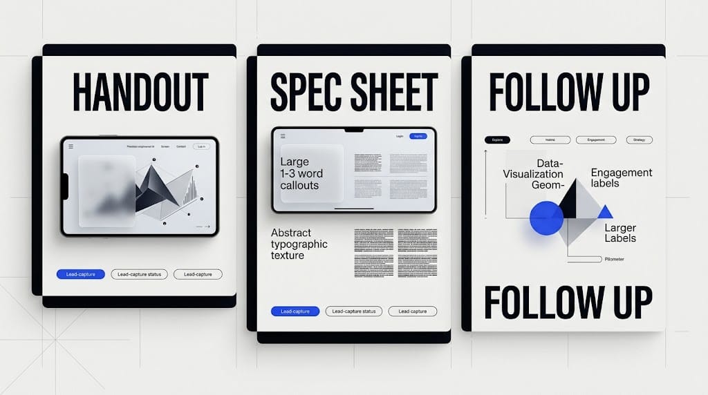
Print Material Hierarchy: Guiding the Information Flow
In a digital age, print materials still matter at trade shows. They provide a tangible takeaway and a physical reminder of your brand. The key is hierarchy: giving the right information to the right person at the right time.
Tier 1: Initial Engagement Materials
- Business Cards: Essential for every interaction. Ensure they are well-designed and represent your brand.
- One-Pagers/Flyers: A quick overview of your company or a specific product line. These are for general attendees, a broad introduction. Keep the text minimal and focus on visual appeal and a clear call to action (e.g., “Visit our website for more details”).
- QR Codes: Integrate QR codes linking to specific product pages, demo videos, or your lead capture form. This bridges print and digital seamlessly.
These should be easily accessible at the front of your booth or on a reception counter.
Tier 2: Qualified Lead Materials
- Product Spec Sheets: Detailed information for prospects showing genuine interest. These contain technical specifications, dimensions, performance data, and safety information.
- Short Brochures: More in-depth than a one-pager, focusing on benefits, applications, and perhaps a small case study.
These are distributed by your sales team during or after a meaningful conversation. They are not for casual passersby. Our work redesigning the Klein Tools catalog, with its 40,000+ SKUs, taught us the importance of clear hierarchy and accessibility of information, a lesson directly applicable to trade show print strategy.
Tier 3: Follow-Up & Deeper Dive
- Case Studies: Detailed examples of how your product solved a specific problem for a client.
- White Papers: Thought leadership pieces that position your brand as an expert in the field.
- Detailed Catalogs: For those truly interested in your full product range.
These are usually not physically handed out at the show but are promised as follow-up. They are too heavy or too much information for an initial meeting. Instead, collect contact information and send them digitally post-show. This also provides a reason for further communication.
Design your print materials to be easy to carry. Attendees collect a lot of paper. A well-designed, concise piece is more likely to be kept than a bulky, overwhelming binder.
Staffing and Training: The Human Infrastructure
No matter how well-designed your booth is, your staff are the ultimate interface. They are part of your sales infrastructure. Briefing them on the booth’s design strategy is essential. They need to understand:
- The main messaging points for each zone of the booth.
- Where specific products are located and how to operate demos.
- The hierarchy of print materials and when to offer each.
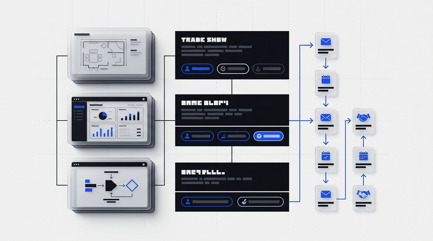
- The lead capture process and how to qualify prospects quickly.
A well-trained team can amplify the effectiveness of your design. An untrained team can negate even the most thoughtful design work. Encourage proactive engagement, not passive waiting. The company Apellix, a drone startup, understood this. Their initial launch needed both striking visuals and a knowledgeable team to explain a complex new technology. The booth provided the stage; the staff brought the story to life.
Ready to turn your next trade show booth into a high-performance sales asset? Contact DesignX to talk through your project.
Frequently Asked Questions
Why should industrial brands treat a trade show booth as sales infrastructure?
Many industrial brands approach trade show booths as an expense. They see a display, some graphics, and a place to put their products. This thinking misses the point. Your booth is a critical piece of sales infrastructure.
What should teams know about designing for every approach?
People interact with your booth in stages. They see it from a distance, approach it, and then engage with it. Each stage demands a different design focus. We break this down into a four-stage sight-line strategy.
How should teams approach engineering the 10-second first impression?
Research indicates you have roughly 10 seconds to make a lasting impression on a trade show floor. This short window is not about conveying every detail of your offering. It’s about communicating your core value and brand identity. This is the “What do you do?” test.
What should teams know about effective product demo staging?
Product demos are the heart of many industrial trade show experiences. They are not merely showing a product; they are performing a sales story. Poorly staged demos waste booth space and staff time. Designing the Demo Zone: Visibility: Ensure your demo is easily seen from the aisle, drawing people in.
What should teams know about guiding the information flow?
In a digital age, print materials still matter at trade shows. They provide a tangible takeaway and a physical reminder of your brand. The key is hierarchy: giving the right information to the right person at the right time. Tier 1: Initial Engagement Materials Business Cards: Essential for every interaction.