
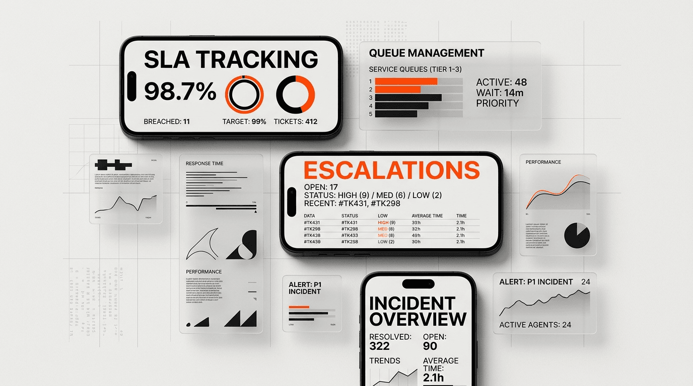
Direct answer: The best SaaS support dashboard helps a team spot queue pressure, act before an SLA breach, route escalations, and connect recurring support problems to customer and product risk.
DesignX approaches dashboard design as a decision system. Each metric needs an owner, a threshold, and a path from the aggregate number to the ticket or account that needs attention.
- Separate live queue control from historical reporting.
- Show time remaining and breach risk before an SLA turns red.
- Pair ticket volume with team capacity and queue age.
- Connect support signals to account value, product use, and retention risk.
SaaS support dashboard best practices start with the work a support lead must do during a busy shift. A row of KPI cards can describe the queue. It rarely tells the lead which ticket needs an owner, which enterprise account is exposed, or where to move capacity before response targets slip.
Support has direct commercial weight. Salesforce’s 2024 State of Service findings, based on more than 5,500 service professionals in 30 countries, report that 88% of customers say good service makes them more likely to purchase again. The same research found that 76% of service organizations expected higher case volume. A dashboard has to help a team control that pressure, not decorate it.
SaaS support dashboard best practices begin with three jobs
A support dashboard serves three time horizons. Mixing them into one screen produces a dense report that works for no one.
Control the queue now
The live view answers operational questions: Which queues are growing? Which conversations have no owner? Which SLA targets will breach next? Which agent or team has room to help? Managers should be able to open the underlying tickets from every warning.
Explain what changed
The analytical view shows patterns across a week, month, release, plan, region, or channel. It helps a support leader explain a backlog spike, compare response and resolution distributions, and find topics that create repeat contact. This view can refresh less often because it supports planning instead of minute-by-minute routing.
Protect customer value
The account-risk view links support activity to product and commercial context. Repeated high-severity tickets, falling product use, poor satisfaction, an open escalation, and a near-term renewal create a different situation than one isolated password-reset request. The dashboard should make that difference visible without exposing revenue or account data to people who do not need it.
Salesforce found a large proactivity gap: 61% of service teams believed they addressed issues proactively, while 33% of customers agreed that companies anticipated their needs. A support dashboard can close part of that gap by showing risk early enough for a person to act.
Choose support metrics by the decision they trigger
Metric selection should start with a plain question: If this number changes, who does what? Keep the metric when the team can name the owner and response. Move it to a report when it only helps with a monthly review.
| Signal | Question it answers | Expected action | Useful breakdown |
|---|---|---|---|
| Unassigned and waiting | Is demand entering faster than the team can claim it? | Assign, rebalance, or change routing | Queue, priority, plan, channel |
| SLA at risk | Which commitments need intervention before breach? | Escalate, reassign, or update the customer | Minutes remaining, severity, owner |
| Backlog age | Are old tickets hiding behind a stable total? | Run an aging sweep and remove blockers | Age buckets, status, dependency |
| Median and 90th-percentile response | Does the typical customer get help, and how bad is the slow tail? | Adjust staffing, routing, or process | Channel, tier, hour, issue type |
| Repeat contact and reopen rate | Are fast replies producing durable resolutions? | Review answer quality or product cause | Topic, product area, agent, segment |
| Account risk | Which support problems may affect renewal or adoption? | Coordinate support, success, and product | Severity, usage change, value, renewal window |
Zendesk’s Support dashboard documentation includes median first reply, first resolution, and full resolution times alongside SLA achievement and active breached tickets. Atlassian’s request management dashboard pairs open requests, workload, SLA adherence, and customer satisfaction. These are strong inputs. The UX still has to tell the team which decision each input supports.
12 SaaS support dashboard best practices
1. Design the first screen for intervention
Open with conditions that require action, such as unassigned conversations, longest wait, SLA targets at risk, stalled escalations, and capacity by queue. Give each card a clear threshold and owner. A metric without an action path belongs in analysis, not the live control layer.
2. Separate live operations from historical analytics
Live operations need current queue state and a short time window. Historical analytics need comparisons, distributions, and longer trends. Put them in separate views with different refresh rules. This keeps the live dashboard fast and prevents retrospective charts from pushing urgent work below the fold.
Intercom’s real-time dashboard documentation notes that most metrics refresh every 60 seconds while SLA and CSAT refresh every 15 minutes. That difference should appear in the interface. Show the last updated time at the card or data-group level when sources have different freshness.
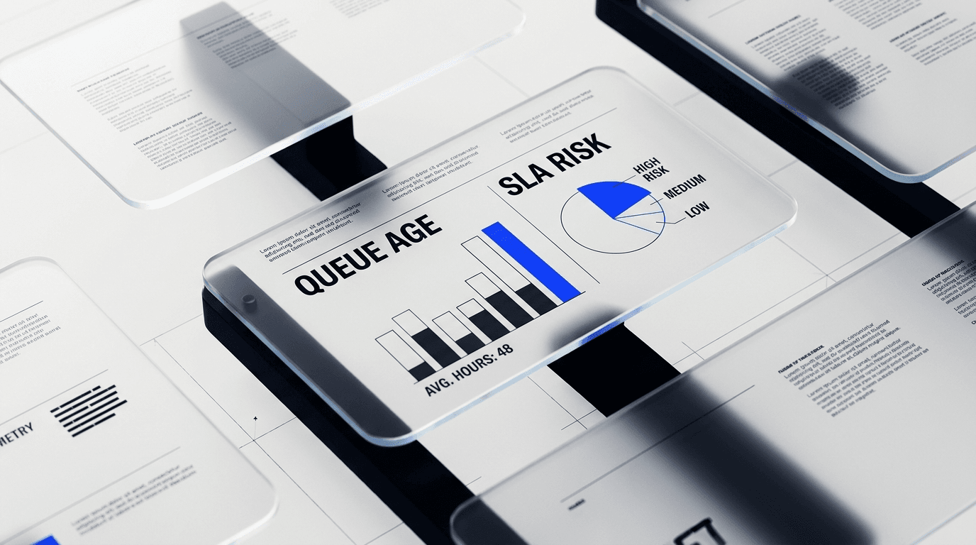
3. Show SLA risk before the breach
A red count of breached tickets arrives too late. Show the time remaining, predicted breach window, priority, owner, blocker, and affected account. Use warning bands such as under 30 minutes or under one business hour based on the team’s actual policy. Let managers filter to tickets they can still save.
4. Pair volume with capacity
Ticket volume alone cannot explain whether a queue is healthy. Place incoming demand next to active teammates, available capacity, current assignments, and the rate of resolved work. A growing backlog with spare capacity suggests a routing problem. A growing backlog with saturated capacity calls for staffing, deflection, or scope decisions.
5. Use age distributions instead of a single average
An average can hide a small group of customers waiting far too long. Show the median and a tail measure such as the 90th percentile. Add age buckets for the live queue, then make each bucket clickable. A lead should move from “12 tickets older than eight hours” to those 12 tickets in one step.
6. Make every aggregate a doorway
Clickable totals, chart points, segments, and alerts should preserve the current filters when they open the ticket list. Include a visible route back to the dashboard state. This interaction turns data visualization into work rather than a report someone checks and leaves.
7. Put targets and comparisons beside the number
“First response: 42 minutes” lacks context. Add the target, prior period, direction, sample size, and business-hours basis. Use the same calculation across cards and exports. If one team views median calendar time and another receives average business-hours time, the dashboard will create arguments instead of shared understanding.
8. Connect support data to account health with care
Support tickets can strengthen a churn-risk view when the dashboard combines them with product usage, customer satisfaction, plan, renewal date, and account value. Keep each signal visible so a user can see why the account is flagged. Avoid one opaque health score that hides the evidence.
Pendo’s 2025 software retention benchmark found that products kept 39% of new users after one month on average and about 30% after three months. User retention differs from account retention, especially in B2B SaaS, but the finding shows why support and product behavior need a shared view. A support spike paired with falling use deserves more attention than either signal alone.
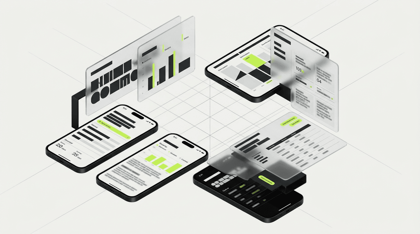
9. Give each role a bounded view
Agents need assigned work, priority, context, and the next response target. Team leads need queue health, capacity, aging, and escalation control. Customer success and product leaders need recurring topics, affected accounts, product areas, and trend evidence. Executives need service level, cost, satisfaction, risk, and movement over time.
Design around those jobs, then use shared metric definitions underneath. Our broader guide to SaaS dashboard design best practices covers the visual hierarchy, chart, layout, accessibility, and progressive-disclosure foundations that support this role model.
10. Reserve color for status and severity
Use red, amber, and green for states with agreed meaning. Pair color with text, icons, or patterns so people do not have to distinguish hue alone. Decorative chart palettes weaken alerts. Test contrast against WCAG requirements and test the screen in grayscale to see whether hierarchy survives without color.
11. Design stale, loading, empty, and partial-data states
A blank chart can mean zero tickets, a broken connection, a filter with no matches, or data that has not arrived. Name the state and provide the next action. Show source freshness, failed widgets, delayed calculations, and partial coverage. Trust drops fast when two cards disagree and the interface offers no explanation.
12. Test with messy production-shaped data
Prototype with long account names, mixed time zones, breached targets, unassigned tickets, large counts, missing satisfaction scores, and simultaneous incidents. Then watch a support lead handle a realistic shift change or escalation. Measure whether the new design reduces time to identify risk, time to assign an owner, and time to reach the underlying ticket.
Build role-specific support dashboard views on one metric model
Role-specific views should share definitions and source data. They should not become separate reporting products with conflicting totals.
| Role | Primary view | Primary action | Avoid |
|---|---|---|---|
| Agent | Assigned queue, priority, context, next SLA target | Respond, resolve, escalate, or hand off | Teamwide vanity KPIs |
| Team lead | Demand, capacity, age, SLA risk, blockers | Rebalance work and clear risk | Monthly trend clutter |
| Success or product | Topics, accounts, product area, repeat contact, usage change | Coordinate account or product follow-up | Individual agent scorekeeping |
| Executive | Service level, satisfaction, cost, retention risk, trend | Set priorities and fund capacity | Ticket-level operational detail |
This is a common B2B UX design problem: several people need the same system, but their decisions happen at different levels. Permissions, terminology, filters, and drill-down depth should reflect that difference.
Support dashboard mistakes that create blind spots
- One screen for every role. Agents scroll past executive charts while leaders stare at ticket detail they cannot use.
- Equal weight for every card. A breach warning should not compete with last month’s closed-ticket total.
- Postmortem-only SLA reporting. The team learns about failure after the promise is broken.
- Average-only timing metrics. A healthy mean can hide a harmful tail.
- Color without an action. A red widget names danger but provides no owner, reason, or route to the work.
- Support data isolated from product context. Repeated tickets never reach the product team, and at-risk accounts look healthy until renewal.
- Unlabeled freshness. Users compare cards that update on different schedules and lose confidence in both.
A structured SaaS UX audit checklist can catch many of these issues before a redesign begins. Pair the interface review with queue observation, metric-definition review, support interviews, and a sample of real escalations.
How DesignX approaches SaaS support dashboard design
DesignX starts with the decisions, data definitions, and failure conditions. We map each role to the questions they need to answer, trace every high-priority signal to an action, and test the interface with production-shaped data. The design system comes after that model is sound.
Our senior team brings product, UX, interface, and system experience from work connected to Apple, Shopify, eBay, Bodybuilding.com, HP, Oura Ring, and complex clients such as Klein Tools. You can review a related B2B SaaS dashboard case study and our guide to choosing a SaaS UI/UX design agency.
If your support dashboard reports yesterday while the team struggles with today’s queue, talk with DesignX about a SaaS dashboard UX engagement. We can audit the current experience, define the decision model, and design a clearer operating layer for support, success, product, and leadership.
Frequently asked questions
What should a SaaS support dashboard include?
A SaaS support dashboard should include unassigned work, waiting conversations, backlog age, demand versus capacity, SLA targets at risk, response and resolution distributions, escalations, satisfaction, and repeat-contact signals. Add account value and product-usage context for teams that need to coordinate retention work. Each metric should link to the tickets or accounts behind it.
Which customer support metrics matter most?
The most useful metrics depend on the decision. Live operations often need unassigned volume, longest wait, SLA risk, active capacity, and queue age. Planning views benefit from median and 90th-percentile response or resolution time, repeat contact, reopen rate, customer satisfaction, topic trends, and cost. Keep a metric only when the team can name its owner and expected response.
How often should a support dashboard refresh?
Queue state, assignments, and waiting-time signals may need updates every minute or faster. Satisfaction, SLA rollups, account health, and product analytics may update every 15 minutes, hourly, or daily. Label the last update time for each data group. Do not imply that a slow source is live.
Should agents and executives use the same support dashboard?
They should use the same metric definitions and source model, but they need different views. Agents need assigned work and the next service target. Executives need trend, service level, satisfaction, cost, and retention exposure. A shared dashboard can support both roles through permissions and bounded views rather than one crowded screen.
How should a dashboard show SLA risk?
Show time remaining, breach probability or warning band, priority, owner, blocker, and affected account before the target fails. Let a manager filter by queue or severity and open the underlying ticket with the same context preserved. A historical breached-ticket count belongs in analysis, not as the only live SLA signal.
How can support dashboards help reduce SaaS churn?
They can flag repeated severe issues, poor satisfaction, falling product use, open escalations, and near-term renewals in one account view. The dashboard should show the evidence behind the risk and route the next step to support, customer success, or product. Support activity alone cannot predict churn, but it becomes useful when paired with behavioral and commercial context.