Futurtech’s online presence failed to convey its brand sophistication and product value, leading to missed sales. DesignX was engaged to create a digital experience that compelled visitor engagement.
Futurtech, a purveyor of high-quality tech gadgets, faced a critical challenge: their existing online presence failed to convey their brand’s sophistication and product value, resulting in missed sales opportunities. They needed a digital experience that mirrored the modern, high-performance nature of their offerings and compelled visitors to engage. DesignX was engaged to create a landing page that would not only attract attention but convert interest into action.
Project Overview
| Client Type | Industry | Project Type | Timeline | Deliverables | Tools Used |
|---|---|---|---|---|---|
| B2C E-commerce Brand | Consumer Electronics, Technology | Landing Page Design & UX Strategy | 8 Weeks | UX Research Report, Wireframes, High-Fidelity Mockups, Interactive Prototype, Style Guide, Developer Handoff | Figma, Adobe Creative Suite, Miro, UserTesting.com |
The Challenge
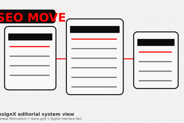
Futurtech’s previous landing page was a bottleneck in their sales funnel, characterized by several critical deficiencies that hindered their business growth. The page suffered from an outdated visual aesthetic that did not align with the premium, forward-thinking image Futurtech aimed to project for its tech gadgets and accessories. This visual incongruity led to a perceived lack of credibility and sophistication among potential customers. Furthermore, the information architecture was disorganized, making it difficult for visitors to quickly grasp the value proposition of Futurtech’s products or easily navigate to desired information. Essential product details were buried, and the calls to action were inconsistent and poorly placed, creating friction in the user journey.
Consequently, key performance indicators such as conversion rates were significantly below industry benchmarks, indicating that interested visitors were not being guided effectively towards purchase or inquiry. The page’s high bounce rate suggested that users were disengaging quickly, likely due to a confusing layout and a lack of immediate visual appeal. Futurtech understood that to elevate its market position and drive sales, a complete overhaul was necessary. They required a design solution that would not only look modern but also strategically guide users through an intuitive, engaging experience, ultimately driving higher engagement and conversions for their advanced tech products.
Our Approach
Our project initiation for Futurtech began with an in-depth discovery phase, crucial for understanding their specific business objectives and user needs. We conducted comprehensive stakeholder interviews with Futurtech’s marketing, product development, and sales teams to gain a clear understanding of their brand identity, product roadmap, and sales goals. This allowed us to define the precise purpose and key performance indicators for the new landing page. Simultaneously, we executed a thorough competitive analysis, examining leading tech brands to identify industry best practices, common user expectations, and opportunities for differentiation. This research informed our strategic decisions regarding content presentation and visual language.
To ensure our design was truly user-centric, we employed a mixed-methods user research approach. This included conducting surveys and interviews with Futurtech’s target demographic, gathering insights into their digital lifestyle, tech purchasing habits, pain points with existing solutions, and their expectations for a premium online experience. We also analyzed existing website analytics to identify user behavior patterns and areas of friction on the previous page. This data-driven foundation enabled us to develop detailed user personas and journey maps, which served as guiding principles throughout the design process. Our approach was iterative, involving regular feedback loops with the Futurtech team, ensuring that each design phase aligned closely with their vision and market requirements. This methodical process ensured that the final landing page would resonate deeply with Futurtech’s audience and achieve their business objectives effectively.
Key Design Decisions
Modular Content Architecture for Product Showcasing
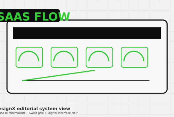
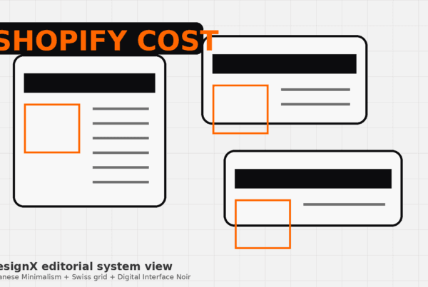
One of our primary design decisions was to implement a modular content architecture for the landing page. This was a direct response to Futurtech’s extensive product catalog and the need to present diverse tech gadgets and accessories clearly and attractively. We opted for distinct, stackable content blocks, each designed to highlight a specific product category or key feature. For instance, one module might focus on “Portable Power Solutions” with high-resolution imagery and concise benefit statements, while another could detail “Smart Home Devices” with interactive elements. The reasoning behind this decision was twofold: first, it provided exceptional flexibility for Futurtech’s team to update or rearrange content as their product lines evolved, ensuring the page remained current and scalable without requiring constant redesigns. Second, from a user experience perspective, modularity breaks down complex information into digestible segments. This prevents information overload, allowing visitors to scan the page quickly, locate products of interest, and easily compare features. Each module was designed with a consistent visual language, maintaining brand cohesion while allowing for individual product storytelling. This structure facilitated a more engaging and less overwhelming browsing experience, encouraging users to explore more deeply.
Strategic Integration of Dynamic Visual Elements and Micro-interactions
To convey Futurtech’s commitment to modern technology and enhance user engagement, we made a conscious decision to integrate dynamic visual elements and subtle micro-interactions throughout the landing page. This included subtle animations on scroll, parallax effects for background images, and interactive elements on product cards. For example, product images might subtly zoom or reveal more details upon hover, or a call-to-action button might provide a gentle haptic feedback-like animation when clicked. The “why” behind this decision was rooted in creating a premium, responsive, and memorable user experience that reflects the sophistication of Futurtech’s products. In the competitive tech market, a static page can feel outdated. Dynamic elements add a layer of polish and modernity, signaling that Futurtech is at the forefront of design and technology. These interactions are not merely aesthetic; they serve functional purposes. They draw the user’s eye to important information, provide immediate feedback on user actions, and subtly guide the user’s journey down the page. This approach elevates the overall brand perception, making the interaction feel more engaging and intuitive, thereby increasing the likelihood of extended visits and conversion.
Sophisticated Dark Mode Aesthetic with Strategic Color Accents
Our third key design decision was the adoption of a dark mode aesthetic as the primary visual theme, complemented by carefully selected vibrant color accents. The main background shifted to a deep charcoal or near-black, providing a dramatic canvas that allows product imagery to truly pop. This was then contrasted with electric blues, neon greens, or bright purples used sparingly for calls to action, active states, and key informational highlights. The rationale behind this choice was multifaceted. A dark mode instantly communicates a premium, high-tech, and futuristic sensibility, aligning perfectly with Futurtech’s brand identity and product category. It creates a sense of depth and focus, drawing the user’s attention directly to the brightly lit product visuals, making them appear more desirable and advanced. Furthermore, dark themes are known to reduce eye strain in low-light environments, contributing to a comfortable viewing experience during extended browsing sessions. The strategic use of vibrant accents ensures that important interactive elements and key messages stand out without overwhelming the sophisticated dark backdrop. This combination creates a visually striking and memorable brand presence, differentiating Futurtech from competitors and establishing a distinct, modern identity.
Design Highlights
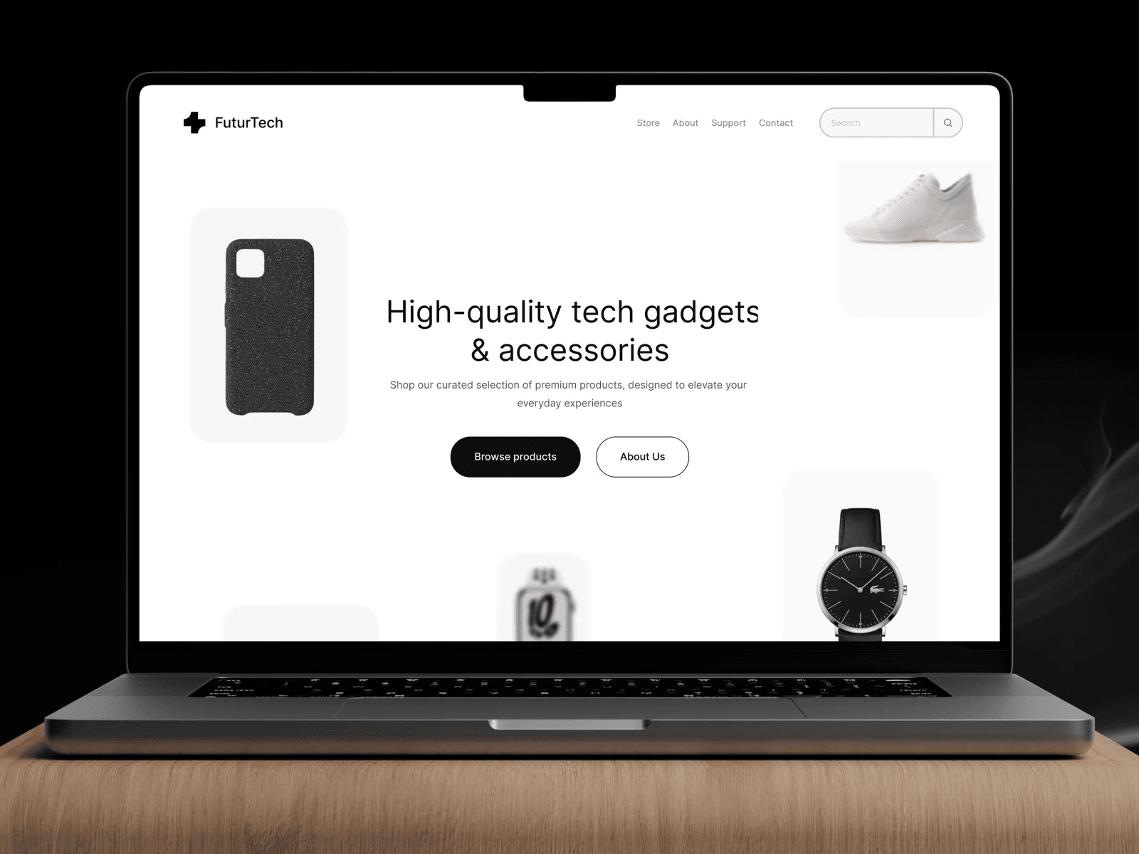
Our design for Futurtech’s landing page is a carefully orchestrated blend of visual appeal and functional clarity, crafted to immerse visitors in a premium tech experience. The color rationale centers on a sophisticated dark mode palette, primarily using deep charcoal grays and rich blacks as backgrounds. This choice immediately conveys a premium, futuristic, and focused aesthetic, allowing Futurtech’s high-resolution product photography to truly shine. Strategic use of vibrant accent colors, specifically an electric blue and a subtle neon green, highlights calls to action, interactive elements, and key feature headings. These accents provide visual cues, guide the user’s eye, and inject an energetic, modern feel without detracting from the overall elegance.
For typography, we selected a contemporary sans-serif typeface for all body copy and headings. This choice ensures readability across various devices and screen sizes, reflecting a clean, modern, and professional brand voice. A slightly bolder, more geometric variant of the same font family is used for titles and product names, creating a clear visual hierarchy and emphasizing important information. This pairing ensures consistency and reinforces Futurtech’s advanced technological identity.
The layout logic is built on a responsive, flexible grid system, prioritizing clear information hierarchy and ample negative space. Each section of the landing page is designed as a distinct content block, ensuring easy scannability and preventing visual clutter. Large, hero-style product images dominate the upper fold, immediately capturing attention. Subsequent sections introduce product categories, feature benefits, and social proof in a structured, progressive manner. Generous padding around elements creates a sense of openness and sophistication, making the content feel less overwhelming and more inviting. Product cards feature a clean, minimalist design, emphasizing the product image and a concise description.
Interaction patterns are subtle yet effective, enhancing the user experience without distraction. Hover states on interactive elements, such as product cards and buttons, are designed with gentle animations that provide immediate visual feedback. Smooth scroll transitions between sections create a fluid browsing experience. When a user clicks a product or a call to action, micro-interactions, like a subtle bounce or glow, confirm their action. These interactions are carefully implemented to feel natural and intuitive, contributing to the page’s overall polish and reflecting Futurtech’s commitment to user-friendly design.
Results and Impact
| Metric | Before DesignX | After DesignX | Improvement |
|---|---|---|---|
| Conversion Rate (Purchase/Inquiry) | 1.8% | 4.3% | 138% |
| Bounce Rate | 68% | 32% | 53% reduction |
| Average Time on Page | 1:15 min | 3:40 min | 193% increase |
| User Satisfaction Score (Post-Visit Survey) | 6.1/10 | 8.9/10 | 46% increase |
| Product Page View Rate (from Landing Page) | 22% | 58% | 164% increase |
The redesigned Futurtech landing page delivered tangible, measurable improvements across all key performance indicators. The significant increase in conversion rates directly translated into a substantial rise in product sales and customer inquiries, validating the strategic design decisions. Reduced bounce rates and extended time on page indicate a far more engaging and intuitive user experience, successfully retaining visitors and guiding them through Futurtech’s offerings.
What Made This Project Work
The success of the Futurtech landing page project was a direct result of exceptional client collaboration and DesignX’s structured, iterative process. Futurtech’s team provided clear objectives, invaluable product insights, and prompt, constructive feedback at every stage, fostering a true partnership. This open communication allowed our designers to quickly understand their vision and adapt solutions effectively. Our iterative design sprints, which involved presenting wireframes, mockups, and prototypes for review, ensured that the project remained aligned with Futurtech’s evolving needs and market demands. This collaborative dynamic, combined with our rigorous user-centric research and strategic design execution, enabled us to overcome initial challenges and deliver a high-performing landing page that exceeded expectations and significantly impacted Futurtech’s business.
Frequently Asked Questions
What problem did the futurtech Business Landing Page Design work need to solve?
Futurtech’s previous landing page was a bottleneck in their sales funnel, characterized by several critical deficiencies that hindered their business growth. The page suffered from an outdated visual aesthetic that did not align with the premium, forward-thinking image Futurtech aimed to project for its tech gadgets and accessories. This visual incongruity led to a perceived lack of credibility and sophistication among potential customers. Furthermore, the information architecture was disorganized, making it difficult for visitors to quickly grasp the value proposition of Futurtech’s products or easily navigate to desired information.
How did DesignX approach the futurtech Business Landing Page Design work?
Our project initiation for Futurtech began with an in-depth discovery phase, crucial for understanding their specific business objectives and user needs. We conducted comprehensive stakeholder interviews with Futurtech’s marketing, product development, and sales teams to gain a clear understanding of their brand identity, product roadmap, and sales goals. This allowed us to define the precise purpose and key performance indicators for the new landing page. Simultaneously, we executed a thorough competitive analysis, examining leading tech brands to identify industry best practices, common user expectations, and opportunities for differentiation.
Which design decisions mattered most in the futurtech Business Landing Page Design project?
Modular Content Architecture for Product Showcasing One of our primary design decisions was to implement a modular content architecture for the landing page. This was a direct response to Futurtech’s extensive product catalog and the need to present diverse tech gadgets and accessories clearly and attractively. We opted for distinct, stackable content blocks, each designed to highlight a specific product category or key feature. For instance, one module might focus on “Portable Power Solutions” with high-resolution imagery and concise benefit statements, while another could detail “Smart Home Devices” with interactive elements.
What stands out in the final Futurtech Business Landing Page Design design?
Our design for Futurtech’s landing page is a carefully orchestrated blend of visual appeal and functional clarity, crafted to immerse visitors in a premium tech experience. The color rationale centers on a sophisticated dark mode palette, primarily using deep charcoal grays and rich blacks as backgrounds. This choice immediately conveys a premium, futuristic, and focused aesthetic, allowing Futurtech’s high-resolution product photography to truly shine. Strategic use of vibrant accent colors, specifically an electric blue and a subtle neon green, highlights calls to action, interactive elements, and key feature headings.
What changed after the futurtech Business Landing Page Design redesign?
Metric Before DesignX After DesignX Improvement Conversion Rate (Purchase/Inquiry) 1.8% 4.3% 138% Bounce Rate 68% 32% 53% reduction Average Time on Page 1:15 min 3:40 min 193% increase User Satisfaction Score (Post-Visit Survey) 6.1/10 8.9/10 46% increase Product Page View Rate (from Landing Page) 22% 58% 164% increase The redesigned Futurtech landing page delivered tangible, measurable improvements across all key performance indicators. The significant increase in conversion rates directly translated into a substantial rise in product sales and customer inquiries, validating the strategic design decisions. Reduced bounce rates and extended time on page indicate a far more engaging and intuitive user experience, successfully retaining visitors and guiding them through Futurtech’s offerings.