Ella AI, an anxiety support chatbot, needed to transform its technology into a genuinely connecting mobile app. DesignX was sought to craft an empathetic and intuitive interface for users.
The challenge of mental well-being in the digital age demands more than just functionality; it requires empathy, trust, and a truly intuitive experience. Ella AI, an advanced chatbot designed to support individuals with anxiety, recognized the need to transform its promising technology into a mobile application that genuinely connected with users. They sought DesignX to craft an interface that felt calming, empowering, and profoundly human.
Project Overview
| Category | Detail |
|---|---|
| Client Type | Startup (Mental Health Technology) |
| Industry | Mental Health, AI, Mobile Application |
| Project Type | UI/UX Design, User Research, Brand Identity Integration |
| Timeline | 14 Weeks |
| Deliverables | User Flows, Wireframes, High-Fidelity UI Screens, Interactive Prototype, Design System, UI Style Guide, Usability Testing Reports |
| Tools Used | Figma, Adobe Illustrator, Miro, UserTesting.com, Maze |
The Challenge
Ella AI possessed a powerful AI-driven chatbot capable of delivering personalized mental health support, but its initial mobile application concept lacked a crucial element: emotional resonance. The existing interface was functional yet visually stark, presenting a fragmented and often clinical user experience that failed to align with the compassionate intent of the platform. Users reported feeling disconnected, struggling with a visual identity that felt inconsistent and a navigation system that was more confusing than comforting. Specific pain points included an uninviting aesthetic, which inadvertently heightened user anxiety rather than alleviating it, and a lack of clear visual hierarchy that made discovering coping strategies or mindfulness exercises an arduous task. This resulted in lower-than-desired user engagement, limited retention, and a significant barrier to Ella AI achieving its mission of empowering mental health journeys. The core problem was transforming a robust technological offering into an approachable, trustworthy, and aesthetically pleasing digital companion for individuals seeking peace of mind.
Our Approach
Our engagement with Ella AI commenced with a deep dive into their core mission and the nuanced landscape of mental health support. The discovery phase involved extensive stakeholder interviews, competitor analysis of leading mental wellness applications, and a thorough review of existing user feedback. We then initiated a rigorous user research program, deploying surveys and conducting remote one-on-one interviews with individuals who either experienced anxiety or sought mental health support through digital platforms. This allowed us to develop detailed user personas and empathy maps, capturing the emotional states, pain points, and aspirational interactions of Ella AI’s target audience. We also conducted card sorting exercises to inform the information architecture, ensuring that content was organized intuitively.
Following this research, our team moved into an iterative ideation and prototyping phase. We began with sketching and low-fidelity wireframes to rapidly explore various layout and interaction patterns for core user flows, such as onboarding, chatbot interaction, and exercise discovery. These concepts were then translated into high-fidelity prototypes. Throughout this process, usability testing was paramount. We conducted multiple rounds of moderated and unmoderated tests with representative users, gathering actionable feedback on everything from visual appeal to navigational clarity. This iterative design and testing cycle allowed us to validate our assumptions, refine the user experience, and ensure every design decision was grounded in genuine user needs and behaviors, ultimately shaping an application that felt both effective and empathetic.
Key Design Decisions
Implementing a “Calm-First” Color Palette and Softened Geometry
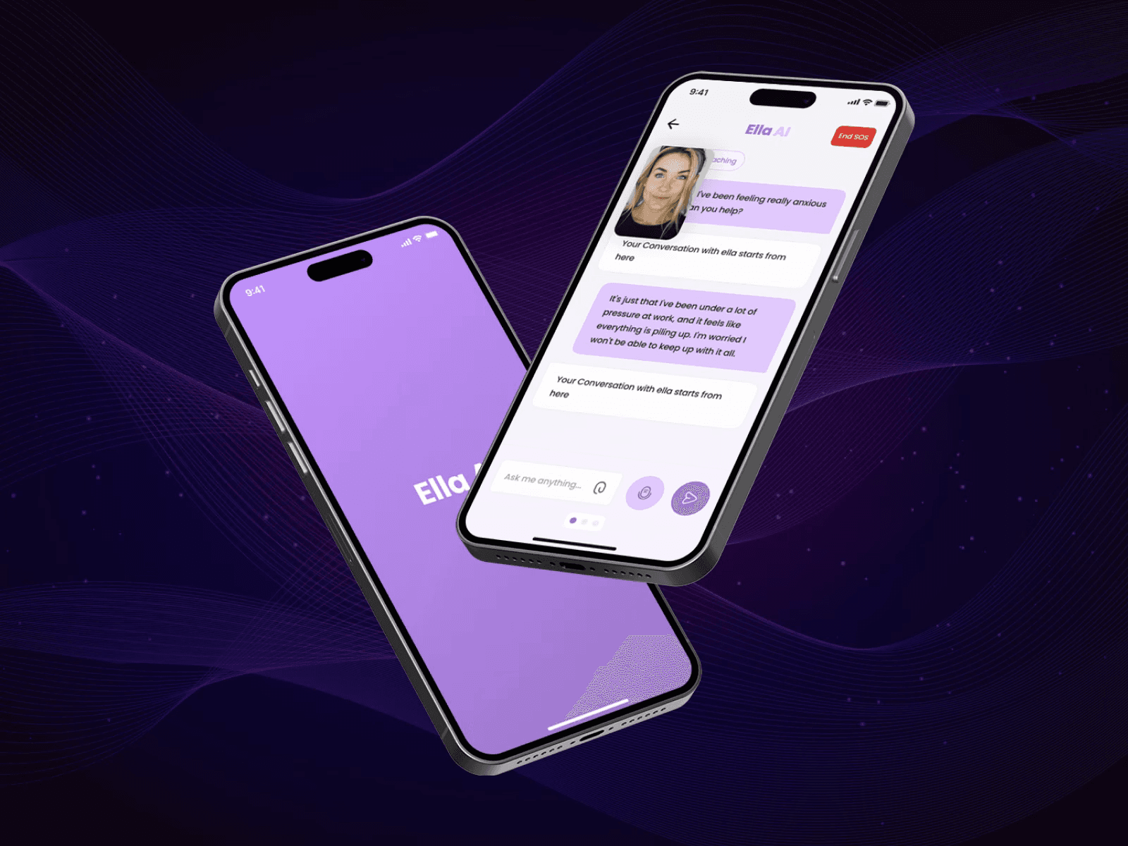
The initial visual language of Ella AI leaned towards a high-contrast, somewhat impersonal aesthetic. Our research indicated that users seeking mental health support require a visual environment that promotes tranquility, not agitation. We consciously shifted to a “calm-first” color palette, dominated by muted blues and greens, known for their calming psychological effects, complemented by soft grays and warm, subtle accents like a gentle peach or cream. This strategic selection was designed to reduce visual stress and foster a sense of serenity and trust. Simultaneously, we universally applied softened geometry, transforming sharp corners into gentle curves for all UI elements, buttons, and content containers. This decision was rooted in the understanding that organic, rounded forms are perceived as more approachable, less intimidating, and inherently more comforting than rigid, angular shapes. The combination of these color and form choices directly addressed the need for an empathetic and soothing digital space, creating an immediate sense of safety and welcome for users engaging with sensitive content.
Prioritizing Intuitive Navigation through Contextual Pathways
One of the primary challenges identified in the pre-design phase was users struggling to locate specific coping mechanisms or mindfulness exercises amidst a generic navigation structure. Our solution involved re-envisioning the information architecture to create intuitive, contextual pathways rather than relying solely on a flat tab bar. While a clear bottom navigation bar provides core access, the main dashboard was redesigned to dynamically present “quick access” cards based on user history, stated preferences, or common anxiety triggers. For instance, after a conversation about stress, the app might offer immediate access to “Breathwork Exercises” or “Guided Meditations.” Furthermore, relevant tools and resources are seamlessly integrated within the chat interface itself, appearing as suggested prompts or clickable elements when the chatbot identifies a need. This design decision significantly reduces cognitive load, allowing users to effortlessly transition between proactive self-help and reactive support. The rationale was to mirror a natural human interaction, where assistance is offered precisely when and where it is most relevant, fostering a more fluid and less frustrating user journey.
Crafting a Persona-Driven Conversational UI
The core of Ella AI is its chatbot, and its effectiveness relies heavily on its ability to feel empathetic, responsive, and genuinely helpful. Our design team focused intently on crafting a persona-driven conversational UI that reflected Ella AI’s intended character: a knowledgeable, compassionate, and non-judgmental guide. This involved meticulous attention to typography within chat bubbles, ensuring readability and a friendly tone, alongside varying message lengths to mimic natural dialogue flow. We designed subtle yet distinct visual cues for Ella’s messages, using soft gradient backgrounds that differentiate them from user input and suggest a gentle, supportive presence. Micro-animations for typing indicators and message delivery were implemented to provide immediate, reassuring feedback, making interactions feel dynamic and less robotic. This strategic approach to the conversational interface was crucial for building user trust and encouraging open communication, which are foundational for effective mental health support. The goal was to make users feel genuinely heard and understood, transforming a technological interaction into a supportive relationship.
Design Highlights
Our design process for Ella AI meticulously integrated visual and interaction principles to create a truly supportive experience. The color rationale, as detailed, hinged on a “calm-first” palette. Muted blues and soft greens formed the primary foundation, evoking trust, serenity, and growth. These were accented with warm, inviting tones like a gentle peach and cream, strategically used for call-to-action elements or positive feedback, to add a touch of comfort and empathy without overstimulating the user. High-saturation colors were deliberately avoided to maintain a tranquil environment.
For typography choice, we selected a highly legible sans-
Frequently Asked Questions
What problem did the ella AI AI Chatbot Mobile App Design work need to solve?
Ella AI possessed a powerful AI-driven chatbot capable of delivering personalized mental health support, but its initial mobile application concept lacked a crucial element: emotional resonance. The existing interface was functional yet visually stark, presenting a fragmented and often clinical user experience that failed to align with the compassionate intent of the platform. Users reported feeling disconnected, struggling with a visual identity that felt inconsistent and a navigation system that was more confusing than comforting. Specific pain points included an uninviting aesthetic, which inadvertently heightened user anxiety rather than alleviating it, and a lack of clear visual hierarchy that made discovering coping strategies or mindfulness exercises an arduous task.
How did DesignX approach the ella AI AI Chatbot Mobile App Design work?
Our engagement with Ella AI commenced with a deep dive into their core mission and the nuanced landscape of mental health support. The discovery phase involved extensive stakeholder interviews, competitor analysis of leading mental wellness applications, and a thorough review of existing user feedback. We then initiated a rigorous user research program, deploying surveys and conducting remote one-on-one interviews with individuals who either experienced anxiety or sought mental health support through digital platforms. This allowed us to develop detailed user personas and empathy maps, capturing the emotional states, pain points, and aspirational interactions of Ella AI’s target audience.
Which design decisions mattered most in the ella AI AI Chatbot Mobile App Design project?
Implementing a “Calm-First” Color Palette and Softened Geometry The initial visual language of Ella AI leaned towards a high-contrast, somewhat impersonal aesthetic. Our research indicated that users seeking mental health support require a visual environment that promotes tranquility, not agitation. We consciously shifted to a “calm-first” color palette, dominated by muted blues and greens, known for their calming psychological effects, complemented by soft grays and warm, subtle accents like a gentle peach or cream. This strategic selection was designed to reduce visual stress and foster a sense of serenity and trust.
What stands out in the final Ella AI AI Chatbot Mobile App Design design?
Our design process for Ella AI meticulously integrated visual and interaction principles to create a truly supportive experience. The color rationale , as detailed, hinged on a “calm-first” palette. Muted blues and soft greens formed the primary foundation, evoking trust, serenity, and growth. These were accented with warm, inviting tones like a gentle peach and cream, strategically used for call-to-action elements or positive feedback, to add a touch of comfort and empathy without overstimulating the user.
Related DesignX reading: For more context on the design decisions behind this work, see AI product design UX, AI-generated UI design, MVP design for startups.