If you searched for a ux audit checklist saas teams can use, you probably do not need a giant research deck. You need a sharp way to spot where your site or product is making buyers hesitate, bounce, or stall.
At DesignX, we treat SaaS UX audits like diagnosis, not cleanup. You are not reviewing pages in isolation. You are checking whether message, flow, trust, and product logic line up well enough to move someone from interest to action.
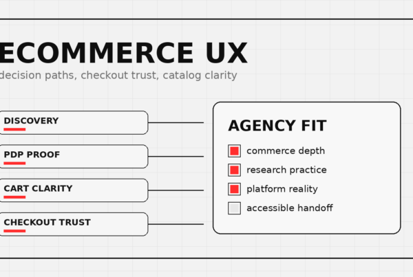
UX audit checklist SaaS teams should run before a redesign
Run this checklist on the pages and flows that sit closest to revenue. For most teams, that means homepage, solution or feature pages, pricing, demo request, trial signup, and the first-run product experience.
| Area | What to look for | Risk if broken |
|---|---|---|
| Message match | Does the landing page continue the promise from ads, search, outbound, or referrals? | High bounce, weak demo intent |
| Above-the-fold clarity | Can buyers tell who it is for, what it does, and what to do next in five seconds? | Confusion, low CTA clicks |
| Navigation and page hierarchy | Are key pages easy to find, or are users forced to hunt? | Drop-off before action |
| Form and CTA friction | Are requests clear, low-friction, and worth the ask? | Lost demos, abandoned trials |
| Trust and proof | Do proof points answer risk, credibility, and buyer objections? | Slow sales cycles, hesitation |
| Onboarding and activation | Does the first product session confirm the value promised before signup? | Trial churn, weak activation |
If your site is already under pressure to convert, pair this checklist with our guides on B2B UX design, SaaS dashboard design best practices, website redesign ROI, and why SaaS websites stop converting. Those pages help once you know where the problem lives.
1. Check message match before you touch the interface
A lot of SaaS teams jump straight to layout critiques. That is backwards.
If the visitor clicks an ad for enterprise workflow visibility and lands on generic agency copy, the page can look polished and still fail. Message mismatch is often the first leak. The audit question is simple: does the first screen continue the exact promise that brought the user here?
Review headlines, subheads, supporting bullets, hero art, and CTA labels together. They should all point at the same buyer problem. If they do not, the page is making the user translate your story for you.
SaaS buyers compare risk fast. If they cannot tell whether you solve their specific workflow, role, or use case, they move on. Clean visual design does not rescue vague positioning.
Nielsen Norman Group’s usability heuristics still hold up here, especially visibility of system status, consistency, and error prevention. Those checks catch the kind of friction that drags down demo intent and activation before a team touches visual polish.
2. Review above-the-fold clarity like a buyer who has never heard of you
Within a few seconds, a strong SaaS page should answer four questions:
- Who is this for?
- What problem does it solve?
- Why should I trust it?
- What should I do next?
If one of those answers is missing, the page is depending on patience buyers do not have. This happens a lot on founder-led sites where internal shorthand replaces buyer language and the first CTA asks too much, too soon.
3. Audit the path to action, not just the page copy
A good ux audit checklist saas review should always trace the path from first impression to action. Can someone move from homepage to pricing, feature proof, case studies, or signup without friction? Are the primary and secondary paths obvious? Does the CTA label match the commitment level?
Look for these patterns:
- Multiple competing CTAs on the same screen
- Buttons that sound soft when the ask is high-intent
- Important pages buried under vague navigation labels
- Feature pages with no clear next step
- Dead-end sections that explain but do not advance
For B2B teams, pricing and demo flows deserve extra scrutiny. Enterprise buyers are not scared off by complexity alone. They get scared off by uncertainty. If the next step feels ambiguous, they delay it.
4. Score form friction harder than you think you should
If your demo or signup form asks for a long list of fields, the audit should force a blunt question: do we need this now, or do we just like having it? Extra fields can make internal sales routing easier, but they also create more chances for a motivated user to quit.
Check field count, label clarity, error handling, mobile keyboard behavior, loading states, confirmation steps, and what happens after submission. A smooth form does not only collect information. It keeps decision confidence intact.
At DesignX, the fastest wins usually come from fewer fields, better expectation setting, and stronger confirmation states. If a user submits a form and gets a vague thank-you screen, the experience still feels unfinished.
5. Look for proof that reduces risk, not proof that fills space
In SaaS, proof should answer the buyer’s hidden questions. Has this team solved a problem like mine? Do they understand product complexity? Can they handle implementation, not just mockups?
That is why case-study framing matters so much. Specificity beats volume. Klein Tools is a useful example on the DesignX side because the redesign supported a catalog experience with 40,000+ SKUs and led to a 23% lift in dealer adoption. That lands harder than a generic sentence about happy clients.
6. Review pricing and plan pages for hidden hesitation
Pricing pages are rarely broken by typography alone. They are usually broken by unanswered questions.
When you audit pricing, check whether the page explains who each plan is for, what changes at each tier, what buyers should do if they are between options, and what happens after they click. If you hide too much behind sales, the page needs to justify that. If you show pricing, it needs to be legible and comparable.
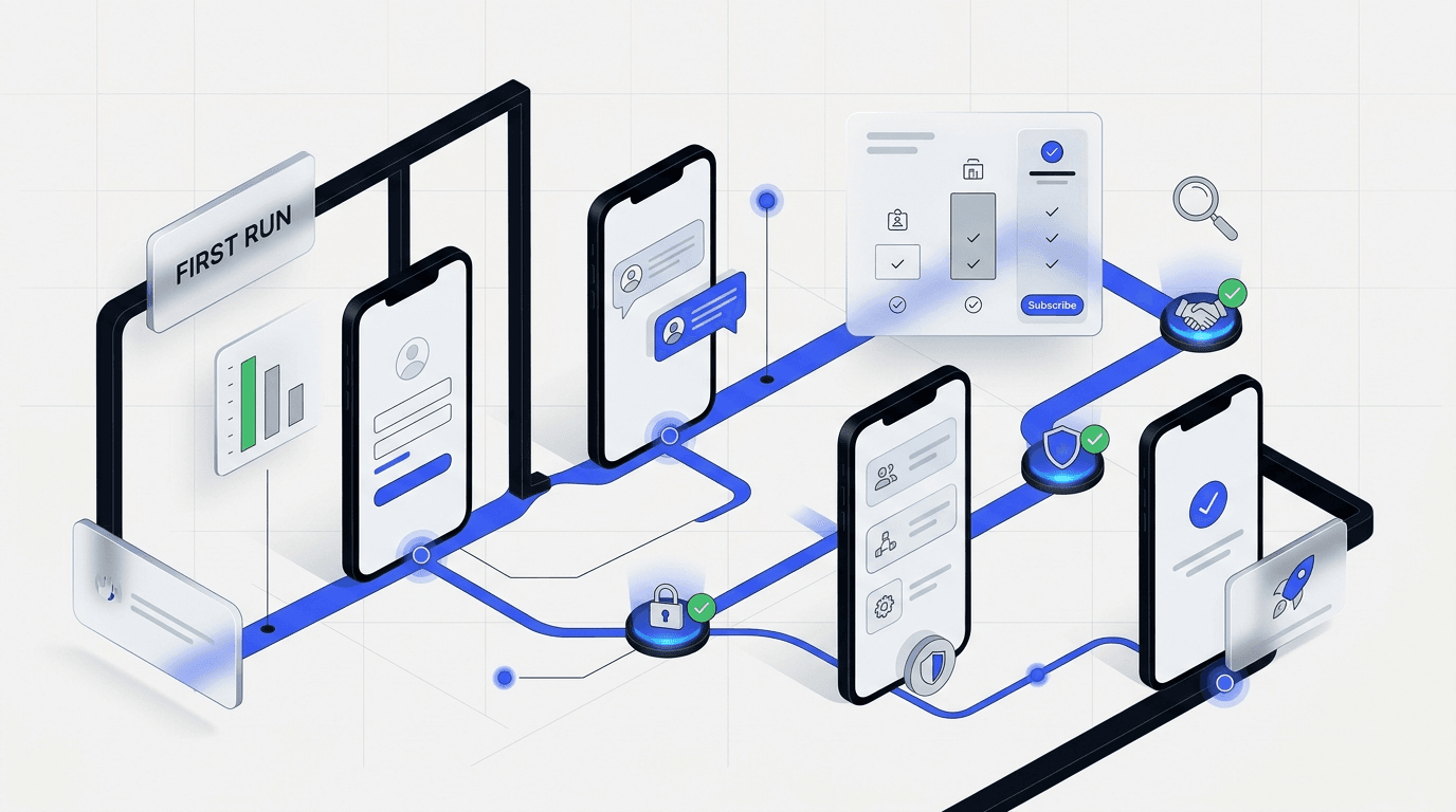
7. Audit the first-run product experience, not just the marketing site
A SaaS UX audit is incomplete if it ends at signup. The real handoff happens in the first session.
Check whether onboarding confirms the promise the website made. If the site sells speed, does setup feel fast? If the site sells clarity, does the dashboard feel legible on first use? If the site sells team adoption, are permissions, empty states, and invite flows simple enough to support that story?
8. Do not skip mobile, speed, and instrumentation
On mobile, check headline wrapping, tap targets, sticky bars, form usability, table overflow, and whether proof sections turn into unreadable walls. On performance, focus on the pages that matter most commercially. A slow homepage is bad. A slow pricing or signup page is worse.
Instrumentation matters too. If the audit finds friction but the team is not tracking CTA clicks, form starts, form completions, pricing interactions, or onboarding milestones, it will be harder to prove which fixes worked. You do not need perfect analytics to run a good audit, but you do need enough signal to validate the next round of changes.
Use the HEART framework for adoption and task success, then pair it with Core Web Vitals guidance so the audit covers both felt friction and page performance.
A simple scoring model for your SaaS UX audit
Give each area a score from 1 to 5. Do not overthink it. The point is to force prioritization.
- 1 = clearly broken
- 2 = weak and inconsistent
- 3 = acceptable but leaking
- 4 = strong with minor gaps
- 5 = clear, convincing, and easy to act on
Score message match, hero clarity, CTA path, form friction, proof quality, pricing clarity, onboarding flow, mobile experience, and speed. Anything at 1 or 2 goes into the first fix round. Leave 3s until the major leaks are closed.
What to fix first after the audit
- Clarify the story. Tighten headline, subhead, and primary CTA before changing visual style.
- Reduce friction on the main path. Simplify navigation and cut form drag where intent is highest.
- Move stronger proof closer to action. Put specific evidence near demos, trials, and pricing decisions.
- Close the promise gap. Align onboarding and first-run product states with what the site sold.
- Track the changes. Instrument the moments you expect to improve.
The order matters. If the page is unclear, a visual refresh can hide the problem instead of solving it. If the path is broken, new copy will not save the flow. Diagnosis first, redesign second.
When to run this checklist
Run this audit before paid acquisition ramps up, before a full redesign gets approved, after major positioning changes, after a sudden drop in conversion quality, or when sales keeps repeating the same objections your site should already answer.
Frequently Asked Questions
What should a UX audit checklist for SaaS include?
A solid checklist should cover message match, above-the-fold clarity, CTA paths, navigation, form friction, pricing comprehension, proof quality, onboarding flow, mobile usability, and performance on key commercial pages. The point is not to review screens in isolation. It is to trace the path from first impression to first value and find where the experience leaks trust or momentum.
How long does a SaaS UX audit take?
A quick diagnostic pass can happen in under an hour for the highest-value pages. A deeper audit with screenshots and scoring takes longer because the product flow and stakeholder context matter. Most teams should audit the revenue path first, then expand once the biggest leaks are clear.
Should we run a UX audit before a redesign?
Yes. A redesign without diagnosis often turns into expensive visual cleanup. An audit shows what is broken, what is only annoying, and which issues deserve budget first. That keeps the team from spending design budget on the wrong layer of the problem.
What is the biggest mistake in SaaS UX audits?
The most common mistake is reviewing isolated screens instead of the whole conversion path. Buyers experience one connected sequence of promises, questions, and decisions. When a team only critiques screens, it misses the handoff gaps that kill activation and trust.
Can a UX audit improve conversions without a full redesign?
Often, yes. Strong gains can come from clearer positioning, better CTA hierarchy, fewer form fields, stronger proof placement, and tighter onboarding alignment long before a full redesign is necessary. Many SaaS teams need a sharper path to action, not a brand new interface.
Final takeaway
A practical ux audit checklist saas teams can trust is not a style review. It is a way to find friction before it turns into wasted traffic, weaker demos, and slower activation.
If you score the path honestly and fix the clearest leaks first, you will usually learn more from one focused audit than from weeks of scattered redesign debate. And if the audit shows the problem is bigger than a quick fix, at least you will know exactly what the redesign needs to solve.
If you want a senior team to run the audit, rank the issues, and turn the findings into a redesign brief, talk with DesignX about a UX audit and strategy engagement.