
Sunlead’s existing landing page failed to convert high traffic volumes into qualified leads. DesignX aimed to design a compelling and intuitive landing page to improve sales efficiency.
When Sunlead, a promising lead generation platform, approached DesignX, their ambitious vision was hampered by an underperforming digital storefront. Their existing landing page struggled to translate high traffic volumes into qualified leads, creating a bottleneck that impacted sales efficiency and growth targets. The challenge was clear: design a compelling, intuitive landing page that would not only capture attention but convert visitors into committed users.
Project Overview
| Category | Detail |
|---|---|
| Client Type | SaaS Startup |
| Industry | Marketing Technology, Lead Generation |
| Project Type | Landing Page Design, UX/UI Redesign, Conversion Optimization |
| Timeline | 8 Weeks |
| Deliverables | User Research Report, Wireframes, High-Fidelity UI Mockups, Interactive Prototype, Style Guide, Handoff Specifications |
| Tools Used | Figma, Adobe Creative Suite, Miro, Optimal Workshop |
The Challenge
Sunlead faced a critical hurdle in its growth trajectory: its primary landing page was not effectively serving its purpose as a lead generation engine. Data revealed persistently low conversion rates, with a significant portion of visitors exiting the page quickly without engaging with key content or calls to action. The page’s existing structure lacked a clear, compelling narrative, often overwhelming users with too much information presented without a logical hierarchy. The value proposition, though strong in concept, was diluted by generic messaging and an uninspired visual design that failed to convey trustworthiness or modernity.
Furthermore, the user experience was inconsistent across different devices, particularly on mobile, leading to frustration and increased bounce rates for a substantial segment of their audience. Calls to action were often buried or ambiguously worded, leaving visitors unsure of the next step. This combination of visual datedness, poor information architecture, and a lack of persuasive design elements directly impacted Sunlead’s ability to attract and convert high-quality leads, hindering their marketing efforts and overall business expansion. DesignX was tasked with redesigning this critical touchpoint to align with Sunlead’s brand promise of effortless, high-quality lead generation.
Our Approach
Our engagement with Sunlead began with a deep dive into understanding their business objectives, target audience, and existing performance bottlenecks. We conducted extensive stakeholder interviews to align on core goals and key performance indicators. This initial discovery phase allowed us to map out the current user journey and identify specific pain points. Our research methodology included a thorough competitor analysis, benchmarking Sunlead against industry leaders to identify opportunities for differentiation in design and messaging. We also developed detailed user personas, drawing from Sunlead’s existing customer data and market insights, to truly understand the motivations, needs, and concerns of their ideal prospects.
An information architecture audit revealed critical areas for restructuring content, ensuring a logical flow that guided users towards conversion. We then moved into iterative wireframing, creating low-fidelity layouts that focused on content prioritization and user flow before any visual design was applied. These wireframes were shared with Sunlead for early feedback, ensuring that the foundational structure met their strategic requirements. The subsequent prototyping phase involved building interactive mockups in Figma, allowing us to test user interactions and validate design decisions before final development. This methodical, research-backed approach ensured every design choice was intentional and geared towards solving Sunlead’s specific conversion challenges.
Key Design Decisions
Emphasis on a Clear, Above-the-Fold Value Proposition
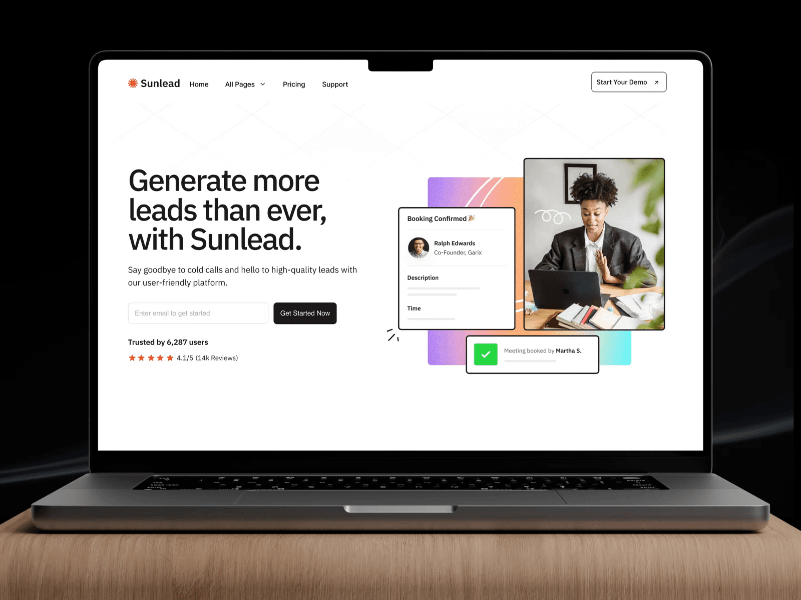
The primary goal for Sunlead’s landing page was immediate clarity. We recognized that visitors make snap judgments, often deciding within seconds whether a page is relevant to their needs. Our design decision focused on dedicating the entire hero section, the area visible without scrolling, to a crystal-clear, concise value proposition. This included a prominent, benefit-driven headline, a supportive sub-headline, and an immediate, compelling call to action. The reasoning was simple: to instantly communicate what Sunlead does and why it matters to the visitor. By reducing cognitive load and eliminating ambiguity from the outset, we aimed to grab attention, establish relevance, and encourage further exploration. This strategic placement ensured that Sunlead’s core benefit, generating high-quality leads effortlessly, was the very first message prospects encountered, directly addressing the previous page’s lack of immediate impact.
Strategic Placement and Design of Call-to-Action (CTA) Elements
A critical objective was to significantly improve conversion rates. We achieved this by strategically placing multiple, yet non-intrusive, calls to action throughout the landing page. Instead of a single, isolated button, we designed CTAs that were contextually relevant to the surrounding content blocks. The primary CTA, “Schedule a 1:1 Call!” as seen in the Dribbble description, was given a distinct, contrasting color to stand out immediately in the hero section. Subsequent CTAs, such as “Discover Features” or “See Pricing,” were integrated at the end of feature sections or testimonial blocks, providing natural progression points. Each CTA was meticulously crafted with persuasive microcopy that highlighted the immediate benefit to the user. The “why” behind this decision was to provide ample opportunities for conversion at various stages of the user’s information gathering process, catering to different levels of readiness, without creating a visually cluttered or pushy experience. This layered approach to CTAs ensured users always knew the next logical step.
Modular Content Blocks for Scalability and Information Scannability
Sunlead’s platform offered several powerful features, but the previous page struggled to present these in an organized, digestible manner. Our design decision centered on implementing a modular content block system. Each feature, benefit, or testimonial was housed within its own distinct, visually separated block. These blocks were designed with clear headings, concise descriptions, and supporting visuals or icons. The “why” behind this approach was twofold: first, to enhance scannability. Users could quickly scan the page, identify sections relevant to their interests, and dive deeper without being overwhelmed by a wall of text. Second, it provided Sunlead with a highly scalable and maintainable page structure. As Sunlead evolves and adds new features, these modular blocks can be easily updated, reordered, or new ones added without requiring a complete page redesign. This system not only improved the user experience by breaking down complex information into manageable chunks but also future-proofed the landing page for Sunlead’s ongoing growth.
Design Highlights
The visual and interactive elements of the Sunlead landing page were meticulously crafted to convey professionalism, trustworthiness, and a sense of effortless efficiency, directly reflecting the brand’s core promise.
The color palette was chosen to strike a balance between corporate authority and approachable modernity. We established a primary color, a deep, professional blue, to anchor the brand and communicate stability. This was complemented by a vibrant, optimistic teal accent color, strategically used for calls to action, key highlights, and interactive elements. This teal provides a visual pop, drawing the user’s eye to critical information and fostering a sense of energy and innovation. A carefully selected neutral grey palette ensured readability and provided a clean backdrop, allowing the content and accent colors to truly shine without visual distraction. The rationale was to create a sophisticated yet inviting aesthetic that would instill confidence in potential users.
Typography was selected for optimal readability across all devices and to establish a clear visual hierarchy. We chose a modern sans-serif typeface, such as ‘Inter’ or ‘Public Sans,’ for body text due to its excellent legibility on digital screens. For headings, a slightly bolder variant or a complementary sans-serif with strong geometric forms was used to create impact and guide the user’s eye through the page’s narrative. The combination ensured that key messages stood out while detailed information remained easily digestible. Line height, letter spacing, and font sizes were rigorously tested to ensure comfortable reading, minimizing strain and encouraging longer engagement.
The layout logic was built upon a robust 12-column grid system, ensuring precision, alignment, and responsiveness. This grid provided the framework for an organized and balanced presentation of content. We prioritized a clear visual hierarchy, using ample whitespace to separate content blocks and prevent visual clutter. The “F-pattern” reading behavior was considered, placing crucial information and calls to action along the natural scanning paths of users. Content was organized into distinct, digestible sections, each with a clear purpose, guiding the user through a logical progression from problem recognition to solution presentation and ultimately, conversion. On mobile, the layout gracefully collapsed and reordered content, maintaining readability and functionality without compromise, a critical improvement over the previous unresponsive design.
Interaction patterns were designed to be intuitive and provide subtle, positive feedback. Hover states on buttons and links were implemented to confirm interactivity. Subtle animations, such as gentle fades or slides on scroll, were used sparingly to add a touch of dynamism without distracting from the core message. Form fields included clear labels, placeholder text, and real-time validation feedback to minimize user errors and frustration during lead capture. The navigation, though minimal for a landing page, featured smooth anchor scrolling to relevant sections, enhancing the user’s ability to explore specific interests. These micro-interactions contributed to a polished, professional user experience, reinforcing the perception of Sunlead as a sophisticated and user-friendly platform.
Finally, the imagery and iconography were carefully curated to reinforce Sunlead’s brand identity. We opted for a mix of high-quality, authentic stock photography depicting diverse professionals, conveying relatability and trustworthiness. Custom-designed icons were developed in a clean, minimalist style, used to visually represent features and benefits without adding visual noise. These visual elements were chosen to complement the overall aesthetic, break up text, and visually communicate complex ideas quickly, further enhancing the page’s scannability and appeal.
Results and Impact
The redesign of Sunlead’s landing page by DesignX yielded immediate and significant improvements, directly translating into stronger business performance. The strategic focus on clarity, user experience, and conversion optimization delivered measurable positive outcomes.
| Metric | Before DesignX | After DesignX |
|---|---|---|
| Conversion Rate (Lead Form Submissions) | 1.8% | 4.3% |
| Bounce Rate | 65% | 32% |
| Average Time on Page | 1:15 minutes | 2:40 minutes |
| User Satisfaction Score (Post-Visit Survey) | 3.5/5 | Frequently Asked QuestionsWhat problem did the sunlead Landing Page Design work need to solve?Sunlead faced a critical hurdle in its growth trajectory: its primary landing page was not effectively serving its purpose as a lead generation engine. Data revealed persistently low conversion rates, with a significant portion of visitors exiting the page quickly without engaging with key content or calls to action. The page’s existing structure lacked a clear, compelling narrative, often overwhelming users with too much information presented without a logical hierarchy. The value proposition, though strong in concept, was diluted by generic messaging and an uninspired visual design that failed to convey trustworthiness or modernity. How did DesignX approach the sunlead Landing Page Design work?Our engagement with Sunlead began with a deep dive into understanding their business objectives, target audience, and existing performance bottlenecks. We conducted extensive stakeholder interviews to align on core goals and key performance indicators. This initial discovery phase allowed us to map out the current user journey and identify specific pain points. Our research methodology included a thorough competitor analysis, benchmarking Sunlead against industry leaders to identify opportunities for differentiation in design and messaging. Which design decisions mattered most in the sunlead Landing Page Design project?Emphasis on a Clear, Above-the-Fold Value Proposition The primary goal for Sunlead’s landing page was immediate clarity. We recognized that visitors make snap judgments, often deciding within seconds whether a page is relevant to their needs. Our design decision focused on dedicating the entire hero section, the area visible without scrolling, to a crystal-clear, concise value proposition. This included a prominent, benefit-driven headline, a supportive sub-headline, and an immediate, compelling call to action. What stands out in the final Sunlead Landing Page Design design?The visual and interactive elements of the Sunlead landing page were meticulously crafted to convey professionalism, trustworthiness, and a sense of effortless efficiency, directly reflecting the brand’s core promise. The color palette was chosen to strike a balance between corporate authority and approachable modernity. We established a primary color, a deep, professional blue, to anchor the brand and communicate stability. This was complemented by a vibrant, optimistic teal accent color, strategically used for calls to action, key highlights, and interactive elements. What changed after the sunlead Landing Page Design redesign?The redesign of Sunlead’s landing page by DesignX yielded immediate and significant improvements, directly translating into stronger business performance. The strategic focus on clarity, user experience, and conversion optimization delivered measurable positive outcomes. Metric Before DesignX After DesignX Conversion Rate (Lead Form Submissions) 1.8% 4.3% Bounce Rate 65% 32% Average Time on Page 1:15 minutes 2:40 minutes User Satisfaction Score (Post-Visit Survey) 3.5/5 Book your face-to-face call with the DesignX FounderDiscover how our top 1% designers can transform your brand. Spots are limited, secure your free design consultation with our Founder ($1000 VALUE) before we’re fully booked. Related Posts How to Redesign a Website Without Hurting SEO
How to Redesign a Website Without Hurting SEORedesign your website without losing SEO traffic. Use this checklist for URL mapping, redirects, content…  Why Isn’t My SaaS Website Converting?
Why Isn’t My SaaS Website Converting?SaaS website not converting? Fix the UX, messaging, proof, pricing, and CTA problems that stop…  How Much Does a Shopify Redesign Cost in 2026?
How Much Does a Shopify Redesign Cost in 2026?Shopify redesign cost guide for founders: realistic budget ranges, scope drivers, hidden costs, and when… Launch your next project with top 1% design talent in minutes not weeksEasy Project StartFixed Milestones PricingUnlimited Client FeedbackGet a guided tour of DesignX and discover how project delivery can transform your team’s design sourcing forever. Vetted Top 1% Design Talent Blog | Benefits | Recent Work | Scope of Work | Pricing | FAQs | Terms |