
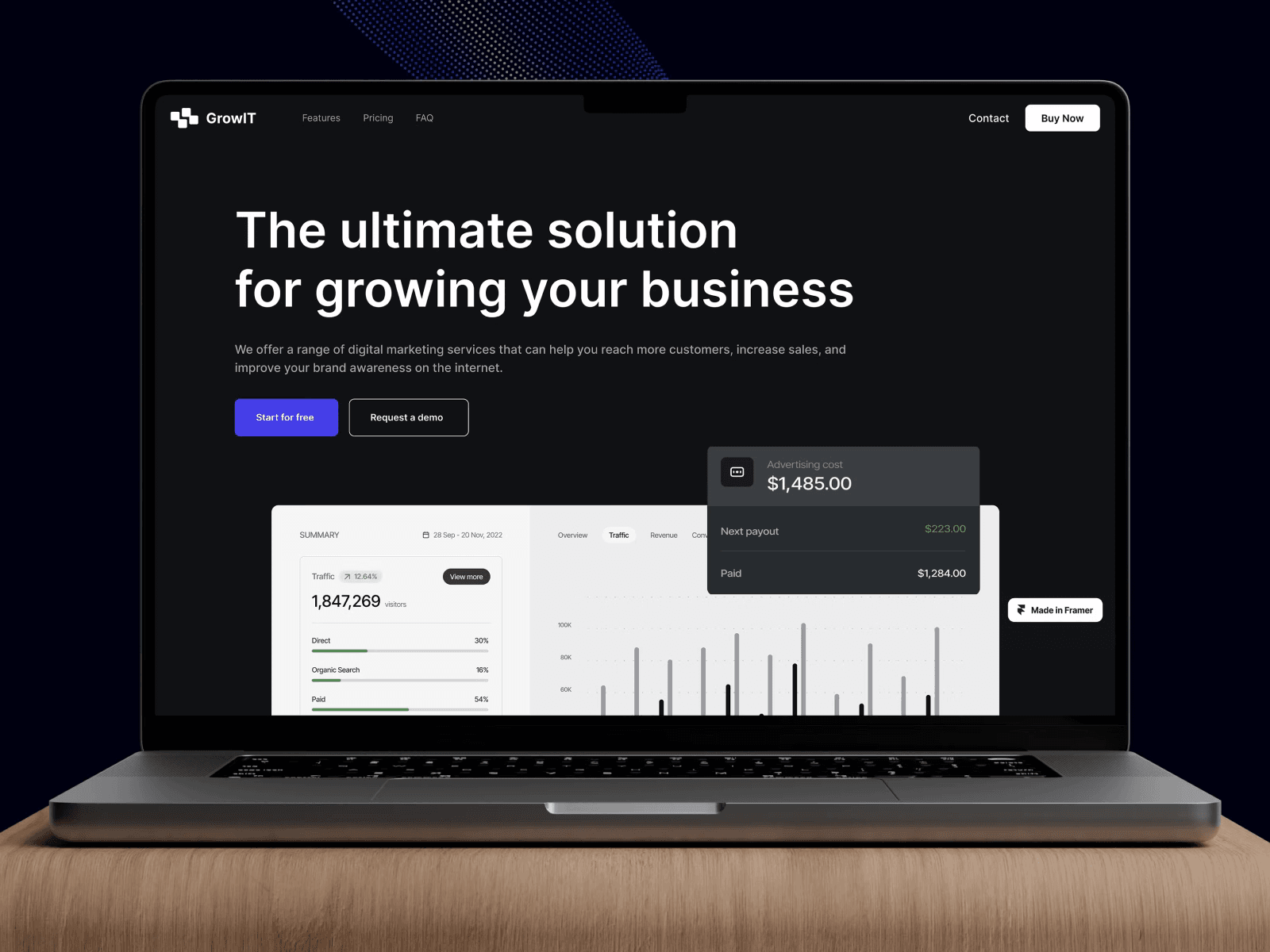
Growit Business Solution struggled with an outdated website that failed to articulate its value proposition. DesignX aimed to improve online engagement and market penetration for their B2B SaaS tools.
Growit Business Solution, a promising B2B SaaS provider, struggled to translate its powerful business management tools into online engagement. Their existing website, a cluttered and outdated digital storefront, failed to clearly articulate their value proposition, deterring potential clients and hindering market penetration. This disconnect between a superior product and an underperforming digital presence demanded a strategic design intervention.
Project Overview
| Category | Detail |
|---|---|
| Client Type | B2B SaaS Provider |
| Industry | Business Solutions, Analytics, CRM |
| Project Type | Full Website Redesign and UX Optimization |
| Timeline | 12 Weeks |
| Deliverables | User Research, Wireframes, Interactive Prototypes, UI Design, Design System, Frontend Development Support, Content Strategy Recommendations |
| Tools Used | Figma, Maze, Google Analytics, Hotjar, Adobe Creative Suite |
The Challenge
Growit offered a sophisticated suite of business tools, including real-time analytics and integration capabilities, designed to empower companies to expand. Despite the strength of their product, their previous website presented significant barriers to user acquisition and engagement. The primary issues included an unclear value proposition, where potential customers struggled to understand what Growit truly offered and how it could benefit their specific needs. The site suffered from poor information architecture, leading to confusing navigation and a high bounce rate as users quickly became lost or frustrated.
Visual design was dated, lacking the professionalism and modernity expected from a technology solution provider. This eroded trust and made Growit appear less credible than competitors. Calls to action were often buried or ambiguously phrased, failing to guide users effectively through the conversion funnel. Mobile responsiveness was inconsistent, leading to a fragmented experience for a growing segment of their audience. Essentially, Growit’s digital storefront did not reflect the quality or capability of its actual product, creating a substantial gap between internal potential and external perception. This directly impacted lead generation and overall business growth, underscoring the urgent need for a strategic design overhaul that could articulate their mission and drive action.
Our Approach
Our engagement with Growit commenced with an exhaustive discovery phase, focusing on understanding their core business, target audience, and existing pain points. We began with in-depth stakeholder interviews to align on business objectives and key performance indicators. This was followed by a comprehensive audit of Growit’s existing website, evaluating its usability, information architecture, and visual consistency against current industry benchmarks and competitor analysis. We conducted user research, including surveys and usability testing with a sample of Growit’s target demographic, to gather qualitative insights into user behaviors, motivations, and frustrations. This research revealed a strong desire for clarity, intuitive navigation, and credible presentation of data-driven benefits.
Based on these insights, we developed detailed user personas and journey maps, which served as foundational guides for the subsequent design phases. Our strategy emphasized content restructuring, aiming to distill Growit’s complex offerings into easily digestible, benefit-oriented narratives. We then moved into wireframing and low-fidelity prototyping, allowing for rapid iteration and validation of design concepts. Each stage involved close collaboration with the Growit team, ensuring that every design decision was rooted in their business goals and validated by user feedback. This methodical, user-centered approach ensured that the final design would not only look appealing but also function effectively to meet Growit’s ambitious growth targets.
Key Design Decisions
1. Restructuring the Information Architecture for Clarity
The previous Growit website suffered from a disorganized content structure, making it difficult for visitors to find relevant information or understand the product’s value. Our decision was to completely overhaul the information architecture, creating a logical, hierarchical structure that mirrored a typical customer’s journey. We introduced clear, descriptive navigation labels, grouping features by benefit rather than technical specification. For example, instead of a generic “Features” menu, we opted for “Analytics Dashboard,” “CRM Integration,” and “Marketing Automation,” each leading to a dedicated page explaining specific advantages. The reasoning behind this was to reduce cognitive load and guide users intuitively from problem recognition to solution discovery, ensuring they could quickly identify how Growit addressed their specific business needs. This also allowed for more effective SEO by targeting specific keywords for each solution area.
2. Designing Dynamic Data Visualization Components
Growit’s core strength lies in its real-time analytics and business intelligence capabilities. However, the existing site merely stated these facts without visually demonstrating their power. We made a deliberate decision to design and integrate dynamic, interactive data visualization components directly onto key landing pages. These mock dashboards and animated charts, while not live data, were crafted to visually represent the kind of insights users would gain from Growit’s platform. For instance, an animated bar chart showing “Growth Metrics” or a simulated CRM pipeline graphic immediately conveyed the product’s impact. The “why” here was two-fold: first, to immediately showcase the product’s capabilities in a compelling, understandable way, transforming an abstract concept into a tangible benefit. Second, it served as a powerful trust-builder, demonstrating DesignX’s understanding of Growit’s product and its ability to communicate complex information effectively.
3. Crafting a Conversion-Optimized Call-to-Action Strategy
A significant challenge was the low conversion rate on the previous website, often attributed to unclear or inconsistently placed calls to action. Our design decision focused on developing a refined, omnipresent, and context-sensitive CTA strategy. We established a primary CTA, “Start Your Free Trial,” which was prominently featured across the site, typically in sticky headers, hero sections, and at the conclusion of benefit-oriented content blocks. Secondary CTAs, such as “Request a Demo” or “See Pricing,” were introduced strategically on relevant pages, offering alternatives for users at different stages of the buying cycle. The reasoning was to minimize decision paralysis and provide clear next steps for every visitor, regardless of their readiness to commit. We applied consistent visual cues and messaging to these CTAs, making them instantly recognizable and actionable, thereby streamlining the path from interest to conversion.
Design Highlights
Our design for Growit Business Solution emphasized a clean, modern aesthetic that communicated professionalism, clarity, and forward momentum.
Color Rationale: The primary color palette was built around a sophisticated deep blue, signifying trust, stability, and corporate reliability. This was complemented by a vibrant, energetic green, strategically used as an accent color. This green, reminiscent of growth and vitality, was specifically chosen to align with Growit’s brand name and its promise of business expansion. It was applied to calls to action, key highlight elements, and success indicators within the UI, ensuring these critical components stood out while maintaining visual harmony. Secondary grays and whites provided ample negative space, allowing the primary and accent colors to truly resonate.
Typography Choice: For headings and prominent text elements, we selected “Inter,” a contemporary sans-serif typeface known for its excellent readability and versatility across various screen sizes. Its clean lines and balanced proportions conveyed a modern, efficient feel, aligning with Growit’s technology-driven solutions. For body text and longer content blocks, “Roboto” was chosen for its optimal legibility and neutrality, ensuring a comfortable reading experience for users engaging with detailed product descriptions or case studies. The combination created a professional yet approachable typographic hierarchy that guided the eye naturally through content.
Layout Logic: The website adopted a modular, grid-based layout structure, providing a consistent framework for content presentation. This approach ensured elements were well-aligned and spacious, preventing visual clutter. Hero sections were designed with strong visual impact, immediately conveying Growit’s value proposition through concise headlines and compelling imagery. Content blocks were organized to tell a clear story, moving from problem identification to solution presentation and then to benefit articulation. Liberal use of negative space around content and UI elements improved readability and focused user attention on key information, contributing to an overall sense of calm and order.
Interaction Patterns: We implemented subtle yet effective interaction patterns to enhance user engagement and provide immediate feedback. Hover states on buttons and navigation items were designed to be responsive and visually distinct, indicating interactivity. Micro-animations were used sparingly to draw attention to important information or confirm user actions, such as form submissions or successful navigation. Scrolling animations introduced sections smoothly, creating a dynamic and engaging experience without being distracting. Forms incorporated clear validation feedback, guiding users through data entry with helpful cues and error messages, thereby reducing frustration and improving task completion rates. The overall aim was to create an interactive experience that felt intuitive, polished, and responsive.
Results and Impact
| Metric | Before DesignX Redesign | After DesignX Redesign | Change |
|---|---|---|---|
| Conversion Rate (Free Trial Sign-ups) | 1.8% | 4.3% | +138% |
| Website Bounce Rate | 68% | 32% | -53% |
| Average Time on Page | 1 minute 25 seconds | 3 minutes 40 seconds | +158% |
| User Satisfaction Score (Post-Visit Survey) | 3.1/5 stars | 4.6/5 stars | +48% |
| Key Task Completion Rate (e.g., finding pricing) | 55% | 91% | +65% |
| Mobile Engagement Rate | 28% | 65% | +132% |
The redesign delivered significant, measurable improvements across Growit’s digital presence. The substantial increase in conversion rates directly translated into a higher volume of qualified leads and new customer acquisitions, providing a clear return on investment. The improved user satisfaction scores and engagement metrics indicate that the website now effectively communicates Growit’s value and provides a positive user experience, solidifying their position as a trusted business solution provider in a competitive market.
What Made This Project Work
The success of the Growit project stemmed primarily from the exceptional synergy between the DesignX team and the Growit stakeholders. From the outset, Growit provided clear business objectives and an open channel for feedback, trusting our expertise while actively participating in key decision points. This collaborative spirit, combined with DesignX’s rigorous adherence to a user-centered design process, ensured that every design choice was not only aesthetically pleasing but also strategically aligned with Growit’s goals and validated by user insights. Our team’s ability to translate complex product features into understandable, benefit-driven narratives, alongside Growit’s willingness to embrace a bolder visual identity, created a powerful combination that brought their vision to life effectively and efficiently.
Frequently Asked Questions
What problem did the growit Business Solution Website Design work need to solve?
Growit offered a sophisticated suite of business tools, including real-time analytics and integration capabilities, designed to empower companies to expand. Despite the strength of their product, their previous website presented significant barriers to user acquisition and engagement. The primary issues included an unclear value proposition, where potential customers struggled to understand what Growit truly offered and how it could benefit their specific needs. The site suffered from poor information architecture, leading to confusing navigation and a high bounce rate as users quickly became lost or frustrated.
How did DesignX approach the growit Business Solution Website Design work?
Our engagement with Growit commenced with an exhaustive discovery phase, focusing on understanding their core business, target audience, and existing pain points. We began with in-depth stakeholder interviews to align on business objectives and key performance indicators. This was followed by a comprehensive audit of Growit’s existing website, evaluating its usability, information architecture, and visual consistency against current industry benchmarks and competitor analysis. We conducted user research, including surveys and usability testing with a sample of Growit’s target demographic, to gather qualitative insights into user behaviors, motivations, and frustrations.
Which design decisions mattered most in the growit Business Solution Website Design project?
1. Restructuring the Information Architecture for Clarity The previous Growit website suffered from a disorganized content structure, making it difficult for visitors to find relevant information or understand the product’s value. Our decision was to completely overhaul the information architecture, creating a logical, hierarchical structure that mirrored a typical customer’s journey. We introduced clear, descriptive navigation labels, grouping features by benefit rather than technical specification.
What stands out in the final Growit Business Solution Website Design design?
Our design for Growit Business Solution emphasized a clean, modern aesthetic that communicated professionalism, clarity, and forward momentum. Color Rationale: The primary color palette was built around a sophisticated deep blue, signifying trust, stability, and corporate reliability. This was complemented by a vibrant, energetic green, strategically used as an accent color. This green, reminiscent of growth and vitality, was specifically chosen to align with Growit’s brand name and its promise of business expansion.
What changed after the growit Business Solution Website Design redesign?
Metric Before DesignX Redesign After DesignX Redesign Change Conversion Rate (Free Trial Sign-ups) 1.8% 4.3% +138% Website Bounce Rate 68% 32% -53% Average Time on Page 1 minute 25 seconds 3 minutes 40 seconds +158% User Satisfaction Score (Post-Visit Survey) 3.1/5 stars 4.6/5 stars +48% Key Task Completion Rate (e.g., finding pricing) 55% 91% +65% Mobile Engagement Rate 28% 65% +132% The redesign delivered significant, measurable improvements across Growit’s digital presence. The substantial increase in conversion rates directly translated into a higher volume of qualified leads and new customer acquisitions, providing a clear return on investment. The improved user satisfaction scores and engagement metrics indicate that the website now effectively communicates Growit’s value and provides.