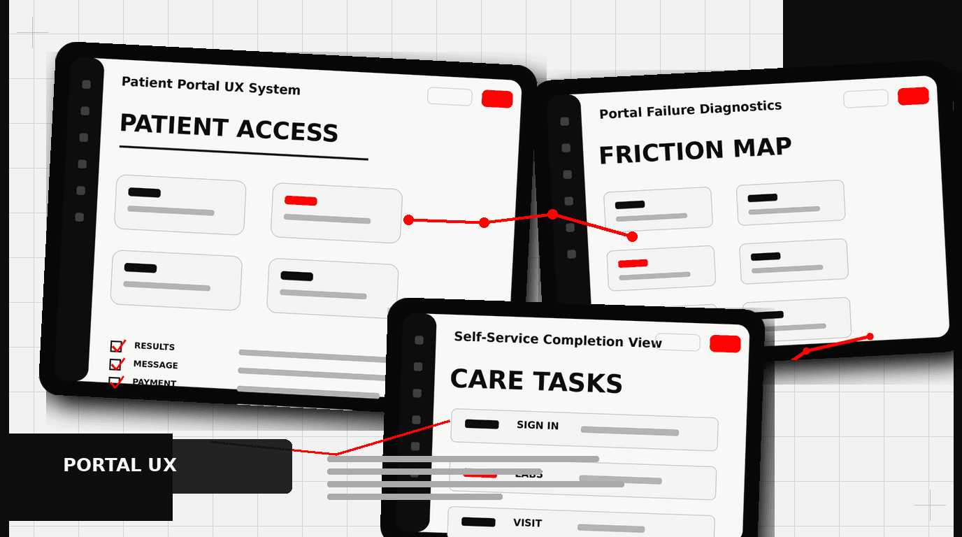
Patient portal login rates average around 30%, which means healthcare providers are spending millions on systems most patients never open, and the root cause is design built for regulatory compliance rather than actual human use. This post examines what drives that adoption gap and what a patient portal built for people, not auditors, actually looks like.
The Truth About Patient Portal Design: Why Most Are Unusable
Walk into nearly any hospital or clinic today, and you will hear about their patient portal. It is meant to be the digital front door, a central hub for everything from appointments to lab results. The reality? Most patient portals are terrible. Data shows login rates often hover around 30%. That is not engagement. That is a digital ghost town. This low adoption is not a technology problem; it is a design problem. The user experience is an afterthought, built for compliance, not for people.
Healthcare providers spend millions on these systems, only to see them languish. The promise of reduced administrative load, better patient outcomes, and stronger patient-provider relationships remains largely unfulfilled because the basic patient portal design fails to meet user needs. We see patterns repeating across different systems: complex navigation, medical jargon, and a general disregard for how real people interact with digital tools in their daily lives. We have helped organizations like Klein Tools redesign complex product catalogs, making thousands of SKUs understandable. The complexity of patient health data is no different; it requires careful, intentional design.
The “Build It and They Will Come” Fallacy
Many patient portals emerge from an IT department checklist or a regulatory mandate. The thinking often goes: “We need a portal, so we will install one.” User research, usability testing, and thoughtful interaction design are skipped. The result is a system that checks boxes but frustrates users. This approach treats patients as passive recipients of information, not active participants in their health journey. They are expected to adapt to the system, rather than the system adapting to them.
A good patient portal design starts with understanding the patient. What are their goals? What information do they need? When do they need it? How do they prefer to receive it? Without this foundational understanding, any digital tool, no matter how feature-rich, will fall short. It is why consumer products, like the Oura Ring, succeed; they are built from the ground up with the user experience as the primary driver.
Appointment Booking Friction: A Common Pitfall
Booking an appointment through a patient portal should be straightforward. Too often, it is a maze. Patients face confusing interfaces, limited time slot options, and forms that ask for information the system already has. This creates unnecessary friction, pushing people back to the phone, defeating the portal’s purpose.
Consider the typical appointment flow:
- Logging in takes too many steps or fails often.
- Finding the “Schedule Appointment” button is difficult, buried in menus.
- Selecting a provider or specialty requires navigating poorly organized lists.
- Available times are presented in an unclear calendar view, or there are no available times at all.
- Multiple pages of forms ask for insurance details, reasons for visit, or demographic data already on file.
- Confirmation is unclear, or rescheduling is equally difficult.
A well-designed appointment system uses principles from consumer scheduling apps. It offers clear pathways, intelligent filtering for providers and times, and pre-fills known patient data. The system should present options based on the patient’s insurance, their last visit, or their primary care physician. It should offer clear “next steps” and confirmations. When we work with clients like HP, simplifying complex user flows is a core part of the design process; healthcare needs this same rigor.
Presenting Lab Results: Data Over Understanding
Receiving lab results can be a source of anxiety. A poorly designed patient portal only amplifies this. Most portals dump raw data, often with obscure medical abbreviations and reference ranges that mean little to the average person. Imagine seeing a blood test result with terms like “MCV,” “MCH,” or “MCHC” without any explanation. Then imagine seeing values outside the “normal” range without context on what that means for your health. This is a common experience.
Effective patient portal design for lab results looks different:
- Plain Language Summaries: Start with a high-level summary explaining what the test measures and what the results generally mean in simple terms.
- Visualizations: Use graphs and charts to show trends over time, rather than just isolated numbers. This helps patients see patterns in their health.
- Contextual Explanations: For each abnormal result, provide a brief, easy-to-understand explanation of what it might indicate and suggest next steps, like “discuss with your doctor.”
- Reference Range Clarity: Clearly label the normal range and highlight where the patient’s result falls. Explain why certain values are important.
- Actionable Information: If a result requires immediate action, make that clear. Do not bury it.
The goal is to move from data presentation to health literacy. Patients should leave the lab results section feeling informed, not confused or anxious. This requires designers who can translate complex information into digestible formats, a skill we honed when making complex product information accessible for Klein Tools’ vast catalog.
Message Threading UX: The Digital Conversation Gap
Secure messaging between patients and providers is a powerful feature, but its implementation often misses the mark. Many patient portals treat messages like an archaic email client. Threads are hard to follow, attachments are difficult to manage, and the overall experience feels clunky and slow.
Typical issues include:
- Fragmented Conversations: A new message often starts a new thread, even if it relates to an ongoing issue. This makes tracking an exchange about a specific symptom or medication impossible.
- Poor Notification Systems: Patients miss new messages because notifications are inconsistent or non-existent outside the portal.
- Attachment Woes: Uploading or viewing documents, images, or forms is often a struggle.
- Lack of Context: Messages lack integration with other parts of the portal. A message about an upcoming appointment should link to that appointment’s details.
- Slow Load Times: A common complaint, leading to abandonment.
Modern communication apps, like Slack or even simple SMS, have set a high bar for messaging UX. Patient portals should learn from these. Imagine a message system where conversations are grouped by topic or encounter, where you can easily see the history, and where attaching a photo of a rash or a scan of a document is as easy as sending it to a friend. This improves communication efficiency for both patient and provider, reducing phone calls and administrative overhead.
The Invisible Cost of Bad Patient Portal Design
The consequences of poor patient portal design extend beyond low login rates. They impact the entire healthcare ecosystem:
- Increased Administrative Burden: When patients cannot find information or complete tasks online, they call the clinic. This consumes staff time that could be spent on patient care.
- Reduced Patient Engagement: Patients who struggle with a portal are less likely to manage their health proactively. This can affect medication adherence, follow-up appointments, and overall health outcomes.
- Poor Patient Satisfaction: A frustrating digital experience reflects poorly on the entire practice or hospital system. In a competitive market, this matters.
- Missed Revenue Opportunities: Portals can be a channel for patient education, preventive care reminders, and even elective services. Bad design shuts these down.
- Data Silos: When systems are not designed to integrate or communicate well, patient data remains fragmented, hindering coordinated care.
Designing for a patient is designing for business outcomes. A well-designed patient portal does not just look good; it saves money, improves care, and builds trust.
What Good Patient Portal Design Looks Like
Creating an effective patient portal involves a deliberate, user-centered approach. It is not about adding more features; it is about designing the right features well.
User-Centered Research and Discovery
Start with the people who will use it. This means conducting patient interviews, surveys, and usability tests. Observe how patients currently manage their health. Map out their journeys. Understand their pain points and their goals. This foundational work informs every design decision. We apply this process for all our projects, from early-stage startups like Apellix to established brands, ensuring the end product meets real needs.
Clear Information Architecture and Navigation
Patients need to find what they are looking for quickly. This requires a logical structure for information and intuitive navigation. Use clear labels. Group related items. Avoid jargon. A clean, uncluttered interface guides the user, rather than overwhelming them.
Accessibility First
Healthcare is for everyone. Patient portals must be accessible to people with disabilities, including those with visual impairments, cognitive differences, or motor challenges. Adhering to Web Content Accessibility Guidelines (WCAG) is not just good practice; it is often a legal requirement. This includes proper color contrast, keyboard navigation, and screen reader compatibility.
Visual Clarity and Hierarchy
Health information can be complex. Good design uses visual hierarchy to make it digestible. Important information should stand out. Use whitespace, appropriate typography, and consistent visual elements to create a calm, trustworthy experience. This is about making information easy to scan and understand quickly, reducing cognitive load.
Feedback Loops and Iteration
A patient portal is never “finished.” It should evolve. Implement mechanisms for patient feedback. Regularly review analytics to see where users struggle. Plan for continuous updates based on user needs and technological advancements. This iterative process ensures the portal remains relevant and useful over time.
Actionable Steps for Better Patient Portal Design
If you are looking to improve your patient portal, start here:
- Audit Your Current Portal: Identify common pain points. What features are rarely used? Where do patients get stuck?
- Talk to Your Patients: Conduct informal interviews or formal usability testing. What do they want to achieve? What frustrates them?
- Prioritize Key Use Cases: Instead of trying to fix everything, focus on the 2-4 most critical tasks patients perform. Booking appointments, viewing results, or messaging are good starting points.
- Design for Health Literacy: Simplify language. Use visuals. Provide context. Assume your users are not medical experts.
- Pilot and Iterate: Roll out changes incrementally. Test new designs with small groups. Gather feedback and refine.
Frequently Asked Questions
What should teams know about why most are unusable?
Walk into nearly any hospital or clinic today, and you will hear about their patient portal. It is meant to be the digital front door, a central hub for everything from appointments to lab results. The reality? Most patient portals are terrible.
What should teams know about the “build it and they will come” fallacy?
Many patient portals emerge from an IT department checklist or a regulatory mandate. The thinking often goes: “We need a portal, so we will install one.” User research , usability testing, and thoughtful interaction design are skipped. The result is a system that checks boxes but frustrates users. This approach treats patients as passive recipients of information, not active participants in their health journey.
What should teams know about a common pitfall?
Booking an appointment through a patient portal should be straightforward. Too often, it is a maze. Patients face confusing interfaces, limited time slot options, and forms that ask for information the system already has. This creates unnecessary friction, pushing people back to the phone, defeating the portal’s purpose.
What should teams know about data over understanding?
Receiving lab results can be a source of anxiety. A poorly designed patient portal only amplifies this. Most portals dump raw data, often with obscure medical abbreviations and reference ranges that mean little to the average person. Imagine seeing a blood test result with terms like “MCV,” “MCH,” or “MCHC” without any explanation.
What should teams know about the digital conversation gap?
Secure messaging between patients and providers is a powerful feature, but its implementation often misses the mark. Many patient portals treat messages like an archaic email client. Threads are hard to follow, attachments are difficult to manage, and the overall experience feels clunky and slow. Typical issues include: Fragmented Conversations: A new message often starts a new thread, even if it relates to an ongoing issue.