Healthcare technology buyers operate on 9-to-18-month sales cycles, multimillion-dollar budgets, and the weight of patient outcomes, which makes them categorically different from the consumer SaaS audience most website playbooks are written for. Your site needs to function as a persistent, multi-stakeholder sales tool that educates a procurement committee over months, not a landing page optimized for a single click.
The Long Game: Designing for the Healthcare B2B Sales Cycle
The healthcare technology space is not like consumer SaaS. You are not selling a subscription to an individual. You are selling a solution to an organization, often a large one, with budgets in the millions and patient lives on the line. This means a sales cycle that stretches anywhere from 9 to 18 months, sometimes longer. During this time, your website does not just introduce your product. It acts as a persistent, always-on salesperson, educating, reassuring, and building trust with multiple stakeholders.
Consider the varied personas involved. You have the clinician who cares about patient outcomes and workflow efficiency. The IT director who worries about data security, integration, and system stability. The procurement specialist focused on budget and vendor contracts. Legal teams scrutinizing compliance. Administrators looking at ROI and operational impact. And, sometimes, even direct patient users who need to understand the interface. A successful health tech website design recognizes these diverse needs and addresses them, often simultaneously, without overwhelming any single visitor.
Many health tech companies make the mistake of designing for a single user type, or worse, for their own internal understanding of the product. This often leads to websites that are either too technical, too marketing-heavy, or too generic. Our work with clients like Oura Ring, designing their launch identity, or HP, navigating enterprise buyer journeys, has taught us that complexity is not an excuse for poor design. It is a demand for even clearer, more strategic information architecture and content presentation.
Building Trust: More Than Just Pretty Pictures
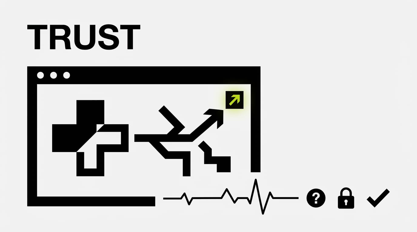
Skepticism is the default in healthcare. Decision-makers are risk-averse. They need proof, reassurance, and clear signals that your solution is reliable, compliant, and secure. Your website is the first, and often most enduring, touchpoint for establishing this trust. Visual design plays a part, of course, but true trust is built on credibility, transparency, and a clear demonstration of understanding their unique challenges.
Security and compliance are non-negotiable. These are not features to be buried in a footer. They are foundational elements that need prominent, yet tastefully integrated, placement. Think about the common badges: HIPAA compliance, SOC 2 Type 2 reports, GDPR adherence, ISO 27001 certifications. These signals tell IT and legal teams you understand the landscape. They can be presented in a dedicated “Trust & Security” section, but also subtly reinforced near relevant product descriptions or data handling explanations.
Instead of just listing acronyms, explain what they mean for the customer. “HIPAA compliant” is a start. “We encrypt all patient data at rest and in transit, exceeding HIPAA requirements, and conduct regular third-party audits to ensure data integrity” is better. This transparency builds confidence. Design the presentation of these details so they are easily found, digestible, and cross-referenced. A clear information hierarchy is not just good UX; it is a trust-building exercise.
Beyond certifications, think about the overall tone and visual language. Does it convey professionalism, expertise, and empathy? Or does it look like a startup trying too hard? A clean, organized layout with clear typography, intuitive navigation, and high-quality imagery projects competence. This is not about being flashy. It is about being dependable. For a project like our Klein Tools catalog redesign, we faced the challenge of presenting over 40,000 SKUs clearly to a skeptical dealer network. The lesson was simple: clarity and organization lead directly to trust and adoption.
Content That Converts: The Case Study Imperative
Your product features list will not close a deal in health tech. Your case studies will. They are the social proof, the real-world validation that your solution delivers tangible results in a similar environment. But not all case studies are created equal. In the context of a 9-18 month sales cycle with multiple stakeholders, your case studies need to be strategic, detailed, and adaptable.

A strong health tech case study structure should include:
- **The Challenge:** Clearly articulate the specific problem the client faced. Use industry-specific language.
- **The Solution:** Describe how your product addressed that challenge. Focus on functionality relevant to the problem.
- **The Results:** This is where the hard numbers live. Quantifiable outcomes are paramount. Think beyond general “efficiency gains.”
- **Specific Metrics:** How much did they reduce readmissions? By what percentage did staff save time on administrative tasks? What was the ROI on their investment over 12 months? Did patient satisfaction scores improve?
- **Stakeholder-Specific Takeaways:** Design your case study page to allow different stakeholders to quickly find what matters to them. An IT director might skim for integration details. A clinician will look for patient impact. An administrator will zero in on cost savings.
- **Direct Quotes:** Authentic testimonials from key personnel add a human layer of credibility.
We often recommend creating “mini-case studies” or executive summaries for quick consumption, alongside full, downloadable versions that provide all the granular detail for those deep dives. For organizations like Bodybuilding.com, where we helped manage a vast content library, the lesson was in segmenting and delivering the right content to the right user at the right time. For health tech, this means understanding the buyer’s journey and matching content to their current informational needs.
Do not just tell a story; prove a thesis. Use data visualizations, charts, and graphs to make those results undeniable. Show the before and after. If you claim to reduce physician burnout, present survey data. If you claim to shorten hospital stays, show average length of stay metrics. This data-driven approach is what separates a compelling case study from a marketing brochure.
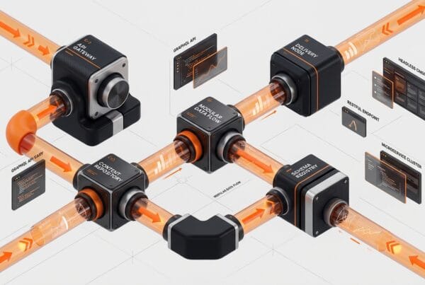
Navigating the Technical Maze: Integration Documentation UX
For many health tech solutions, particularly those that are not standalone, integration is everything. Your product must connect with Electronic Health Records (EHRs), Practice Management Systems (PMS), lab systems, and other clinical or administrative platforms. The IT department will be a gatekeeper, and their primary concern will be how easily and securely your system talks to theirs. This makes your integration documentation a mission-critical piece of your health tech website design.
Poor documentation is a red flag. It signals potential headaches, delays, and security vulnerabilities. Excellent documentation, however, can be a sales asset. It reduces friction, answers technical questions proactively, and demonstrates a commitment to interoperability.
Key elements of strong integration documentation UX:
- **Clear Navigation and Search:** Technical users need to find specific APIs, endpoints, and data models quickly. A strong search function and logical information architecture are essential.
- **full API Reference:** Detailed descriptions of every API endpoint, parameters, request/response examples, authentication methods, and error codes.
- **Code Samples:** Provide code snippets in popular languages (Python, JavaScript, C#, Java) to demonstrate how to interact with your APIs. Make them easy to copy.
- **Version Control and Changelogs:** Clearly indicate API versions and document changes between versions. This helps developers plan upgrades and avoid breaking changes.
- **Diagrams and Flowcharts:** Visual explanations of data flow, system architecture, and integration points can simplify complex concepts.
- **Use Cases and Tutorials:** Show, don’t just tell. Walk developers through common integration scenarios with step-by-step guides.
Consider platforms like ReadMe.io or Swagger UI which are built for API documentation. Integrating such a platform or replicating its best practices within your own site shows IT buyers you understand their workflow. This is not just about having the information. It is about presenting it in a way that minimizes cognitive load and maximizes utility for a highly specialized audience. The success of a health tech solution often hinges on its ability to integrate into an existing, complex ecosystem. Your website’s documentation needs to reflect that reality.
Optimizing for the Long Sales Cycle
A 9-18 month sales cycle means your website needs to serve different purposes at different stages. It is not just about the initial discovery. It is about nurturing, educating, and providing depth as decision-makers move through their evaluation process. Your health tech website design must support this journey.
Think about content strategy across the funnel:
- **Awareness Stage:** High-level problem/solution content. Thought leadership blog posts, industry trend analyses, and solution overviews.
- **Consideration Stage:** Detailed product pages, feature comparisons, deep-dive webinars, whitepapers, and, of course, those powerful case studies. This is where you address specific stakeholder concerns.
- **Decision Stage:** Implementation guides, security documentation, ROI calculators, detailed pricing information (or clear calls to contact sales for a custom quote), and strong FAQs.
- **Post-Sale/Customer Success:** Support documentation, user guides, training resources, and community forums. This builds retention and advocacy.
Personalization, even subtle personalization, can be effective. If a user downloads a whitepaper on “EHR Integration for Large Hospitals,” subsequent content recommendations could lean towards case studies from similar institutions or webinars on advanced interoperability. This level of responsiveness makes the website feel tailored and intelligent.
Finally, measure what matters. Beyond initial clicks and page views, track engagement with key content assets like whitepaper downloads, case study views, and time spent on technical documentation. Track conversions not just to “contact us” forms, but to demo requests, specific content downloads, or even registrations for private webinars. These metrics provide real insight into how your website is supporting that extended sales journey and ultimately converting skeptical healthcare buyers into confident customers.
Frequently Asked Questions
What is the typical sales cycle for health tech solutions?
The sales cycle for health tech solutions is considerably longer than in many other industries, often ranging from 9 to 18 months. This extended timeline is due to the complexity of healthcare organizations, the number of stakeholders involved, stringent regulatory requirements, and the significant investment usually required.
How many different stakeholders does a health tech website need to address?
A health tech website typically needs to address at least 6 different types of stakeholders: clinicians (doctors, nurses), IT directors, procurement specialists, legal teams, administrators (C-suite, department heads), and sometimes even the end-patient users themselves. Each group has unique concerns and priorities that the website’s content and design must consider.
What are the most important security badges or certifications to display on a health tech website?
Key security badges and certifications for health tech websites include HIPAA compliance (for US patient data), SOC 2 Type 2 reports (system controls), GDPR (for European data privacy), and ISO 27001 (information security management). Displaying these prominently and explaining their significance builds trust with IT and legal buyers.
What makes a health tech case study effective for B2B buyers?
An effective health tech case study goes beyond a simple success story. It clearly outlines the client’s challenge, details your solution, and presents quantifiable results with hard numbers. It should also include specific metrics relevant to healthcare (e.g., reduced readmissions, efficiency gains, improved patient outcomes) and offer takeaways tailored to different stakeholder interests.
Ready to design a website that converts skeptical healthcare buyers? Contact DesignX to talk through your project.