The healthcare industry is undergoing a massive digital transformation, with the global digital health market expected to reach $639.4 billion by 2026. As patients increasingly interact with healthcare services through digital interfaces for tasks like scheduling appointments and managing chronic conditions, the quality of Healthcare UX design has become critical.
The healthcare industry is experiencing a massive digital transformation, with the global digital health market expected to reach $639.4 billion by 2026. As patients increasingly interact with healthcare services through digital interfaces, from scheduling appointments to managing chronic conditions, the quality of Healthcare UX design has become critical to patient outcomes, satisfaction, and engagement. Poor user experience in healthcare isn’t just frustrating; it can lead to medication errors, missed appointments, and patients abandoning care altogether.
Unlike consumer apps where mistakes might cost a sale, healthcare UX design carries the weight of patient safety, regulatory compliance, and accessibility for diverse populations including elderly users and those with disabilities. The stakes are higher, the constraints are tighter, and the need for empathy-driven design has never been more crucial. Whether you’re designing a patient portal, telehealth platform, or medical device interface, understanding the unique challenges of healthcare UX is essential to creating experiences that serve patients and providers alike.
The Unique Challenges of Healthcare UX Design
Balancing Clinical Accuracy with User-Friendly Design
Healthcare applications must present complex medical information in ways that are both accurate and comprehensible to users with varying levels of health literacy. Designers face the challenge of simplifying medical terminology without oversimplifying to the point of inaccuracy or legal liability. A blood glucose tracking app, for example, must display trends clearly while maintaining precise data integrity that clinicians can trust for treatment decisions.
The best healthcare app design achieves this balance through progressive disclosure, contextual help, and carefully crafted microcopy that educates without overwhelming. Platforms like MyChart have succeeded by organizing dense medical records into scannable sections with plain-language summaries alongside technical details.
Navigating Strict Regulatory Requirements
HIPAA compliance, FDA regulations, and international data protection laws create design constraints that don’t exist in most other industries. Every interaction must be auditable, every data point must be securely transmitted, and consent flows must be legally bulletproof. These requirements often conflict with modern UX patterns that prioritize speed and frictionless experiences.
Smart healthcare UX designers build compliance into the experience architecture from day one rather than bolting it on later. This means designing authentication flows that balance security with usability, creating clear audit trails that don’t disrupt user tasks, and building consent mechanisms that genuinely inform users while respecting their time.
Designing for High-Stress, High-Stakes Scenarios
Patients often interact with healthcare interfaces during moments of anxiety, pain, or cognitive impairment. A parent trying to schedule an urgent pediatric appointment at 2 AM operates under very different conditions than someone browsing an e-commerce site. Healthcare accessibility must account for users who may be experiencing stress, taking medications that affect cognition, or dealing with temporary or permanent disabilities.
This reality demands interfaces with generous touch targets, high-contrast text, clear error recovery paths, and minimal cognitive load. Confirmation dialogs for critical actions (like canceling an appointment or stopping medication reminders) must be clear without adding unnecessary friction to routine tasks.
Integrating with Complex Healthcare Systems
Modern healthcare UX rarely exists in isolation. A patient portal must pull data from electronic health records (EHR), billing systems, pharmacy databases, and appointment scheduling platforms, each with their own data structures, update frequencies, and reliability issues. When a lab result is delayed or billing information is inconsistent, patients blame the interface they’re using, not the backend integration challenge.
Effective patient portal design acknowledges these technical realities and designs transparent loading states, clear data freshness indicators, and helpful error messages that explain what’s happening and when information will be available. Epic’s MyChart and Cerner’s HealtheLife demonstrate how smart integration design can create cohesive experiences despite backend complexity.
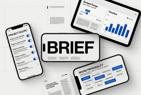
Patient Portal Design Best Practices
Prioritizing Task Completion Over Feature Completeness
The most successful patient portals focus relentlessly on the tasks patients actually want to complete: scheduling appointments, requesting prescription refills, viewing test results, and communicating with providers. Many portals fail by trying to expose every possible feature from the underlying EHR system, creating overwhelming navigation and obscuring the core use cases.
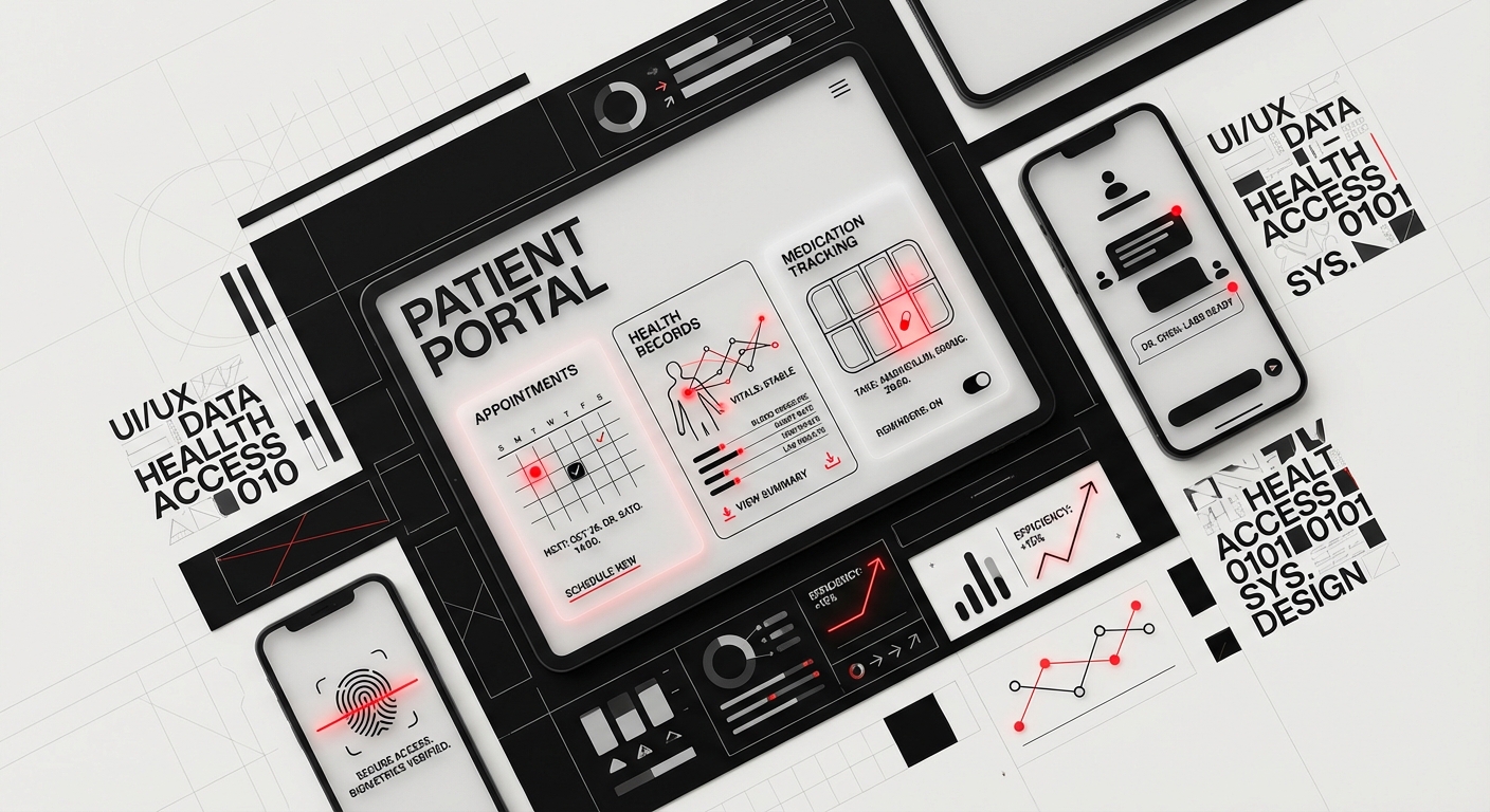
Research from the Pew Research Center shows that 85% of patient portal users focus on just five tasks. Design your information architecture around these high-frequency actions, making them accessible within two clicks from the home screen. Kaiser Permanente’s portal succeeds by featuring “Quick Actions” prominently, understanding that most users come with a specific goal rather than a desire to explore.
Creating Clear Medical Information Hierarchies
Lab results, imaging reports, and clinical notes contain highly variable information density and urgency. A slightly elevated cholesterol reading requires different visual treatment than a critical blood sugar level. Patient portal design must establish clear visual hierarchies that help users quickly identify what requires attention versus what’s routine monitoring data.
Use color coding judiciously and consistently, red for abnormal results requiring action, yellow for borderline values, green for normal ranges. Provide contextual explanations of what each result means and what actions, if any, the patient should take. The Mayo Clinic app excels at this by showing results with reference ranges, trend graphs, and physician notes in a scannable format.
Designing Secure Messaging That Encourages Engagement
Patient-provider messaging can reduce phone call volumes and improve continuity of care, but only if patients trust the system and providers respond promptly. Set clear expectations about response times (typically 2-3 business days for non-urgent messages) and provide status indicators showing when messages have been read by the care team.
Implement message threading to maintain conversation context and smart templates for common questions like prescription refills or appointment changes. Cleveland Clinic’s messaging system demonstrates best practices by categorizing message types, routing them to appropriate staff, and providing estimated response times based on message urgency.
Mobile-First Design for On-the-Go Access
Over 60% of patient portal access now happens on mobile devices, yet many portals still feel like desktop websites squeezed onto small screens. True mobile-first healthcare app design means rethinking task flows for thumb navigation, optimizing for intermittent connectivity, and use device capabilities like biometric authentication and camera access for medication scanning.
Consider the context of mobile healthcare interactions: a patient might be checking lab results in a busy pharmacy or trying to find their insurance card while checking in at reception. Design for these real-world scenarios with offline access to key information, easy-to-read insurance cards, and quick access to appointment details.
HIPAA and Accessibility Compliance in Healthcare Design
Building Privacy-First User Experiences
HIPAA compliant design extends far beyond encrypted data transmission. It encompasses every aspect of how users interact with their health information, from login screens that don’t reveal whether an account exists to session timeouts that protect data on shared devices. Design privacy controls that give users granular control over who can access their information, particularly important for adolescents sharing portals with parents or domestic violence survivors.
Implement features like proxy access with customizable permissions, activity logs showing who accessed what information and when, and easy-to-understand privacy settings. The portal should make users feel confident their sensitive health data is protected without requiring them to understand technical security concepts.
Meeting WCAG 2.1 AA Standards and Beyond
Healthcare interfaces serve users with diverse abilities, including vision impairments, motor difficulties, and cognitive disabilities. Meeting healthcare accessibility standards isn’t just about legal compliance, it’s about ensuring equitable access to care. WCAG 2.1 Level AA compliance should be the baseline, with considerations for Level AAA where feasible.
This means ensuring all functionality is keyboard-accessible, providing alt text for meaningful images, maintaining 4.5:1 contrast ratios for body text, and designing forms with clear labels and error identification. Screen reader testing should be part of your regular QA process, not an afterthought. The VA’s health portal demonstrates strong accessibility with voice navigation options and customizable text sizing that genuinely works across all interface elements.
Designing for Cognitive Accessibility
Beyond physical disabilities, healthcare UX must accommodate users with cognitive challenges including dyslexia, ADHD, dementia, and temporary cognitive impairment from illness or medication. Use plain language (6th-8th grade reading level for patient-facing content), break complex processes into clear steps, and provide multiple ways to accomplish important tasks.
Implement features like medication lists with both generic and brand names, visual medication identification, and appointment reminders with multiple notification methods. Consistency in navigation, labeling, and interaction patterns reduces cognitive load, users shouldn’t have to relearn the interface with each visit.
Balancing Security Requirements with Usability
Multi-factor authentication, session timeouts, and password complexity requirements protect patient data but can create friction that discourages portal adoption. The art of HIPAA compliant design lies in implementing necessary security without making the system so cumbersome that users avoid it or find workarounds.
Consider risk-based authentication that requires additional verification only for sensitive actions like accessing behavioral health records or changing proxy access settings. Enable biometric authentication on mobile devices and remember trusted devices for lower-risk tasks. Document every security decision and its user impact to demonstrate thoughtful compliance to auditors and stakeholders.
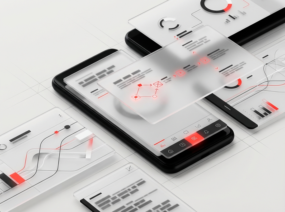
Telehealth Interface Design for Virtual Care
Optimizing Video Quality and Connection Resilience
The foundation of effective telehealth UX is reliable, high-quality video communication that works across varying bandwidth conditions. Users often access telehealth from rural areas with limited connectivity or mobile devices on cellular networks. Design your platform to gracefully degrade quality rather than dropping connections entirely, and provide clear indicators of connection status before and during appointments.
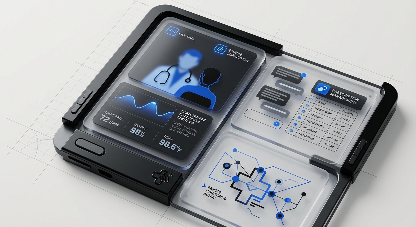
Implement pre-call connection testing that checks camera, microphone, and bandwidth, offering troubleshooting guidance before the appointment starts. Teladoc and Amwell have perfected this with automated tech checks that prevent the all-too-common scenario of patients and providers spending the first five minutes of a video visit troubleshooting audio issues.
Creating Intuitive Pre-Visit and Waiting Room Experiences
The minutes before a telehealth appointment are crucial for gathering information, setting expectations, and reducing patient anxiety. Design waiting room interfaces that clearly show appointment status, estimated wait time, and what will happen next. Provide this time productively by allowing patients to update medications, complete pre-visit questionnaires, or review educational materials related to their appointment.
Avoid the frustrating “click to join” pattern where patients repeatedly click with no feedback about whether the provider has started the session. Instead, show provider status (“Dr. Smith is wrapping up a previous appointment, estimated 5 minutes”) and automatically connect patients when the provider is ready. This transparency builds trust and reduces appointment no-shows.
Designing for Provider Efficiency During Virtual Visits
While patient experience is paramount, telehealth interface design must also optimize provider workflows to ensure sustainable adoption. Providers need simultaneous access to patient charts, ability to document during visits, e-prescribing capabilities, and simple controls for camera/audio without disrupting patient interaction.
Consider picture-in-picture modes that let providers reference lab results while maintaining eye contact, customizable layouts for different appointment types, and integration with EHR systems for smooth documentation. Epic’s telehealth integration demonstrates how thoughtful design can make virtual visits feel like a natural extension of in-person care rather than a completely separate workflow.
Accommodating Different Appointment Types and Specialties
A therapy session requires different interface features than a post-surgical follow-up or a dermatology consultation. Design your platform with specialty-specific modes that adapt the interface to clinical needs. Dermatology visits benefit from high-resolution image capture and drawing tools for highlighting areas of concern. Physical therapy appointments need screen sharing for exercise demonstrations and recording capabilities for patient reference.
Build flexible frameworks that allow specialties to customize their experience while maintaining consistent core interactions that patients recognize across appointment types. This modular approach prevents feature bloat while serving diverse clinical use cases effectively.
Designing for Aging and Diverse Populations
Addressing Age-Related Changes in Vision and Motor Control
As the population ages, healthcare UX design must accommodate age-related vision changes including decreased contrast sensitivity, reduced peripheral vision, and difficulty with small text. Design with larger default text (16-18px minimum), high contrast ratios (especially avoiding light gray text on white backgrounds), and generous spacing between interactive elements.
Motor control changes mean increased difficulty with precise tapping, dragging, and multi-touch gestures. Make touch targets at least 44×44 pixels, avoid requiring gestures like pinch-to-zoom for core functionality, and provide alternatives to time-sensitive interactions. The CDC’s Milestone Tracker app demonstrates excellent age-inclusive design despite being targeted at parents of young children, their principles apply beautifully to interfaces for older adults.
Designing for Limited Health Literacy
Nearly 90 million American adults have limited health literacy, struggling to understand medical terms, navigate complex healthcare systems, and make informed decisions about their care. Healthcare accessibility for these users requires plain language, visual explanations, and progressive disclosure of complex information.
Replace medical jargon with everyday language (“high blood pressure” instead of “hypertension”), use illustrations to explain concepts, and provide context for numbers (showing a cholesterol level of 220 is more meaningful when accompanied by “Target: below 200”). CVS’s prescription refill app excels at this by showing medication purposes, common side effects, and usage instructions in clear, conversational language.
Supporting Multiple Languages and Cultural Contexts
True healthcare access requires interfaces that serve non-English speakers through professional translation, not machine translation of critical medical information. Design interfaces that gracefully handle text expansion when translating to languages like Spanish or German that require 30% more space than English.
Beyond translation, consider cultural factors that influence healthcare interactions: preferences for family involvement in medical decisions, different attitudes toward mental health, and varying levels of comfort with technology. Provide options for adding care partners or family members to accounts and design sharing features that accommodate different cultural models of healthcare decision-making.
Creating Inclusive Design for Disabilities
Medical device UX and healthcare applications must serve users with disabilities who often have the greatest healthcare needs. This includes blind and low-vision users relying on screen readers, deaf users needing alternatives to audio notifications, and users with mobility impairments who may use alternative input devices.
Design alternative notification methods (visual + audio + haptic), provide captions and transcripts for video content, and ensure all functionality works with switch controls and voice commands. Partner with users with disabilities throughout your design process, their insights reveal barriers that able-bodied designers and researchers often miss.
Common Healthcare UX Mistakes to Avoid
Overwhelming Users with Every Possible Feature
The biggest mistake in healthcare UX is exposing all available functionality without prioritizing the tasks users actually need to complete. Just because your EHR system can display 47 different report types doesn’t mean your patient portal should surface all of them. This “feature dumping” creates cluttered interfaces where critical tasks are buried among rarely-used options.
Focus ruthlessly on user research to identify the 20% of features that serve 80% of use cases. Hide advanced features behind clear paths that expert users can discover without cluttering the primary experience. Patient portal design succeeds when it feels simple despite complex backend systems.
Using Medical Jargon Without Plain-Language Alternatives
Displaying lab results labeled “HbA1c: 7.2” means nothing to most patients without explanation. The failure to translate medical terminology into actionable information creates anxiety and reduces patient engagement with their health data. Every technical term should have a plain-language equivalent accessible through tooltips, info icons, or expandable sections.
Provide context for numbers (reference ranges, what results mean, what actions to take), explain abbreviations, and link to educational resources for conditions and treatments. The best healthcare interfaces assume no prior medical knowledge while still providing detailed data for users who want it.
Ignoring Mobile Context and Constraints
Designing a desktop website and shrinking it for mobile ignores the unique contexts of mobile healthcare interactions. Patients use mobile devices for urgent needs, finding the nearest urgent care, checking if a medication is covered by insurance, or pulling up their vaccination records at a pharmacy. Mobile healthcare app design must optimize for these real-world scenarios with offline access, location-aware features, and quick access to time-sensitive information.
Test your mobile experience on actual devices in realistic conditions: outdoors in bright sunlight, with one hand while holding a baby, with poor connectivity. These contexts reveal usability issues that desktop testing misses entirely.
Neglecting Error States and Edge Cases
Healthcare data is messy: lab results get delayed, insurance information changes mid-year, appointments get canceled. Many healthcare interfaces only design for the “happy path” where everything works perfectly, leaving users confused when errors occur. Effective healthcare UX design anticipates problems and designs helpful, actionable error messages.
Replace generic “Error 404” messages with specific guidance: “Your lab results aren’t available yet. Results typically post within 48 hours. Check back tomorrow or call your doctor’s office at [number] if you have urgent questions.” Every error state is an opportunity to maintain trust and guide users toward resolution.
Treating Accessibility as a Checklist Rather Than Core Design
The worst accessibility failures happen when teams retrofit accessibility after designing for able-bodied users. This creates interfaces that technically pass automated tests but provide poor experiences for users with disabilities, like alt text that says “image1234.jpg” or keyboard navigation that jumps illogically through form fields.
Build accessibility into your design process from the start: include users with disabilities in research, test with assistive technologies throughout development, and view healthcare accessibility as fundamental to good design, not a compliance burden. The best healthcare interfaces are more usable for everyone when designed with accessibility as a core principle.
Failing to Design for Trust and Transparency
Healthcare requires deep trust in a digital world increasingly plagued by data breaches and privacy violations. Interfaces that are vague about how data is used, who can access it, or what happens after submitting information erode patient confidence. Design transparency through clear privacy policies in plain language, activity logs showing data access, and upfront explanations of how information will be used.
Make security visible without being intrusive: show when connections are encrypted, explain why you’re asking for certain information, and provide clear controls for data sharing. Patients should feel informed and in control of their health information, not surveilled or confused.
Frequently Asked Questions
What makes healthcare UX design different from other industries?
Healthcare UX design differs fundamentally due to the combination of strict regulatory requirements (HIPAA, FDA, GDPR), high-stakes outcomes where poor usability can impact patient safety, diverse user populations including elderly and disabled users, and complex technical integrations with legacy healthcare systems. Unlike consumer apps where the goal is engagement and conversion, healthcare UX must balance efficiency with thoroughness, ensuring users understand critical health information while maintaining workflows that don’t contribute to provider burnout.
How do you balance HIPAA compliance with good user experience?
The key is building privacy and security into your design process from the beginning rather than treating it as constraints to work around. HIPAA compliant design and good UX align when you implement risk-based authentication (requiring stronger verification only for sensitive actions), design transparent privacy controls that give users confidence without overwhelming them, and create security patterns that feel protective rather than punitive. Use biometric authentication, remember trusted devices, and provide clear explanations of why security measures exist.
What are the most important accessibility considerations for healthcare apps?
Priority accessibility features include WCAG 2.1 AA compliance at minimum (proper contrast ratios, keyboard navigation, screen reader support), plain language at 6th-8th grade reading level, large touch targets (44x44px minimum) for users with motor difficulties, and multiple notification methods (visual, audio, haptic) for users with sensory impairments. Beyond technical compliance, healthcare accessibility requires cognitive accessibility through consistent navigation patterns, clear error messages, and designs that work for users experiencing stress, pain, or medication effects.
How do you design telehealth experiences for users with limited technical skills?
Effective telehealth UX for less technical users requires pre-appointment technical checks with automated troubleshooting, one-click join links that don’t require software installation, clear visual indicators of connection status and waiting time, and accessible technical support via phone or chat before and during appointments. Design should minimize required interactions (avoid complex account creation), provide video tutorials for first-time users, and gracefully handle connection issues without requiring users to understand technical concepts like bandwidth or codecs.
What’s the best approach to presenting complex medical data to patients?
Present complex medical information using progressive disclosure: start with plain-language summaries and action items, then provide detailed technical data for users who want it. Use visual hierarchies to highlight abnormal results, include reference ranges and trend graphs for context, and always pair medical terminology with explanations. The best patient portal design assumes varying levels of health literacy and provides multiple entry points to understanding, summaries for quick review, detailed data for informed patients, and educational links for those wanting to learn more.
How can healthcare apps better serve aging populations?
Designing for older adults requires larger default text (18-20px), high contrast without relying solely on color to convey meaning, generous spacing between interactive elements, and alternatives to complex gestures like pinch-to-zoom. Avoid age-related assumptions, many older adults are tech-savvy, but age-related vision and motor changes affect everyone. Provide customization options for text size and contrast, use clear, direct language, and design patient onboarding that accommodates varying technical comfort levels.
What metrics should you track to measure healthcare UX success?
Beyond standard analytics like completion rates and time-on-task, healthcare UX metrics should include patient-reported outcome measures (satisfaction with care), task success rates for critical functions (appointment scheduling, prescription refills), accessibility compliance through assistive technology testing, support ticket volume and types, and clinical outcomes influenced by platform usage (medication adherence, preventive screening rates). The best metrics connect user experience quality to both patient satisfaction and health outcomes, demonstrating that good healthcare app design contributes directly to better care.
Conclusion
Healthcare UX design stands at the intersection of human-centered design, regulatory compliance, technical complexity, and life-changing impact. As healthcare continues its digital transformation, the experiences we create will determine whether technology fulfills its promise to make healthcare more accessible, efficient, and patient-centered, or creates new barriers that exclude vulnerable populations.
The most successful healthcare experiences prioritize patient needs above technical capabilities, build accessibility and compliance into the foundation rather than bolting them on later, and design for real-world contexts including stress, limited health literacy, and diverse abilities. Whether you’re creating a patient portal, telehealth platform, or medical device interface, remember that every design decision has the potential to impact someone’s health, wellbeing, and relationship with the healthcare system.
At DesignX, we specialize in healthcare UX design that balances regulatory requirements with exceptional user experiences. Our team combines deep healthcare domain expertise with user-centered design methodologies to create digital health solutions that patients trust and providers rely on. Contact us to discuss how we can help you transform your healthcare digital experience into a platform that serves your users while meeting the unique challenges of the healthcare industry.
Related Reading
- B2B UX Design: Why Enterprise Users Deserve Consumer-Grade Experiences
- The Symphony of UX Design: Crafting Intuitive Digital Experiences
- Design Sprints vs Traditional Agencies: A Cost-Benefit Analysis for Modern Teams