Healthcare startups often mistakenly view HIPAA compliance as a regulatory burden rather than a design opportunity. Properly implemented HIPAA compliant web design builds crucial patient trust.
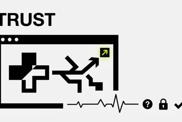
HIPAA Compliance as a Design Opportunity
Many healthcare startups view HIPAA compliance as a regulatory burden, a checklist of requirements that gets in the way of user experience. This perspective misses a critical point. When handled correctly, the constraints of HIPAA compliant web design do not hinder trust. They build it. Patients and providers dealing with sensitive health information need assurance. Good design, built on a foundation of security and transparency, delivers that assurance.
At DesignX, we’ve worked with companies handling everything from complex product catalogs like Klein Tools, where we redesigned their portal for 40,000+ SKUs, to launching the identity for Oura Ring, a device inherently tied to personal health data. We understand that information architecture and user trust are paramount, regardless of the industry. In healthcare, the stakes are simply higher.
The core challenge for healthcare startups is not just meeting the letter of the law, but integrating compliance into the very fabric of their product’s design. This means thinking about security and privacy not as an add-on, but as a foundational element from the first wireframe. Here are areas where startups often fall short, and how to get them right.
Form Design: The First Point of Data Interaction
Forms are where users hand over their most personal information. A poorly designed, insecure-feeling form can lead to high abandonment rates and erode trust immediately. This is not just about aesthetics; it’s about perceived security and clarity.

Minimize Data Collection
The principle of “least privilege” applies to data collection. Ask only for information that is absolutely necessary at that moment. Progressive profiling, where you gather more data as the user’s relationship with your service deepens, is a smart strategy. Don’t ask for a full medical history on the initial signup form for a newsletter.
- Initial Contact Forms: Name, email, reason for inquiry.
- Appointment Scheduling: Add date, time preference, basic symptom.
- Post-Onboarding: Medical history, insurance details.
Each step should feel logical and necessary, not intrusive.
Clear Labeling and Context
Users need to understand why you are asking for specific data. Vague labels or missing context create anxiety. For example, instead of just “Phone Number,” use “Phone Number (for appointment reminders).” Explain the purpose.
Security indicators are also crucial. Make sure your site uses HTTPS and that the padlock icon is visible. Mentioning “encrypted connection” or “HIPAA compliant” near sensitive fields can reassure users, but do not make grand claims you cannot back up. Use simple, direct language.
Validation and Error Handling
Beyond basic input validation, design error messages that are helpful and non-alarming. Instead of “Error,” use “Please enter a valid email address” or “Social Security number format is incorrect.” Avoid exposing server-side errors that could reveal system vulnerabilities. Client-side validation for common formats saves backend resources and provides immediate feedback.
Session Timeouts: Balancing Security and User Experience
HIPAA mandates that access to ePHI (electronic Protected Health Information) must be controlled. Automatic session timeouts are a security necessity, but their implementation often frustrates users, leading to lost work and negative perceptions. The goal is to make these timeouts predictable and less disruptive.

Communicate Proactively
Users hate surprises. Inform them about session timeouts before they happen. A clear, visible timer counting down in the last minute or two of a session gives the user a chance to interact and extend their session. This is far better than an abrupt log-out.
For example, if the system is set to time out after 15 minutes of inactivity (a common setting aligned with NIST guidelines for sensitive data), display a warning at 13 minutes. This warning should include an option to “Stay Logged In” or “Extend Session.”
Save User Progress
One of the biggest pain points is losing unsaved work. Implement an auto-save feature for forms and complex workflows. If a user is timed out, their draft should be saved securely and available upon re-authentication. This feature alone dramatically improves the user experience and reduces frustration.
When we design complex interfaces, like the product configurators we’ve built for manufacturing clients, auto-save is non-negotiable. The same applies with even greater urgency to healthcare applications.
Clear Data on Timeout
Upon timeout, ensure all sensitive data from the previous session is cleared from the browser’s local storage and memory. The user should be forced to re-authenticate completely. This is a security feature, not just a UX consideration.
Consent Flows: Earning Trust Through Transparency
Obtaining informed consent is a cornerstone of ethical healthcare practice and a specific requirement under HIPAA for certain data uses and disclosures. In web design, this translates to clear, granular, and easily manageable consent flows. Many startups get this wrong by treating consent as a single “accept all” checkbox.

Granular Consent Options
Users should have control over what data is shared, with whom, and for what purpose. Instead of a single blanket statement, offer specific choices:
- Consent to share data with your primary physician.
- Consent to share anonymous data for research purposes.
- Consent to receive marketing communications.
- Consent to share with third-party apps (e.g., fitness trackers).
Each option should be distinct and require an affirmative action, like a separate checkbox. This level of control empowers users and demonstrates respect for their privacy.
Clear, Understandable Language
Legal jargon is a barrier to understanding. Translate complex legal terms into plain language. Use tooltips or “Learn More” links to provide additional detail without cluttering the primary consent interface. The average reading level for privacy policies is often that of a college graduate; aim for an 8th-grade reading level instead.
For example, instead of “Indemnification Clause,” explain “What happens if there’s a problem.”
Easy Withdrawal of Consent
Consent is not a one-time event. Users must be able to easily review and withdraw their consent at any time. This functionality should be accessible within the user’s profile settings. Provide clear instructions on how to withdraw consent and explain the implications of doing so. This builds long-term trust and reinforces the user’s autonomy over their data.
Think of it like managing subscriptions. No one wants to hunt for the unsubscribe button. Make consent management equally straightforward.
Audit Trail Visibility: Designing for Accountability
While audit trails are primarily for administrators and compliance officers, the design of the system influences how effectively these trails can be maintained and reviewed. Designing for good auditability means considering how user actions and system events are logged and made accessible.

Log All Relevant Actions
A strong audit trail captures every interaction with ePHI. This includes:
- User logins and logouts.
- Access to specific patient records.
- Modification of data.
- Deletion of data.
- Changes to consent preferences.
- System errors related to data access.
Each log entry should include who, what, when, and where (IP address). This level of detail is critical for investigations and demonstrating compliance to auditors.
Data Integrity and Tamper-Proofing
The audit trail itself must be protected from alteration. Design systems where log data is immutable once written. Use secure hashing and cryptographic signatures to ensure the integrity of audit logs. This is often handled at the backend infrastructure level, but the front-end design must not introduce vulnerabilities that compromise this.
Structured and Searchable Logs
For an audit trail to be useful, it must be easily searchable and understandable. Design the system to generate logs in a structured format (e.g., JSON) that can be easily parsed by security information and event management (SIEM) systems. This allows compliance teams to quickly identify patterns, anomalies, and potential breaches.
When we design complex data portals, like those for managing inventory or customer interactions, the backend structure is always built for clear, retrievable data. For healthcare, this principle is foundational to an effective HIPAA compliant web design.
Beyond the Checklist: Building a Culture of Trust
HIPAA compliant web design is not just about avoiding penalties. It’s about establishing credibility in a sensitive industry. Healthcare startups that embrace these constraints as opportunities to build better products, rather than obstacles, will differentiate themselves. They will earn the trust of patients, providers, and partners.
Focus on transparency, user control, and clear communication. These design principles, when applied rigorously within the HIPAA framework, create digital experiences that are not only compliant but also genuinely trustworthy. That is the true mark of a successful healthcare product.
Ready to build a trustworthy and compliant digital healthcare product? Contact DesignX to talk through your project.
Frequently Asked Questions
How does HIPAA compliance affect web design for healthcare startups?
HIPAA compliance shapes every aspect of healthcare web design, from form fields and data storage to third-party scripts and hosting infrastructure. Startups must implement technical safeguards like encryption, access controls, and audit logs, but also design user-facing elements like consent flows, privacy notices, and data access controls that are both legally compliant and actually usable. This means rethinking common UX patterns like social login, analytics tracking, and chatbots to ensure Protected Health Information stays protected. DesignX helps healthcare startups build compliant web experiences that don’t sacrifice usability, partnering with legal and security teams to design systems where compliance is built into the user experience from day one.
Related Reading from DesignX
- Healthcare App Design
- Healthcare UX Design
- Health Tech Website Design
- Patient Portal Design