
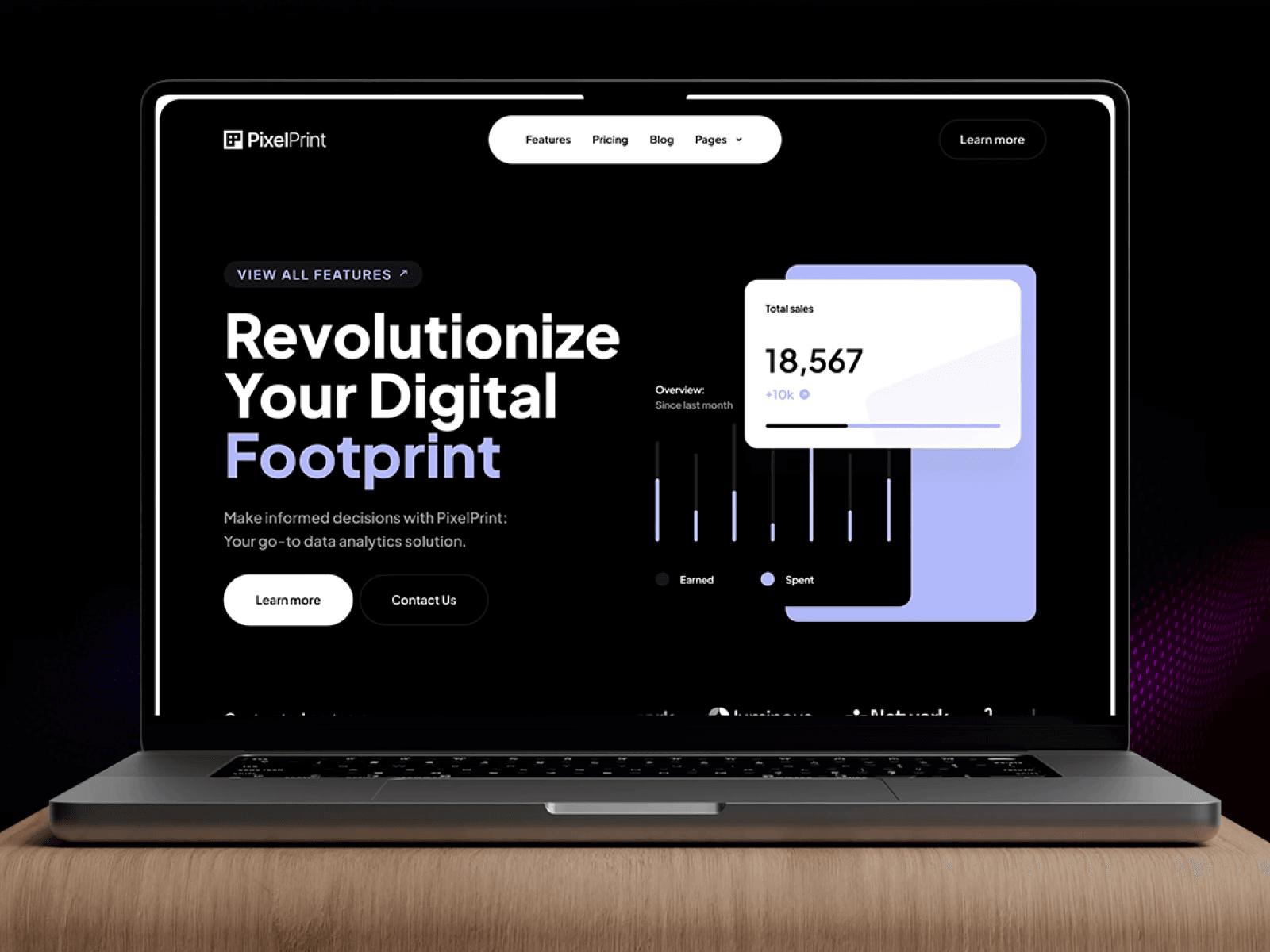
Pixelprint’s existing landing page failed to reflect its analytical solution’s sophistication and convert visitors into leads. DesignX was engaged to redefine their digital presence and improve lead conversion.
Pixelprint, a powerful analytical solution, faced a common hurdle: its online presence did not reflect the sophistication and actionable insights its platform offered. The existing landing page struggled to capture audience attention, translate complex features into tangible benefits, and ultimately convert visitors into qualified leads. DesignX was engaged to redefine their digital front door, creating an experience that resonated with data-driven decision-makers.
Project Overview
| Client Type | Industry | Project Type | Timeline | Deliverables | Tools Used |
|---|---|---|---|---|---|
| SaaS Startup | Data Analytics, Business Intelligence | Landing Page Design, UI/UX, Design System | 6 weeks | Wireframes, UI Mockups, Interactive Prototypes, Design System Guidelines, Final Design Files | Figma, Adobe Illustrator, Miro, Hotjar (for post-launch analysis) |
The Challenge
Pixelprint possessed an advanced analytical platform, yet its digital representation failed to convey this strength. The previous landing page suffered from several critical deficiencies. It presented a generic aesthetic, lacking the visual gravitas expected of a serious data solution. The information architecture was disorganized, leading to cognitive overload; users struggled to quickly grasp Pixelprint’s unique value proposition amidst a jumble of features. Key messages were buried, and the primary call to action, “Schedule a Demo,” was easily overlooked, resulting in a significantly low conversion rate. Visitors experienced high bounce rates, indicating an immediate disconnect between their expectations and the page’s content. Furthermore, the page’s visual design felt dated, eroding trust and failing to position Pixelprint as a forward-thinking industry leader. This outdated digital footprint was directly impeding Pixelprint’s lead generation efforts and its ability to attract serious business inquiries, despite the clear power of its underlying technology. The core problem was a failure to translate complex data capabilities into a clear, compelling, and user-friendly story that encouraged engagement and conversion.
Our Approach
Our engagement began with an intensive discovery phase, focusing on deeply understanding Pixelprint’s core technology, business objectives, and target audience. We conducted extensive stakeholder interviews with Pixelprint’s product, sales, and marketing teams to map out the platform’s unique selling points and the specific pain points it addressed for users. This qualitative data was complemented by a thorough competitive analysis, identifying industry best practices and opportunities for differentiation in the crowded analytics market. We developed detailed user personas, segmenting Pixelprint’s audience into key roles such as marketing managers, data analysts, and executive decision-makers, each with distinct needs and motivations.
Through user journey mapping, we visualized the ideal path a visitor would take on the landing page, from initial awareness to conversion. This allowed us to prioritize content and strategize optimal placement for critical information and calls to action. A content audit of Pixelprint’s existing materials helped us streamline messaging, ensuring clarity and conciseness. We then moved into iterative design sprints, beginning with low-fidelity wireframes to establish layout and information hierarchy, followed by high-fidelity UI mockups and interactive prototypes. Each stage involved regular feedback sessions with the Pixelprint team, ensuring constant alignment and incorporating their invaluable insights, making the design process a true collaboration built on shared goals and iterative refinement.
Key Design Decisions
Adopting a “Data Storytelling” Content Structure
Our primary design decision centered on moving beyond a mere feature list to a “data storytelling” approach for content presentation. The previous landing page simply enumerated functionalities, which, while technically accurate, failed to convey the *impact* of Pixelprint’s solution. We recognized that Pixelprint’s true value lay in its ability to transform raw data into actionable insights and strategic advantages. Therefore, the new structure was designed to guide users through a clear narrative: presenting common business challenges, demonstrating how Pixelprint directly addresses those challenges, illustrating the specific benefits and outcomes users could expect, and finally, offering a clear path to engagement. This meant prioritizing real-world use-case scenarios and outcome-driven headlines at the top of the page, rather than abstract technical specifications. The “why” behind this was to immediately connect with the user’s business context, fostering an understanding of the tangible value Pixelprint offers, rather than requiring them to interpret complex features themselves. This narrative structure significantly reduced cognitive load and made the value proposition immediately apparent.
Integrating Dynamic and Simulated Data Visualizations
To overcome the challenge of communicating the power of a real-time analytics platform on a static landing page, we made a deliberate decision to incorporate dynamic and simulated data visualizations. Static screenshots of dashboards often feel inert and fail to capture the live, interactive nature of an analytical solution. Our design integrated subtly animated charts, graphs, and data flows that *mimicked* the platform’s actual functionality. These visual elements were strategically placed in sections describing different analytical capabilities, providing immediate, tangible representations of complex data insights. For example, when discussing “real-time tracking,” a small, animated line graph would subtly update. The “why” here was twofold: first, to provide a compelling visual demonstration of Pixelprint’s capabilities without requiring an immediate signup or demo, thereby building immediate curiosity and perceived value. Second, these visuals made abstract data concepts more concrete and engaging, allowing users to intuitively grasp the power and sophistication of the platform, fostering a sense of trust and technological prowess.
Strategic and Contextual Call to Action Placement
A critical flaw in the previous design was the isolated and easily missed primary call to action (CTA). Our third key decision involved a strategic and contextual placement of the “Schedule a Demo” CTA throughout the landing page. Instead of a single, static button, we identified several high-intent points within the user journey where a visitor would naturally be considering the next step. These included immediately after the core value proposition, following compelling testimonials, after detailing specific features or benefits, and prominently before the footer. Each CTA was visually distinct yet cohesive with the overall design, using an accent color to ensure visibility. The “why” was rooted in conversion optimization principles: by providing multiple, well-timed opportunities for conversion, we significantly reduced friction and the likelihood of users dropping off due to an inability to easily find the next step. Each CTA was also subtly rephrased or contextualized based on the surrounding content, ensuring it felt like a natural progression rather than an interruption, thus maximizing the potential for lead capture.
Design Highlights
Our design for the Pixelprint landing page focused on creating a sophisticated, trustworthy, and intuitive experience that visually communicated data intelligence. The color palette was meticulously chosen to reflect these attributes. We anchored the design in deep blues and rich purples, which universally convey trust, expertise, and technological sophistication in the data analytics space. These primary colors were used for foundational elements, headings, and background accents, establishing a serious and professional tone. For accentuation, particularly for calls to action, key data highlights, and interactive elements, we introduced vibrant greens and teals. These colors evoke concepts of growth, positive trends, and actionable insights, creating a compelling contrast that guides the user’s eye and emphasizes critical information. Subdued grays and clean whites provided ample negative space, ensuring content legibility and a sense of clarity, preventing visual clutter.
Typography was selected to reinforce both modernity and readability. For headings and impactful statements, we chose Montserrat. Its clean, geometric forms provide a contemporary feel while maintaining excellent legibility, making titles and subtitles immediately sc
Frequently Asked Questions
What problem did the pixelprint Analytical Solution Landing Page Design work need to solve?
Pixelprint possessed an advanced analytical platform, yet its digital representation failed to convey this strength. The previous landing page suffered from several critical deficiencies. It presented a generic aesthetic, lacking the visual gravitas expected of a serious data solution. The information architecture was disorganized, leading to cognitive overload; users struggled to quickly grasp Pixelprint’s unique value proposition amidst a jumble of features.
How did DesignX approach the pixelprint Analytical Solution Landing Page Design work?
Our engagement began with an intensive discovery phase, focusing on deeply understanding Pixelprint’s core technology, business objectives, and target audience. We conducted extensive stakeholder interviews with Pixelprint’s product, sales, and marketing teams to map out the platform’s unique selling points and the specific pain points it addressed for users. This qualitative data was complemented by a thorough competitive analysis, identifying industry best practices and opportunities for differentiation in the crowded analytics market. We developed detailed user personas, segmenting Pixelprint’s audience into key roles such as marketing managers, data analysts, and executive decision-makers, each with distinct needs and motivations.
Which design decisions mattered most in the pixelprint Analytical Solution Landing Page Design project?
Adopting a “Data Storytelling” Content Structure Our primary design decision centered on moving beyond a mere feature list to a “data storytelling” approach for content presentation. The previous landing page simply enumerated functionalities, which, while technically accurate, failed to convey the *impact* of Pixelprint’s solution. We recognized that Pixelprint’s true value lay in its ability to transform raw data into actionable insights and strategic advantages. Therefore, the new structure was designed to guide users through a clear narrative: presenting common business challenges, demonstrating how Pixelprint directly addresses those challenges, illustrating the specific benefits and outcomes users could expect, and finally, offering a clear path to engagement.
What stands out in the final Pixelprint Analytical Solution Landing Page Design design?
Our design for the Pixelprint landing page focused on creating a sophisticated, trustworthy, and intuitive experience that visually communicated data intelligence. The color palette was meticulously chosen to reflect these attributes. We anchored the design in deep blues and rich purples, which universally convey trust, expertise, and technological sophistication in the data analytics space. These primary colors were used for foundational elements, headings, and background accents, establishing a serious and professional tone.