SaaS companies often jump into website redesigns without strategic planning. A website is a primary sales and marketing engine, requiring clear goals before design work begins.
The Pre-Flight Checklist for a SaaS Website Redesign
Many SaaS companies approach a website redesign like a fresh coat of paint. They see an outdated look or feel, then jump straight into mood boards and wireframes. This is a common misstep. A website is a primary sales and marketing engine, not just a digital brochure. Before any design work begins, you need a clear understanding of your current performance, your audience, and your business objectives. Skipping this part leads to a beautiful site that doesn’t actually work harder for your business.
Start by auditing your existing site. What are your top-performing pages? Where do users drop off? Tools like Google Analytics, Hotjar, or FullStory offer data points. Combine these quantitative insights with qualitative feedback. Talk to your sales team, your customer support team, and most importantly, your actual users. What are their pain points? What questions do they consistently ask?
Define your “why.” Are you struggling with low conversion rates for demos or trials? Is your brand messaging unclear? Do you need to target a new market segment? Clear objectives guide every design and content decision. For instance, if your goal is to increase trial sign-ups by 20% in six months, every design choice on your pricing and features pages will be scrutinized against that metric. This upfront work is not glamorous, but it is the foundation for a successful SaaS website redesign.
Taming Scope Creep: The Silent Killer of Momentum
Scope creep is an insidious problem. It starts with a small, seemingly innocent request: “Can we just add this one feature?” or “What if we also update the blog design?” On a SaaS website redesign, where many internal teams have a vested interest, these small additions multiply quickly. Before you know it, a six-week project stretches into six months, budgets balloon, and the initial momentum vanishes.

To prevent this, define the project scope with precision from day one. Think of it as drawing a hard line in the sand. Every deliverable, every page, every feature should be documented and agreed upon. At DesignX, we create detailed Statement of Work documents that leave little room for ambiguity. If a new idea surfaces, it’s not immediately added to the current project. Instead, it goes into a “parking lot” for future phases or a formal change request process. This process includes:
- A clear description of the proposed change.
- An assessment of its impact on the timeline and budget.
- Approval by the core project stakeholders.
When working with companies like HP on their product pages, the sheer number of stakeholders and product lines meant scope definition had to be rigorous. Without that discipline, the project would have become an unmanageable beast. Focus on what we call the Minimum Viable Experience for your new site. Not “Minimum Viable Everything.” Identify the core pages and functionality required to meet your primary business goals. Launch that. Then, iterate and expand in subsequent phases. This approach keeps projects on track and preserves momentum.
Aligning Stakeholders: More Than Just a Kick-Off Meeting
A SaaS website redesign impacts almost every department: marketing, sales, product, engineering, customer success, and leadership. Each team brings its own perspective, priorities, and often, its own jargon. Without careful alignment, these different viewpoints can lead to endless revisions, internal friction, and a diluted final product. A single kick-off meeting is rarely enough to build lasting consensus.

We advocate for structured workshops early in the process. These sessions aren’t just about sharing information; they’re about collaborative decision-making. We bring together key representatives from each department to:
- Review current site performance and user feedback.
- Define target audiences and their specific needs.
- Establish a clear hierarchy of business goals.
- Map out key user journeys through the proposed site.
During our Oura Ring launch identity project, aligning internal teams on a consistent brand voice and visual direction was paramount. It required active participation from marketing, product, and leadership. We established a single point of contact, often a dedicated project manager or head of marketing, to consolidate feedback and make final decisions. This prevents a “design by committee” situation, where conflicting feedback from multiple individuals can paralyze progress.
Use frameworks like a RACI matrix (Responsible, Accountable, Consulted, Informed) to clarify roles and responsibilities. Everyone knows who is doing what, who needs to approve, and who just needs to be kept in the loop. This level of transparency and structured collaboration prevents surprises and builds trust, which is essential for maintaining momentum through the inevitable challenges of a complex project.
Content-First or Design-First? A False Dichotomy for SaaS.
The debate about content-first versus design-first often crops up in redesign projects. For a SaaS website, neither approach works in isolation. They are intertwined. You cannot design effectively without understanding the content, and you cannot write compelling content without a sense of how it will be presented. It’s not an either/or; it’s an iterative dance.
Our approach at DesignX usually starts with a content audit and a messaging strategy. What messages are we trying to convey? What unique value do we offer? Who are we talking to? This isn’t about writing every word, but about defining the core narratives, calls to action, and information hierarchy. This strategic content blueprint then informs the wireframes and initial design concepts. For instance, if a primary message is “Simplify complex workflows,” the design might emphasize clean layouts and intuitive navigation.
Conversely, the design process often uncovers gaps or opportunities in the content. A beautifully designed pricing page might highlight the need for clearer feature comparisons. A new hero section might demand punchier, more benefit-driven headlines. We often create “lorem ipsum” wireframes with placeholder text, but the placeholders are always informed by the content strategy. They indicate where headlines will go, where bullet points will live, and where calls to action will be placed. Then, the content writers fill those spaces, often shaping and refining the design in the process.
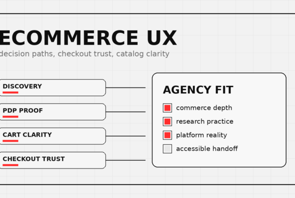
When we tackled the Klein Tools catalog redesign, dealing with 40,000+ SKUs meant we absolutely had to understand the content structure before we could even think about visual design. The sheer volume and complexity of product data dictated much of the user interface. The design had to serve the content, making it accessible and searchable, rather than dominating it. This iterative back-and-forth ensures that the final product is both aesthetically pleasing and highly functional, delivering your message effectively.
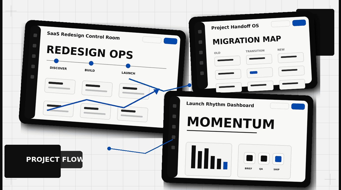
Redesign Sprint or Full Rebuild? Choosing Your Pace.
Deciding between a focused redesign sprint and a complete website rebuild depends on your existing site’s condition, your budget, and your business goals. There isn’t a one-size-fits-all answer, but understanding the characteristics of each approach helps you choose the right path.
The Redesign Sprint Approach
A redesign sprint focuses on targeted improvements, often on specific high-impact pages or sections. This approach is suitable when:
- Your current site has a solid technical foundation but needs a visual refresh.
- You want to address specific UX friction points quickly.
- Your brand identity needs minor updates, not a complete overhaul.
- You need to test new messaging or conversion strategies without a major investment.
This path typically involves updating key landing pages, optimizing conversion funnels, or improving mobile responsiveness. It’s about making impactful changes in a shorter timeframe, usually weeks to a few months. Think of it as a series of well-planned A/B tests rolled into a design project. The goal is faster results and iterative learning. You can launch, gather data, and then decide on the next set of improvements.
The Full Rebuild Strategy
A full rebuild is a full overhaul of your website. This is the right choice when:
- Your current site is built on outdated technology, creating significant technical debt.
- Your brand has fundamentally changed, requiring a new visual identity and messaging from the ground up.
- The existing user experience is broken or inconsistent across the site.
- You are entering a new market or launching a significantly different product offering.
- Your information architecture no longer serves your users or business needs.
A full rebuild involves deep discovery, a complete overhaul of information architecture, new visual design, and often a migration to a new platform or content management system. This process takes longer, typically several months, and requires a larger investment. However, it offers the opportunity to fix deep-seated issues and create a future-proof foundation. For companies like Bodybuilding.com, where the platform itself is key to the user experience, a full rebuild often makes more sense to address underlying technical and UX challenges.
To decide, audit your current site’s performance, technical stack, and alignment with your current and future business strategy. Sometimes, a series of sprints can achieve what a full rebuild would, but with less risk and faster time to market for improvements.
Measuring Success Beyond the Launch Button
Launching your redesigned SaaS website is not the finish line. It’s the start of a new race. Many companies celebrate the launch, then move on, failing to track whether the redesign actually achieved its objectives. Without post-launch measurement, you’re operating on assumption, not data.
Before the project even starts, define your Key Performance Indicators (KPIs). These metrics should directly tie back to the “why” of your redesign. Common KPIs for a SaaS website include:
- Conversion Rates: Track trial sign-ups, demo requests, contact form submissions, or specific feature registrations. Compare these against your pre-redesign baseline.
- Engagement Metrics: Monitor bounce rate, time on page, pages per session, and scroll depth. Are users spending more time on valuable content?
- SEO Performance: Keep an eye on organic traffic, keyword rankings, and domain authority. A redesign should preserve or improve your search visibility.
- User Feedback: Implement tools like heatmaps, session recordings, and on-site surveys (e.g., Net Promoter Score or specific feedback forms). What are users saying about the new experience?
- Sales Velocity: Work with your sales team to see if the new site is generating higher quality leads or shortening the sales cycle.
Set up dashboards to track these metrics weekly and monthly. Conduct A/B tests on specific elements post-launch. Test different headlines, calls to action, or even entire page layouts. This iterative optimization is where you truly extract value from your redesign investment. For our clients, like Bodybuilding.com, continuous measurement and optimization are part of the ongoing growth strategy. It’s about refining the experience based on how real users interact with it, ensuring the website continues to perform as a high-octane growth engine.
Ready to drive more leads and better user experience with your SaaS website? Contact DesignX to talk through your project.
Frequently Asked Questions
What should teams know about the pre-flight checklist for a SaaS website redesign?
Many SaaS companies approach a website redesign like a fresh coat of paint. They see an outdated look or feel, then jump straight into mood boards and wireframes. This is a common misstep. A website is a primary sales and marketing engine, not just a digital brochure.
What should teams know about the silent killer of momentum?
Scope creep is an insidious problem. It starts with a small, seemingly innocent request: “Can we just add this one feature?” or “What if we also update the blog design?” On a SaaS website redesign, where many internal teams have a vested interest, these small additions multiply quickly. Before you know it, a six-week project stretches into six months, budgets balloon, and the initial momentum vanishes. To prevent this, define the project scope with precision from day one.
What should teams know about more than just a kick-off meeting?
A SaaS website redesign impacts almost every department: marketing, sales, product, engineering, customer success, and leadership. Each team brings its own perspective, priorities, and often, its own jargon. Without careful alignment, these different viewpoints can lead to endless revisions, internal friction, and a diluted final product. A single kick-off meeting is rarely enough to build lasting consensus.
What should teams know about content-first or design-first? a false dichotomy for SaaS?
The debate about content-first versus design-first often crops up in redesign projects. For a SaaS website, neither approach works in isolation. They are intertwined. You cannot design effectively without understanding the content, and you cannot write compelling content without a sense of how it will be presented.
What should teams know about redesign sprint or full rebuild? choosing your pace?
Deciding between a focused redesign sprint and a complete website rebuild depends on your existing site’s condition, your budget, and your business goals. There isn’t a one-size-fits-all answer, but understanding the characteristics of each approach helps you choose the right path. The Redesign Sprint Approach A redesign sprint focuses on targeted improvements, often on specific high-impact pages or sections. This approach is suitable when: Your current site has a solid technical foundation but needs a visual refresh.