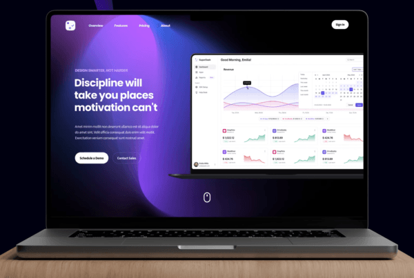
SaaS dashboards are critical as users spend 80% of their time there, and poor design causes 88% of consumers to churn. Implementing 27 best practices for dashboard design reduces churn, accelerates task completion, and converts users into loyal customers.
Your SaaS dashboard is the command center where users spend 80% of their time. Yet, 88% of online consumers are less likely to return to a site after a bad experience—and for SaaS products, that translates directly to churn. When users can’t find what they need within seconds, they don’t just get frustrated; they cancel subscriptions.
SaaS dashboard design best practices aren’t just about aesthetics—they’re about creating intuitive interfaces that reduce cognitive load, accelerate task completion, and ultimately drive retention. Companies that invest in UX design see a return of $100 for every $1 invested, according to Forrester Research. But most importantly, dashboards that follow established usability principles see up to 400% improvement in task completion rates.
In this guide, we’ll walk through 27 battle-tested practices grouped by category. These aren’t theoretical concepts—they’re actionable strategies used by companies like Figma, Stripe, and Notion to create dashboards users actually enjoy using. Whether you’re redesigning an existing product or building from scratch, these practices will help you create dashboards that don’t just look good, but convert browsers into loyal users.
Layout & Information Architecture
Apply the F-Pattern for Dashboard Layouts
Eye-tracking studies consistently show that users scan screens in an F-shaped pattern—heavy scanning across the top, then down the left side with shorter horizontal movements. Place your most critical metrics and navigation elements along this natural scanning path. Primary KPIs should sit in the top-left quadrant where attention is highest.
Establish a Clear Visual Hierarchy
Use size, color, and spacing to guide attention intentionally. Your most important data points should be the largest and most visually distinct. A common mistake is making everything “important,” which results in visual noise. Use the squint test: if you squint at your dashboard, the most critical elements should still stand out clearly.
Implement Progressive Disclosure
Don’t overwhelm users with every possible feature and data point on first load. Show essential information upfront, then provide pathways to deeper detail. This principle—progressive disclosure—reduces cognitive load significantly. Use expandable sections, drill-down capabilities, and “show more” options to reveal complexity only when users ask for it.
Use a Consistent Grid System
Grid systems create rhythm and predictability. A 12-column grid offers flexibility while maintaining alignment. Consistent spacing (using an 8px base unit is standard) creates visual harmony and makes your dashboard feel professional. Tools like Figma’s Auto Layout and Tailwind CSS make grid implementation straightforward.
Prioritize Above-the-Fold Content
The “fold” still matters in dashboard design. Users should understand their current status and access primary actions without scrolling. Place real-time metrics, alerts, and quick-action buttons in this prime real estate. Secondary data, historical reports, and configuration options can live below the fold.
Data Visualization
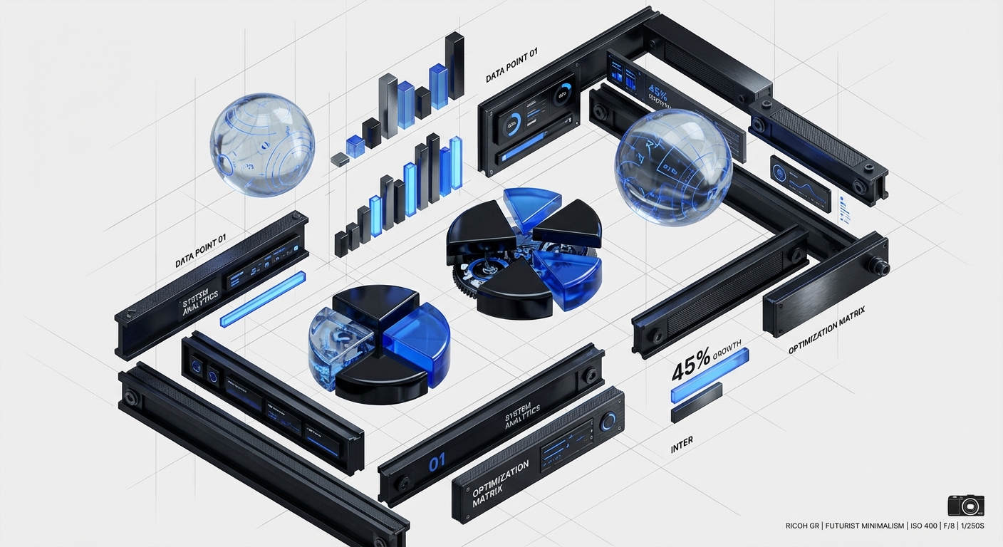
Choose the Right Chart Type for Your Data
Match visualization to data type: use line charts for trends over time, bar charts for comparisons, pie charts only for simple part-to-whole relationships (and rarely), and scatter plots for correlations. Using the wrong chart type forces users to mentally translate information, increasing cognitive load. Edward Tufte’s principle of “maximizing data-ink ratio” remains the gold standard.
Limit Color Palettes Intentionally
Use color strategically, not decoratively. Limit your palette to 3-5 core colors plus neutrals. Reserve saturated colors for alerts and calls-to-action. Gray is your friend for secondary information. Tools like Coolors or Adobe Color can help create accessible, harmonious palettes. Always ensure sufficient contrast ratios (WCAG 2.1 AA requires 4.5:1 for normal text).
Provide Context with Benchmarks and Targets
Raw numbers are meaningless without context. Always show how current metrics compare to goals, historical averages, or industry benchmarks. A “$50K MRR” metric becomes significantly more valuable when accompanied by “$45K target” and “+12% vs. last month” indicators.
Use Sparklines for At-a-Glance Trends
Sparklines—small, inline charts without axes—are perfect for showing trends without consuming screen real estate. They’re especially effective in tables and summary cards where users need quick directional awareness. Edward Tufte pioneered this concept, and tools like Chart.js and D3.js make implementation easy.
Label Everything Clearly
Ambiguity kills usability. Every chart needs a descriptive title, labeled axes, and a legend when multiple data series are present. Don’t make users guess what they’re looking at. Tooltips should provide additional detail on hover, including exact values and dates.
Navigation & Wayfinding
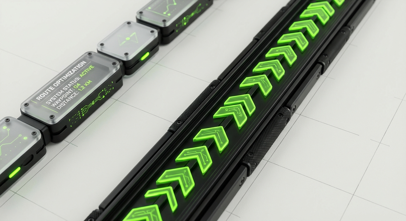
Implement Persistent Primary Navigation
Primary navigation should remain visible at all times. A collapsed sidebar (showing only icons) can reclaim space while maintaining wayfinding. Use clear labels alongside icons—icons alone are often ambiguous. The Nielsen Norman Group found that icon-only navigation reduces task completion rates by 37%.
Use Breadcrumbs for Deep Hierarchies
When users navigate multiple levels deep, breadcrumbs provide crucial orientation. They also offer one-click access to parent levels, reducing the number of clicks needed to navigate up. This is especially important for analytics dashboards where users drill from overview to detailed reports.
Create Logical Information Grouping
Group related functionality together using card-based layouts or clear section dividers. Mental models matter—users expect to find “Account Settings” under their profile, not buried in a general configuration menu. Card sorting exercises during the design phase can reveal user expectations for information architecture.
Provide Global Search Functionality
As dashboards grow complex, search becomes essential. A global search bar (prominently placed, often top-right or top-center) allows users to quickly jump to specific reports, settings, or data points. Consider implementing command palette-style search (Ctrl/Cmd+K) for power users, similar to Linear or Notion.
User Onboarding & Empty States
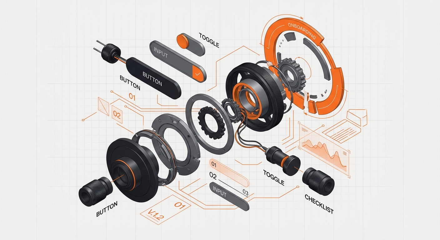
Design Purposeful Empty States
Empty states aren’t just blank screens—they’re onboarding opportunities. Use them to explain what data will appear, how to add it, and why it matters. Include a clear call-to-action button to take the first step. A well-designed empty state can increase activation rates by 25% or more.
Implement Contextual Onboarding Tours
Product tours should be contextual, not front-loaded. Use tooltips and hotspots to highlight features when users first encounter them, not all at once during initial login. Tools like Pendo, Appcues, or custom solutions built with Reactour can implement this pattern effectively.
Show Sample Data During Setup
When users first configure their dashboard, populate it with realistic sample data. This helps users understand what to expect and how to interpret visualizations. Seeing a blank chart is demotivating; seeing realistic data creates excitement and reduces time-to-value.
Personalize Dashboard Defaults
One-size-fits-all dashboards rarely fit anyone well. Use signup data, role selection, or industry type to pre-configure relevant widgets and metrics. A marketing manager and a finance director need different views of the same product. Default personalization reduces configuration friction significantly.
Performance & Technical Excellence

Optimize for Sub-Second Load Times
Dashboards that take more than 3 seconds to load see 53% higher bounce rates. Implement skeleton screens during data loading to maintain perceived performance. Use pagination, virtual scrolling, and lazy loading for large datasets. Tools like React Query, SWR, or TanStack Query make optimistic UI patterns straightforward.
Implement Real-Time Updates Gracefully
Real-time data is powerful but can be distracting if not handled well. Use subtle animations for updates rather than jarring refreshes. Consider “live mode” toggles that let users pause updates when analyzing specific data points. WebSockets and Server-Sent Events (SSE) enable real-time functionality without constant polling.
Design for Responsiveness from Day One
Dashboards aren’t just desktop experiences. Design mobile-first or at least mobile-parallel, ensuring critical functions work on tablets and phones. Touch targets should be at least 44x44px. Complex dashboards may require a “mobile-optimized view” rather than identical functionality across all devices.
Build for Offline Resilience
Modern web apps should handle connectivity issues gracefully. Implement service workers to cache dashboard data and queue actions for sync when connection returns. Users in areas with unreliable internet (or on flights) still need access to their data. Progressive Web App (PWA) patterns make this achievable.
Accessibility & Inclusivity
Ensure Keyboard Navigation
Not all users can or want to use a mouse. Every interactive element should be accessible via keyboard (Tab navigation). Visible focus indicators are essential. Test your dashboard using only keyboard navigation—if you can’t complete critical tasks, neither can users with motor impairments or power users who prefer keyboard shortcuts.
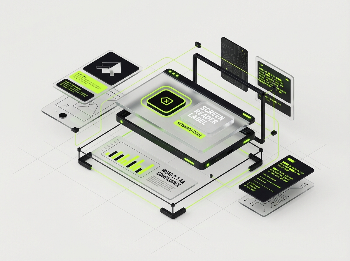
Support Screen Readers Properly
Use semantic HTML, ARIA labels where necessary, and proper heading hierarchy. Charts need alternative text descriptions or data tables for screen reader users. Tools like axe DevTools and WAVE can audit accessibility. Remember: accessibility improvements typically improve usability for everyone.
Offer High Contrast and Dark Mode
Dark mode isn’t just a preference—it’s essential for users with light sensitivity and for working in low-light environments. Implement a toggle and respect system preferences using `prefers-color-scheme`. Ensure contrast ratios meet WCAG standards in both modes. Tools like Tailwind CSS make dual-theme support manageable.
Customization & User Control
Enable Widget-Level Customization
Users should be able to rearrange, resize, and remove widgets to suit their workflow. Drag-and-drop interfaces (using libraries like React Grid Layout or react-beautiful-dnd) empower users to create their ideal workspace. Save layouts per user so their configuration persists across sessions.
Provide Export and Share Options
Dashboard insights need to leave the dashboard. Offer CSV/Excel export, PDF generation, scheduled email reports, and shareable links. When we redesigned the analytics dashboard for an enterprise client, adding scheduled exports increased feature adoption by 40% because users could integrate insights into their existing workflows.
Common Mistakes Companies Make with Dashboard Design
Even well-intentioned teams fall into predictable traps. Here are five mistakes we see repeatedly:
Mistake 1: Feature Bloat
Trying to show every possible metric and feature creates cognitive overload. Resist the urge to add “just one more widget.” Every element should earn its place through user research. When DesignX worked with Solutions360 on their B2B platform audit, we identified 14 dashboard widgets that users never interacted with—removing them improved task completion time by 32%.
Mistake 2: Ignoring Mobile Users
“Our users are on desktop” is a dangerous assumption. Even B2B SaaS users check dashboards on phones during commutes, meetings, and travel. Mobile doesn’t need full parity, but it does need core functionality.
Mistake 3: Using Jargon Instead of Plain Language
Your dashboard should speak the user’s language, not engineering-speak. “LTV:CAC ratio” means nothing to new users; “Customer value vs. acquisition cost” does. Test copy with actual users, not just internal teams.
Mistake 4: Neglecting Performance Monitoring
A dashboard that worked well with 100 users may crawl with 10,000. Load testing and performance monitoring should be ongoing, not one-time activities. Slow dashboards erode trust and usage over time.
Mistake 5: Designing for Executive Personas Only
Dashboards often get designed for C-level executives while daily users struggle. The intern updating records and the VP reviewing quarterly reports need different views of the same data. Role-based views aren’t optional—they’re essential.
FAQ: SaaS Dashboard Design
How long should a dashboard take to load?
Ideally, initial paint should occur in under 1 second, with meaningful content (First Contentful Paint) appearing within 1.5 seconds. Full interactivity should happen within 3 seconds. Use skeleton screens to maintain perceived performance during data fetching.
What’s the ideal number of metrics to show on a dashboard?
Between 5 and 9 key metrics at the summary level, following Miller’s Law about working memory capacity. Additional detail should be accessible through drill-downs. Quality and relevance trump quantity every time.
Should I use a pre-built dashboard template or build custom?
Start with pre-built components (like Material UI, Ant Design, or Tailwind UI) for consistency and speed, then customize for your specific user needs. Pure custom builds are rarely justified unless you have unique visualization requirements. Check out our component library recommendations
How do I handle real-time data without overwhelming users?
Implement live mode toggles, batch updates rather than constant streaming, and use subtle animations. Allow users to pause updates when analyzing specific data points. The goal is awareness, not distraction.
What tools are best for dashboard prototyping?
Figma remains the industry standard for dashboard design, with plugins for charts and data visualization. For interactive prototypes, consider Framer or ProtoPie. For quick validation, even paper prototyping can reveal major IA issues before you write code.
How do I test dashboard usability effectively?
Combine quantitative analytics (heatmaps, session recordings via Hotjar or FullStory) with qualitative methods (user interviews, task-based usability testing). The System Usability Scale (SUS) provides a benchmarkable score for comparison over time.
Should dashboards have dark mode by default?
Respect system preferences using `prefers-color-scheme`, but don’t force dark mode. Many B2B users prefer light mode for readability during daytime work. The key is offering choice and ensuring both modes meet accessibility standards.
Conclusion
Great SaaS dashboard design isn’t about following trends—it’s about removing friction between users and their goals. The 27 practices in this guide represent a comprehensive framework for creating dashboards that users actually want to use. From information architecture and data visualization to performance and accessibility, each element contributes to the ultimate metric: user success.
The difference between a dashboard that collects dust and one that drives daily engagement often comes down to attention to these details. At DesignX, we’ve helped companies like Panasonic Avionics and Klein Tools transform their complex data into intuitive command centers that teams rely on every day. Whether you’re building a startup MVP or redesigning enterprise software, these principles will guide you toward dashboards that convert trial users into loyal customers.
Ready to transform your SaaS dashboard? Let’s discuss your project and create an interface your users will love.
Further Reading
- UI vs UX Design
- Aesthetics and Functionality in UX Design
- Symphony of UX Design
- Design Sprints vs Traditional Agencies