
Use this conversion focused landing page design checklist to verify one goal, match the page to traffic intent, prove the offer, remove interaction friction, and measure every conversion step. DesignX uses this order when reviewing SaaS and service pages because visual polish cannot rescue a page that sends the wrong message or loses the form submission.
The short version:
- Match the headline, offer, and CTA to the visitor’s source and intent.
- Put specific proof beside the claim it supports.
- Remove form fields, links, and choices that do not help the primary action.
- Test the full mobile path with real content and real error states.
- Confirm analytics before you spend more money on traffic.
Landing-page benchmarks provide context, not a target carved in stone. Unbounce analyzed more than 57 million conversions across more than 41,000 landing pages and found a 6.6% median conversion rate across industries. Its SaaS median was 3.8%. Your offer, channel, audience, and definition of a conversion can move that number in either direction.
Why most landing page checklists fail in practice
The current search results include useful lists with 20, 41, or 49 checks. They cover headlines, forms, buttons, speed, proof, and tracking. A team can agree with every item and remain unsure where to start.
Use a scored gate instead. Give each check a score:
- 0: missing, broken, or contradicted by evidence
- 1: present but weak, untested, or inconsistent
- 2: clear, functional, and supported by evidence
The full checklist has 20 checks and a maximum score of 40.
| Score | What it means | Next move |
|---|---|---|
| 0-23 | The page has foundation problems | Fix the offer, message, mechanics, and measurement before testing cosmetic changes |
| 24-32 | The page works but loses clarity or trust | Repair the lowest-scoring gate and run one focused test |
| 33-40 | The page has a sound base | Build a test backlog from observed friction and visitor behavior |
Record a short note beside every score. “CTA is weak” gives your team nothing to act on. “CTA says Learn More, while the ad promises a pricing estimate” tells the writer and designer what to repair.
How to use the conversion focused landing page design checklist
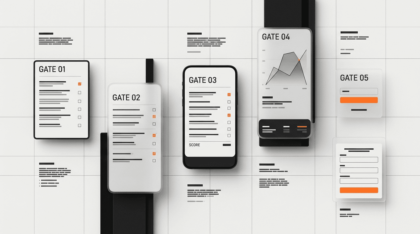
Review the page in five gates. Score each gate in order because an early failure can make the rest of the page irrelevant. A broken form needs repair before a copy test. A headline that attracts the wrong buyer needs repair before button-color tests.
Gate 1: traffic intent and message match
1. Can you name the traffic source and visitor intent?
Write down the source, audience, and expected next step. A visitor who clicked a pricing ad brings a different question from a visitor who opened an educational LinkedIn post. One page can serve several channels, but each channel still needs a clear route into the offer.
Score 2 when the team can name the source, buyer state, and primary action without guessing.
2. Does the headline match the promise that brought the visitor?
Compare the ad, email, social post, or internal link with the page headline. Keep the same offer, audience, and level of specificity. Google Ads includes relevance and usefulness in its landing-page experience assessment. Visitors apply the same standard in less formal terms: “Did I land in the right place?”
3. Can a new visitor explain the offer after the first screen?
Show the first screen to someone outside the project. Ask them who the offer serves, what result it provides, and what action comes next. Do not coach them. Their answer reveals what the interface communicated.
4. Does the page ask for one primary conversion?
Name the conversion in one line: book a call, start a trial, request pricing, buy, or download. Navigation links, chat prompts, newsletter forms, and secondary offers split attention. Keep legal and support links where users need them, but give one action the strongest visual weight.
Gate 2: offer clarity and proof
5. Does the value proposition describe a concrete outcome?
Replace broad claims such as “grow your business” with the change the buyer can expect. Name the user, the problem, the result, and any honest constraint. A strong statement can still be short: “Find the five UX failures blocking trial activation before your team funds a redesign.”
6. Does every major claim have nearby proof?
Place customer evidence, product screenshots, numbers, or process details beside the claim they support. A logo wall near the footer cannot prove a specific promise in the hero. Match proof to claim.
DesignX often sees teams hide their best evidence in case studies while the landing page relies on adjectives. Pull the useful detail forward. A named result carries more weight than “trusted by leading brands.”
7. Does the page answer the buyer’s main risk?
List the concern most likely to stop the action: price, time, implementation effort, privacy, contract length, migration risk, or fit. Address it before the CTA that asks the visitor to commit.
Service pages can explain engagement shape, timeline, and who will do the work. Product pages can show security, setup effort, cancellation terms, or trial limits. Choose the risk tied to this offer.
8. Are testimonials specific enough to verify?
Use a name, role, company, situation, and result when permission allows. “The team was great” has little diagnostic value. “DesignX helped our product team rebuild the dealer catalog flow, and dealer adoption rose 23%” gives the reader a result and context.
Gate 3: CTA and form friction
9. Does the CTA describe the next step?
Button copy should set an expectation. “Get the checklist,” “See pricing,” or “Book a 30-minute teardown” tells the visitor what happens. “Submit” describes the browser action and hides the value.
Repeat the same primary CTA after sections that resolve a major objection. Keep the label and outcome consistent.
10. Can visitors find the CTA at the moment they are ready?
Place the first CTA near the offer summary. Add later CTAs after proof, process, pricing context, or FAQ content. Avoid a fixed pattern such as one button every two sections. Place each CTA after the page has earned the ask.
11. Can the team justify every form field?
Tie each field to a decision or follow-up step. Remove fields collected for curiosity or future database cleanup. If the sales team needs more detail, test a two-step form that asks for commitment before qualification.
Keep labels visible. Explain sensitive requests. Preserve the user’s input when validation fails.
12. Does the form handle success and failure with care?
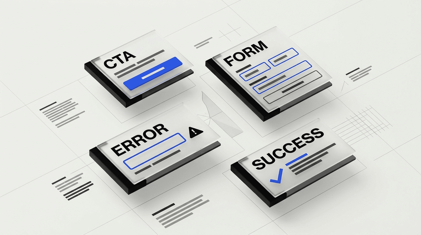
Test empty fields, invalid email, slow requests, duplicate submissions, and server errors. Write messages that tell the user what happened and what to do next. After success, show a confirmation page or state that records the conversion and sets the next expectation.
The DesignX UX audit checklist for SaaS covers broader product-flow checks when the landing page feeds a signup or onboarding path.
Gate 4: hierarchy, mobile, and accessibility
13. Does the first screen establish a useful reading order?
The eye should reach the promise, support, proof, and CTA without crossing competing banners or decorative cards. Use size, spacing, and contrast to set priority. A landing page needs a path, not a pile of attractive components.
14. Can a scanner understand the argument from headings alone?
Read only the headings and captions. They should form a sales argument: problem, outcome, mechanism, evidence, fit, and next step. Labels such as “Features” or “Why us” force the reader to inspect the body before learning anything.
15. Does each image explain the offer?
Show the product, process, output, or result. Decorative dashboard mockups waste space when the buyer needs to see the report, workflow, or deliverable. Add captions when an image needs context, and keep screenshots legible on mobile.
16. Can someone complete the action on a phone with one hand?
Test at narrow widths with the real headline, the longest field label, open validation messages, and the full cookie banner. Check tap spacing, sticky elements, keyboard behavior, and content order.
WCAG 2.2 sets a 24 by 24 CSS pixel minimum target size at Level AA, with documented exceptions. Treat compliance as the floor. Give high-value controls enough space for a rushed user on a small screen.
Gate 5: performance, tracking, and QA
17. Does the page meet the Core Web Vitals targets?
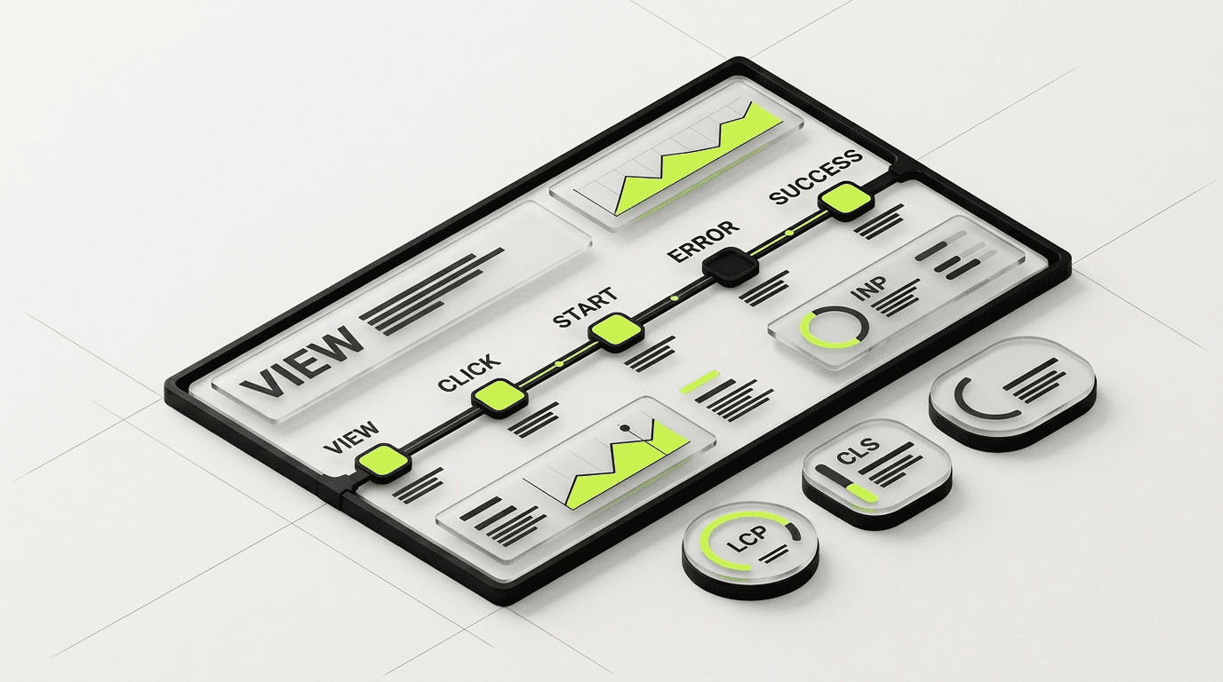
Google defines good performance as Largest Contentful Paint within 2.5 seconds, Interaction to Next Paint at 200 milliseconds or less, and Cumulative Layout Shift at 0.1 or less. Measure at the 75th percentile for mobile and desktop, as described in the official Web Vitals guidance.
Start with the hero image, tag-manager scripts, embedded video, font loading, and layout shifts near the CTA. Measure with field data when the page has enough traffic.
18. Does analytics record the full conversion path?
Confirm the page view, CTA click, form start, form error, form success, and thank-you state. Use event names your team can read without a lookup table. Preserve campaign parameters through the conversion path.
Analytics cannot tell you why a visitor hesitated. Missing analytics can make a working page look broken or a broken form look healthy.
19. Has someone outside the build team completed the flow?
Give a fresh tester the ad or source message, then ask them to complete the action on phone and desktop. Watch without helping. Record confusion, dead ends, surprise, and questions. The test exposes gaps that a component-by-component QA pass can miss.
20. Does the team have one testable hypothesis?
Write the next experiment in this format: “Changing X for audience Y should improve metric Z because we observed evidence E.” Name one primary metric and one guardrail metric. Keep the test tied to a scored weakness or observed behavior.
The DesignX guide to conversion-focused website redesigns explains how to turn these findings into a scoped redesign instead of an endless patch queue. Teams with a wider site problem can also review why SaaS websites stop converting.
Fix landing page problems in this order
Score alone does not set priority. Use four repair levels:
- Mechanics: broken forms, missing tracking, slow interactions, unreadable mobile layouts, or accessibility failures.
- Comprehension: source mismatch, unclear offer, weak headline, or competing actions.
- Confidence: missing proof, unanswered risk, vague process, or thin privacy context.
- Experiment candidates: CTA wording, section order, image choice, form sequence, or offer presentation.
This order protects the test. A button-copy experiment means little when the form drops submissions or the headline attracts the wrong buyer.
For a larger project, the SaaS website redesign planning guide can help the team control scope, approvals, and launch risk. Buyers comparing engagement models can review the DesignX agency pricing guide.
FAQs: Conversion focused landing page design checklist
What is a good landing page conversion rate?
Unbounce reports a 6.6% median across industries and 3.8% for SaaS in its benchmark dataset. Use the closest industry and conversion type as context. Compare the page against its own channel, audience, and prior performance before treating a broad benchmark as a verdict.
How many CTAs should a landing page have?
Use one primary conversion goal and repeat that action where the page earns it. A page may include legal, support, or low-emphasis navigation links, but those links should not compete with the main CTA. Secondary conversion paths need a clear business reason and separate measurement.
How long should a landing page be?
Use enough content to explain the offer, prove the claim, answer the main risks, and support the decision. A simple download may need a short page. A high-price service or complex SaaS product needs more evidence and process detail. Remove any section that cannot help the buyer decide.
How many fields should a landing page form include?
Ask for the information required to deliver the offer or route the lead. Tie each field to an action. Test a shorter or staged form when completion drops, and monitor lead quality beside conversion rate so the team does not trade useful context for empty volume.
Should a landing page remove the main navigation?
Campaign pages often benefit from fewer exit paths, but the right choice depends on buyer intent and trust. Keep required legal and privacy links. Test a reduced navigation against the current page when visitors need more company context before they act.
How often should a team test a landing page?
Run a test when you have a clear hypothesis, sound tracking, enough traffic, and a decision you can act on. Low-traffic teams can combine analytics with interviews, session review, usability tests, and sales feedback. Testing on a calendar creates noise when the evidence cannot support a decision.
Turn the scorecard into a scoped repair plan
Run this conversion focused landing page design checklist with marketing, sales, design, and engineering in the room. Score from evidence. Assign the four lowest checks, fix mechanics first, and choose one experiment after the page can support a clean measurement.
If the score reveals a wider conversion problem, see how DesignX scopes conversion-focused website redesign work. If the page needs broader research and funnel review, read the DesignX approach to conversion rate optimization and UX.
If you want a senior team to turn the lowest-scoring checks into a scoped repair plan, talk with DesignX about the landing page.