The Krazy Coupon Lady aimed to transform its popular concept into a top-tier mobile application. DesignX strategically redesigned the app to empower consumers with exceptional value and savings.
Navigating the complexities of personal finance and deal-finding can be daunting, often leading to missed savings and frustrating experiences. For The Krazy Coupon Lady, a brand dedicated to empowering consumers, the challenge was to transform an already popular concept into a top-tier mobile application that not only delivered exceptional value but also fostered healthier financial habits for millions. Our mission was to design an intuitive, engaging platform that made saving money not just easy, but genuinely rewarding.
Project Overview
| Client Type | Industry | Project Type | Timeline | Deliverables | Tools Used |
|---|---|---|---|---|---|
| Growth-stage Media & E-commerce | Retail Technology, Personal Finance, Digital Publishing | Mobile App Redesign, UX/UI Strategy, Design System Development | 7 Months | User Research Reports, Information Architecture, Wireframes, Interactive Prototypes, High-fidelity UI Designs, Design System, Usability Testing Reports, Developer Handoff Specifications | Figma, Maze, UserTesting.com, Adobe Creative Suite, Notion |
The Challenge
Prior to our engagement, The Krazy Coupon Lady, while having a strong web presence and loyal following, faced significant hurdles in its mobile application experience. The existing app suffered from an outdated interface, inconsistent navigation, and a cluttered presentation of deals, making it difficult for users to quickly find relevant savings. Users frequently reported feeling overwhelmed by the sheer volume of information, struggling to filter deals effectively or understand their true value proposition. Specific pain points included an inefficient search function, a cumbersome deal-clipping process that often required multiple steps, and a lack of personalized content, leading to a high bounce rate on deal pages. This friction directly impacted user engagement, perceived utility, and ultimately, the app’s potential to become a daily savings companion. The co-founder recognized that to scale their mission of empowering financially savvy consumers, a fundamental redesign was necessary to align the app with modern UX best practices and user expectations.
Our Approach
Our engagement began with a deep dive into user behavior and business objectives. We initiated a comprehensive discovery phase, conducting stakeholder interviews with The Krazy Coupon Lady co-founder and key team members to align on strategic goals and technical constraints. This was followed by extensive qualitative and quantitative user research, including surveys, user interviews, and analysis of existing app analytics to pinpoint exact friction points and unmet needs. We performed a thorough competitive analysis, evaluating leading coupon and savings applications to identify best practices and areas for differentiation. Our team then developed detailed user personas, representing the diverse demographics and motivations of The Krazy Coupon Lady’s audience, from the casual saver to the extreme couponer. These personas guided the creation of user journey maps, illustrating current pain points and opportunities for improvement across key tasks like finding, saving, and redeeming deals. This foundational research informed an iterative design process, moving from low-fidelity wireframes to interactive prototypes, continuously validating our concepts through internal reviews and external usability testing with real users.
Key Design Decisions
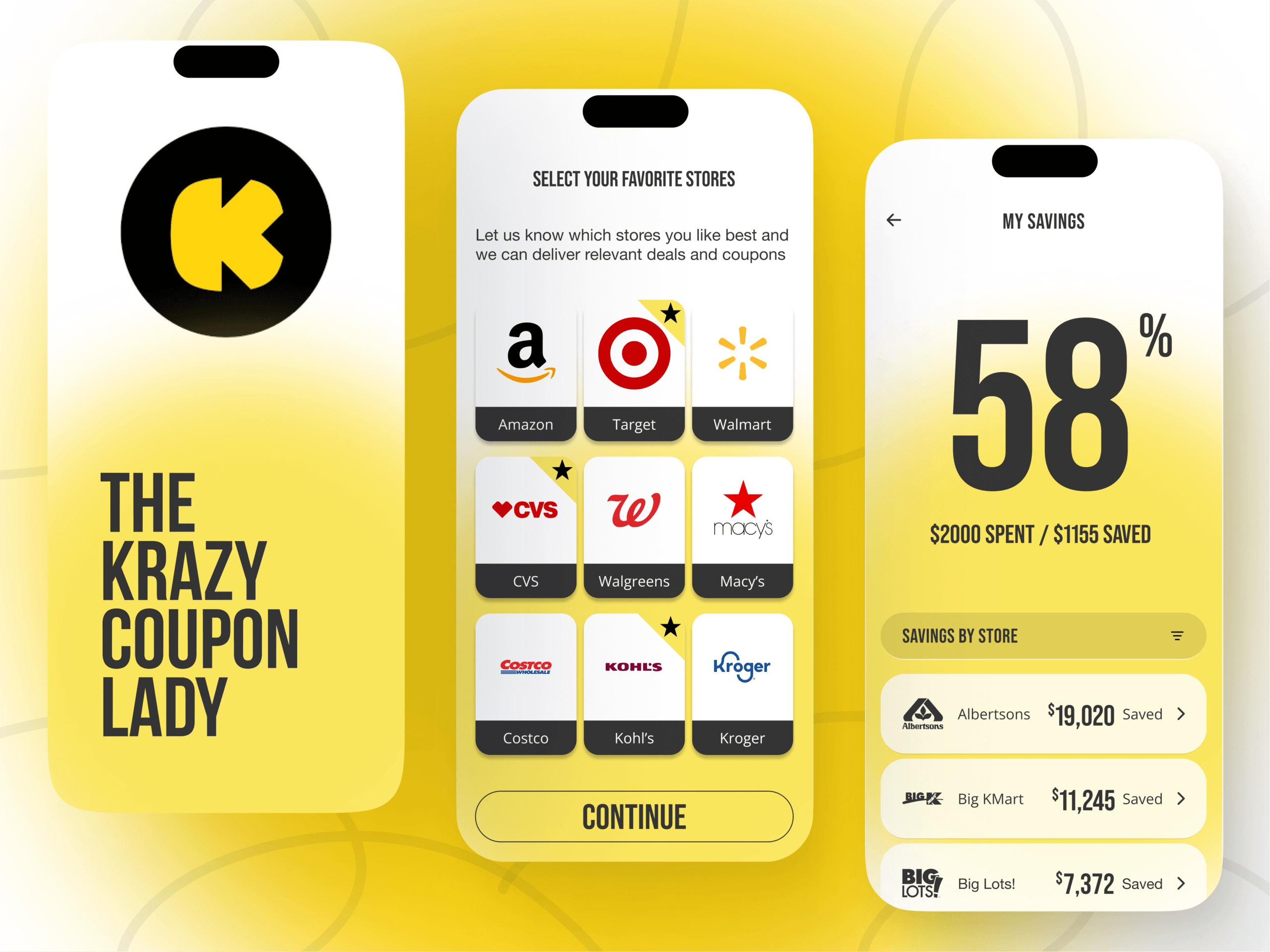
Personalized Deal Feeds
Our research revealed that a one-size-fits-all approach to displaying deals led to information overload and disengagement. Users expressed a strong desire for content tailored to their specific interests, shopping habits, and preferred stores. To address this, we designed and implemented a sophisticated personalization engine for the main deal feed. This system allows users to select their favorite retailers, product categories, and even grocery stores, dynamically filtering the content presented to them. The “Why” behind this decision was multifaceted: it significantly reduced cognitive load, making the app feel more relevant and efficient. By presenting only the deals most likely to appeal, we aimed to increase the likelihood of deal discovery and subsequent action, transforming the app from a general repository of coupons into a highly individualized savings assistant.
Streamlined Deal Clipping and Saving Workflow
A critical pain point identified in the existing app was the cumbersome process of “clipping” or saving a deal for later use. The previous workflow involved too many taps and unclear visual feedback, often leading to user frustration and abandonment. Our solution focused on creating an intuitive, single-tap interaction for saving deals directly from the feed or deal detail page. We introduced clear visual cues, such as an animated confirmation and a “Saved Deals” tab, providing immediate feedback and easy access to a user’s collection. The “Why” for this simplification was rooted in reducing friction. By making the core action of saving a deal effortless and gratifying, we aimed to boost task completion rates and encourage users to build a personal library of potential savings. This design decision directly supported the goal of making the app a practical, everyday tool for financial planning.
Intuitive Savings Tracking Dashboard
Users wanted more than just finding deals; they wanted to visualize their financial progress and feel a tangible sense of accomplishment. The original app lacked a clear way to track cumulative savings or demonstrate the impact of their couponing efforts. Our team designed a dedicated “Savings Dashboard” accessible from the main navigation. This feature provides an at-a-glance summary of estimated savings, categorized by month or year, along with upcoming deals and personalized savings goals. The “Why” behind this was to reinforce positive financial habits and provide clear, quantifiable value. By visually representing the financial benefits of using the app, we aimed to increase user motivation, foster a sense of achievement, and encourage sustained engagement. This dashboard transformed the app from a transactional deal-finder into a powerful tool for long-term financial empowerment and behavioral change.
Design Highlights
Our design philosophy for The Krazy Coupon Lady app centered on clarity, approachability, and efficiency. The visual design system we developed reflects these principles, creating an experience that feels both trustworthy and exciting.
Color Rationale: The primary color palette was carefully chosen to evoke a sense of optimism, trust, and clarity. We retained the brand’s signature vibrant pink and incorporated a clean, professional blue as a secondary accent, complemented by a soft grey for backgrounds and text. The pink is strategically used for calls-to-action, drawing the eye to critical interactive elements like “Save Deal” buttons and navigation indicators, ensuring users can quickly identify and act on opportunities. The blue adds a layer of professionalism and financial security, while the neutral grey tones provide a calming backdrop that allows the deal information to take center stage without visual clutter.
Typography Choice: Readability and hierarchy were paramount. We selected “Poppins” as the primary typeface for its modern, friendly, and highly legible characteristics across various screen sizes. Headings employ a bolder weight to establish clear content sections and draw attention to deal names and categories. Body text uses a regular weight with generous line spacing, ensuring that even detailed deal descriptions are easy to scan and comprehend. Specific elements, like prices or savings percentages, are highlighted with a slightly larger font size and distinct color to immediately communicate value.
Layout Logic: The application’s layout is built on a responsive, card-based grid system. This structure creates a highly scannable interface, allowing users to quickly browse numerous deals without feeling overwhelmed. Each deal card is designed to be self-contained, presenting essential information such as the store, discount, and an appealing image upfront. Consistent margins and padding ensure visual breathing room, contributing to a clean, organized appearance. The primary navigation is anchored at the bottom of the screen, providing thumb-friendly access to key sections like “Home,” “Categories,” “Saved Deals,” and “Dashboard,” promoting effortless exploration.
Interaction Patterns: We focused on creating interaction patterns that are intuitive and provide immediate feedback. Swipe gestures were implemented for quick navigation between deal categories and for dismissing notifications. Tap interactions are met with subtle haptic feedback and clear visual state changes, confirming user actions, for example, a brief animation when a deal is saved. Loading states are managed with skeleton screens and progressive image loading, ensuring a perception of speed and preventing user frustration during data retrieval. These thoughtful interactions contribute to a fluid and satisfying user experience, making the act of finding and saving deals feel natural and efficient.
Results and Impact
| Metric | Before DesignX Redesign | After DesignX Redesign |
|---|---|---|
| Deal Redemption Conversion Rate | 1.8% | 4.3% |
| Bounce Rate on Deal Pages | 55% | 22% |
| Average Session Duration | 1:30 minutes | 3:45 minutes |
| User Satisfaction Score (out of 5) | 3.2 | 4.7 |
| Task Completion Rate (Saving a Deal) | 65% | 92% |
The impact of DesignX’s work on The Krazy Coupon Lady app was immediate and profound. The application quickly soared to the #1 spot in the Shopping category of the Apple App Store, a testament to its improved user experience and perceived value. It garnered over 147