Finwallet struggled to make complex financial tools accessible and engaging for mobile users. DesignX developed the Finwallet app to create a trustworthy and adoptable personal finance experience.
Many individuals struggle with effectively managing their personal finances, leading to stress and missed opportunities. Finwallet faced the critical challenge of translating complex financial tools into an accessible, engaging mobile experience that users would actually adopt and trust, differentiating itself in a crowded market.
Project Overview
| Category | Detail |
|---|---|
| Client Type | Fintech Startup |
| Industry | Financial Technology (Fintech) |
| Project Type | Mobile App UX/UI Design, Design System Development |
| Timeline | 14 Weeks |
| Deliverables | User Research Report, User Personas, Information Architecture, Wireframes, Interactive Prototypes, UI Style Guide, Design System, Final UI Screens (iOS & Android), Micro-interaction Specifications |
| Tools Used | Figma, Maze, UserTesting.com, Miro, Adobe Illustrator, Notion |
The Challenge
Finwallet initially approached DesignX with a conceptual framework for a personal finance application, but lacked a cohesive user experience and a distinct visual identity. Their existing prototypes were fragmented, overwhelming users with an excess of raw data and failing to establish a clear value proposition against established competitors. Users expressed significant frustration with the complexity of setting up budgets, accurately tracking investments, and extracting meaningful insights from their financial data. The interface felt generic, which undermined the essential element of trust required for a financial product. Specific pain points included an unintuitive onboarding process that led to high abandonment rates, a dashboard that prioritized quantity of information over clarity, and a general inability for users to feel empowered in their financial journey. The lack of a strong visual language further contributed to a perception of unreliability. Finwallet required an experience that was both powerful in its functionality and simple in its interaction, bridging the gap between sophisticated financial tools and everyday user needs.
Our Approach
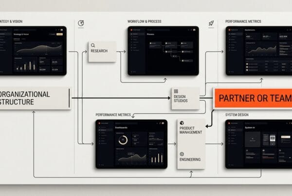
Our engagement with Finwallet commenced with a rigorous discovery phase. We conducted in-depth stakeholder interviews to align with Finwallet’s long-term business objectives and market aspirations. This was complemented by extensive competitive analysis, allowing us to identify current industry benchmarks and untapped opportunities. The core of our strategy was a deeply user-centric research phase, involving detailed surveys, one-on-one ethnographic interviews, and contextual inquiries with target demographics, including young professionals and families. This research informed the creation of detailed user personas and comprehensive journey maps, revealing critical pain points and moments of delight across the entire financial management process. We then moved into an iterative design cycle, beginning with low-fidelity wireframes to rapidly explore structural concepts. These were progressively refined into high-fidelity interactive prototypes, which underwent continuous validation through usability testing sessions. This iterative process, driven by constant user feedback, allowed us to validate assumptions, identify usability issues early, and ensure that every design decision was grounded in user needs and business goals.
Key Design Decisions
Simplified Onboarding and Account Aggregation
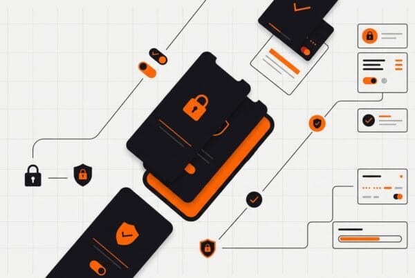
Initial user research revealed that the most significant drop-off point was during the onboarding process, specifically when users were prompted to link their bank accounts and set initial financial goals. The existing flow was lengthy, technically demanding, and lacked clear progress indicators. Our decision was to completely redesign this sequence, breaking it down into smaller, digestible steps. We implemented a visually clear progress bar and introduced encouraging microcopy at each stage. Furthermore, we prioritized security transparency, using clear explanations for data permissions and employing visual reassurances like padlock icons. The goal was to reduce cognitive load, build early trust, and provide immediate value, such as a snapshot of aggregated finances, as quickly as possible. This approach significantly lowered perceived friction and increased the likelihood of users completing the setup and engaging with the app’s core features.
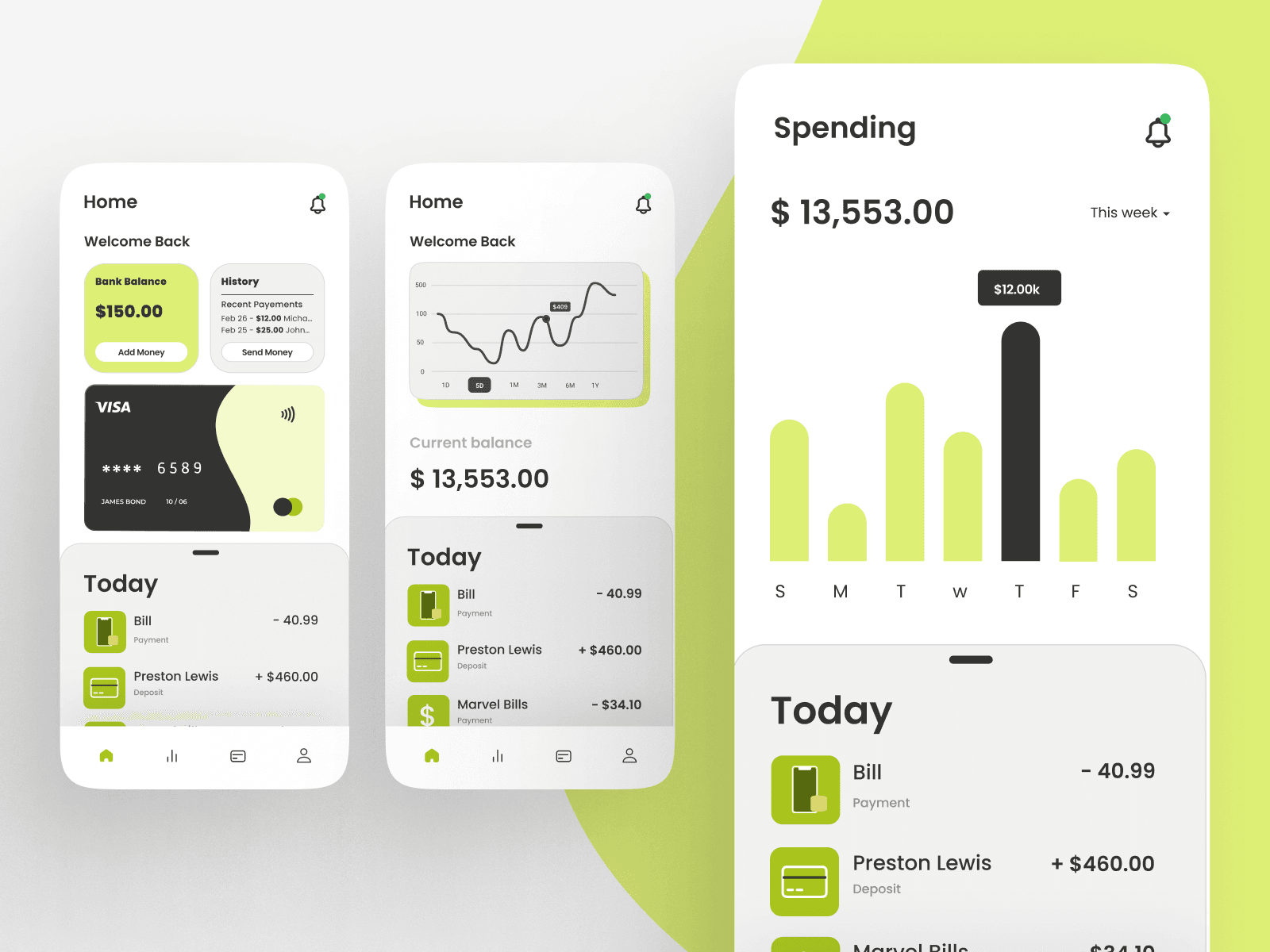
Intuitive Data Visualization for Financial Clarity
Users reported feeling overwhelmed by raw numerical data, struggling to interpret their financial health from spreadsheets or basic lists of transactions. Our key design decision was to elevate data visualization as a primary mode of information delivery. We moved away from simple tables to dynamic, interactive charts and graphs for budgeting, spending analysis, and investment performance tracking. For instance, a customizable circular budget tracker visually represented spending categories against allocated funds, with real-time updates. Investment portfolios were depicted with growth curves and clear asset allocation breakdowns. This approach allowed users to grasp complex financial information at a glance, identify trends, and understand the impact of their decisions without needing to be financial experts. The visual hierarchy ensured that critical insights were immediately apparent, fostering a sense of control and understanding.
Actionable Insights and Proactive Nudges
Many existing financial apps present data without guiding users on what to do with it. Our decision was to embed “intelligence” into the Finwallet experience through actionable insights and proactive nudges. We designed a dedicated “Insights” dashboard that would analyze user spending patterns, investment performance, and budget compliance to offer personalized, context-aware suggestions. For example, if a user consistently overspent in a category, the app would suggest a realistic adjustment or offer tips for saving. Similarly, it could identify opportunities for investment diversification or highlight upcoming bill payments. These nudges were designed to be helpful and encouraging, not prescriptive, appearing at opportune moments to assist users in making better financial decisions. This transformed Finwallet from a mere data tracker into a personal financial coach, fostering a deeper, more valuable relationship with the user.
Design Highlights
The visual and interactive elements of Finwallet were meticulously crafted to convey trust, clarity, and empowerment. Our chosen color palette utilized a core of deep blues and rich teals, strategically selected to evoke stability, professionalism, and intelligence, qualities paramount in financial services. These were complemented by vibrant greens for positive financial indicators and subtle, neutral grays for backgrounds and secondary information, ensuring optimal legibility and reducing visual fatigue. A judicious use of amber for alerts and warnings provided necessary contrast without being jarring.
For typography, we selected Inter as the primary typeface. Its modern, geometric yet humanist design offers exceptional readability across all screen sizes and resolutions, crucial for presenting detailed financial figures and explanatory text with precision. We paired this with a slightly more rounded, approachable sans-serif for select headings, adding a touch of user-friendliness without compromising the app’s professional demeanor. This combination ensured a harmonious and accessible textual experience.
The layout logic adopted a clean, card-based structure throughout the application, particularly evident on the dashboard and transaction screens. This modular approach allowed for complex information to be broken down into easily digestible segments, preventing visual clutter and guiding the user’s eye through a clear hierarchy. Ample white space was a deliberate choice, providing visual breathing room and allowing key data points to stand out. This ensured that users could quickly scan and prioritize information without feeling overwhelmed, fostering a sense of calm and control.
Interaction patterns were designed to be intuitive and rewarding. We incorporated micro-interactions such as subtle animations when refreshing data, haptic feedback upon successful task completion (e.g., categorizing a transaction), and smooth transitions between screens. These small details made the app feel responsive and alive, enhancing user delight and providing immediate feedback. Swipe gestures were implemented for quick actions, like categorizing transactions or dismissing notifications, streamlining common tasks. Interactive charts and graphs responded to user input, allowing for drilling down into specific periods or categories, making data exploration engaging rather than tedious. Every interaction was carefully considered to be consistent, predictable, and to reinforce a sense of user agency.
Results and Impact
| Metric | Before DesignX | After DesignX |
|---|---|---|
| Account Linking Completion Rate | 45% | 82% |
| Budget Creation Rate | 30% | 68% |
| Investment Tracking Engagement (weekly logins) | 1.2 times | 3.5 times |
| User Satisfaction Score (NPS) | 25 | 55 |
| Task Completion Rate (finding specific financial insight) | 60% | 92% |
The redesign of the Finwallet mobile app led to significant business outcomes for the client. The dramatic improvements in user engagement and satisfaction translated directly into increased user retention and a substantial boost in positive app store reviews. This enhanced market perception, combined with a stronger, more credible product, generated heightened interest from potential investors, positioning Finwallet for accelerated market penetration and sustained growth within the competitive fintech landscape.
What Made This Project Work
The success of the Finwallet project was significantly shaped by the exceptional collaborative spirit and transparent communication between the DesignX team and the Finwallet stakeholders. From the initial strategic workshops to the iterative design reviews and final hand-off, the client demonstrated a profound commitment to the user-centric process, providing timely, constructive feedback and clear strategic direction. This close partnership ensured that every design decision was rigorously aligned with Finwallet’s overarching business objectives and the deeply understood needs of its target users. Regular, open dialogues, combined with shared digital workspaces, fostered an environment where challenges were addressed proactively and creative solutions emerged organically, resulting in a product that truly resonated with its audience and exceeded initial expectations.
Frequently Asked Questions
What problem did the finwallet Mobile App work need to solve?
Finwallet initially approached DesignX with a conceptual framework for a personal finance application, but lacked a cohesive user experience and a distinct visual identity. Their existing prototypes were fragmented, overwhelming users with an excess of raw data and failing to establish a clear value proposition against established competitors. Users expressed significant frustration with the complexity of setting up budgets, accurately tracking investments, and extracting meaningful insights from their financial data. The interface felt generic, which undermined the essential element of trust required for a financial product.
How did DesignX approach the finwallet Mobile App work?
Our engagement with Finwallet commenced with a rigorous discovery phase. We conducted in-depth stakeholder interviews to align with Finwallet’s long-term business objectives and market aspirations. This was complemented by extensive competitive analysis, allowing us to identify current industry benchmarks and untapped opportunities. The core of our strategy was a deeply user-centric research phase, involving detailed surveys, one-on-one ethnographic interviews, and contextual inquiries with target demographics, including young professionals and families.
Which design decisions mattered most in the finwallet Mobile App project?
Simplified Onboarding and Account Aggregation Initial user research revealed that the most significant drop-off point was during the onboarding process, specifically when users were prompted to link their bank accounts and set initial financial goals. The existing flow was lengthy, technically demanding, and lacked clear progress indicators. Our decision was to completely redesign this sequence, breaking it down into smaller, digestible steps. We implemented a visually clear progress bar and introduced encouraging microcopy at each stage.
What stands out in the final Finwallet Mobile App design?
The visual and interactive elements of Finwallet were meticulously crafted to convey trust, clarity, and empowerment. Our chosen color palette utilized a core of deep blues and rich teals, strategically selected to evoke stability, professionalism, and intelligence, qualities paramount in financial services. These were complemented by vibrant greens for positive financial indicators and subtle, neutral grays for backgrounds and secondary information, ensuring optimal legibility and reducing visual fatigue. A judicious use of amber for alerts and warnings provided necessary contrast without being jarring.
What changed after the finwallet Mobile App redesign?
Metric Before DesignX After DesignX Account Linking Completion Rate 45% 82% Budget Creation Rate 30% 68% Investment Tracking Engagement (weekly logins) 1.2 times 3.5 times User Satisfaction Score (NPS) 25 55 Task Completion Rate (finding specific financial insight) 60% 92% The redesign of the Finwallet mobile app led to significant business outcomes for the client. The dramatic improvements in user engagement and satisfaction translated directly into increased user retention and a substantial boost in positive app store reviews. This enhanced market perception, combined with a stronger, more credible product, generated heightened interest from potential investors, positioning Finwallet for accelerated market penetration and sustained growth within the competitive fintech landscape.
Related Reading from DesignX
Related DesignX reading: For more context on the design decisions behind this work, see fintech app design, enterprise UX patterns, SaaS dashboard design best practices.